 New
NewStudio Kit
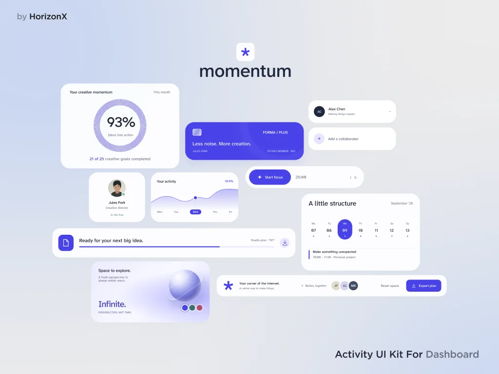
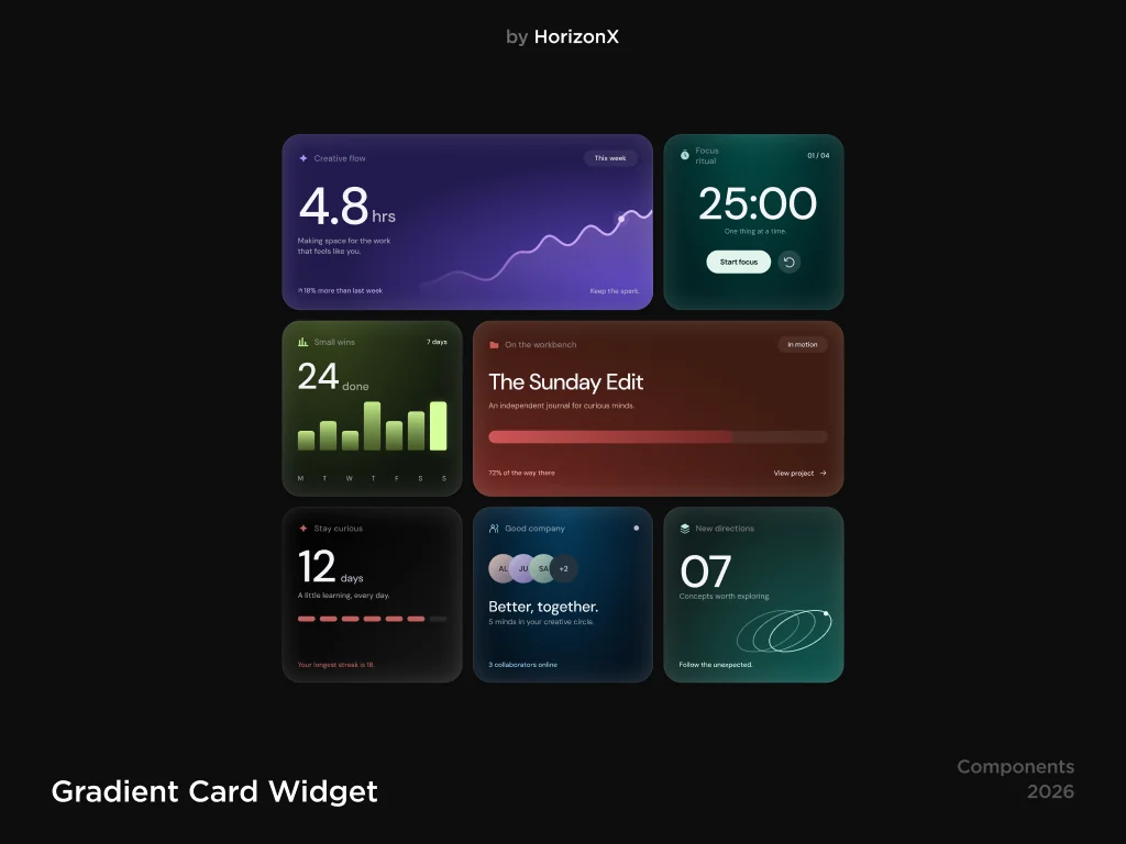
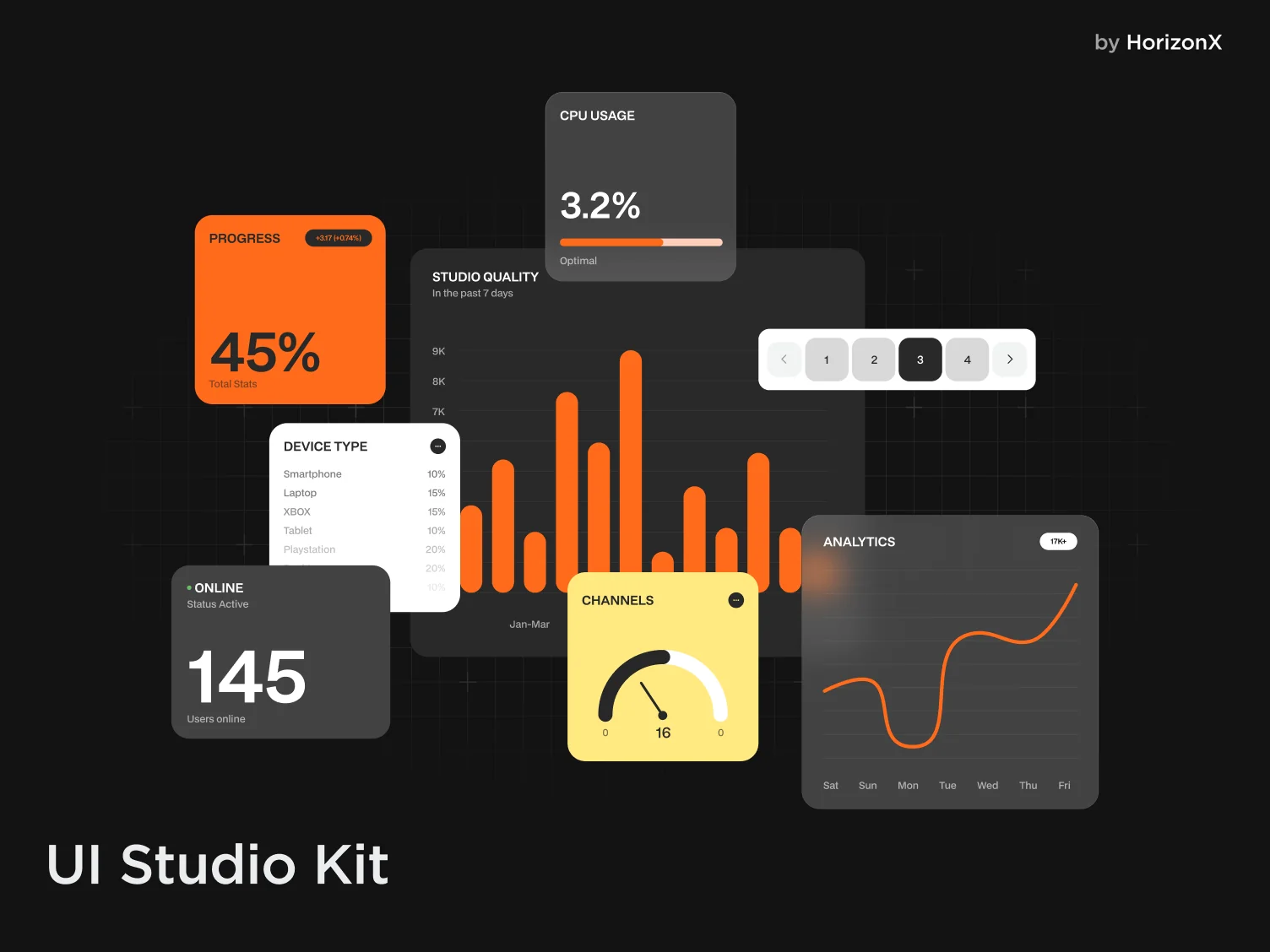
Modular dashboard UI components with bold analytics cards, orange accents, and dark and light compositions.
 HorizonX UI/UX
Collection
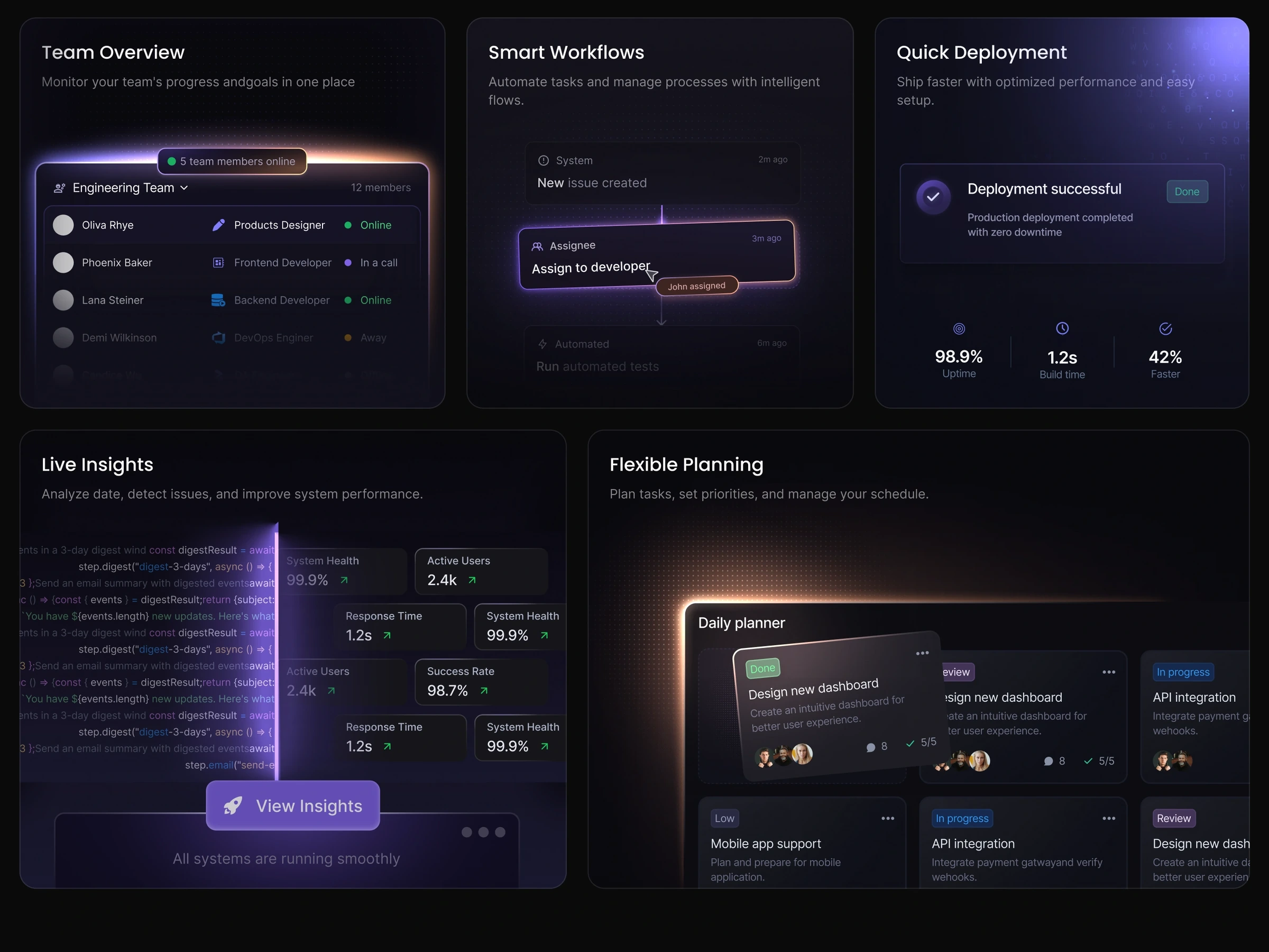
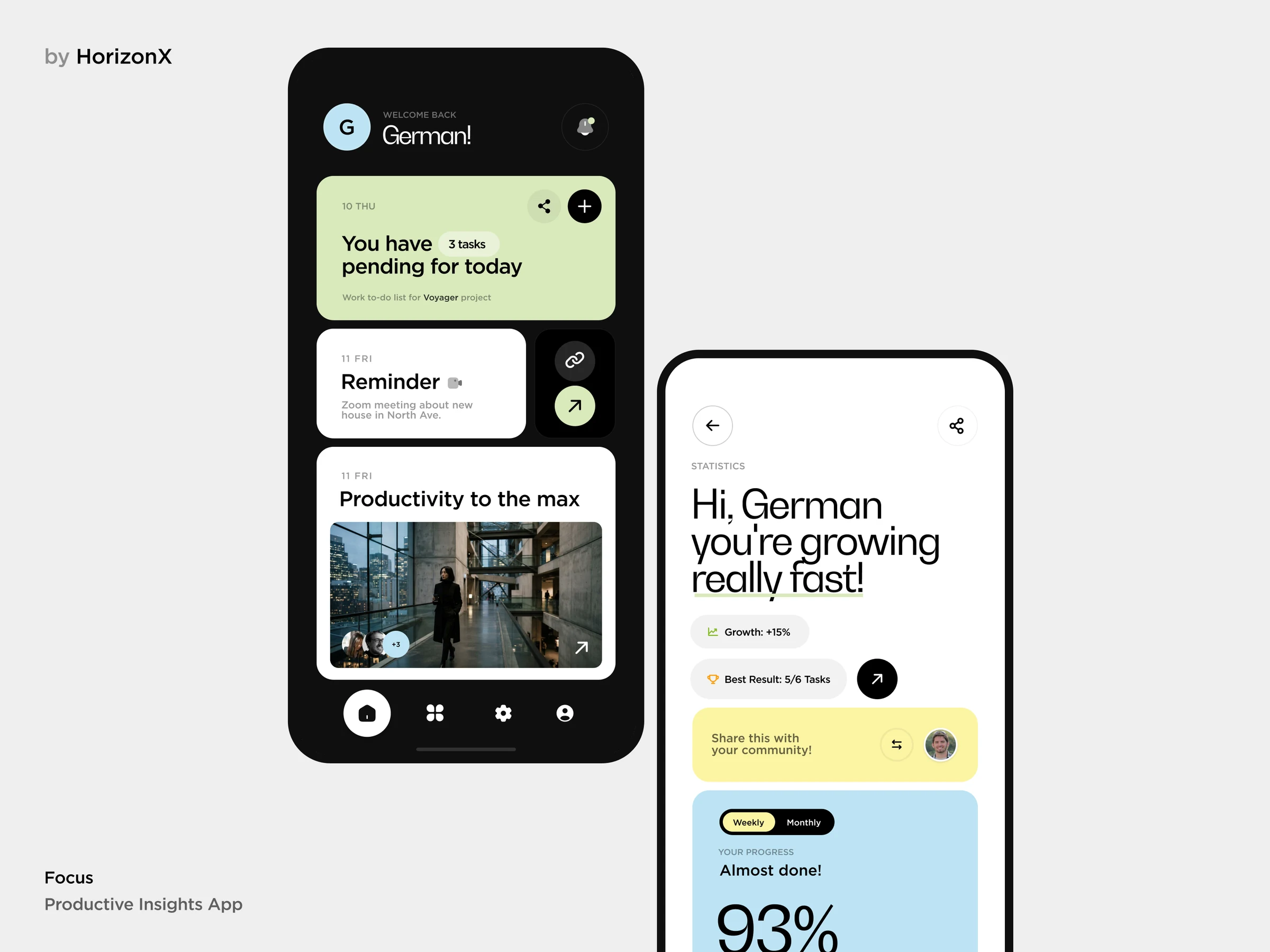
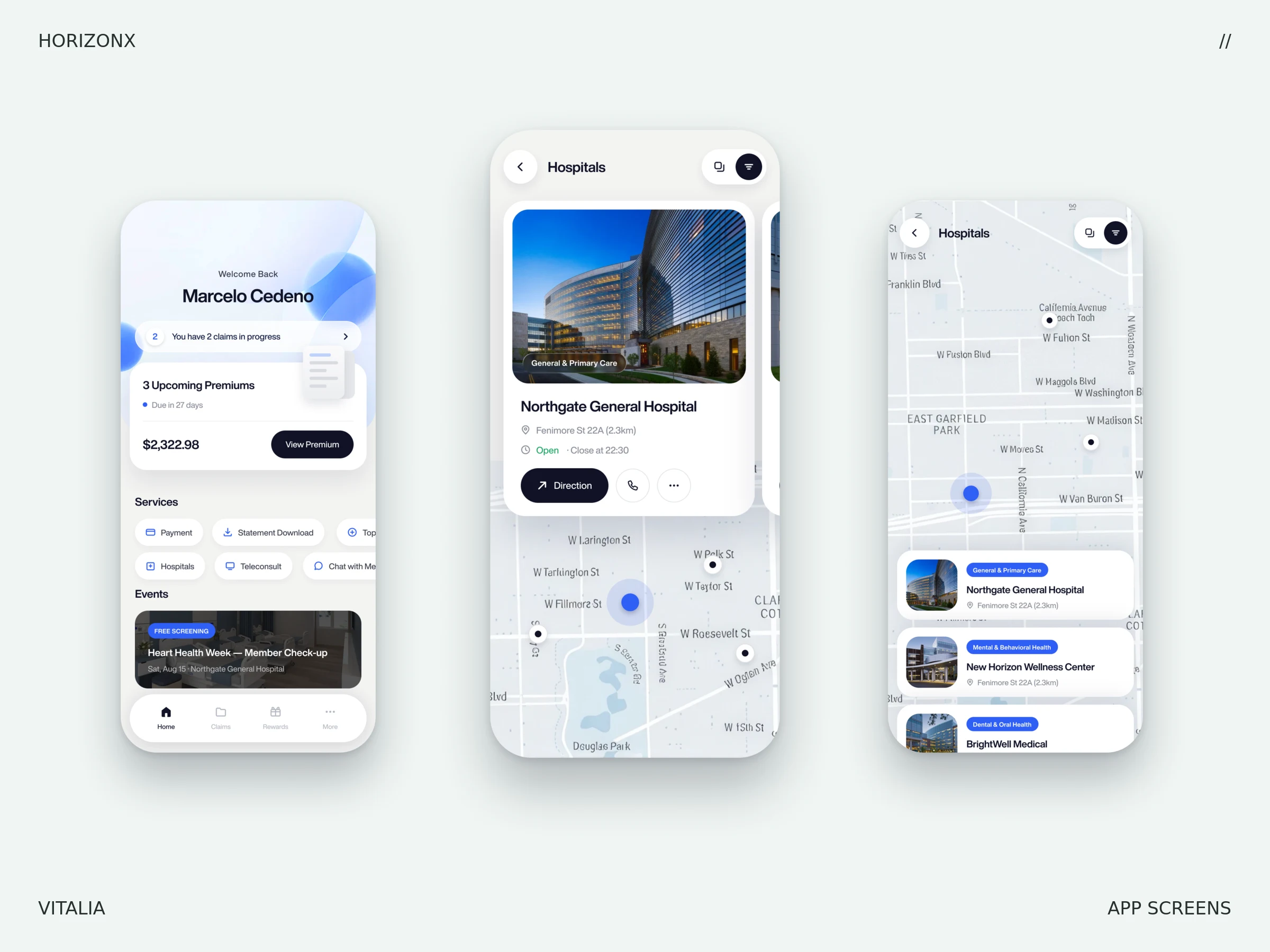
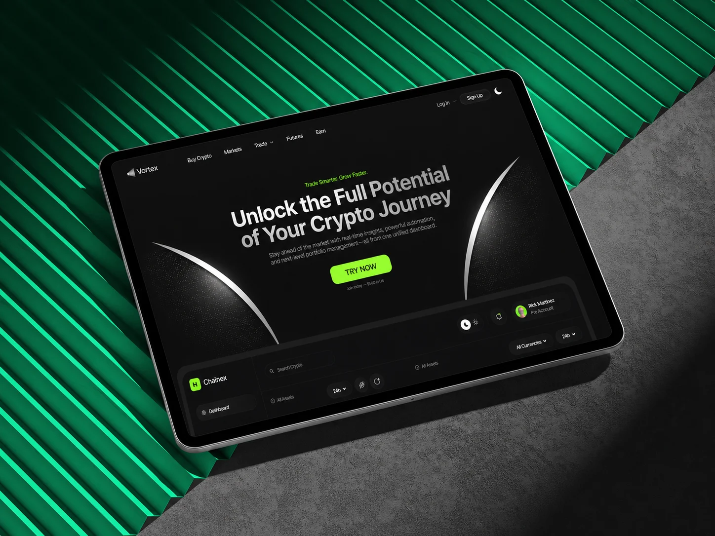
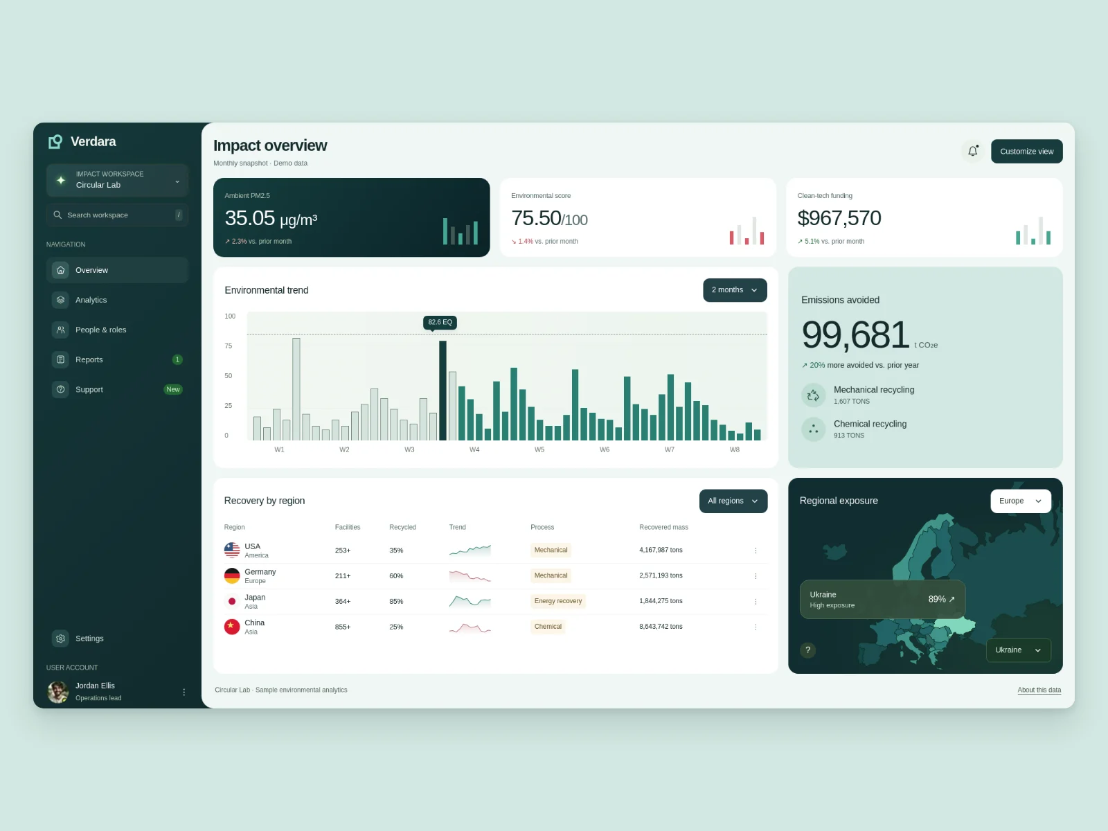
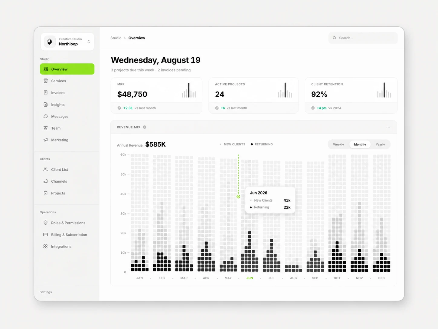
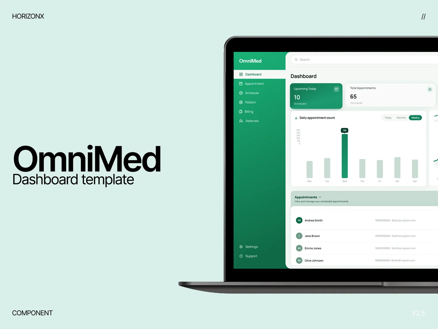
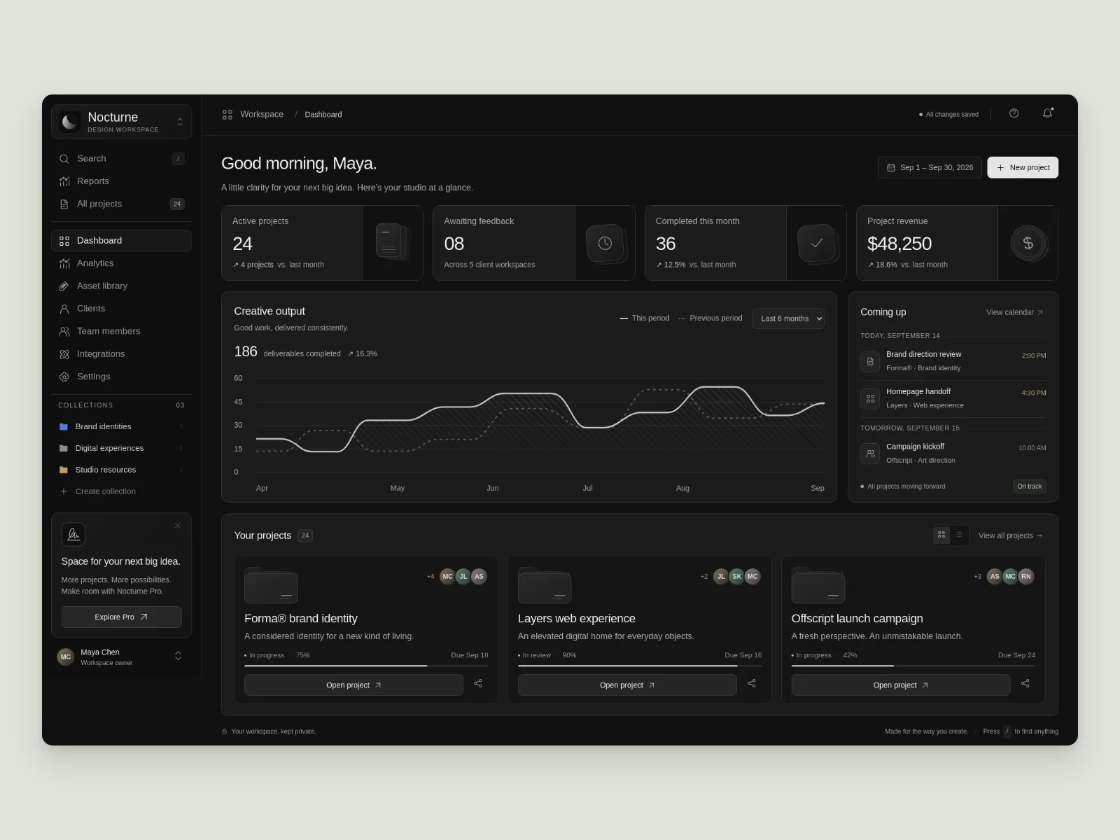
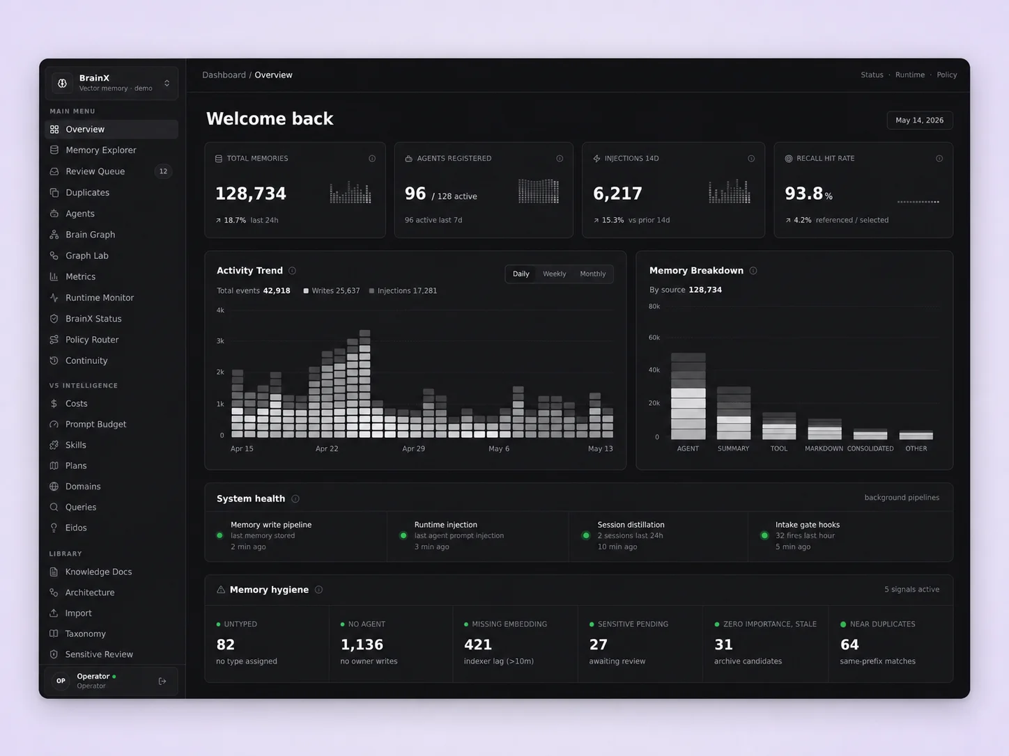
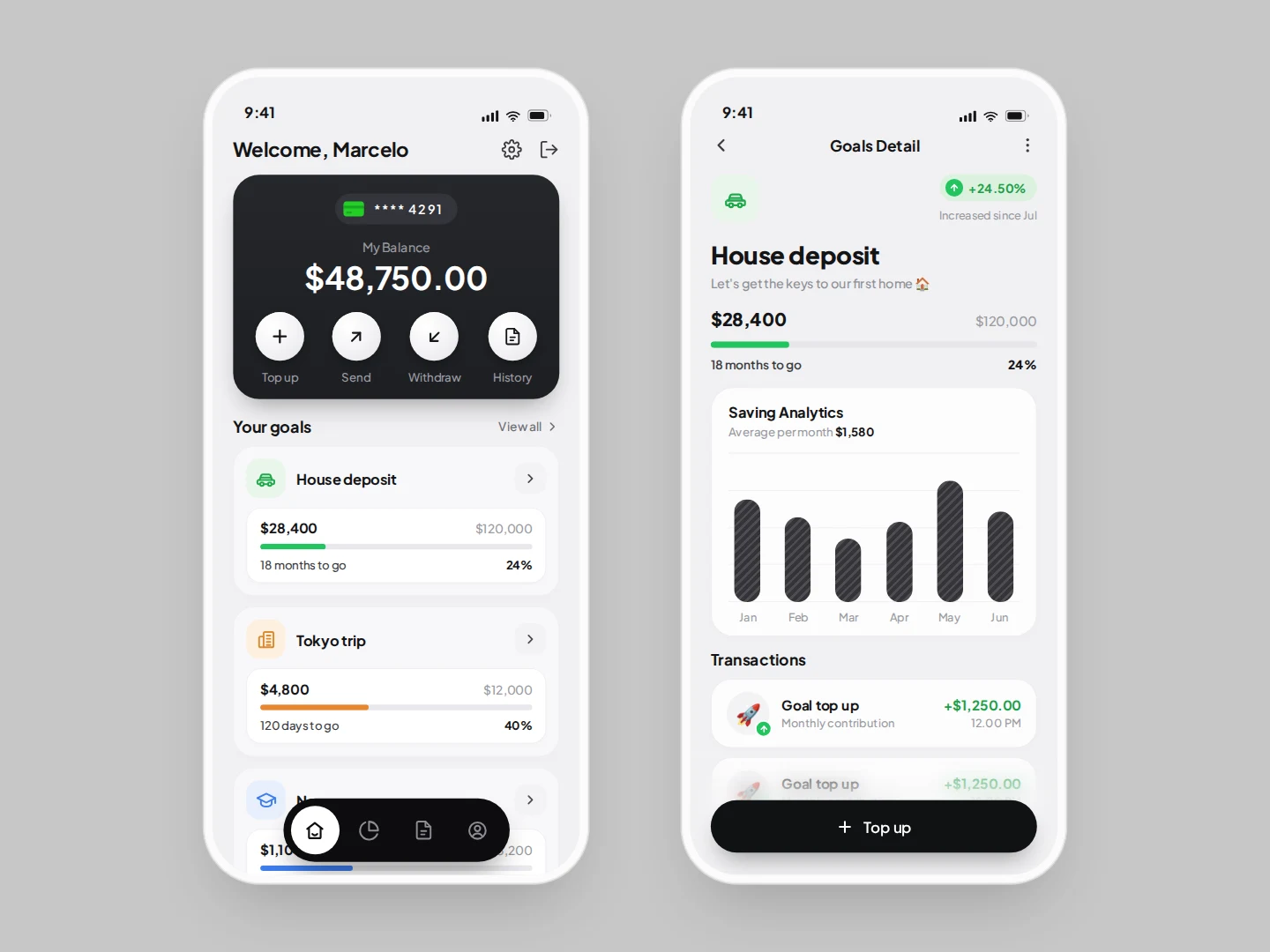
Dashboard templates and admin UI designed around the dense, practical work software needs to handle. Clear navigation, useful data views and production-minded layouts give build projects a credible back office from the first build.
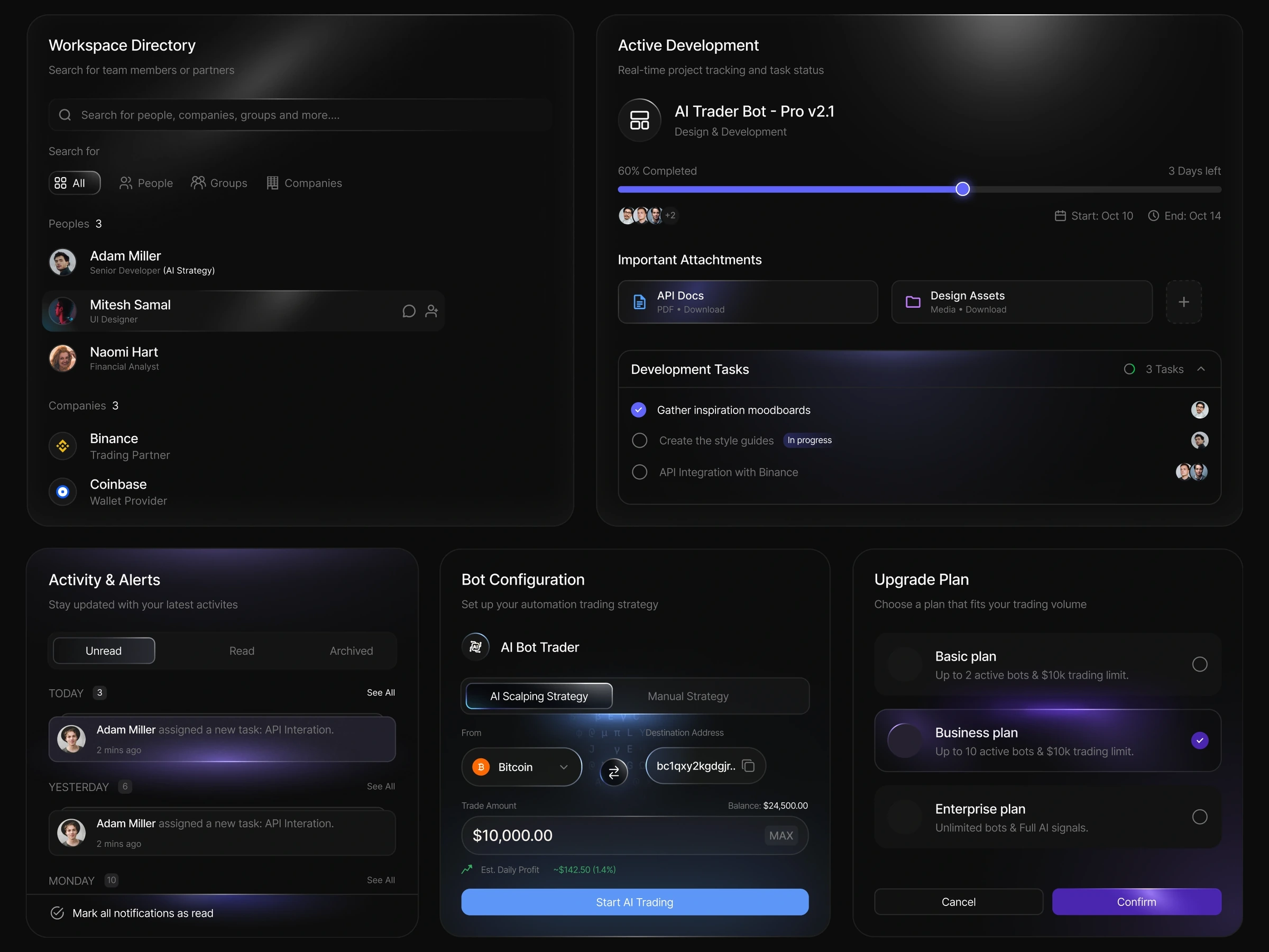
This collection curates dashboard templates and admin UI that are built for real operational software: navigation, tables, charts, filters, forms and the empty and loading states that make a back office feel finished. The screens are composed as systems, not isolated cards.
Because dashboards are the most reused surface in a product, the value here is consistency — a layout that scales from a two-panel admin to a full data-heavy tool without looking different from screen to screen.
Teams building SaaS products, internal tools and anything with an authenticated interface. If a project needs a credible back office alongside its marketing site, these layouts let you stand one up quickly.
They also help product designers who want to communicate a complex information architecture clearly before a full build.
Dashboards are a place where vibe coding can save a lot of time, because the layout is structured and repetitive. Start from a template, and Cursor or v0 can populate the data views and states predictably within a consistent grid.
The emphasis on navigation and empty states is what separates a demo dashboard from a usable one — and those patterns are exactly what these layouts already resolve.
The layouts are delivered as dashboard and admin screens composed for a structured grid. They fit a React or Tailwind build well, and the navigation, filter, panel and state patterns translate directly to a real application shell. You get a consistent system to extend.
This collection
Curated from the live HorizonX catalog. Currently listing 19 designs on this page.
Browse the full catalogRelated collections
A dashboard template is a pre-built admin or analytics interface with navigation, data views, tables, charts and forms arranged in a coherent system you can customize for your product.
Yes. The layouts are designed around dense, practical interfaces — filters, tables and status views — so they scale to a real back office rather than a one-screen demo.
The screens account for the states a real app needs, which is what makes a dashboard feel complete rather than a mockup of a full screen.
The consistent grid and navigation let an agent fill in data views predictably. You get structure and states already decided, so the build progresses instead of stalling on scaffolding.
Looking for more?
Browse every design in the HorizonX catalog.
Other collections