Premium
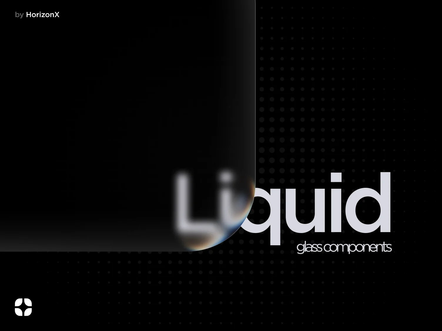
Liquid Glass
Translucent Figma components with soft blur, luminous edges, and layered glass surfaces.
 HorizonX UI/UX
Collection
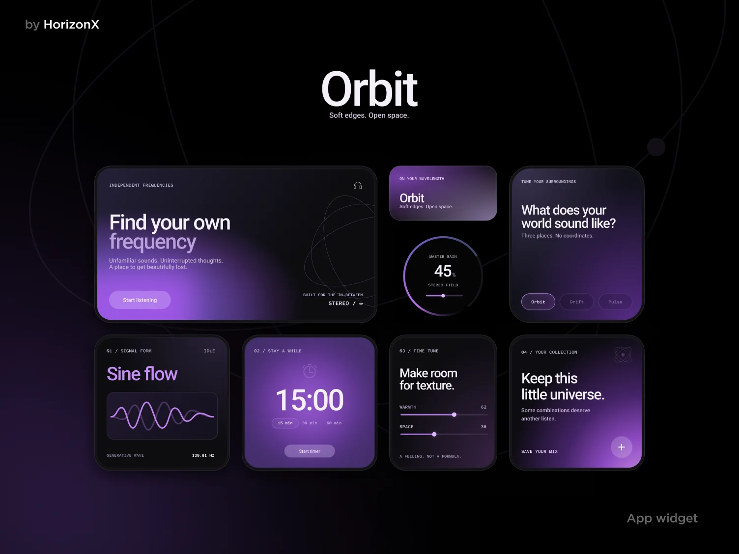
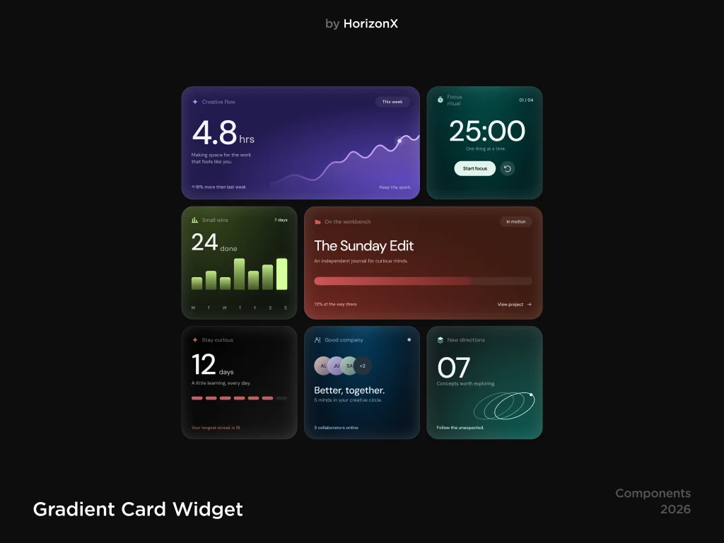
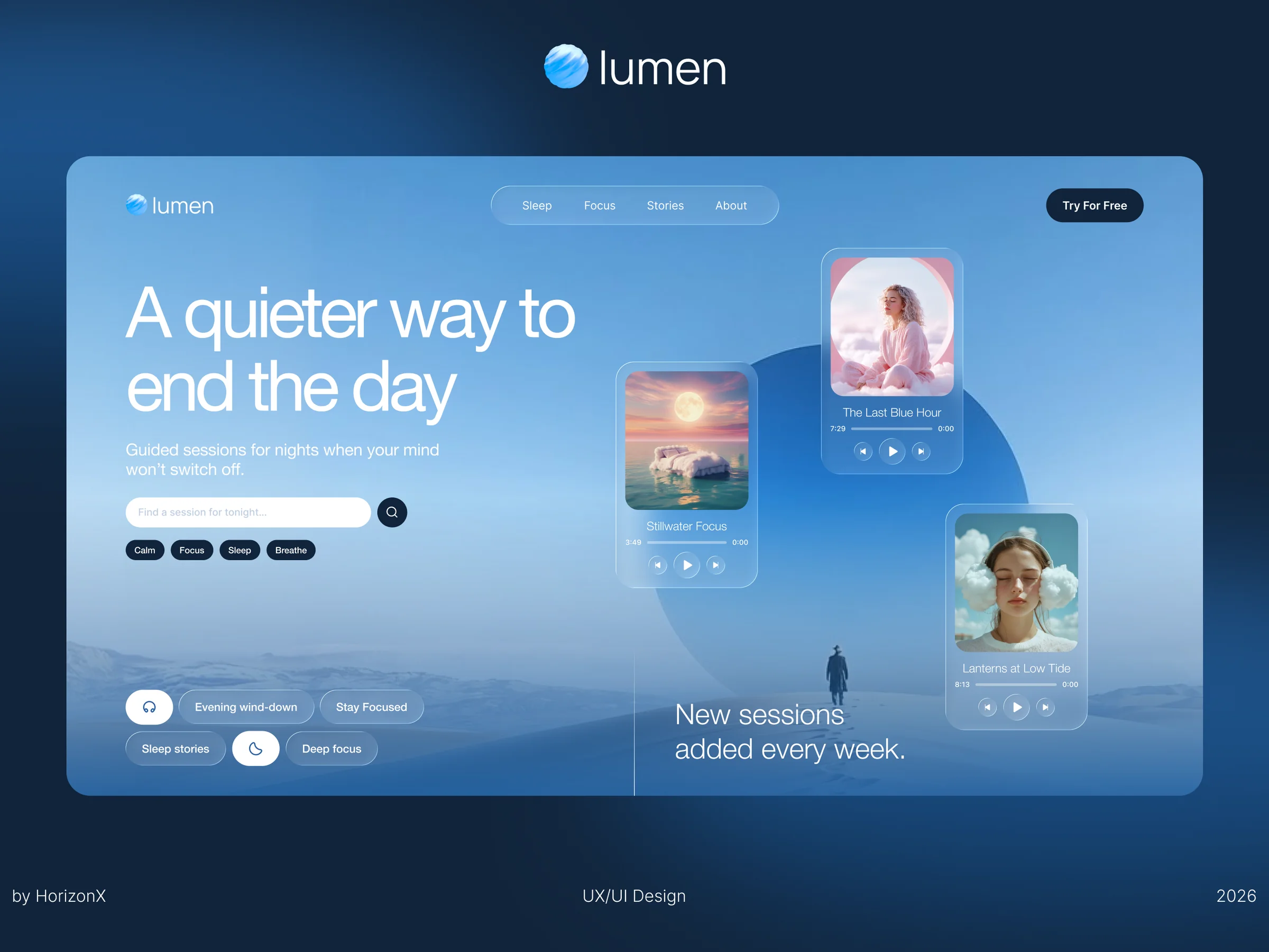
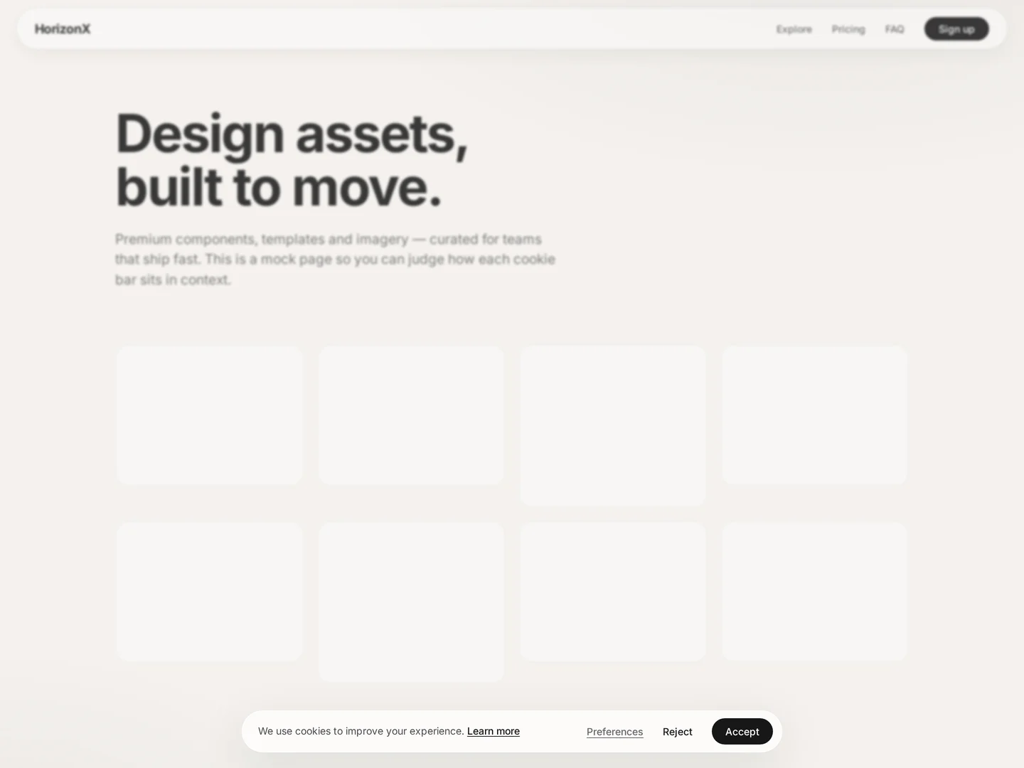
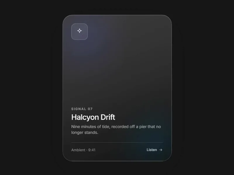
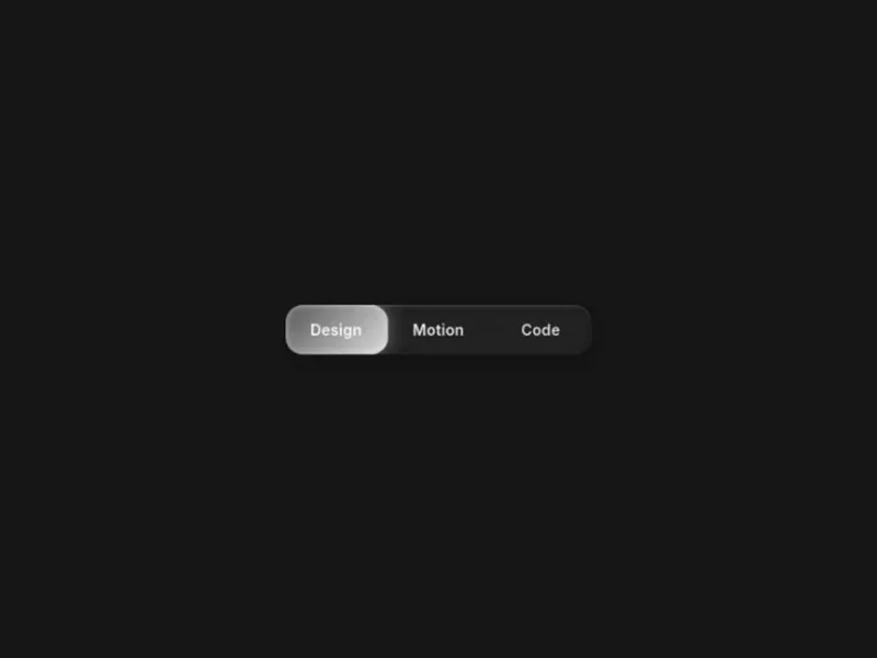
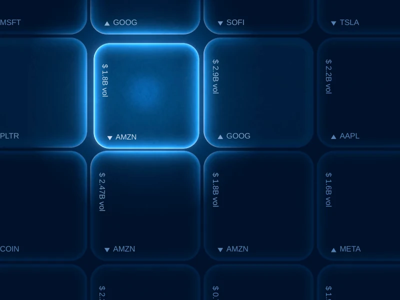
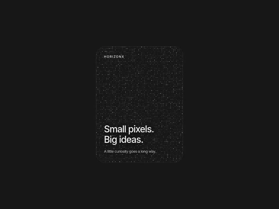
Liquid glass CSS and glassmorphism references: translucent cards, radio controls, a checkbox, widgets, a consent component and a landing page. Use glass to separate a floating panel from a colorful surface. This collection mixes design references with coded controls, so choose the format as well as the look.
Liquid glass CSS and glassmorphism references: translucent cards, radio controls, a checkbox, widgets, a consent component and a landing page.
Use glass to separate a floating panel from a colorful surface. This collection mixes design references with coded controls, so choose the format as well as the look.
Adapt the surface tint, border and text contrast to your background. Open each product to check its format; a Figma reference and a CSS control need different workflows.
Test text on bright and dark content behind the panel. Provide a readable opaque fallback if blur is unavailable, and avoid stacking many expensive blurred surfaces.
Both use translucent surface styling, but the catalog includes several visual interpretations rather than one uniform implementation.
No. The selection includes UI designs and a Figma-tagged landing page alongside CSS controls and a coded consent component.
Use a restrained tint, clear borders and enough text contrast. Test the surface against the actual content that will sit behind it.
Keep exploring
Browse every design in the HorizonX catalog, from UI kits and templates to textures, shaders and mockups.