Neon Pricing
Dark SaaS pricing section: Essentials / Standard / Custom with neon-green Recommended accent.
 HorizonX UI/UX
Collection
Pricing page design starting points in Figma: two dark three-tier pricing sections and a complete pricing page with a billing toggle and a feature comparison table. Use them to lay out your plans, point buyers to the plan most of them should pick and answer the questions that stop a purchase.
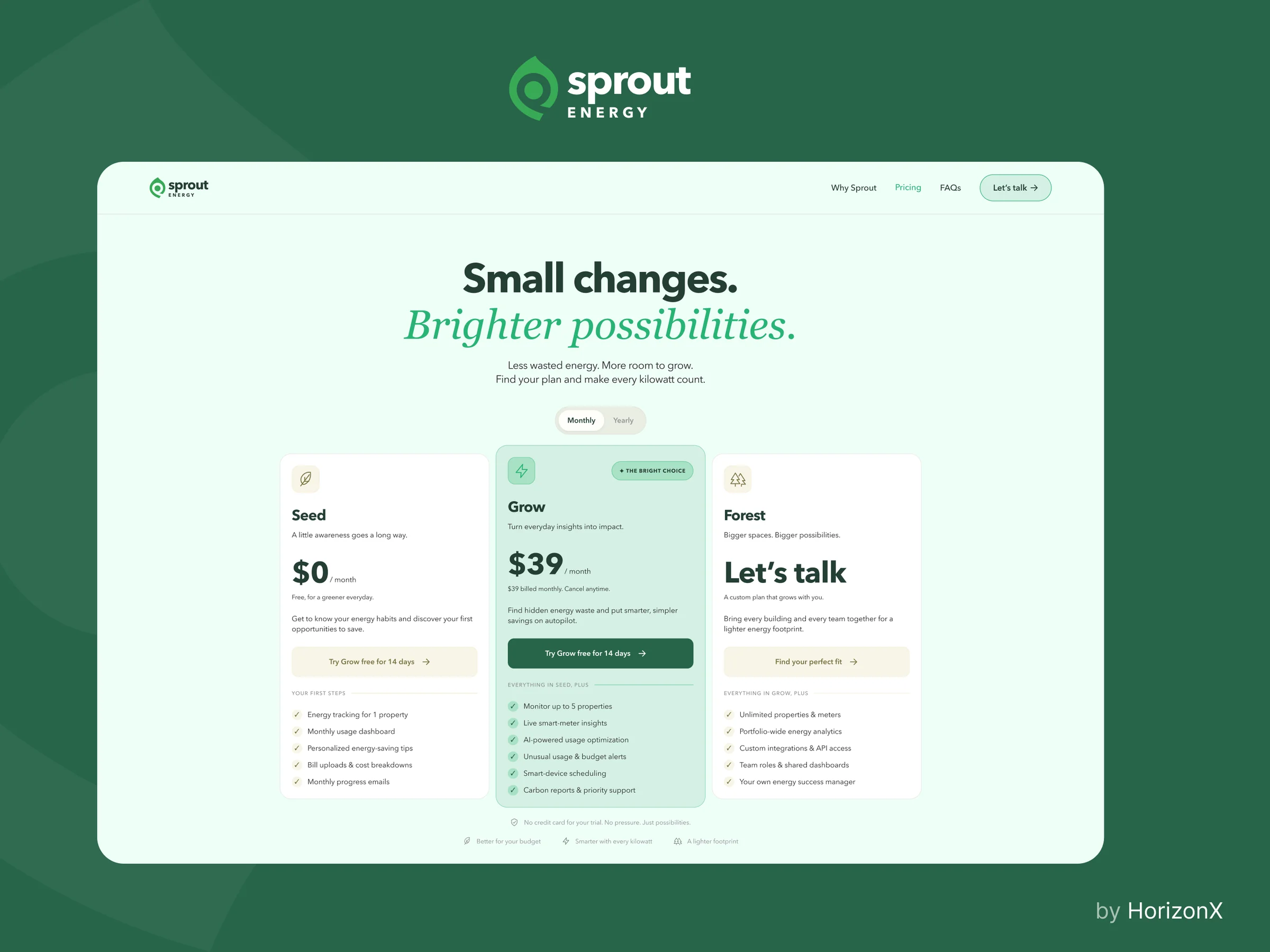
Neon Pricing is a dark SaaS pricing section with Essentials, Standard and Custom tiers and a neon green Recommended accent. Pricing Component is a dark three-tier section with orange accents over a perspective grid. Sprout Energy is a full pricing page for a clean-energy SaaS, with a hero, a monthly and yearly toggle, three plan cards and a feature comparison table. All three are editable Figma files.
A pricing section sits inside a landing page, so it needs only the tiers, one line per plan and one action per card. A dedicated pricing page has room for a billing toggle, a comparison table and answers for buyers who are already comparing plans. Start from Neon Pricing or Pricing Component for a landing page block, and from Sprout Energy when the page has to carry the whole decision.
Write the real plan names, prices and limits before adjusting the layout, because long feature lists change the card heights. Keep one plan visibly recommended, label the billing period beside each price and state the yearly saving if you show a toggle. Rebuild the cards with your own components, keeping the order of plan name, price, summary, action and features.
Check that every price, currency, tax note and limit matches what checkout charges. Let the comparison table scroll or stack on small screens instead of shrinking the text, keep plan actions as real buttons or links, and make sure the recommended badge is not the only way to tell the plans apart.
A short list of plans with clear names, one recommended option, the billing period next to every price and the main differences visible without opening a table. A comparison table and a short FAQ help buyers who need more detail.
Three is a common choice: a starting plan, a recommended plan and an option for larger teams. Use fewer if your offer is simple, because every extra tier makes the choice harder.
No. All three are Figma files. Build the final section in your own stack, or pair the layout with the coded component library you already use.
From the blog
Keep exploring
Browse every design in the HorizonX catalog, from UI kits and templates to textures, shaders and mockups.