Premium
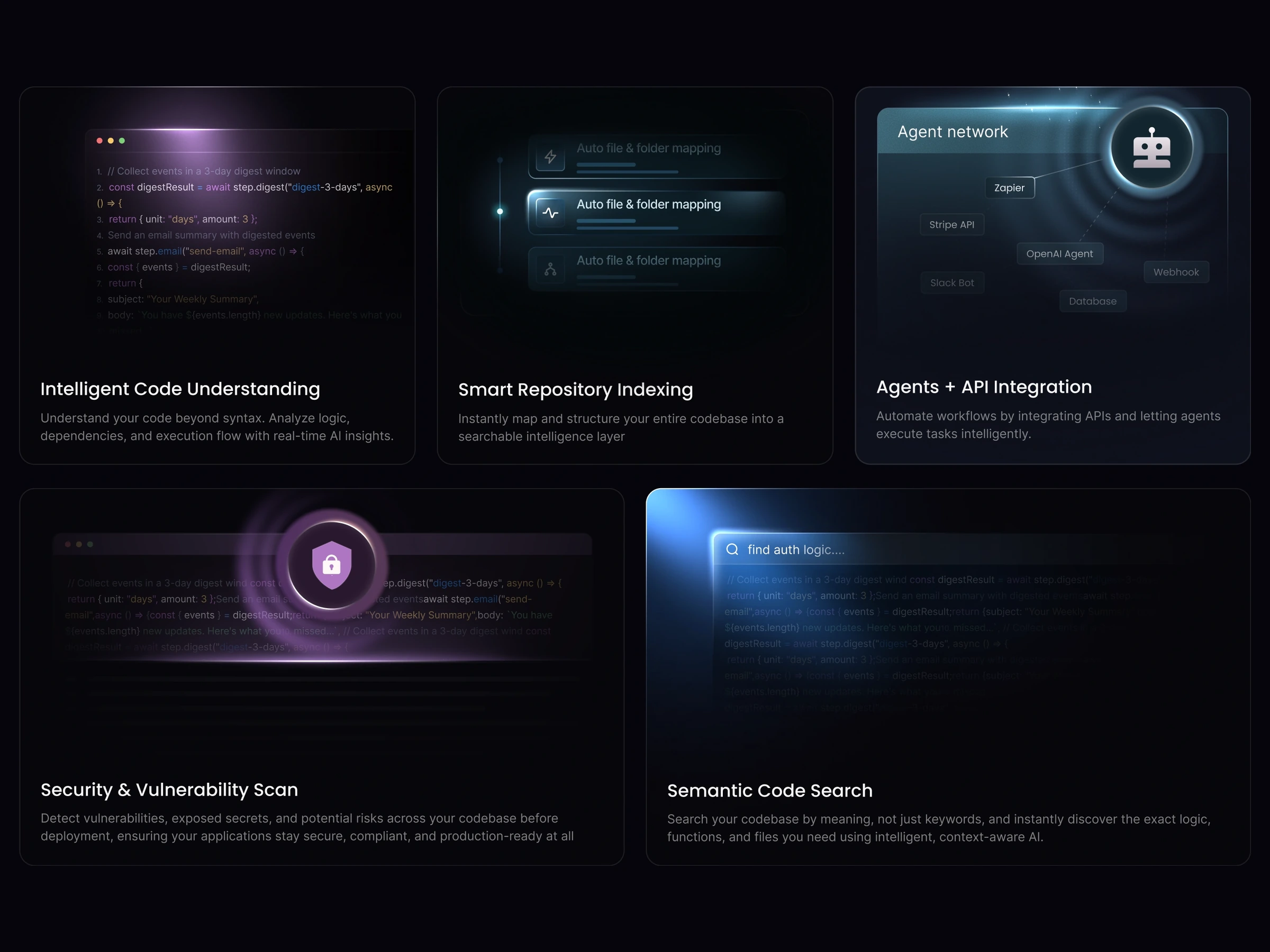
Code Security Bento
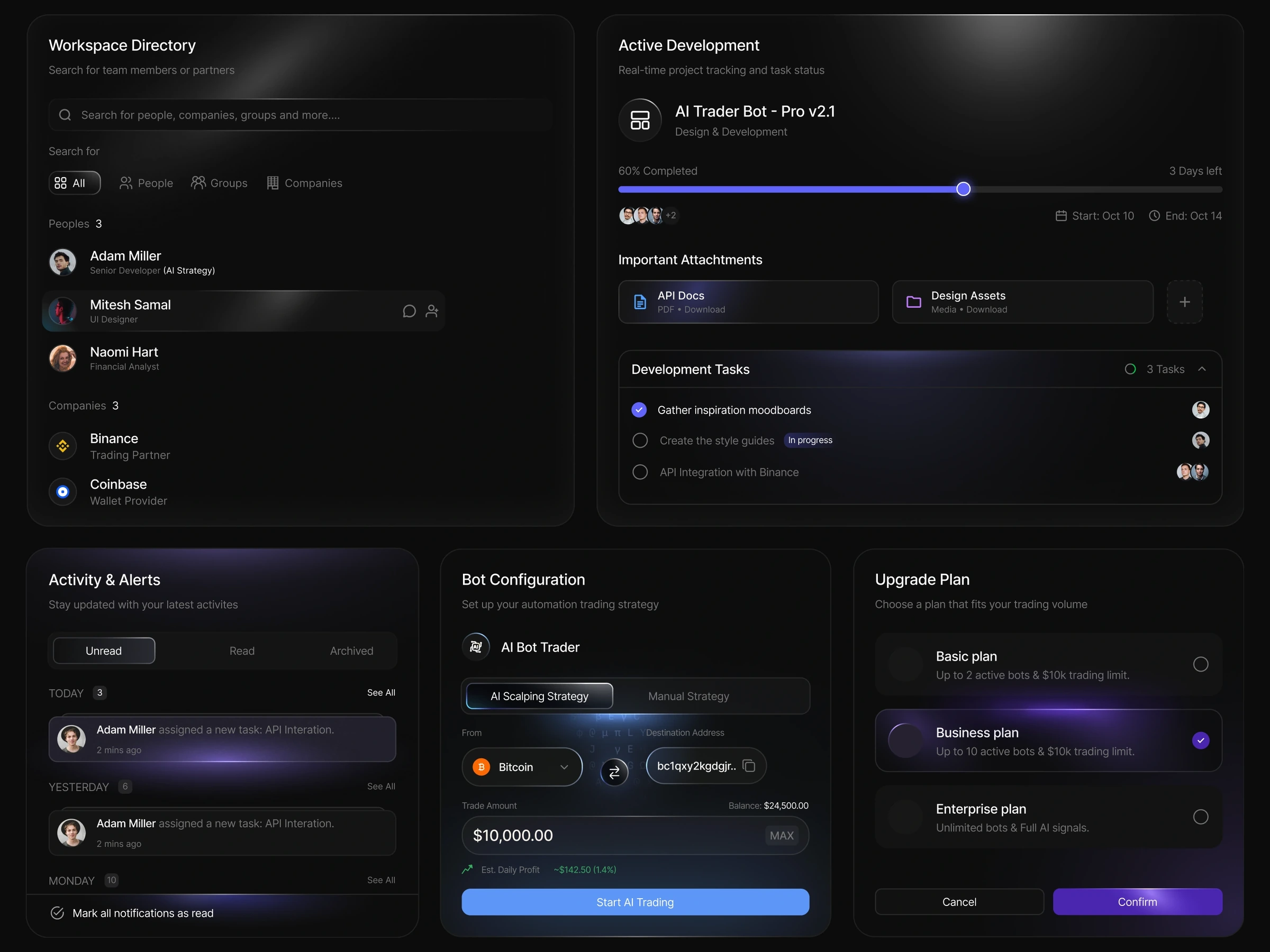
Developer-tooling bento: vulnerability scan and semantic code search over AI growth and assistant cards.
 HorizonX UI/UX
Collection
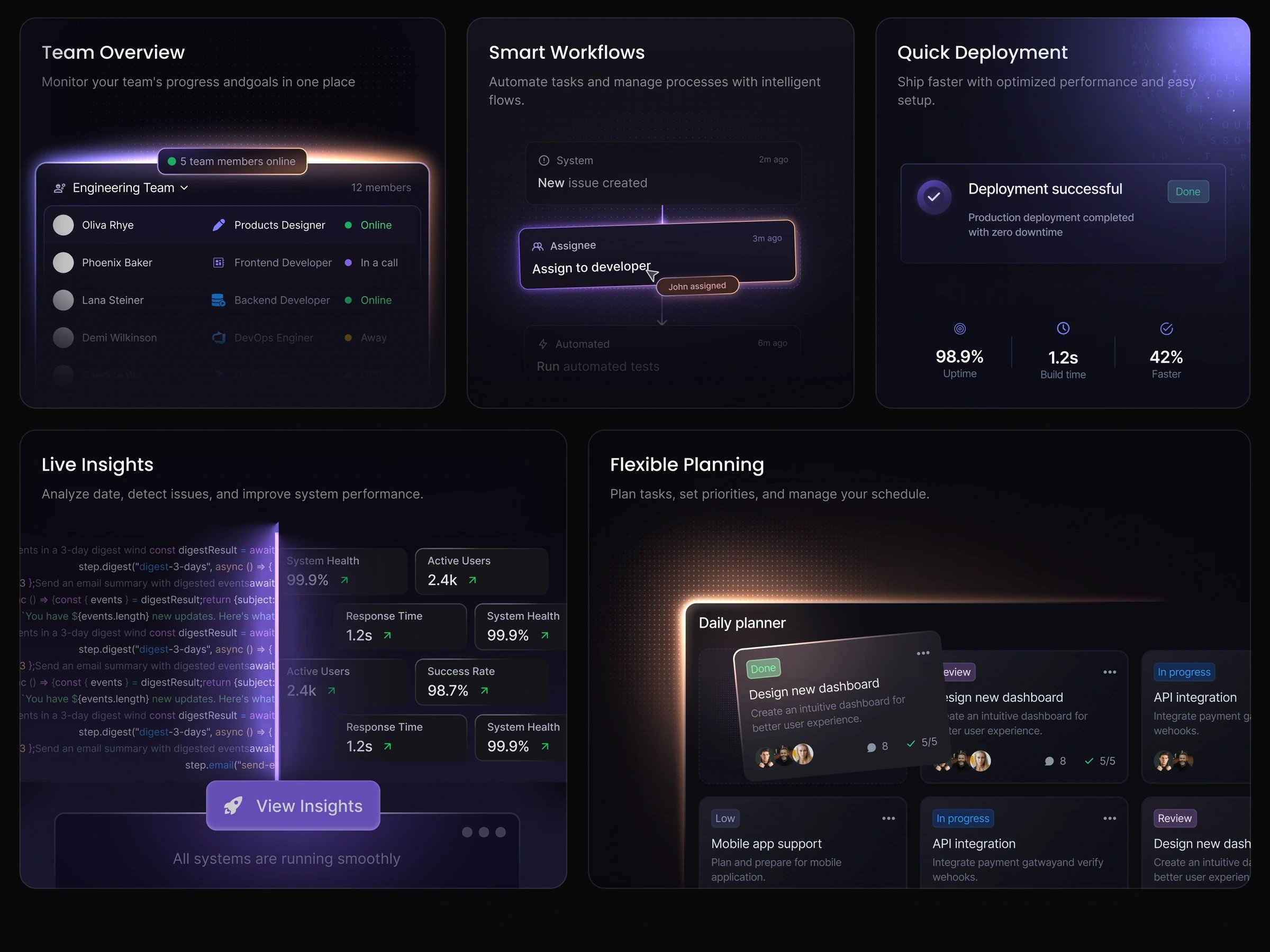
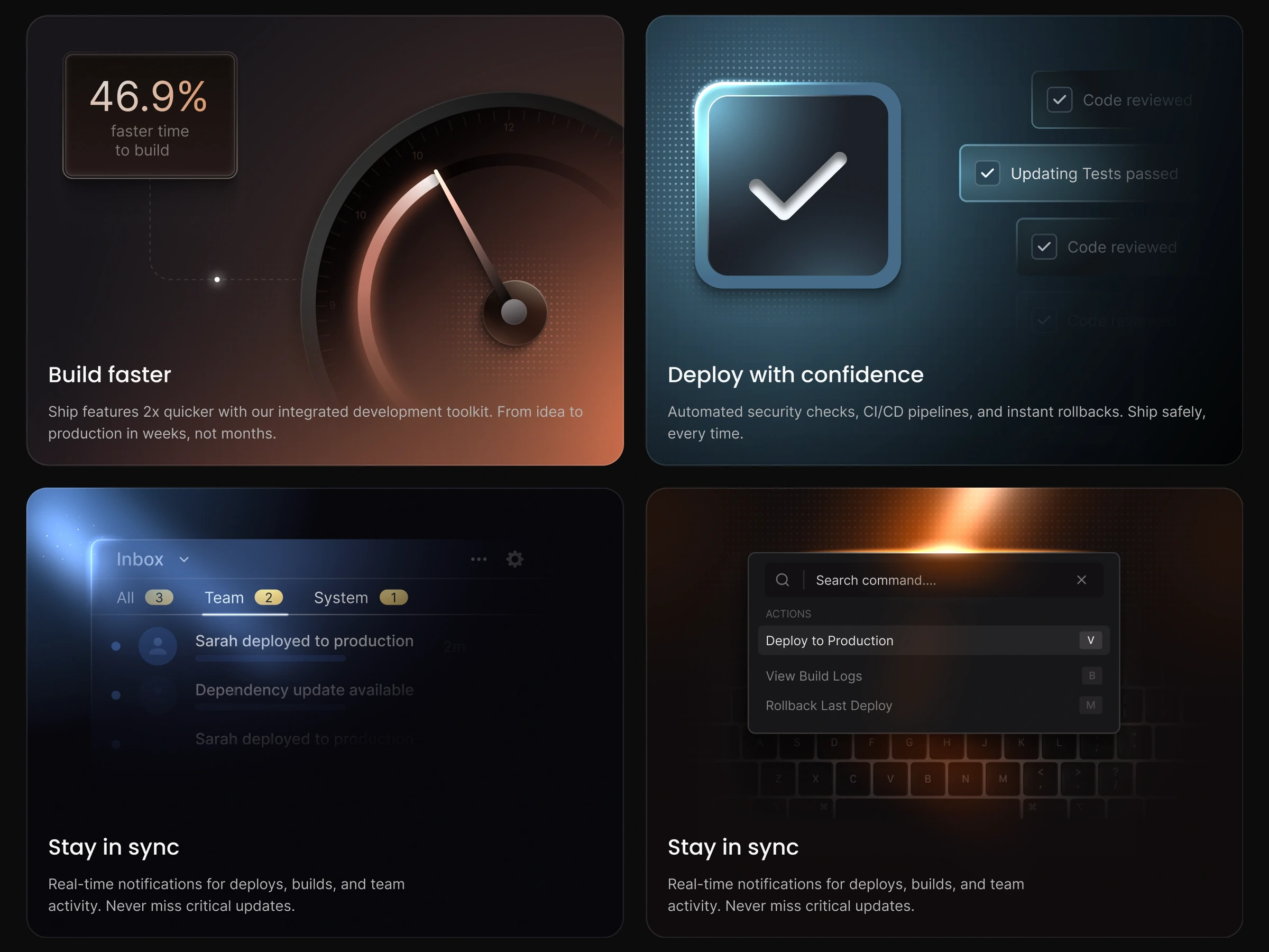
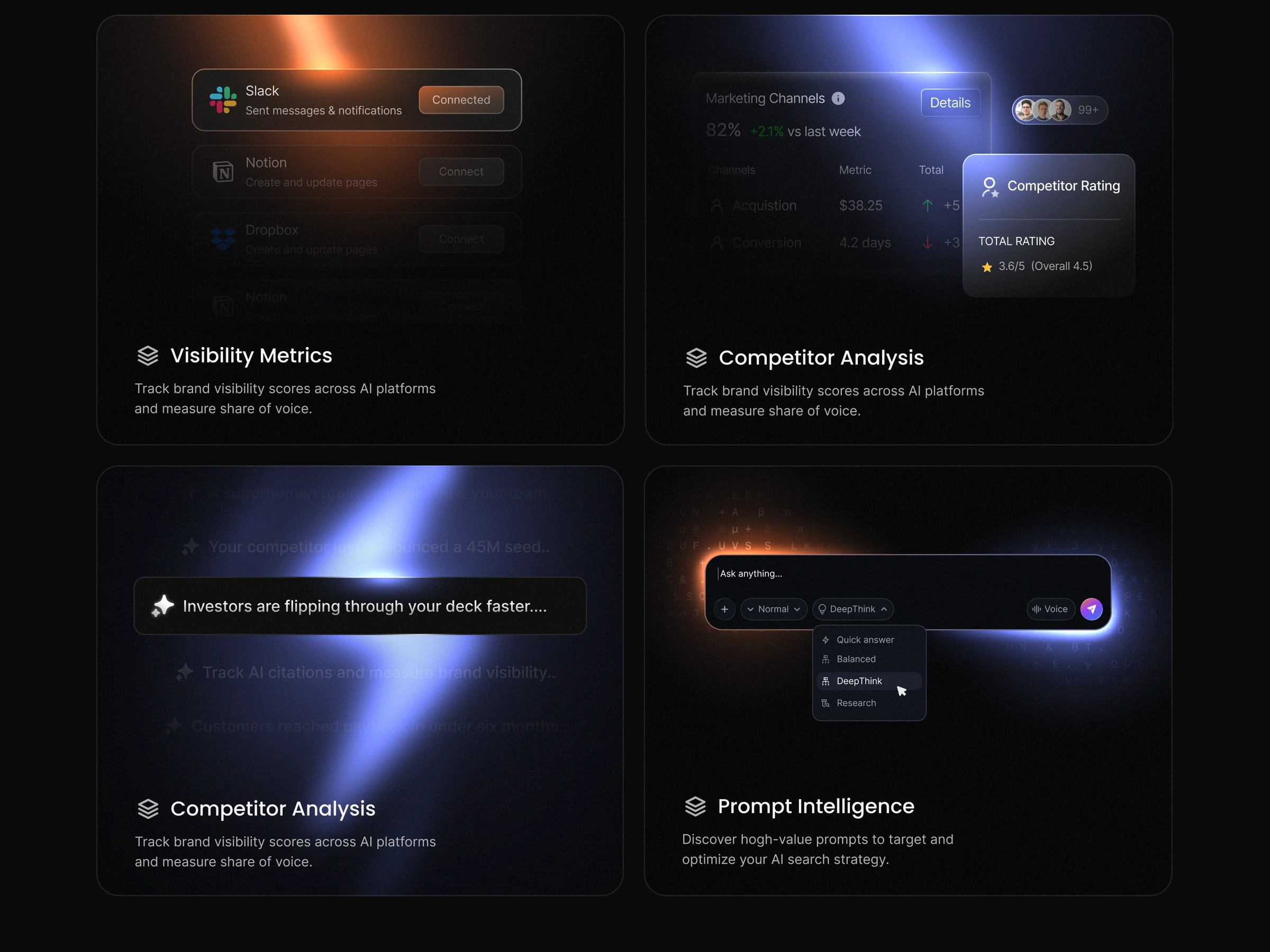
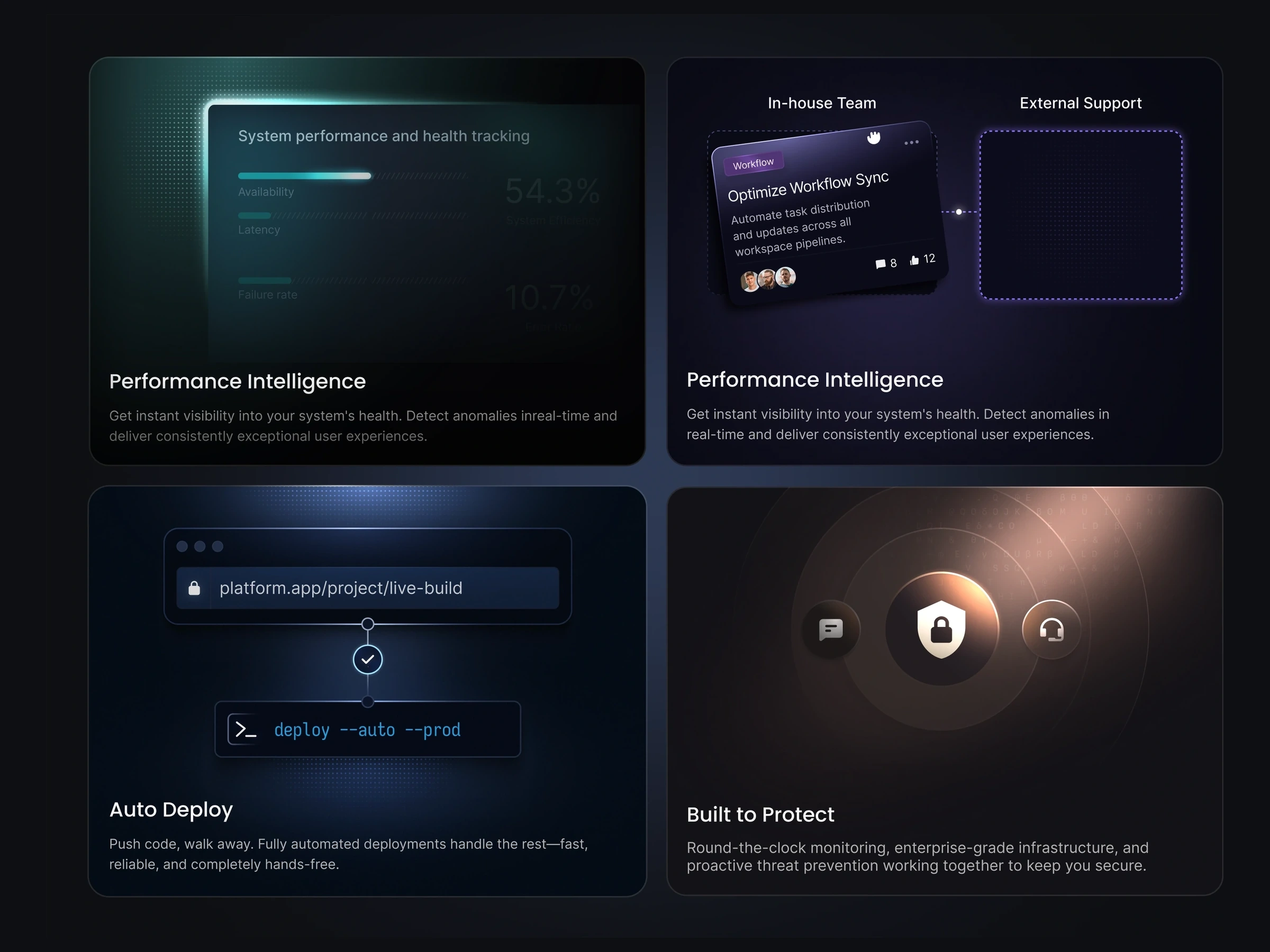
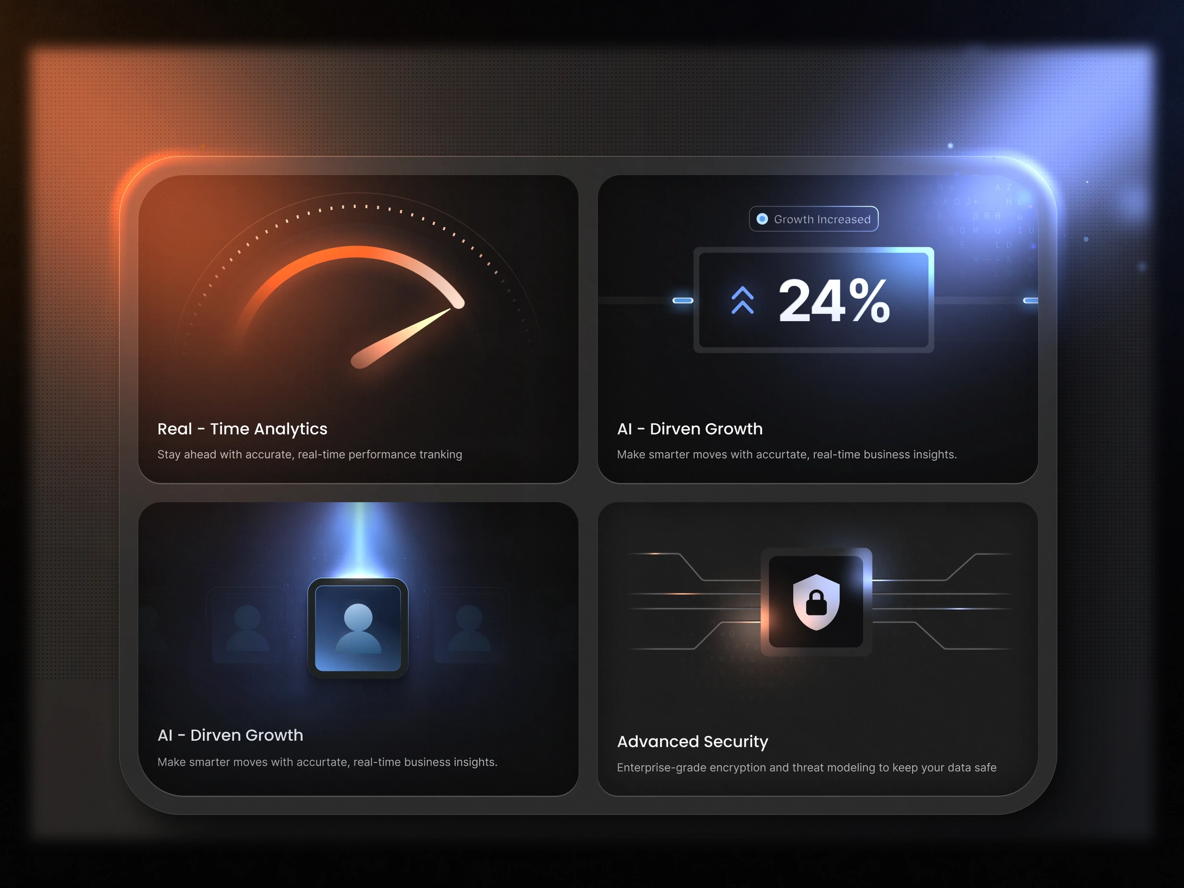
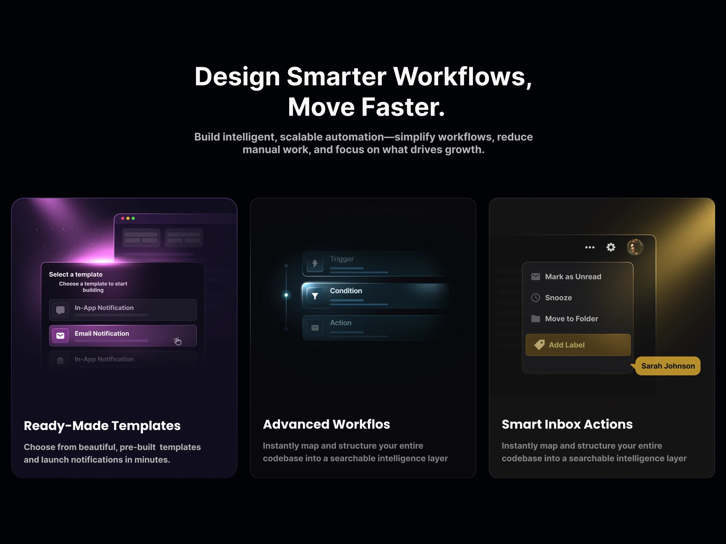
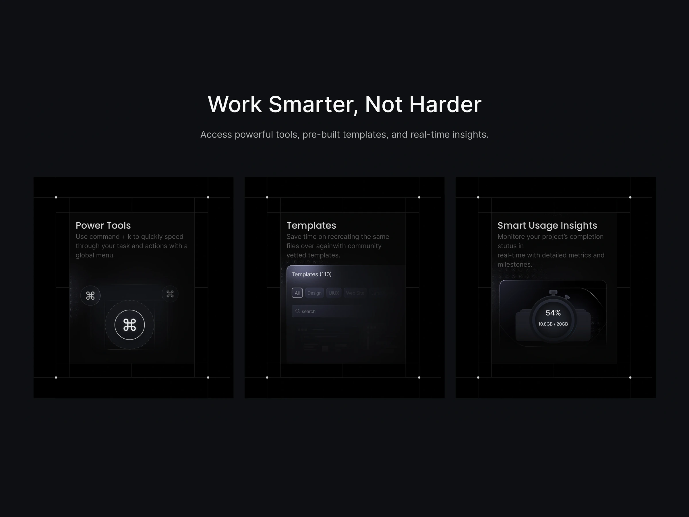
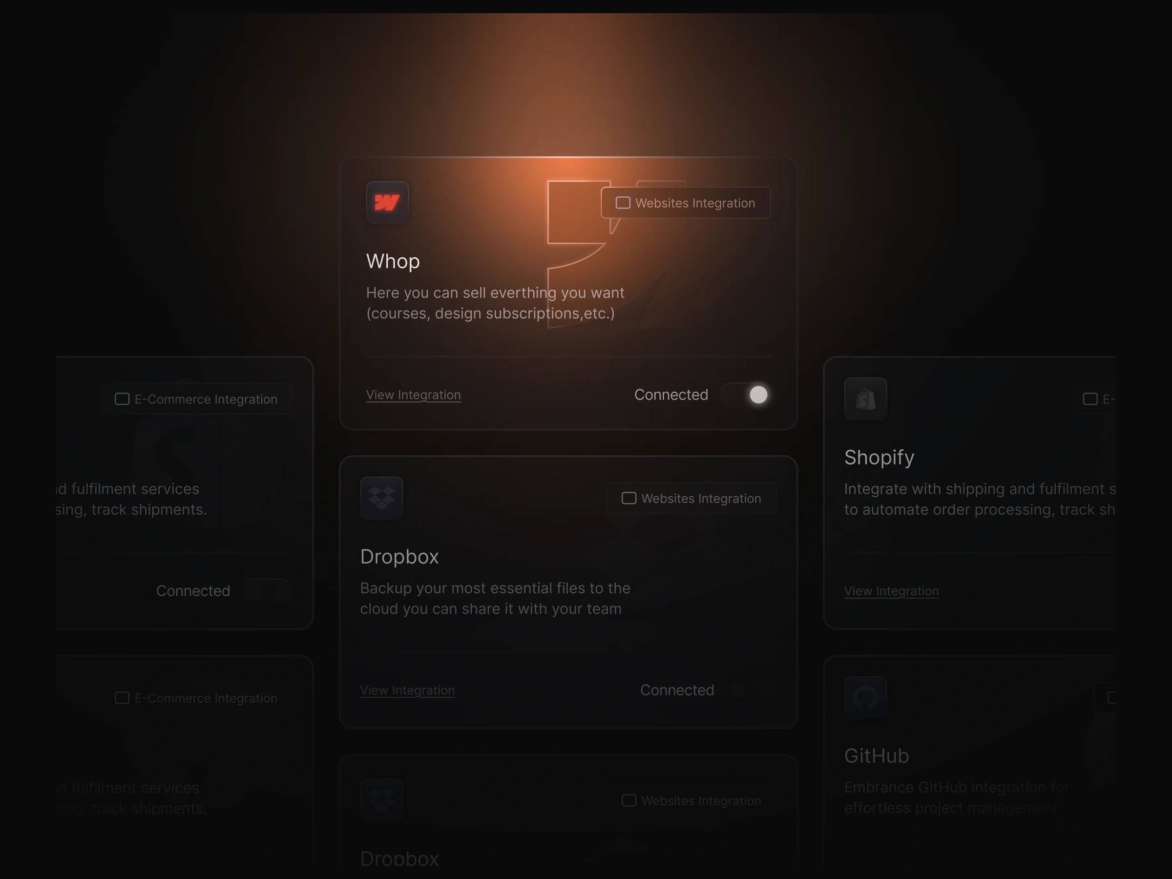
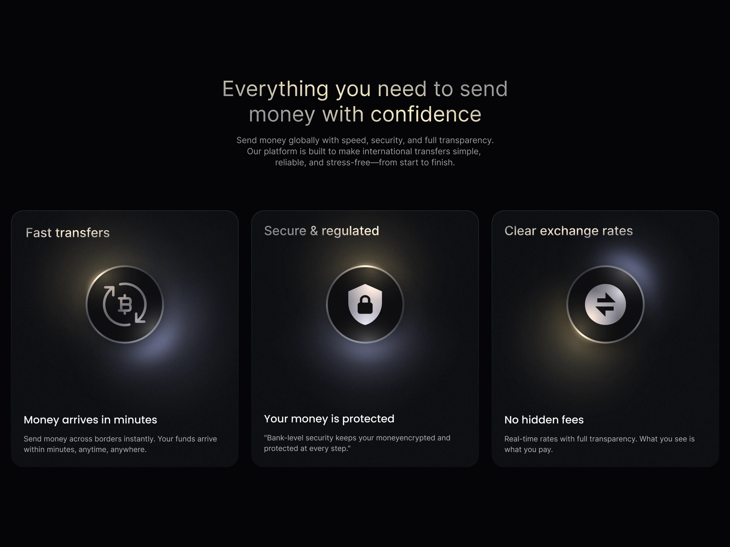
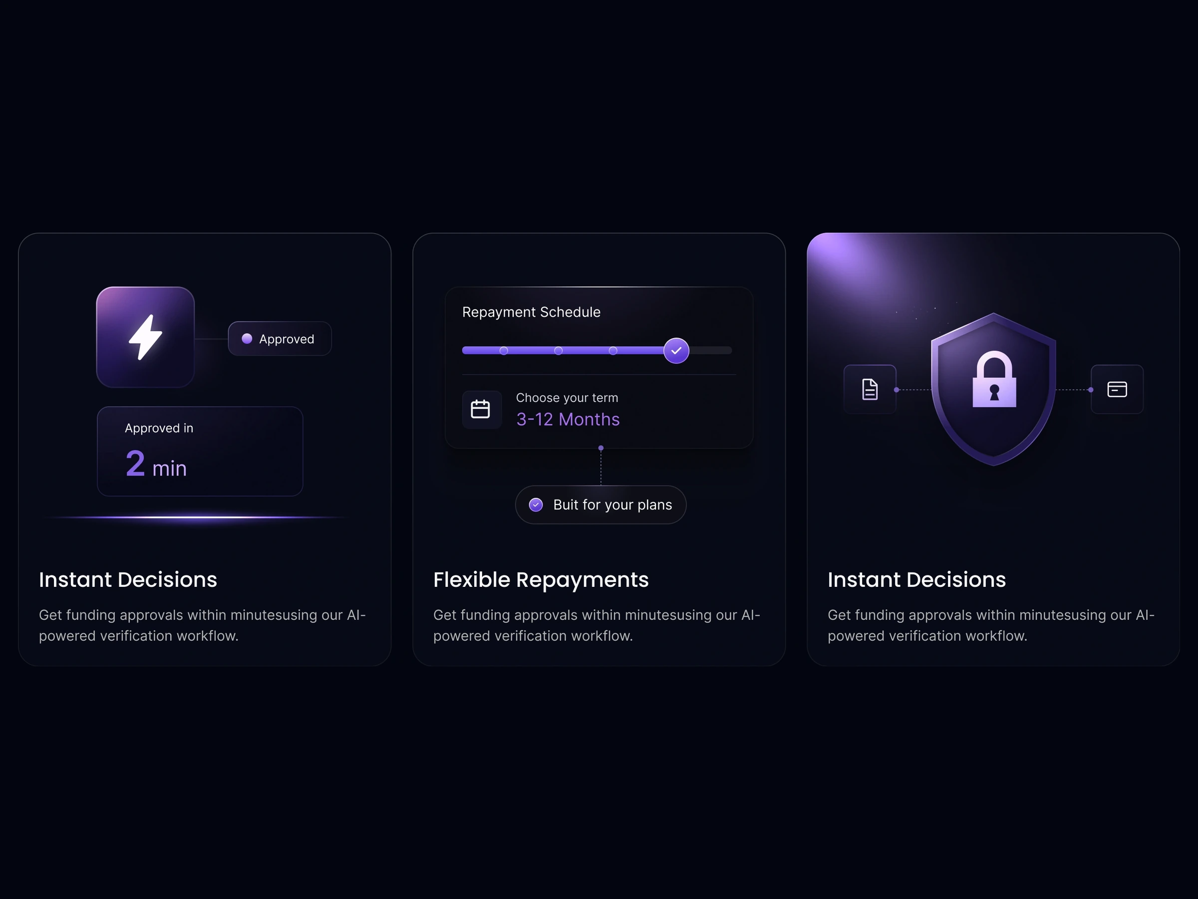
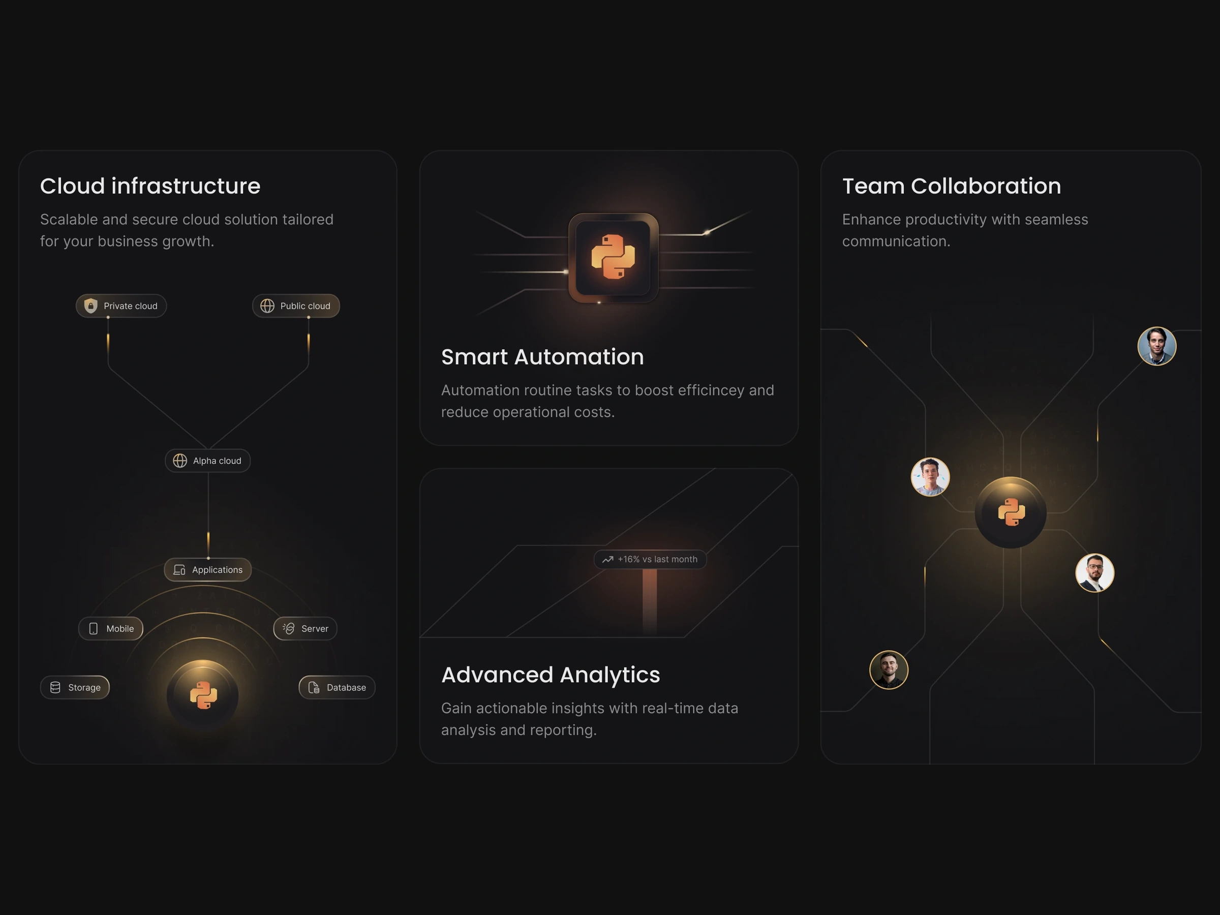
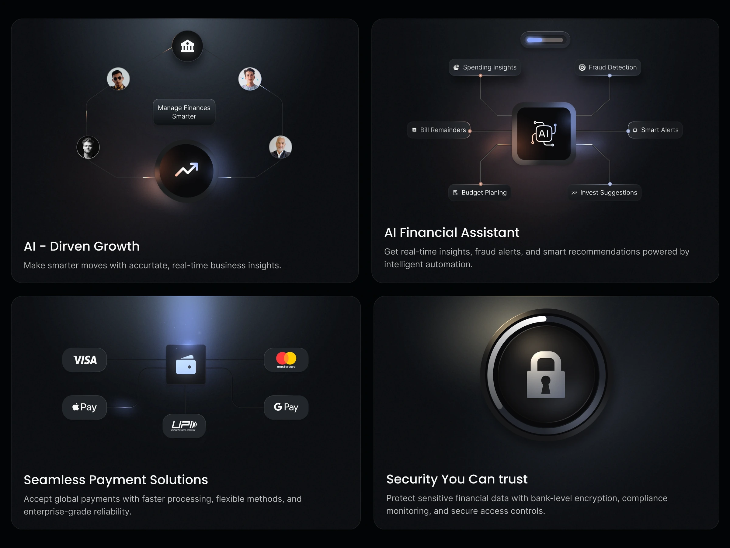
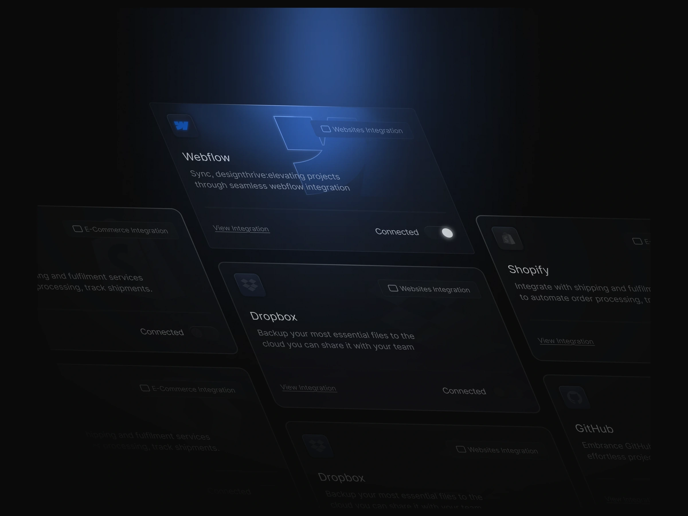
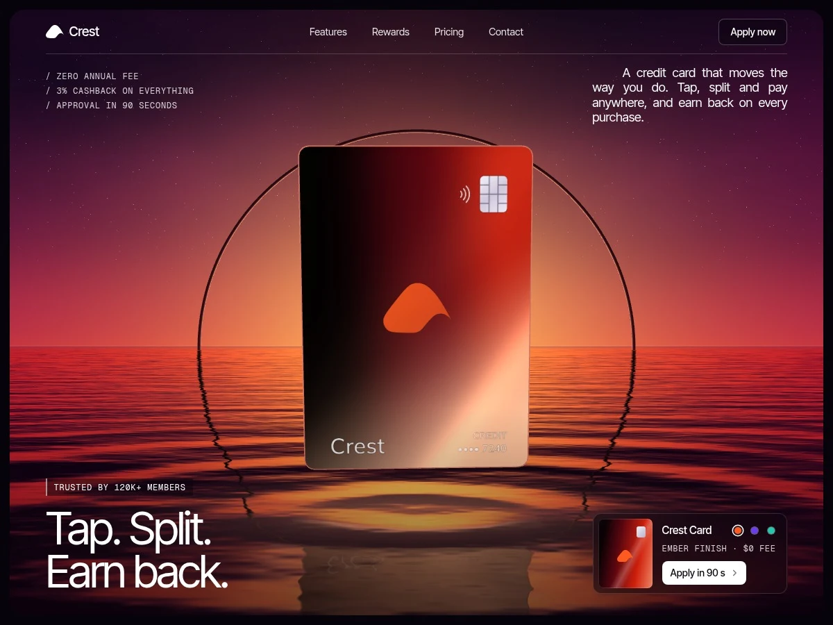
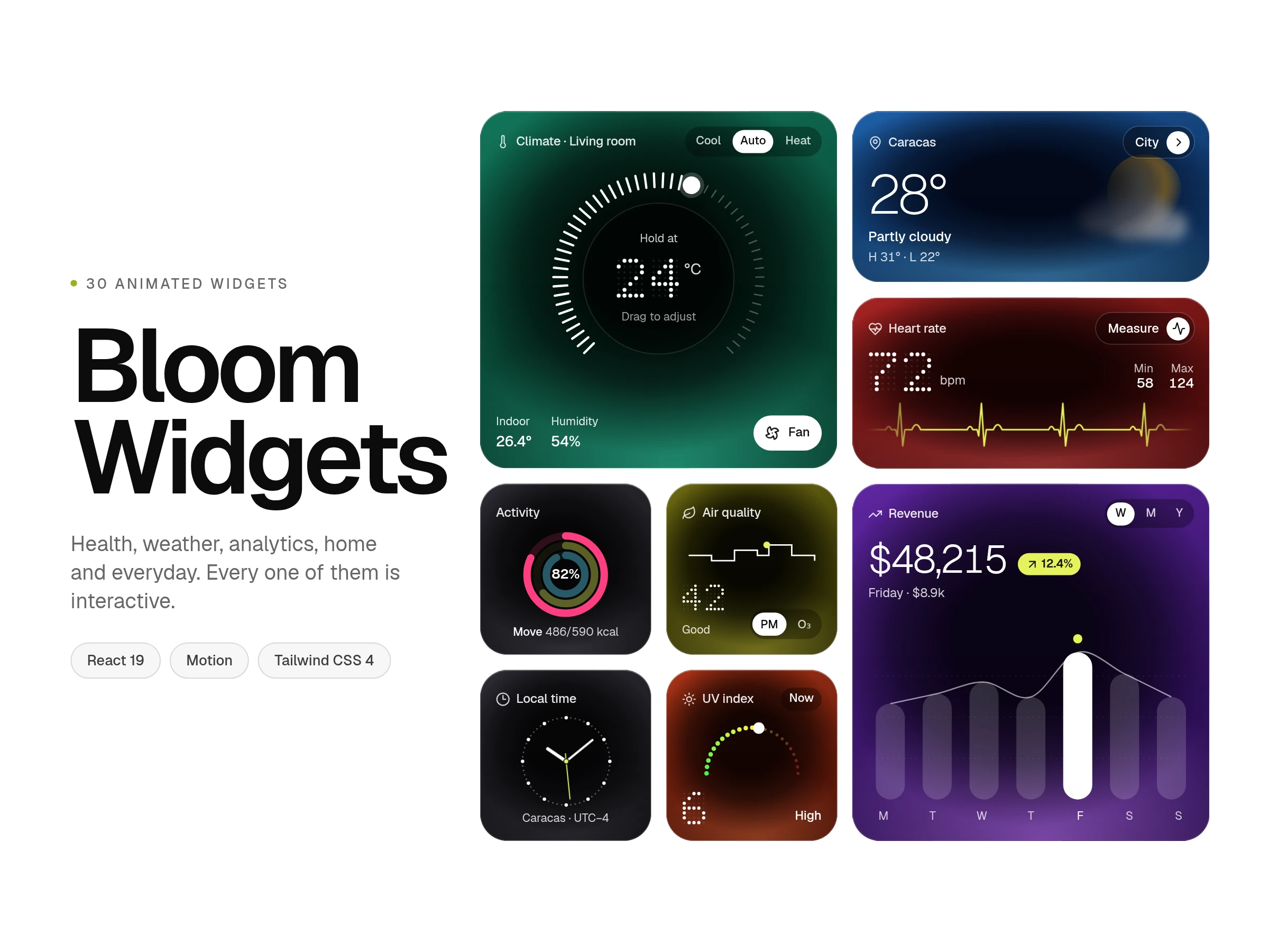
Bento grid design references for SaaS features, integrations, analytics, developer tools and fintech, arranged as compact dark-mode sections. Use a bento section to group related benefits that deserve different amounts of space. Keep a clear reading order instead of treating every tile as an equally important headline.
Bento grid design references for SaaS features, integrations, analytics, developer tools and fintech, arranged as compact dark-mode sections.
Use a bento section to group related benefits that deserve different amounts of space. Keep a clear reading order instead of treating every tile as an equally important headline.
Replace sample claims and app imagery with real product content. Adjust tile spans around your copy and rebuild the arrangement for a narrow viewport rather than shrinking it.
Check contrast inside every tile, including secondary text. Keep the document order meaningful when the visual grid rearranges, and avoid placing essential content in tiny tiles.
Some tiles reference dashboards and app screens, but these products are categorized as bento grid sections rather than complete admin applications.
Related features, integration highlights or product benefits fit well. A long narrative is usually clearer in a conventional reading layout.
Simplify the grid to a readable sequence and preserve the priority of the content. Avoid relying on desktop tile positions to communicate meaning.
From the blog
Keep exploring
Browse every design in the HorizonX catalog, from UI kits and templates to textures, shaders and mockups.