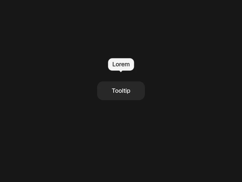
Bounce Tooltip
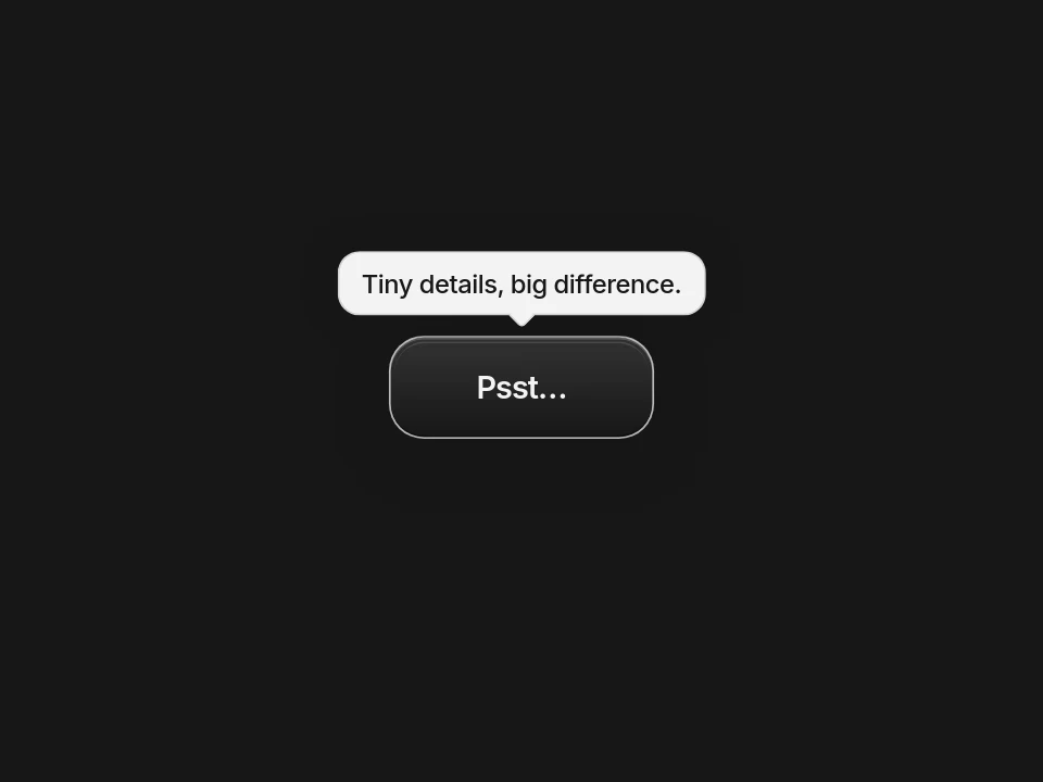
A compact text trigger that brings a playful tooltip into view with a restrained bounce.
 HorizonX UI/UX
Tool collection
Tooltip CSS examples for short hints beside a control: Bounce Tooltip, Rise Tooltip and Signal Tooltip. Compare a bouncing reveal, a rising reveal and a group of default, info and alert hints. Tune text, colours and motion in the editor, then export as HTML, Svelte or React. Keep the hint brief and the control clear without it.
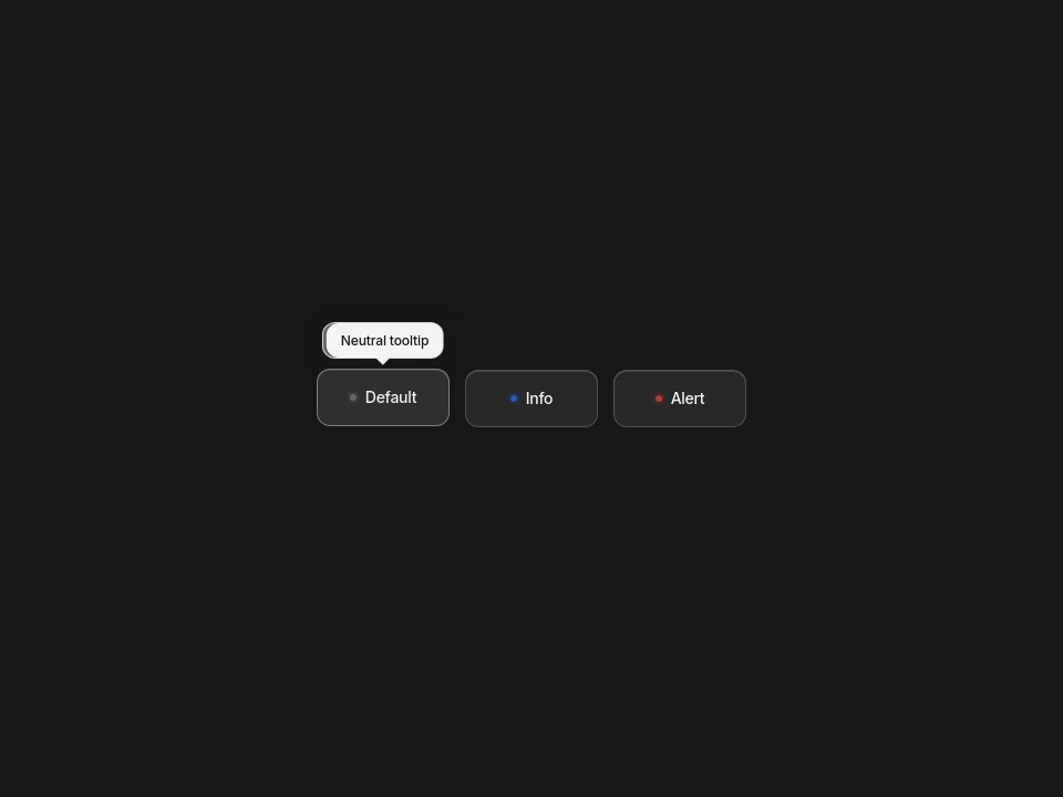
Bounce Tooltip lifts a hint above a text trigger with a shake animation. Rise Tooltip reveals a hint above a button with an upward movement and scale change. Signal Tooltip groups default, info and alert triggers, each with its own hint and accent colour. All three let you edit the labels, tooltip text, sizing and reveal timing.
Use a tooltip for a short explanation of a control, not for the information someone needs to finish a task. Keep tooltip UI design close to the trigger so the hint has a clear owner. Put longer instructions on the page. If the content needs links, buttons or a choice, use a popover rather than one of these text hints.
Start with your real labels and hints, then adjust spacing, colours and motion against the surrounding interface. The reveal styles use CSS, while JavaScript handles click toggling and Escape dismissal. For a tooltip in JavaScript, keep that behaviour when integrating the export. Use unique tooltip IDs when adding more than one instance, so each trigger describes the right hint.
Show the hint on hover and keyboard focus, not hover alone. Associate it with its trigger through aria-describedby and keep a visible focus indicator. These tools include focus reveals and click toggling, but test the exported component in your page. Provide a tap fallback on touch screens or place the same explanation inline. Never hide essential information in a tooltip. Check contrast, Escape dismissal and reduced-motion behaviour.
A tooltip is a short text hint associated with a control. It appears when someone hovers over or focuses the trigger. It adds context without replacing a visible label or essential instructions.
A tooltip gives a brief, non-interactive hint about a control. A popover can hold more content or actions and is usually opened deliberately. A toast reports an event, such as a saved change, rather than describing the control under the pointer.
They can be, but a hover-only hint is not enough. Support keyboard focus, connect the hint with aria-describedby and offer touch users a tap or inline alternative. Keep essential information visible and test dismissal and screen reader behaviour in the finished page.
From the blog
Keep exploring
Every interactive tool on HorizonX opens in an editor you can adjust in the browser before you export it.