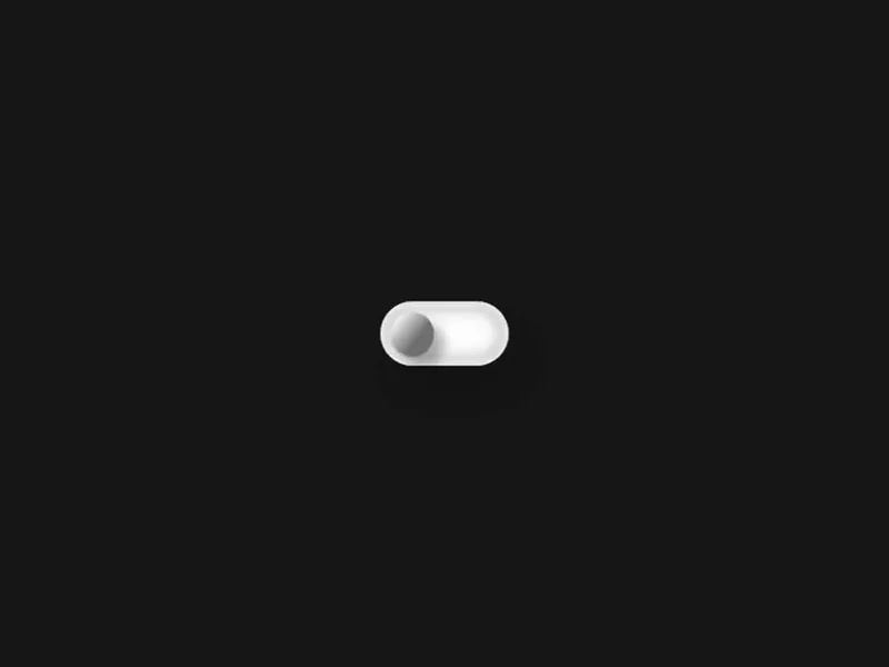
3D Switch
A physical CSS toggle with metallic states, layered depth and inverse perspective.
 HorizonX UI/UX
Tool collection
Form controls built as live components: a 3D switch, a neumorphic LED switch, a frosted theme switch, glass radio selectors, an AI chat input, an expanding search field, a spring tag input and a wheel picker. Tune size, colour and state in the editor, then export as HTML, Svelte or React. Pick each control by the kind of input it collects.
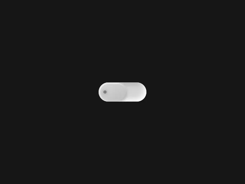
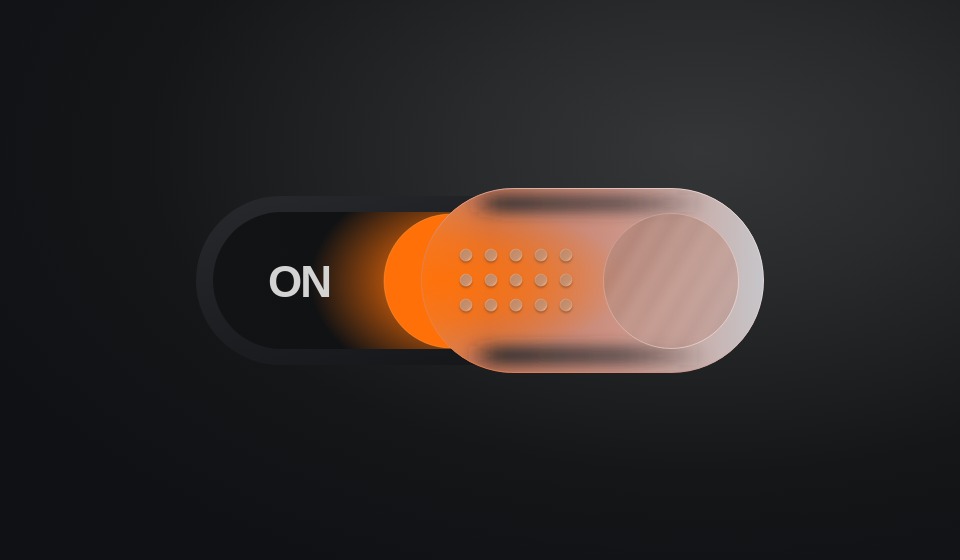
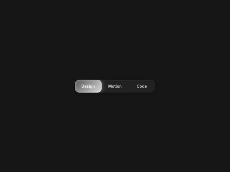
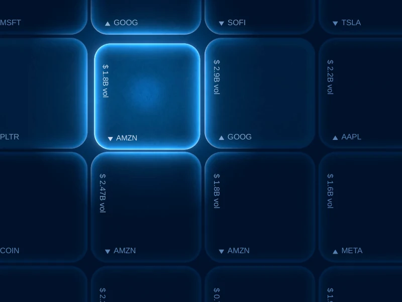
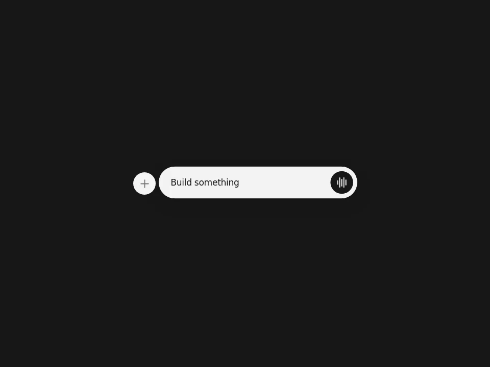
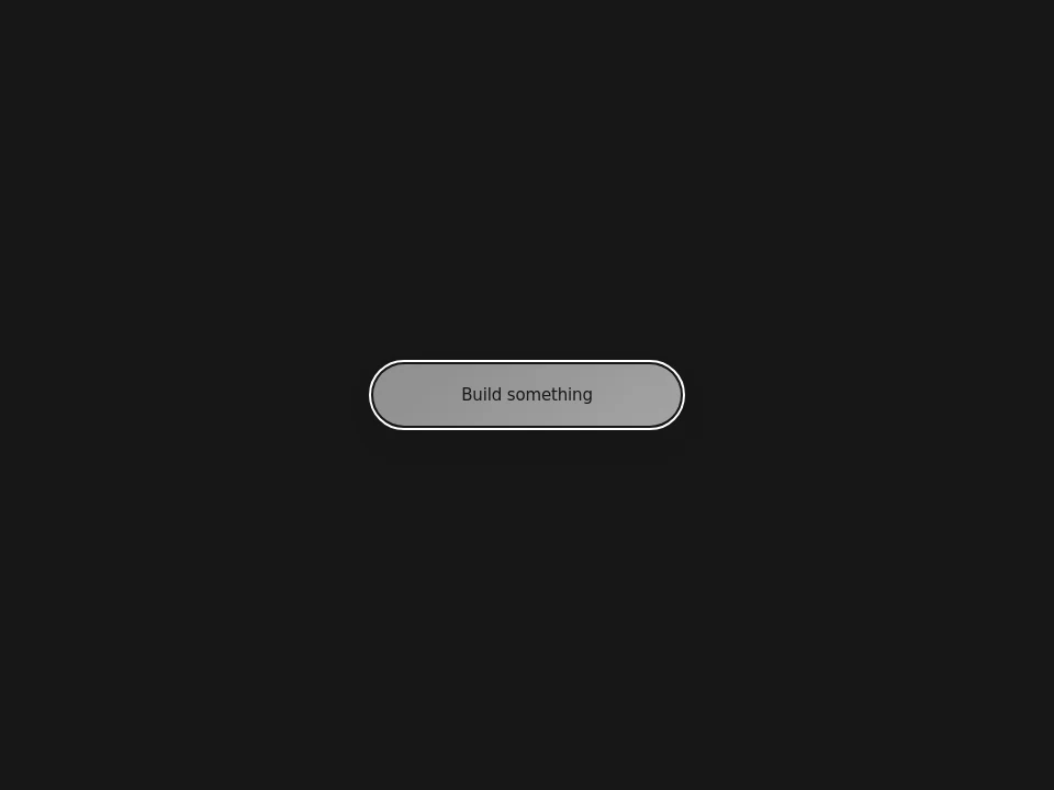
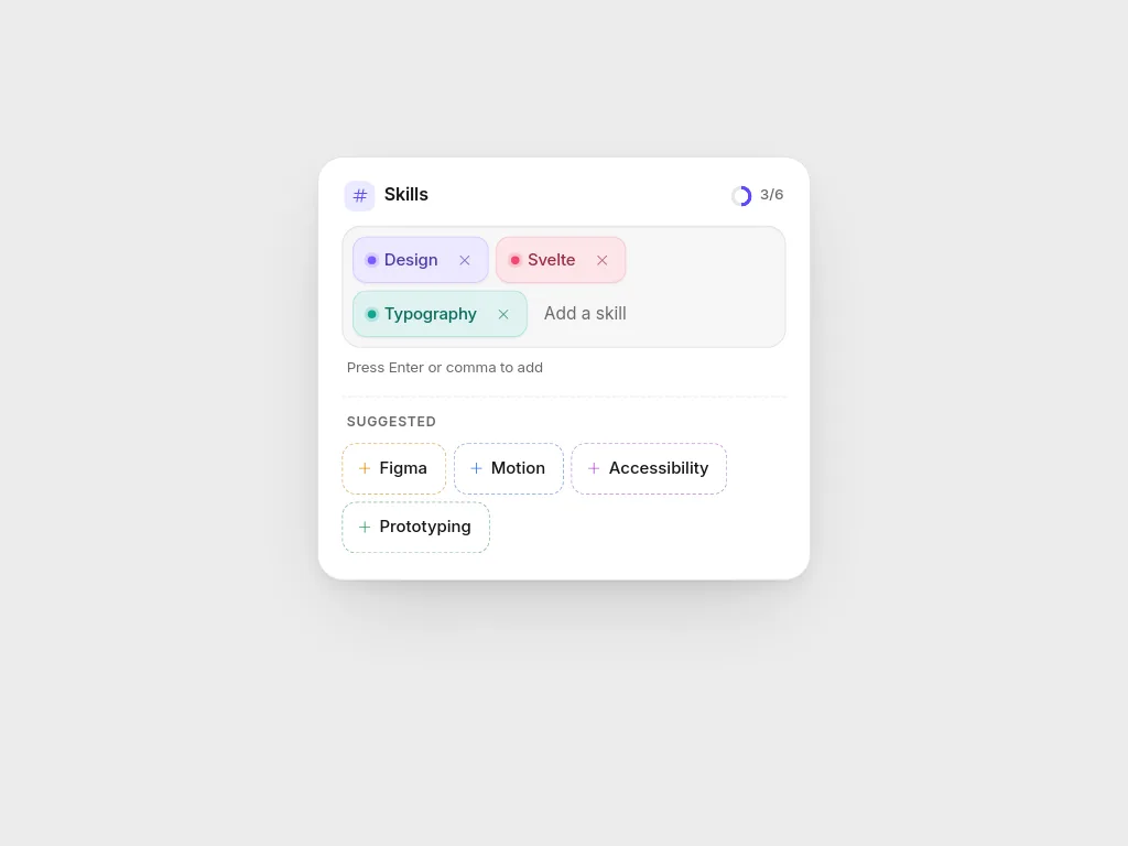
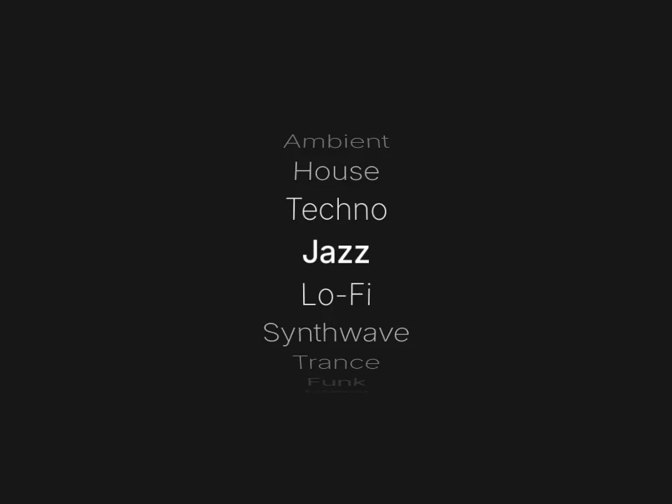
Three toggle switches (a physical 3D switch, a neumorphic switch with an LED and a frosted-glass theme switch), two selectors (Glass Radio, a three-way segmented control, and Glass Keys, a wall of glass keys that behave as radio buttons), three text inputs (an AI chat input with attachment actions, a search field that widens on hover and focus, and Spring Tag Input, a tag field whose chips spring in and out, with suggestions and a tag limit) and Option Wheel, a drum-style picker that spins with momentum.
Use a switch for a setting that takes effect immediately, such as dark mode or notifications. Use a radio selector when exactly one option from a small set applies, and a wheel picker when the list is longer but ordered, such as times or quantities. Text inputs belong wherever people type: a chat composer for prompts, an expanding search field where space is tight until someone needs it, a tag input when one field collects several short values such as skills or topics.
Set labels, sizes and colours against your real form first, then export the component and connect its state to your form model. Each editor exports a standalone HTML document, with Svelte and React versions derived from it. Glass Keys draws on a WebGL canvas with a CSS fallback, so test it on the devices you support.
Give every control a visible label, a focus state and keyboard behaviour that matches its role: Space toggles a switch, arrow keys move within a radio group. Check that on and off states differ by more than colour, and test inputs with long values and browser autofill.
A switch applies a setting immediately, like turning a light on. A checkbox records a choice that is usually confirmed later, for example when a form is submitted, and it also suits multiple selections in a list.
They are not built from Tailwind utility classes. Each export carries its own markup and CSS, so it can sit inside a Tailwind project; Expanding Search, for example, states its height directly so the border-box reset in Tailwind's preflight does not squash it.
The switches are exposed as switches or native checkboxes, and Glass Radio uses real radio inputs. Test keyboard behaviour in your final form, since labels, validation and error messages come from your implementation.
Keep exploring
Every interactive tool on HorizonX opens in an editor you can adjust in the browser before you export it.