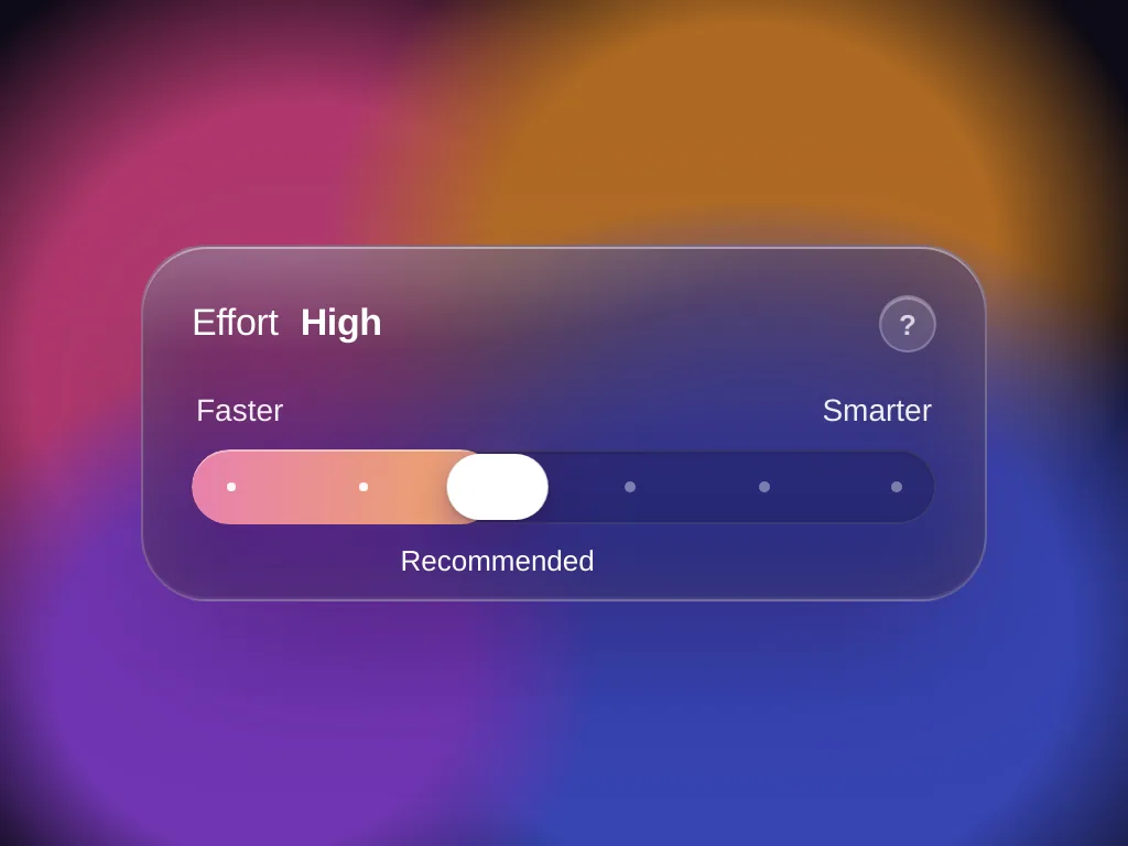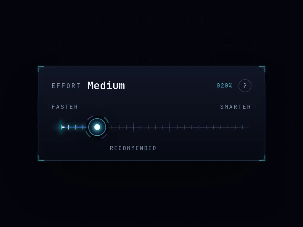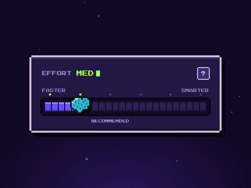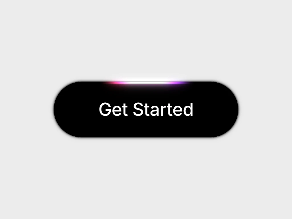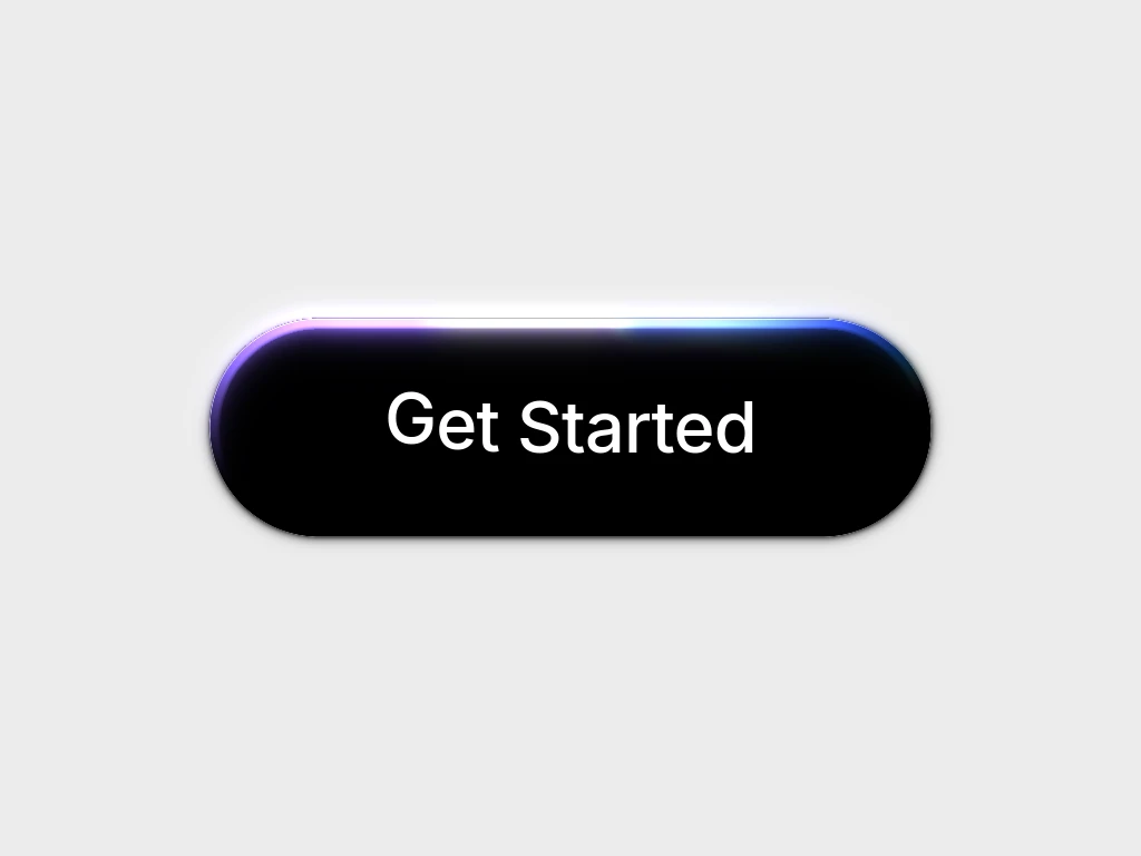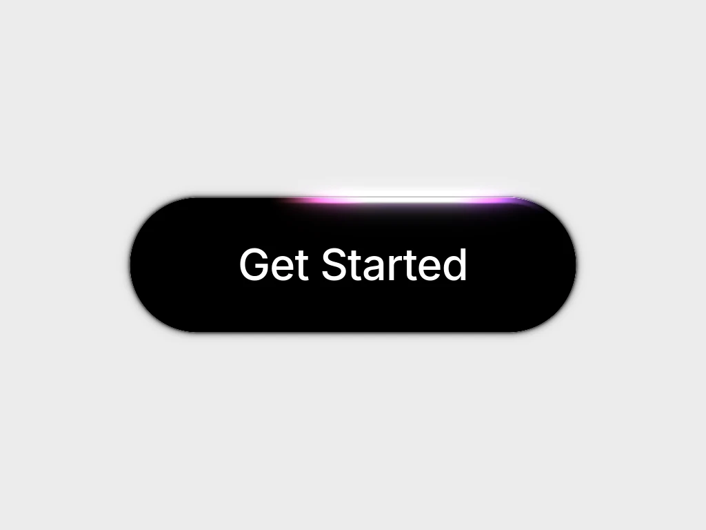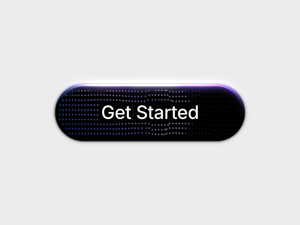
Sleek Effort Slider
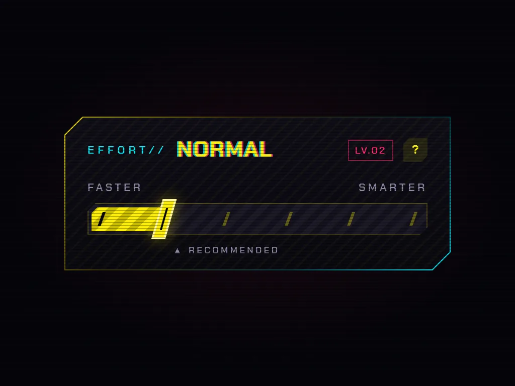
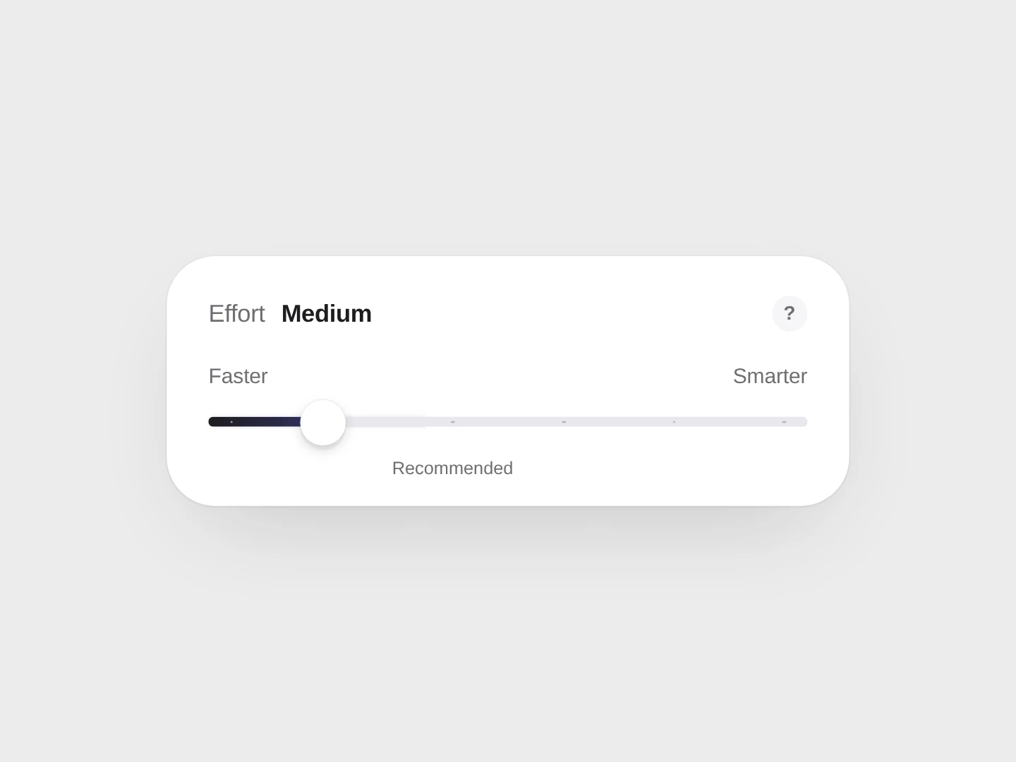
A monochrome effort slider that gathers colour with every stop and, at the top, wraps the card in a soft living light.
 HorizonX UI/UX
Collection
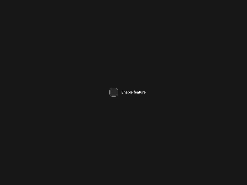
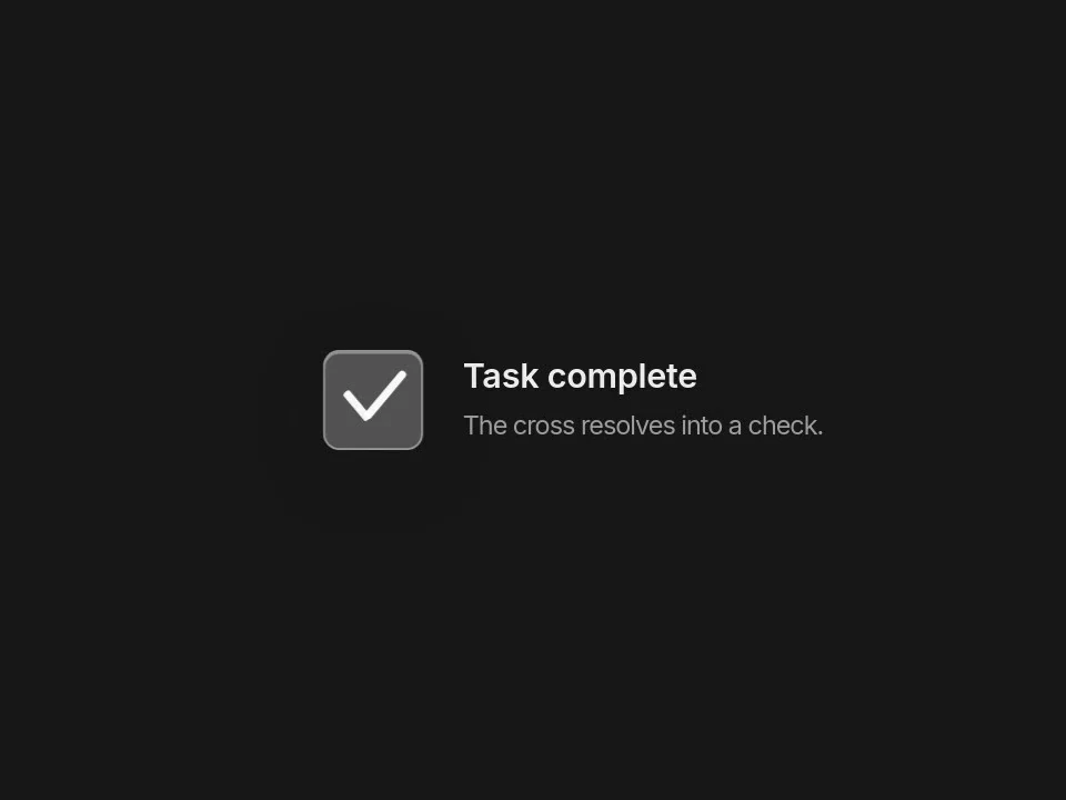
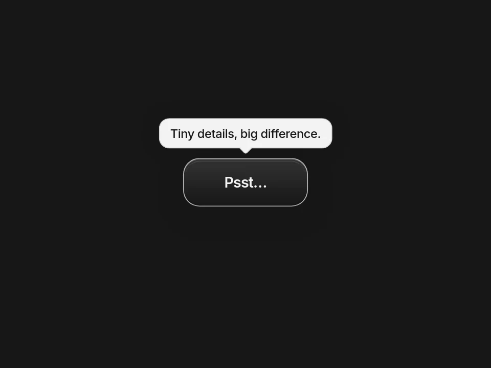
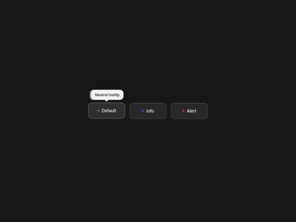
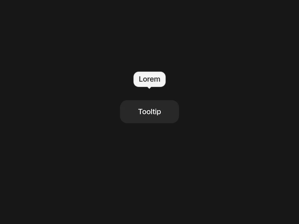
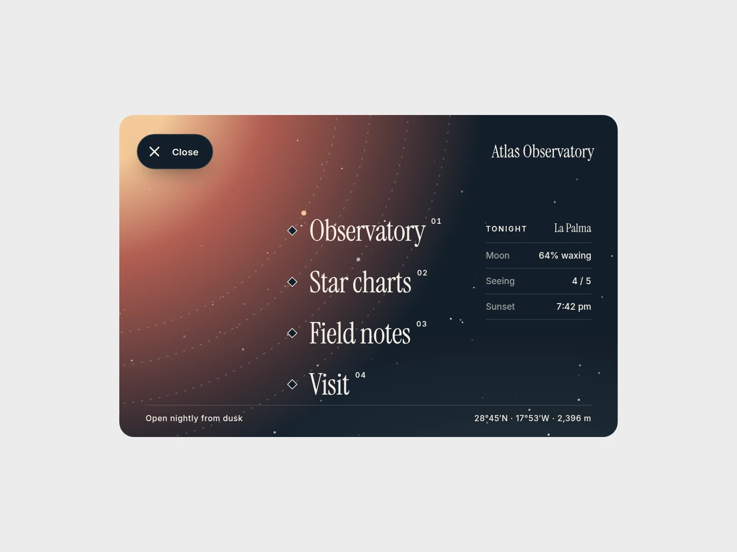
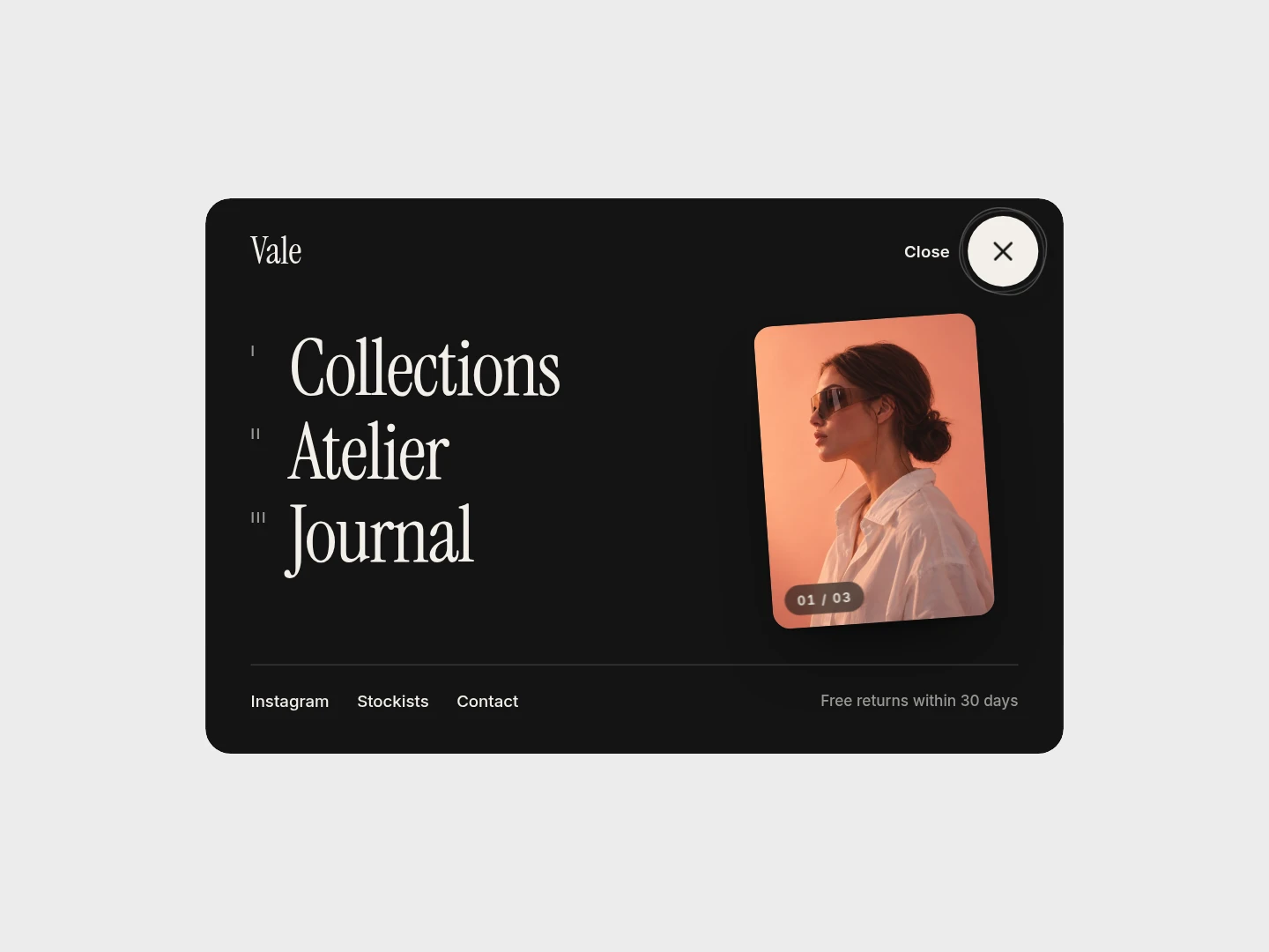
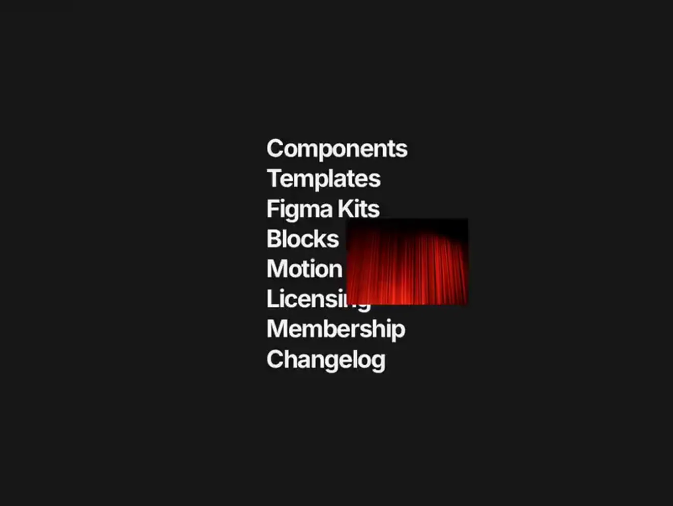
Micro interactions for buttons, checkboxes and tooltips: slide, jelly, glow, morph and feedback treatments selected from existing components. Use a small interaction to clarify a change of state or acknowledge an action. Apply a consistent motion language rather than giving each control a different personality.
Micro interactions for buttons, checkboxes and tooltips: slide, jelly, glow, morph and feedback treatments selected from existing components.
Use a small interaction to clarify a change of state or acknowledge an action. Apply a consistent motion language rather than giving each control a different personality.
Adapt colors and labels to the meaning of the action. Inspect the selected component and available export options, then connect its visual feedback to the real application state.
Test focus, touch and reduced-motion behavior. Tooltips must not be the only source of essential instructions, and a checkbox animation must preserve the checked state.
It is a small response around a specific action or state, such as a checkbox changing or a button acknowledging a pointer interaction.
No. Keyboard and touch users also need clear states. Pair pointer effects with focus and persistent state indicators where appropriate.
Use motion selectively. A consistent, restrained response is easier to understand than a page full of unrelated effects.
From the blog
Keep exploring
Browse every design in the HorizonX catalog, from UI kits and templates to textures, shaders and mockups.