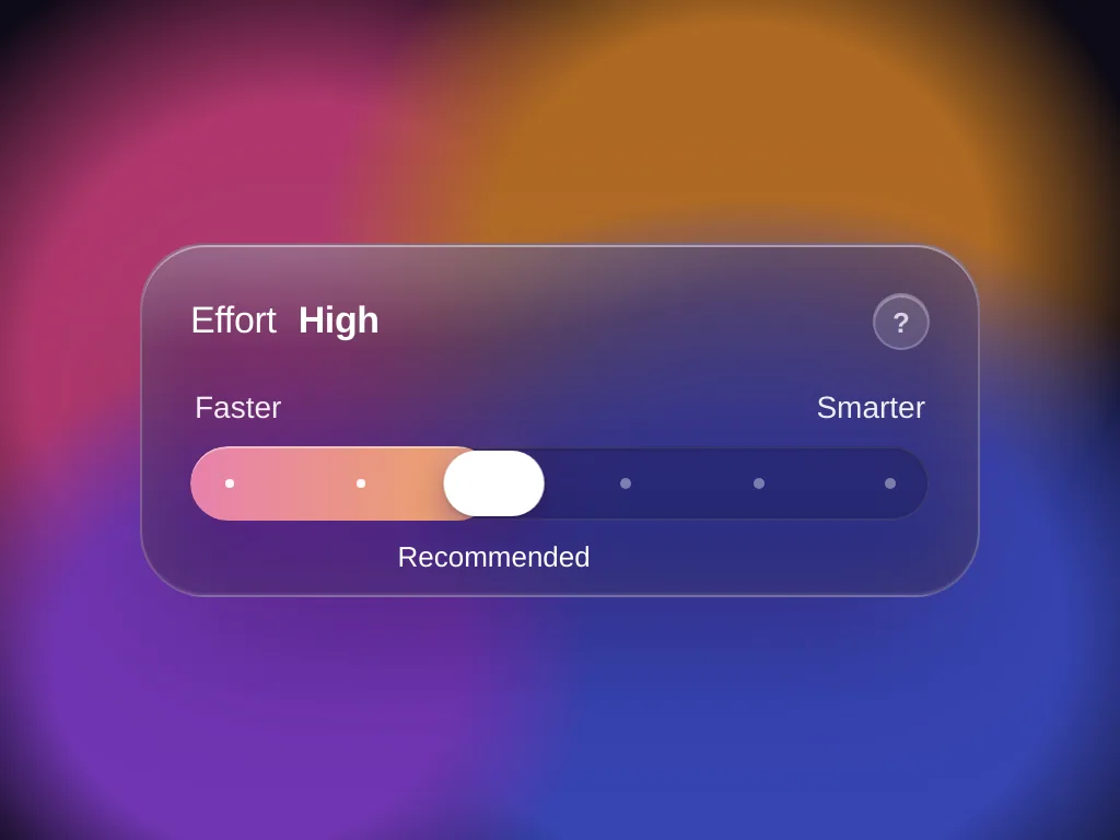
Glass Effort Slider
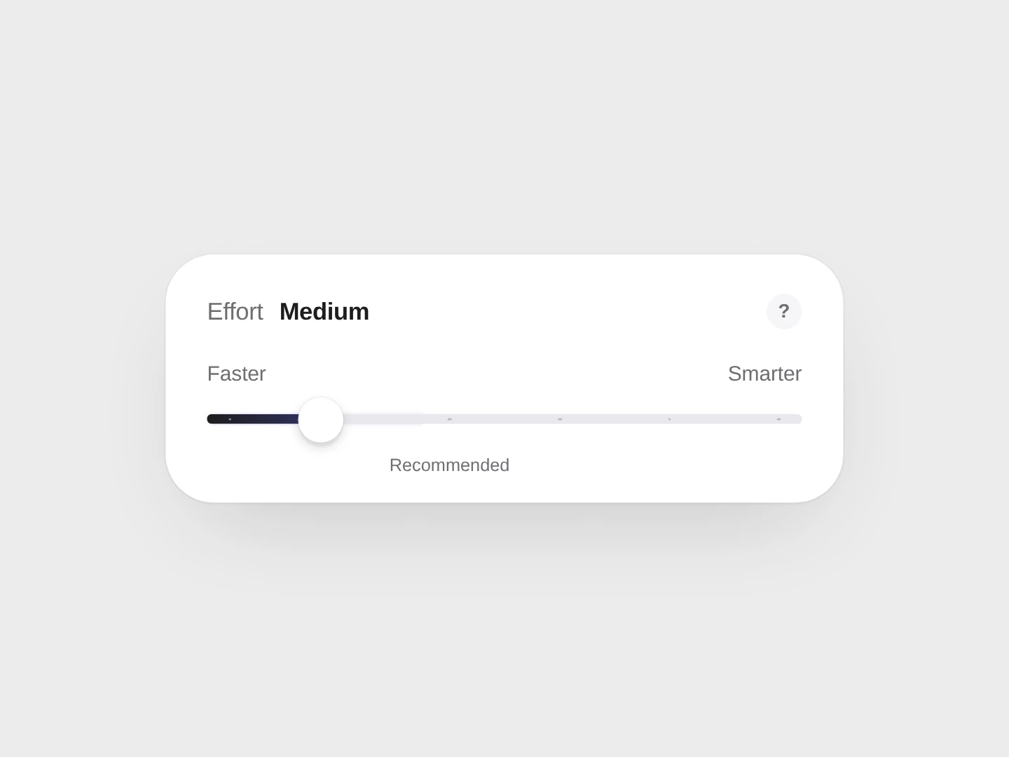
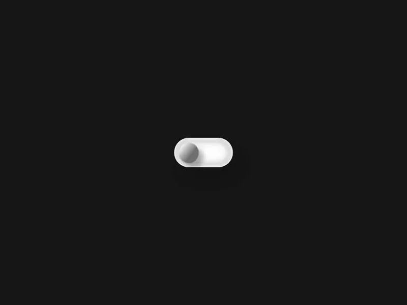
A frosted-glass effort slider whose knob turns into a lens that squashes with speed, blooming into iridescent bubbles at the top.
 HorizonX UI/UX
Tool collection
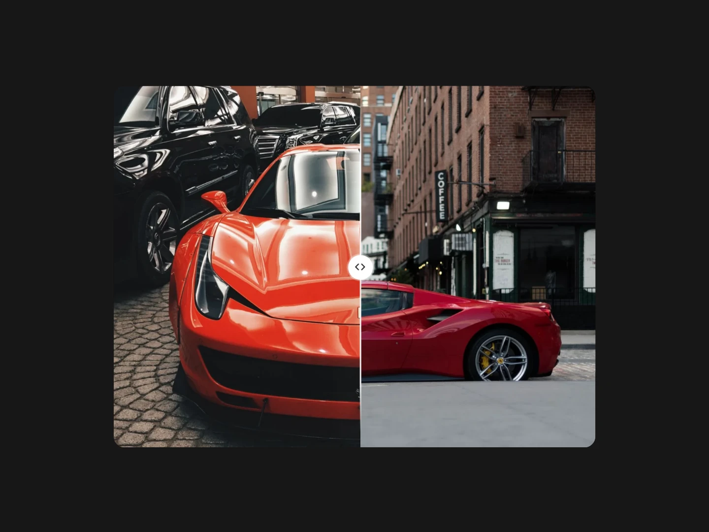
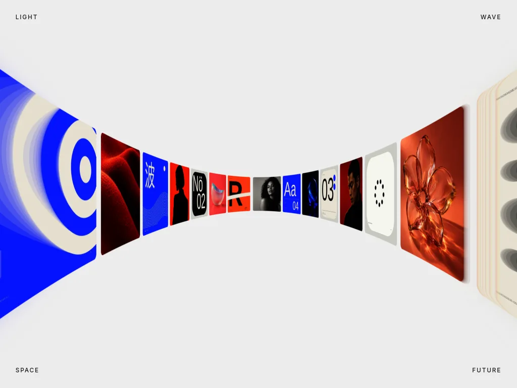
Slider templates for choosing a value, comparing images or moving through photos: five Effort Slider styles, Comparison Slider and Tunnel Fold Slider. Tune the component in the editor, then export as HTML, Svelte or React. Choose a range slider for input, an image divider for comparison or a slide transition for a gallery.
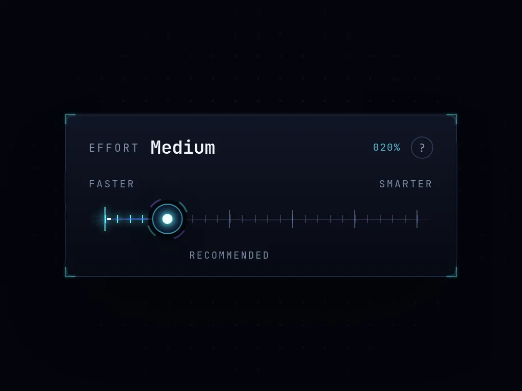
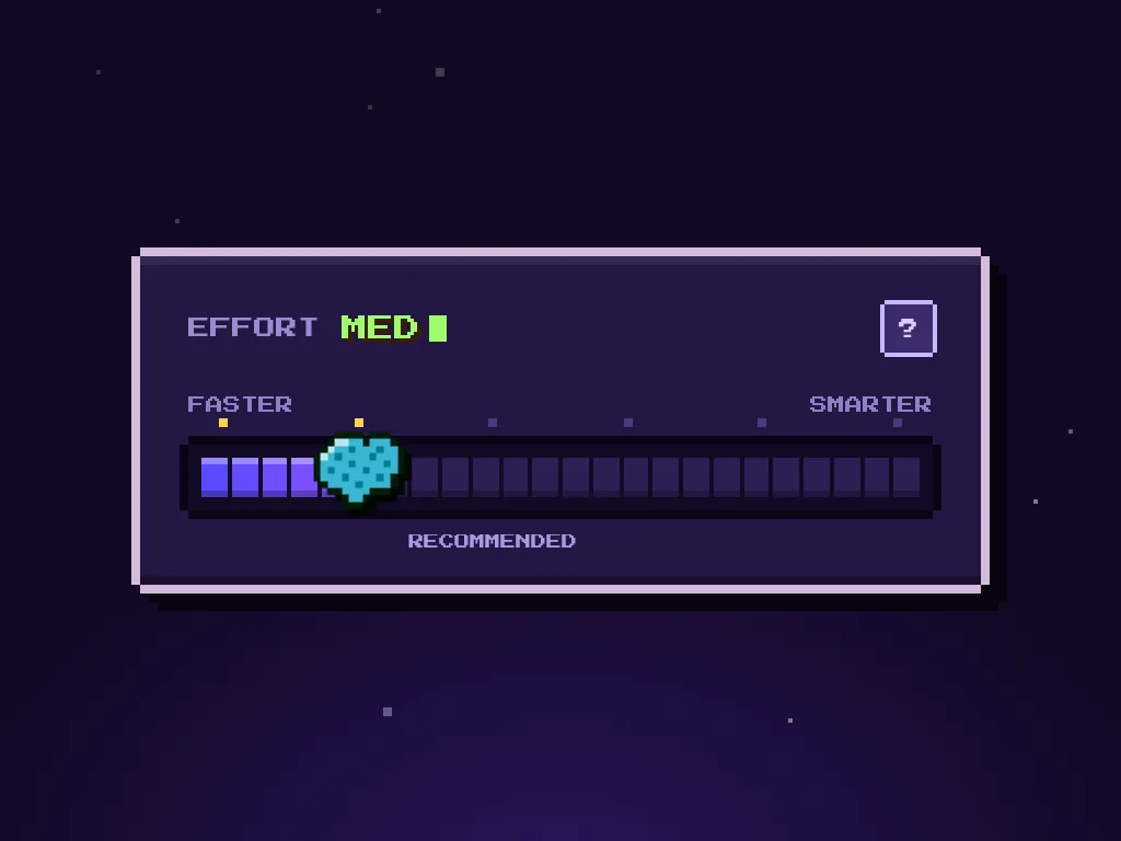
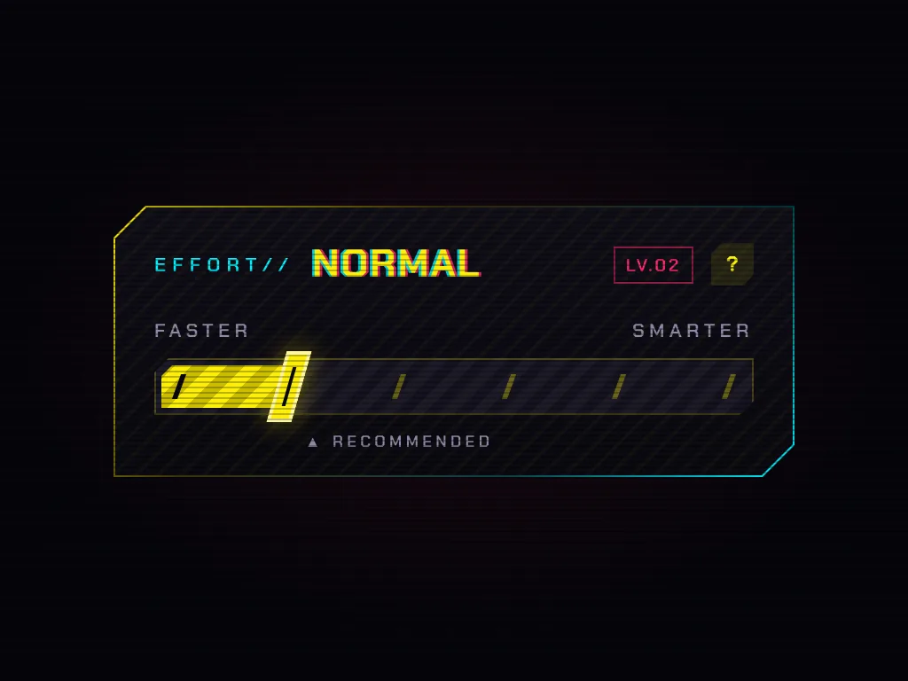
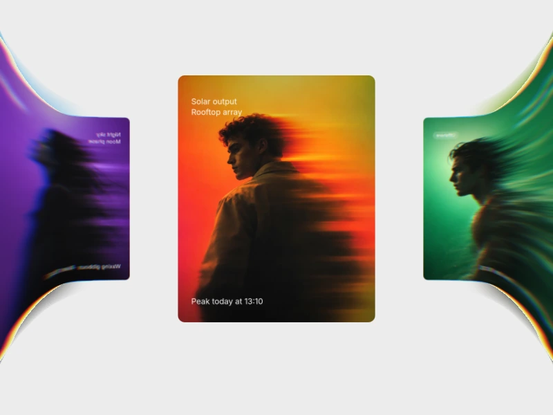
Glass, Sleek, Precision, Pixel and Overdrive are five looks of the same Effort Slider. Its knob follows a spring and snaps to one of six named stops. Comparison Slider reveals two images across a movable divider, horizontally or vertically. Tunnel Fold Slider moves picture cards around a tunnel, folding them as they leave the stage.
A range slider chooses a value. Use an Effort Slider when the choice fits its named stops, rather than a continuous numeric range. A before after image comparison slider reveals differences between two pictures without changing a form value. Tunnel Fold is a photo carousel transition, not an input control. Its moving cards suit a gallery rather than a settings panel.
For a slider in JavaScript, start with the exported component and connect the selected value to your application. Edit the Effort Slider stop names and starting stop, choose comparison images and divider settings, or tune Tunnel Fold playback and fold strength. If your Figma sliders are still design references, use these live components to check motion and interaction. They are code tools, not Figma files.
For a fluid slider feel, tune motion without making the selected value hard to read. Test keyboard input, touch dragging and visible focus in the finished page. Keep the chosen stop clear, use matching crops for image comparisons and check pause and reduced-motion behaviour for the photo carousel. Do not use animation as the only way to explain a value.
It is a starting component for a sliding interaction. Here, Effort Sliders choose a value, Comparison Slider reveals two images and Tunnel Fold Slider moves through photos. Pick the behaviour before choosing the visual style.
Export the component, add it to your page and connect its state to the value or content you need to change. An Effort Slider uses six named stops, so it is not a drop-in control for every numeric range.
No. These are live code components, not Figma slider assets. Use them to test an interaction from a design reference, then export as HTML, Svelte or React.
From the blog
Keep exploring
Every interactive tool on HorizonX opens in an editor you can adjust in the browser before you export it.