

A React carousel does not need a library to start. Put the slides in a horizontal scroll container, let CSS scroll snap line each one up, and add a small React component for the previous and next buttons and a status line. Reach for Embla, Swiper or react-slick when you need infinite loop, autoplay or synced thumbnails.
This guide builds that native version step by step, makes it accessible, and then compares the three libraries that show up most for this query, with versions and bundle sizes measured on 2026-10-09. If you want a ready-made 3D slider instead of a plain row, the galleries and carousels collection has editable carousels that export HTML, Svelte or React.
Do you need a carousel at all?
A carousel hides most of its content behind a control. That is fine when visitors browse one item at a time and the order does not matter much. It is a poor fit when every item is equally important, because few people page through all of them.
| Situation | Better pattern |
|---|---|
| Product photos, case studies, testimonials browsed one by one | Carousel with visible prev/next and partially visible next card |
| Logos or short items that should scroll on their own | Marquee with a pause control |
| Every item must be seen (pricing tiers, steps) | Grid or stacked list |
| A gallery tied to page scroll | Scroll-driven gallery that the reader controls |
The last row has its own article: scroll animation without scroll hijacking explains why the reader, not a timer, should control time in a gallery. For logos that drift on their own, the modern marquee guide covers the pause control that WCAG requires.
Why start from CSS scroll snap
A horizontal overflow-x: auto container already does most of a carousel's job. Touch swipe, trackpad scroll, momentum and keyboard scrolling come from the browser. scroll-snap-type on the container and scroll-snap-align on each slide make it stop on a slide instead of halfway between two. Both properties work in all current browsers; MDN's scroll-snap-type reference and its browser-compat data (version 8.1.5, checked 2026-10-09) list Chrome 69, Edge 79, Firefox 99 and Safari 11 for the current syntax.
What the browser does not give you is visible buttons, a way to know which slide is in view, and the ARIA semantics that tell a screen reader this is a carousel. That is the part React handles.
The markup and CSS
Use a grid with one column per slide. min(80%, 22rem) keeps part of the next card visible, which is the cue that tells people the row scrolls.
.carousel__track {
  display: grid;
  grid-auto-flow: column;
  grid-auto-columns: min(80%, 22rem);
  gap: 1rem;
  margin: 0;
  padding: 0 1rem 0.75rem;
  overflow-x: auto;
  overscroll-behavior-x: contain;
  scroll-snap-type: x mandatory;
  scroll-padding-inline: 1rem;
  scrollbar-width: thin;
}

.carousel__slide {
  scroll-snap-align: start;
}

.carousel__slide img {
  display: block;
  width: 100%;
  height: auto;
  aspect-ratio: 8 / 5;
  object-fit: cover;
  border-radius: 0.75rem;
}

.carousel__track:focus-visible {
  outline: 2px solid currentColor;
  outline-offset: 4px;
}

.carousel__controls {
  display: flex;
  justify-content: flex-end;
  gap: 0.5rem;
  margin-block-end: 0.75rem;
}

.carousel__controls button:disabled {
  opacity: 0.4;
  cursor: default;
}

.visually-hidden {
  position: absolute;
  width: 1px;
  height: 1px;
  overflow: hidden;
  clip-path: inset(50%);
  white-space: nowrap;
}
scroll-padding-inline matches the track padding so a snapped slide lines up with the content edge instead of touching the viewport. overscroll-behavior-x: contain stops a fast swipe at the end of the row from triggering the browser's back gesture.
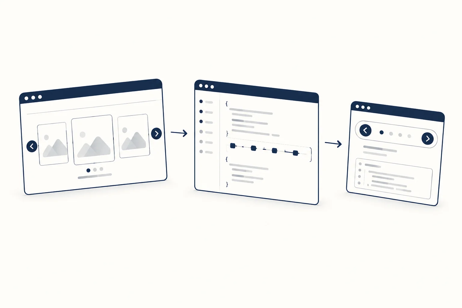
The React component
The component tracks which slides are visible with an IntersectionObserver rooted on the track, so the buttons and status stay correct whether the user clicks, swipes or scrolls with a trackpad. The buttons scroll to the next slide's offset and respect prefers-reduced-motion.
import { useEffect, useRef, useState } from 'react';

export function Carousel({ label, slides }) {
  const trackRef = useRef(null);
  const [visible, setVisible] = useState(() => new Set([0]));

  useEffect(() => {
    const track = trackRef.current;
    const observer = new IntersectionObserver(
      (entries) => {
        setVisible((previous) => {
          const next = new Set(previous);
          for (const entry of entries) {
            const index = Number(entry.target.dataset.index);
            if (entry.isIntersecting) next.add(index);
            else next.delete(index);
          }
          return next;
        });
      },
      { root: track, threshold: 0.6 }
    );
    for (const slide of track.children) observer.observe(slide);
    return () => observer.disconnect();
  }, [slides.length]);

  const first = visible.size ? Math.min(...visible) : 0;
  const last = visible.size ? Math.max(...visible) : 0;
  const atEnd = visible.has(slides.length - 1);

  function goTo(index) {
    const track = trackRef.current;
    const target = track.children[index];
    if (!target) return;
    const reduce = window.matchMedia('(prefers-reduced-motion: reduce)').matches;
    track.scrollTo({
      left: target.offsetLeft - track.children[0].offsetLeft,
      behavior: reduce ? 'auto' : 'smooth'
    });
  }

  return (
    <section className="carousel" aria-roledescription="carousel" aria-label={label}>
      <div className="carousel__controls">
        <button type="button" onClick={() => goTo(first - 1)} disabled={first === 0}>
          Previous
        </button>
        <button type="button" onClick={() => goTo(first + 1)} disabled={atEnd}>
          Next
        </button>
      </div>
      <div className="carousel__track" ref={trackRef} tabIndex={0}>
        {slides.map((slide, index) => (
          <div
            key={slide.id}
            className="carousel__slide"
            data-index={index}
            role="group"
            aria-roledescription="slide"
            aria-label={slide.title}
          >
            <img src={slide.image} alt={slide.alt} width="640" height="400" loading="lazy" />
            <h3>{slide.title}</h3>
          </div>
        ))}
      </div>
      <p className="visually-hidden" aria-live="polite">
        {last > first
          ? `Showing ${first + 1} to ${last + 1} of ${slides.length}`
          : `Showing ${first + 1} of ${slides.length}`}
      </p>
    </section>
  );
}
Use it with an array of slides that each have an id, title, image and alt:
<Carousel label="Recent projects" slides={projects} />
The status reports a range ("Showing 2 to 3 of 6") because on wider screens more than one slide is in view, and at the end of the track the last slide is visible without ever becoming the first one in view. Minified, the component is 809 bytes gzipped without React (esbuild 0.28.2, measured 2026-10-09).
What we checked. We rendered this exact component with React 19 in Chromium (remote headless browser, 900 by 700 viewport, six slides) on 2026-10-09, with motion preferences set to both "no-preference" and "reduce". Previous started disabled, each Next click moved the track to the next snap point until Next disabled itself at the end, Previous moved back one slide, ArrowRight on the focused track scrolled to the next slide, and the console showed no errors. That is a functional check in one browser, not a screen reader test.
Accessibility checklist
The W3C APG carousel pattern is the reference here. The component above already follows its main points:
- The container has
aria-roledescription="carousel"and anaria-label. Each slide is agroupwitharia-roledescription="slide"and a label taken from its title. APG asks that the label not contain the word "slide", because the role description already says it. - Previous and next are real
<button>elements with visible text, so they work with keyboard and voice control. - The track is focusable (
tabIndex={0}) with a visible focus ring, so keyboard users can scroll it with the arrow keys. - The live region is polite and only changes when the visible slides change.
If you add autoplay, APG and WCAG 2.2.2 Pause, Stop, Hide add more work: a stop/start button as the first element in the tab sequence, rotation that pauses on hover and keyboard focus, and aria-live="off" while it rotates. Under reduced motion, keep autoplay off. Most of the time the simpler fix is to leave autoplay out.
The CSS-only carousel (Chrome only for now)
Chrome 135 shipped ::scroll-button() and ::scroll-marker, pseudo-elements that generate the buttons and dots from CSS alone. The Chrome team's carousel post and MDN's CSS carousels guide show complete examples. MDN's compat data (checked 2026-10-09) lists them in Chrome and Edge 135 only, with no Firefox or Safari support, so treat them as a progressive enhancement on top of the version above, not a replacement.
When a library is worth it
The native version stops at the edges. If you need an infinite loop, autoplay with a pause, synced thumbnails, or variable-width slides with exact positioning, a library saves days. These three come up most for "react carousel". Versions are from the npm registry; sizes are the minified and gzipped JavaScript of each package's main React entry, bundled with esbuild 0.28.2 with React marked external, measured on 2026-10-09. They exclude CSS and optional modules, so treat them as a floor.
| Library | Version (published) | JS, min + gzip | Notes |
|---|---|---|---|
| embla-carousel-react | 8.6.0 (2025-04-04) | about 8.1 kB | Headless hook; you write the markup and CSS. Autoplay is a separate plugin. |
| Swiper for React | 14.3.0 (2026-09-28) | about 24.7 kB | Full component with modules for navigation, pagination, autoplay and effects; import swiper/css. |
| react-slick | 0.31.0 (2025-08-07) | about 16.8 kB | Port of the jQuery Slick API; needs the separate slick-carousel package for its CSS. |
Embla is the closest to the native approach: it gives you the scroll logic and leaves styling and semantics to you, so the accessibility checklist above still applies. Swiper does the most out of the box, at the largest size. react-slick suits teams that already know Slick's settings. Whichever you pick, check its docs for the ARIA it outputs and test with a keyboard.

When you want a 3D or WebGL carousel
A flat row is the right default for content. For a hero or a portfolio piece where the motion is part of the design, HorizonX has editors that let you add your own images, tune the motion and export the code:
- Skewed Carousel skews slides with scroll velocity and exports HTML, Svelte or React, with toggles for autoplay, loop, drag, keyboard and dots.
- Fold Carousel is a WebGL card carousel built with three.js; its page lists a live region, a focus ring above the canvas, autoplay off under reduced motion and a still card where WebGL is not available.
Browse the galleries and carousels collection to compare the carousels and galleries side by side before you build one from scratch.
If you meant an image slider rather than a row of cards, such as a before and after comparison or one photo folding into the next, the slider templates collection groups the Comparison Slider and the Tunnel Fold Slider with a set of range sliders.
FAQ
What is the best React carousel library?
It depends on how much you want handled for you. Embla gives you scroll logic and leaves markup and styling to you; Swiper ships complete components and effects at a larger size; react-slick keeps the Slick API. If you only need prev/next on a row of cards, the native scroll-snap version above avoids a dependency.
How do I make a responsive carousel in React?
Size slides with CSS, not JavaScript. grid-auto-columns: min(80%, 22rem) shows one card and a peek of the next on phones and several cards on desktop, and scroll snap keeps them aligned at every width.
Does react-responsive-carousel or pure-react-carousel still work?
Both install from npm, but their release activity differs. According to the npm registry on 2026-10-09, pure-react-carousel published 1.35.0 on 2025-12-24, while react-responsive-carousel's latest version, 3.2.23, dates from 2022-03-03. Check recent releases and open issues against your React version before adopting either.
Can I build a carousel with no JavaScript?
In Chrome and Edge 135 and later, yes, with ::scroll-button() and ::scroll-marker. In other browsers you get a swipeable row without buttons, so keep the React buttons as the baseline.