
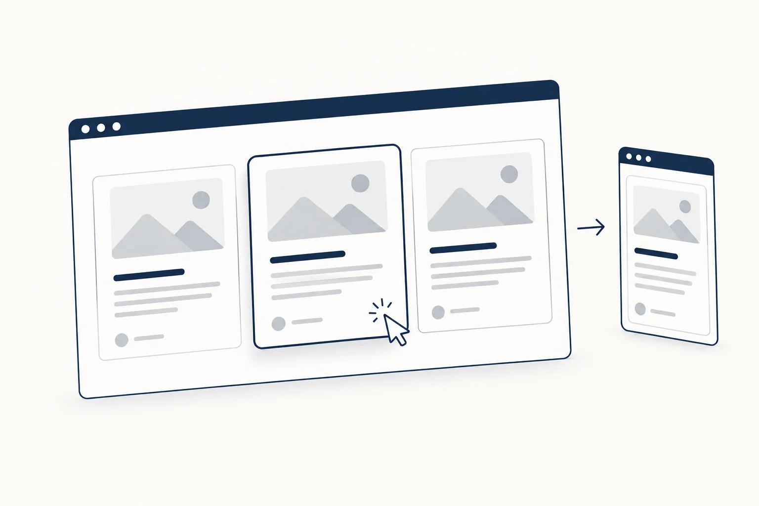
A CSS card is a self-contained block, usually an image, a title, a short summary and an action, laid out in a grid of siblings. Build it as a list of <li> elements, place them with CSS Grid, align their rows with subgrid, make the whole card clickable with one stretched link, and keep hover motion optional.
Most card tutorials stop at a box with a shadow. This one covers the parts that break in production: titles of different lengths pushing content out of line, cards with two click targets, focus rings that vanish, and layouts that do not adapt to the column they sit in. All the CSS below was validated with csstree-validator and rendered in Chromium on 2026-10-09. If you want finished card effects instead of a base component, the HorizonX cards collection groups the ones you can edit and export.
The markup
A set of cards is a list, so screen reader users hear how many items there are. Each card has one primary link, in the heading.
<section class="card-region">
  <ul class="cards">
    <li class="card">
      <img class="card__media" src="grid-guide.webp" alt="" width="640" height="400">
      <h3 class="card__title">
        <a class="card__link" href="/guides/grid">Grid layout guide</a>
      </h3>
      <p class="card__text">A short summary that can wrap to two or three lines.</p>
      <p class="card__meta">8 min read, <a class="card__tag" href="/tags/css">CSS</a></p>
    </li>
    <!-- more cards -->
  </ul>
</section>
The image has an empty alt because the heading already names the card; describe the image only when it carries information the text does not. The width and height attributes let the browser reserve space before the file loads.
A responsive card grid without media queries
.cards {
  display: grid;
  grid-template-columns: repeat(auto-fill, minmax(min(100%, 17rem), 1fr));
  gap: 1.5rem;
  margin: 0;
  padding: 0;
  list-style: none;
}
auto-fill creates as many 17rem columns as fit and 1fr shares the leftover space. The min(100%, 17rem) guard stops a card from overflowing a container narrower than 17rem, which is the usual cause of horizontal scrolling on small phones.
Align titles, text and meta across cards with subgrid
When one card has a two-line title, its summary starts lower than its neighbor's and the row looks broken. Fixed heights and line-clamp hide the symptom. Subgrid fixes it: each card spans four rows of the parent grid and uses those rows for its own children, so every title, summary and meta line in a row shares one track.
.card {
  position: relative;
  display: grid;
  grid-row: span 4;
  grid-template-rows: subgrid;
  row-gap: 0.75rem;
  padding-block-end: 1.25rem;
  border: 1px solid #d9dde3;
  border-radius: 12px;
  background: #fff;
}

.card > :not(.card__media) {
  margin: 0;
  padding-inline: 1.25rem;
}

.card__media {
  width: 100%;
  height: auto;
  aspect-ratio: 16 / 10;
  object-fit: cover;
  border-radius: 11px 11px 0 0;
}

.card__meta {
  align-self: end;
  color: #5b6472;
  font-size: 0.875rem;
}
The span 4 matches the four children. If a card can lose its image, give that variant its own span or keep an empty media slot. aspect-ratio with object-fit: cover keeps every image the same shape whatever its source size.
In our test (three cards, one with a long title, rendered at 960px in Chromium 128 on 2026-10-09), the summaries and meta lines of all three cards started at the same vertical position. Subgrid reached Baseline in September 2023 and became widely available in March 2026, according to the web-features data in MDN's browser compatibility tables (checked 2026-10-09). In an older browser without subgrid, grid-template-rows: subgrid is invalid and ignored, so each card stacks its rows normally; the cards still work, they just do not align across.
Make the whole card clickable, with one link
Wrapping the entire card in <a> makes screen readers announce the whole card as a single long link, and nested links become invalid. The pattern documented in Inclusive Components: Cards keeps the link in the heading and stretches its click area with a pseudo-element:
.card__link {
  color: inherit;
  text-decoration: none;
}

/* Stretch the link over the whole card */
.card__link::after {
  content: "";
  position: absolute;
  inset: 0;
  border-radius: 12px;
}

/* Move the focus ring from the text to the card outline */
.card__link:focus-visible {
  outline: none;
}

.card__link:focus-visible::after {
  outline: 3px solid #1d4ed8;
  outline-offset: 3px;
}

/* Secondary links sit above the overlay */
.card__tag {
  position: relative;
  z-index: 1;
}
The overlay is positioned against .card, which has position: relative. Keyboard users reach each card through one tab stop (plus any secondary links) and see the focus ring around the whole card, because :focus-visible draws it on the pseudo-element. In our render, a click near the card's top corner landed on the heading link, and a click on the tag landed on the tag.
Two trade-offs, both noted in the Inclusive Components article: text inside the card becomes hard to select, because the overlay covers it, and every secondary link has to be lifted above the overlay, which leaves small dead zones around it. If a card needs several actions, consider dropping the stretched link and making the card a plain container with explicit buttons.
Hover lift that respects reduced motion
.card {
  transition: translate 200ms ease-out, box-shadow 200ms ease-out;
}

.card:hover {
  translate: 0 -2px;
  box-shadow: 0 8px 24px rgb(16 24 40 / 0.12);
}

@media (prefers-reduced-motion: reduce) {
  .card {
    transition: none;
  }
  .card:hover {
    translate: none;
  }
}
A 2px lift is enough to signal that the card responds. Under prefers-reduced-motion: reduce the shadow still changes, so the hover feedback stays without the movement. Hover is a bonus: touch screens have no hover, so never hide information behind it.
Let the card adapt to its column with container queries
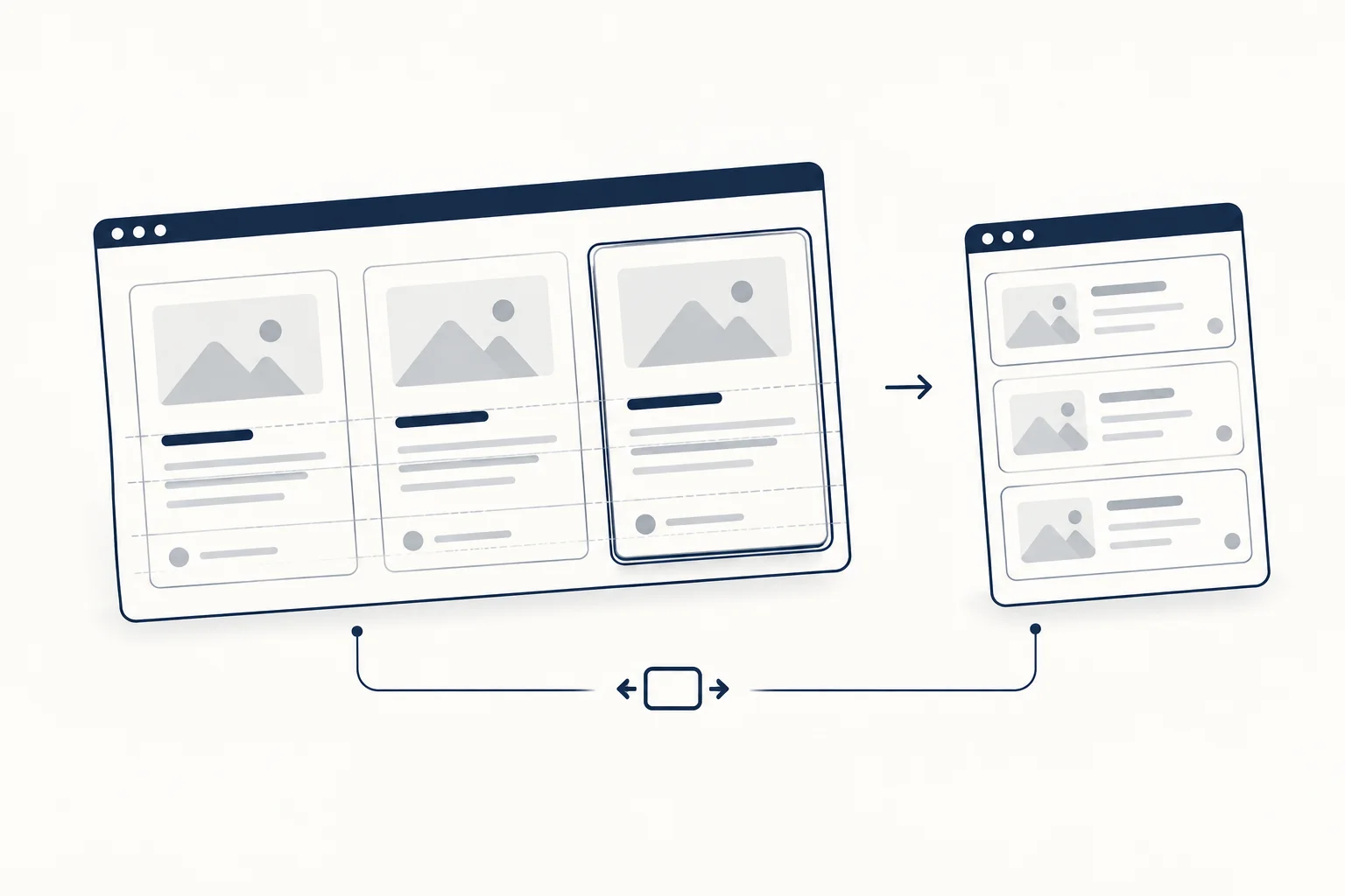
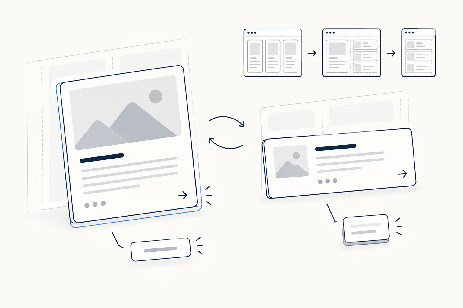
A card in a wide grid and the same card in a narrow sidebar need different layouts. A container query responds to the space the card actually has, not the viewport:
.card-region {
  container-type: inline-size;
}

@container (width < 32rem) {
  .card {
    grid-row: auto;
    grid-template-rows: none;
    grid-template-columns: 6rem 1fr;
    align-items: start;
    column-gap: 1rem;
    padding: 1rem;
  }
  .card > :not(.card__media) {
    grid-column: 2;
    padding-inline: 0;
  }
  .card__media {
    grid-column: 1;
    grid-row: 1 / span 2;
    aspect-ratio: 1;
    border-radius: 8px;
  }
}
Below 32rem the card turns into a horizontal row with a square thumbnail. Note where the container sits: on the wrapper, not on the card. In a minimal test of two subgridded cards, adding container-type: inline-size to the cards themselves made Chromium 128 stop aligning their rows (summary tops at 53px and 82px instead of 82px and 82px). The CSS Grid Level 2 spec says a grid that is forced into an independent formatting context, for example by layout containment, cannot be a subgrid. Current MDN describes container-type: inline-size as style and inline-size containment only, so engines may differ here. Putting the container on the wrapper avoids the question entirely.
Container queries have been Baseline since February 2023 and are widely available (web-features, checked 2026-10-09).
Card checklist
Run this before a card component ships:
- The cards are list items, and each has exactly one primary link.
- Titles of one, two and three lines keep the summaries aligned in a row.
- The grid has no horizontal scroll at 320px wide.
- Tab reaches each card once, the focus ring is visible around the card, and secondary links are still reachable.
- Images reserve their space (
width,heightoraspect-ratio) and have emptyaltwhen decorative. - Hover changes something besides position, and the movement disappears under reduced motion.
- Nothing important appears only on hover.
- A card without an image, or with a very long word in the title, does not break the layout.
Effect cards: when a base card is not enough
The component above is deliberately plain. Landing pages and portfolios often want a card with a visible interaction, and those effects carry their own accessibility work. Three examples from HorizonX, each with an editor you can adjust before exporting:
- Border Glow: a light slides to the card edge nearest the pointer. Keyboard focus lights it and keeps a focus ring, touch runs it on a timer, and reduced motion parks the light in place.
- Luminous Card: a slit of light under the cursor while the card lifts, with keyboard focus and touch reaching the same state. The export is CSS only.
- Pixel Card: a pixel shimmer that reveals the card on hover, in four variants, with keyboard focus, touch taps and a static reduced-motion state.
Use effect cards for a few featured items. A grid of twenty animated cards competes with itself; the bento grid guide covers how to mix one or two highlighted tiles with quiet ones.
FAQ
How do I make CSS cards responsive?
Use grid-template-columns: repeat(auto-fill, minmax(min(100%, 17rem), 1fr)) on the list so the number of columns follows the available width, then add a container query on a wrapper to change the card's internal layout when its column gets narrow. Neither step needs a viewport media query.
Is there a CSS card generator?
Generators that output a box with a border and shadow save little time compared to the snippets above. Where an editor helps is with effect cards, where the timing, colors and interaction states are tedious to tune by hand. HorizonX's card tools let you change those values visually and export the code.
How do I make a 3D card in CSS?
Tilt the card with a perspective() transform on hover and remove the tilt under reduced motion:
.card-3d {
  transition: transform 300ms ease-out;
}

.card-3d:hover {
  transform: perspective(800px) rotateX(4deg) rotateY(-6deg);
}

@media (prefers-reduced-motion: reduce) {
  .card-3d:hover {
    transform: none;
  }
}
Keep the angles small. Pointer-following tilt needs JavaScript to read the cursor position, and it should never be the only way to reach the card's content.
Next step
Build the base card once, run it through the checklist, and keep effects for the few cards that need attention. To browse card effects that already handle focus, touch and reduced motion, open the HorizonX cards collection.