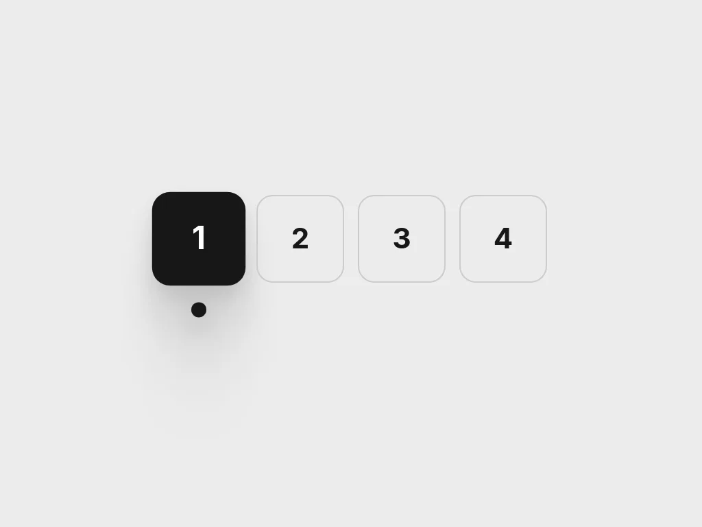
Beacon Tabs
Numbered tabs where the selected tile drops its own fill in from above and lights a beacon underneath.
 HorizonX UI/UX
Tool collection
Navigation components for moving between steps, pages and sections: numbered beacon tabs, a liquid pagination bar, a morphing breadcrumb, a multi-step stepper, a flowing hover menu, a 3D letters menu, two full-screen hamburger menus and a wheel picker. Tune labels, colours and motion in the editor, then export as HTML, Svelte or React. Choose the pattern by how far a person needs to move.
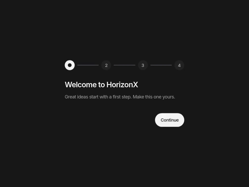
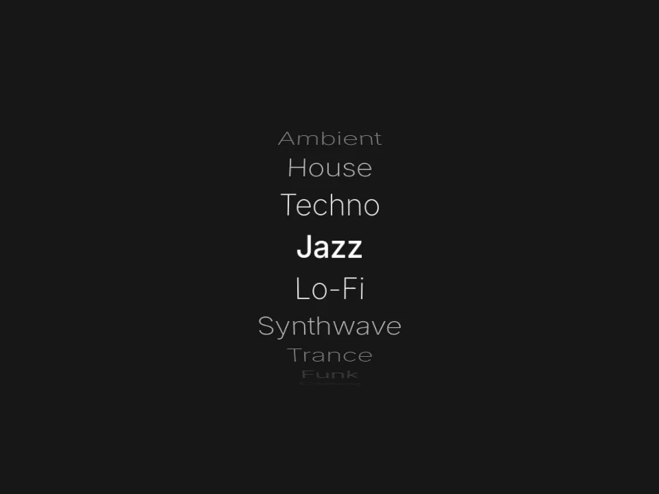
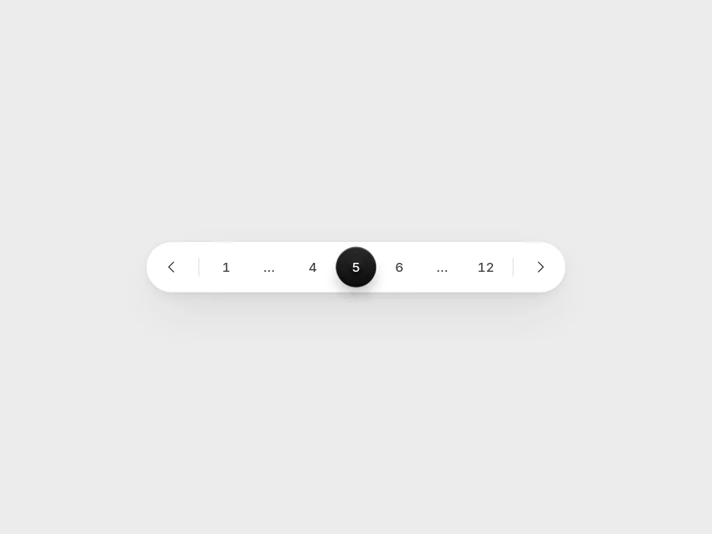
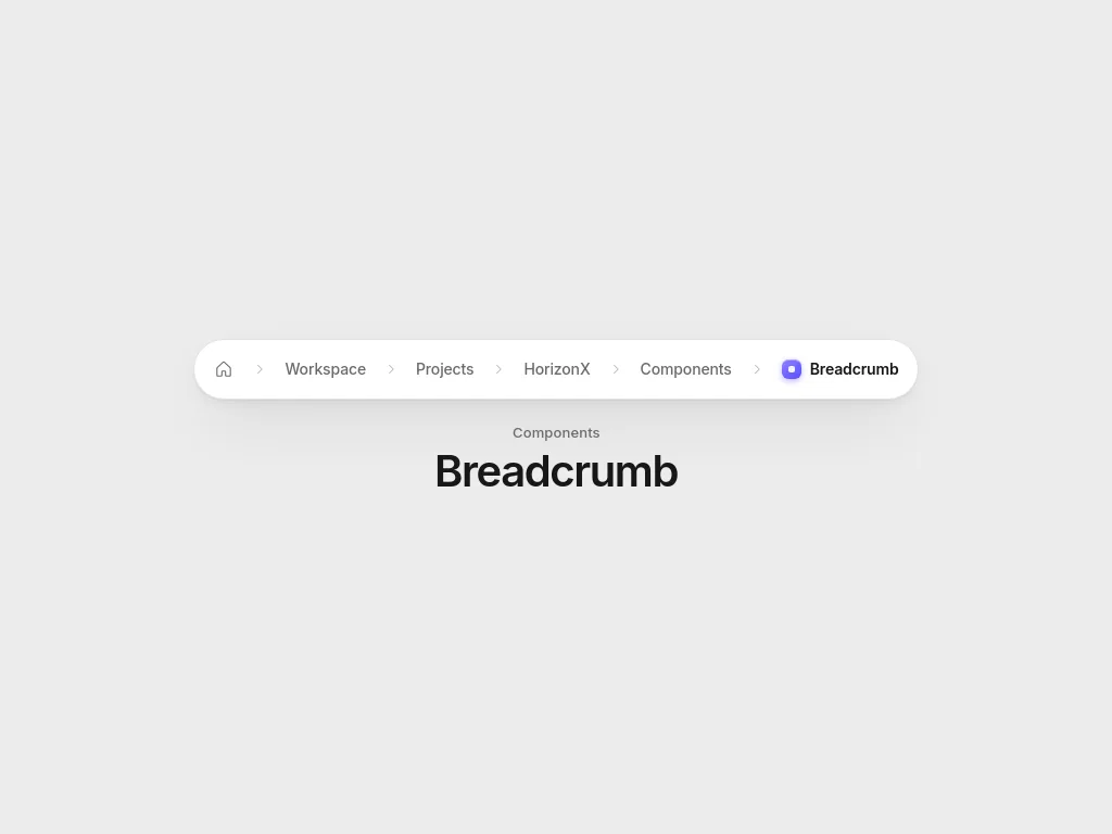
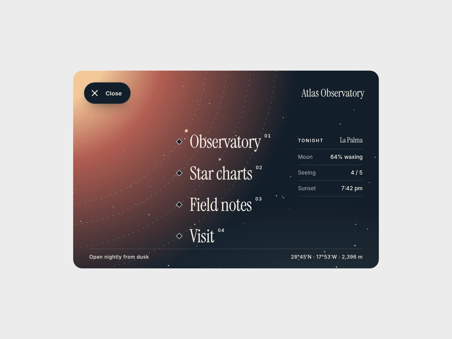
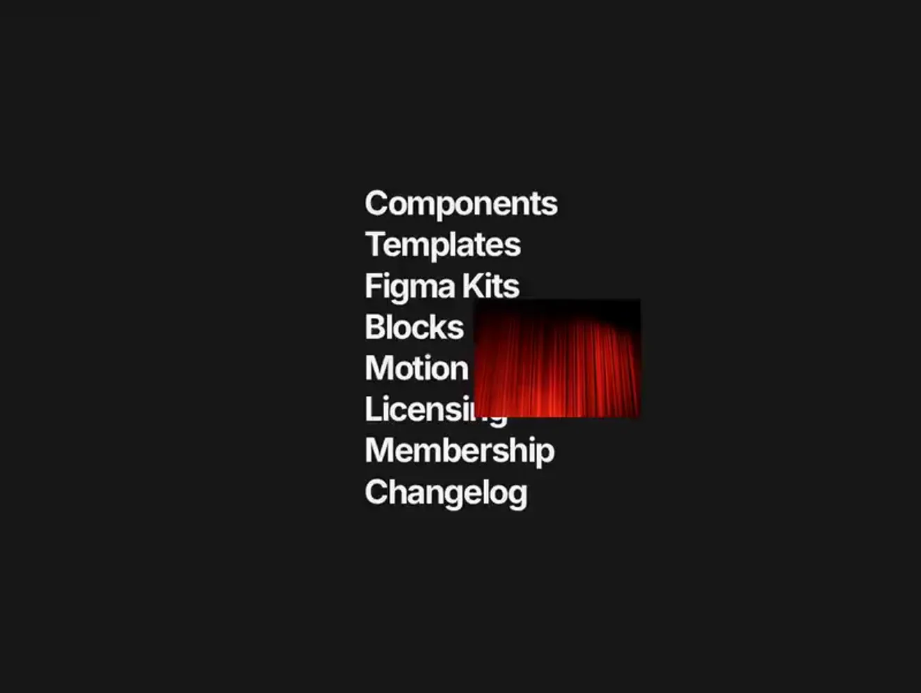
Beacon Tabs is a row of numbered tiles built on a radio group, suited to switching between a few views. Liquid Pagination is a full page bar with previous and next arrows, folded page ranges and an ink drop that flows to the current page. Morph Breadcrumb folds a deep trail into a single button and unfolds the hidden levels one after another. Stepper walks people through a multi-step flow with Previous and Continue buttons and step indicators. Flowing Menu and 3D Letters Menu are full-width menus with hover reveals. Orbit Nav and Curtain Menu are hamburger menus that open over the whole page: a night sky grows out of the toggle with each link on its own orbit, or a curved curtain drops with a photo card that follows the link under the pointer. Option Wheel is a drum picker for choosing one value from an ordered list.
Replace sample labels with your real destinations and steps before tuning motion. Connect tab and stepper state to your router or form so the back button and page reloads behave as expected. The hover menus rely on a pointer, so give touch screens a tap path to the same links.
Mark the current page or step so it is clear without colour alone, keep targets large enough for touch and test the keyboard order through every item. Respect reduced-motion settings on the animated menus.
Tabs change the content shown in one part of the current page. Navigation links move to another page or section. If each option has its own URL, treat it as navigation and build it with links.
Use a stepper when the steps happen in order and later steps depend on earlier ones, such as a signup flow. Use tabs when people can move between views in any order.
Liquid Pagination is the full pattern: previous and next arrows, the first and last page always in reach and folded gaps for long ranges, and it reports every page change to your router. Beacon Tabs is a simpler numbered radio group for a handful of pages.
When it sits two or more levels deep, such as a product inside a category inside a section. Morph Breadcrumb keeps the first level and the current page in view and folds the middle levels into one button, so a deep trail stays short on small screens.
When the links do not fit in the header, which is usual on phones, or when the design keeps navigation out of sight until someone asks for it. Keep the toggle a real button that says whether it opens or closes the menu, trap focus inside while it is open and close it on Escape. Orbit Nav and Curtain Menu do all three.
From the blog
Keep exploring
Every interactive tool on HorizonX opens in an editor you can adjust in the browser before you export it.