

Use a grid for capabilities people can compare, tabs for alternate views of the same subject, and a walkthrough for steps that depend on one another. These are editorial choices before they are component choices. An attractive interaction cannot fix a section whose information has no clear relationship.
Consider a fictional scheduling product with three capabilities: collecting availability, finding a suitable time and sending invitations. The same three labels could fit several layouts, but each layout tells a different story.
Choose a grid when each card stands alone
A grid lets readers scan several capabilities without interacting. It works when someone can understand one card without reading another first.
Write each card as a small answer: what it does, when it matters and what the visual demonstrates. “Smart workflows” is not enough. “Collect availability before proposing a meeting” establishes a task and gives the accompanying image a job.
For the scheduling example, a grid might serve different customer situations: internal meetings, client bookings and interviews. These are parallel use cases, not sequential steps.
Choose tabs when the subject stays stable
Tabs can show different perspectives without repeating the surrounding explanation. For example, a scheduler could show the organiser's view and the attendee's view of the same meeting.
Do not hide the entire value proposition behind an inactive tab. The heading and introduction should explain the common purpose before anyone clicks. Labels should name the contents, not depend on icons or vague words such as “more”.
A tabbed section also needs an implementation review for keyboard operation, selected states and small screens. This is a requirement to check, not something a screenshot can establish.
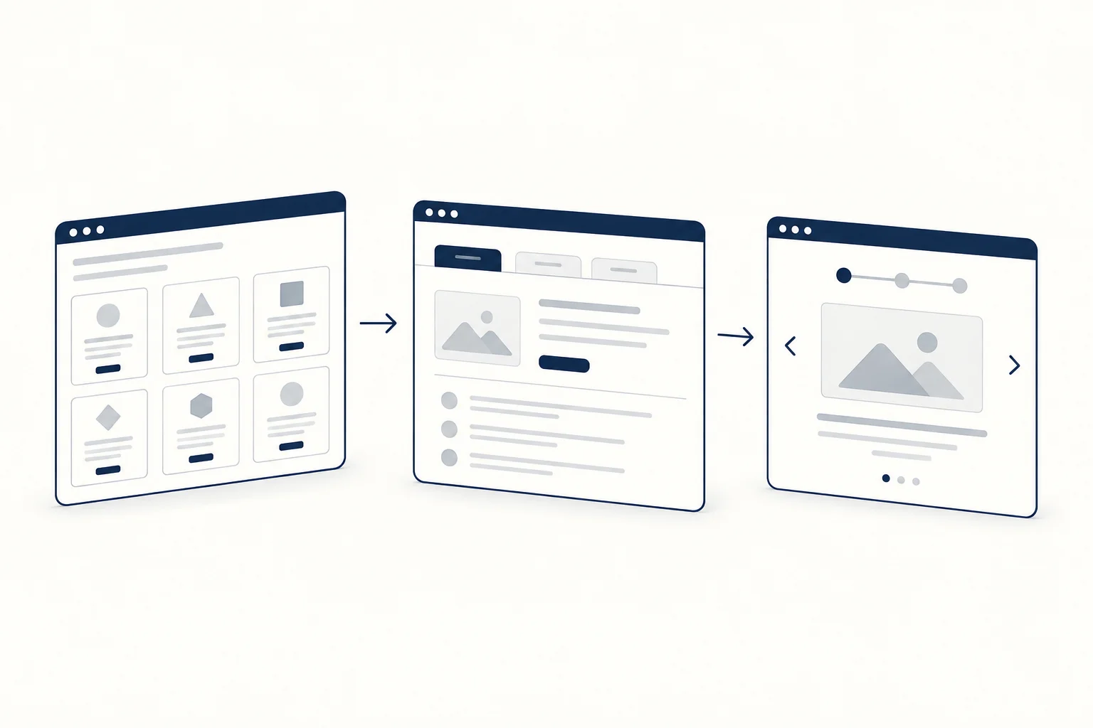
Choose a walkthrough when order matters
If the reader must understand how availability becomes a confirmed meeting, use the actual sequence. Give each step a verb and a visible output. The connection between steps is the substance of the section.
Avoid turning a three-step explanation into a long animated obstacle. A person should be able to read the sequence without waiting for a visual to catch up. Let motion reinforce the story after the story works as ordinary content.
Keep the visual subordinate to the explanation
HorizonX's Product Suite Bento and Code Security Bento are starting points for inspecting card relationships. They do not dictate your feature count or product claims.
Before choosing a component, make a plain-text version of the section. Remove duplicate benefits, decide which screenshot explains each point and test the order in a single column. For a broader page-level review, use the SaaS landing page teardown.
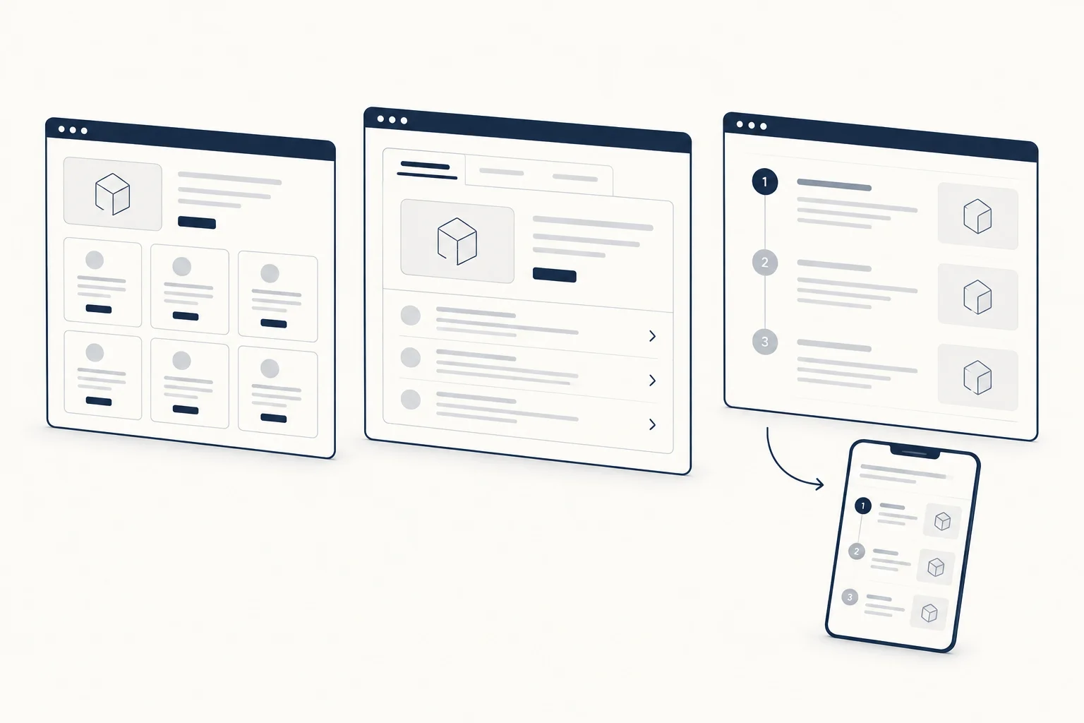
Can a page use all three structures?
Yes, when each structure has a distinct purpose. Avoid using a grid, tabs and a walkthrough to repeat the same three claims. Repetition adds length without necessarily adding understanding.