
A Tailwind tooltip is a small label that appears next to a control on hover or keyboard focus. You can build one with group-hover and group-focus-within utilities alone, but meeting WCAG 1.4.13 needs an Escape key handler. For positioning that flips at the viewport edge, combine the Popover API with CSS anchor positioning, or use Floating UI in React.
This guide covers three working versions, a decision table, and the browser support for each newer feature, checked on 2026-10-09. If you want animated tooltips to start from, the tooltip collection puts the Bounce, Rise and Signal tooltips side by side.
What a tooltip must do
The WAI-ARIA tooltip pattern defines a tooltip as a popup that shows information about an element when it receives keyboard focus or when the mouse hovers over it. The container has role="tooltip", the trigger points to it with aria-describedby, focus stays on the trigger, and Escape dismisses it. The APG marks this pattern as work in progress without task force consensus, so treat it as guidance rather than a finished spec.
WCAG 2.2 success criterion 1.4.13 adds three tests for any custom tooltip:
- Dismissible: the user can hide it without moving the pointer or focus. In practice, Escape.
- Hoverable: the pointer can move from the trigger onto the tooltip without it vanishing.
- Persistent: it stays visible until hover or focus leaves, the user dismisses it, or the information stops being valid.
A tooltip holds a short description only. Touch screens have no hover, so never put information that touch users need only in a tooltip. If it needs a link, a button or a form field, it is a non-modal dialog or a popover, not a tooltip. For the basics of text that appears on hover, including why the title attribute is a weak home for information, see our guide to text on hover.
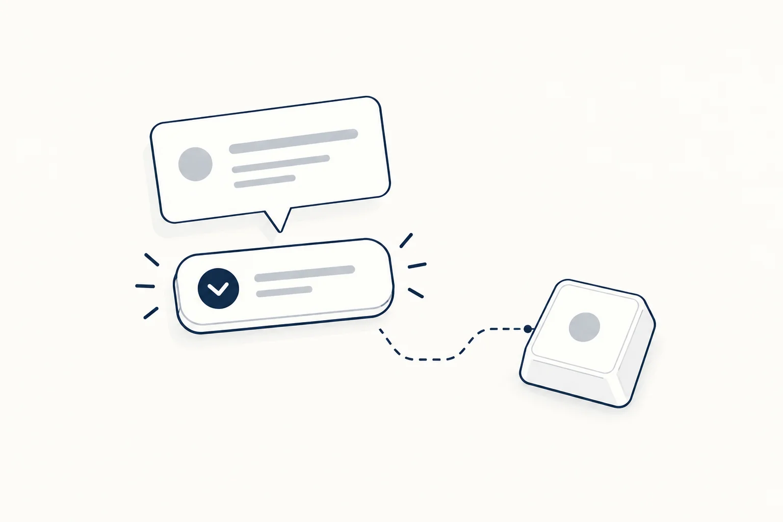
Version 1: Tailwind utilities plus a few lines of JavaScript
This version works in every current browser and positions the tooltip with plain absolute positioning.
<span data-tip-group class="group relative inline-flex">
  <button type="button" aria-describedby="tip-save" class="rounded-lg bg-slate-900 px-4 py-2 text-sm font-medium text-white focus-visible:outline-2 focus-visible:outline-offset-2 focus-visible:outline-slate-900">
    Save
  </button>
  <span class="invisible absolute bottom-full left-1/2 -translate-x-1/2 pb-2 opacity-0 transition-opacity duration-150 group-hover:visible group-hover:opacity-100 group-focus-within:visible group-focus-within:opacity-100 group-data-[dismissed]:invisible group-data-[dismissed]:opacity-0 motion-reduce:transition-none">
    <span role="tooltip" id="tip-save" class="block whitespace-nowrap rounded-md bg-slate-900 px-2.5 py-1.5 text-xs text-white shadow-sm">
      Save draft (Ctrl + S)
    </span>
  </span>
</span>
document.querySelectorAll('[data-tip-group]').forEach((group) => {
  const reset = () => group.removeAttribute('data-dismissed');
  group.addEventListener('keydown', (event) => {
    if (event.key === 'Escape') group.setAttribute('data-dismissed', '');
  });
  group.addEventListener('pointerleave', reset);
  group.addEventListener('focusout', reset);
});

document.addEventListener('keydown', (event) => {
  if (event.key !== 'Escape') return;
  document.querySelectorAll('[data-tip-group]:hover').forEach((group) => {
    group.setAttribute('data-dismissed', '');
  });
});
Why it is built this way:
group-hoverandgroup-focus-withinshow the tooltip for mouse and keyboard users. Tailwind documents both under styling based on parent state.invisiblekeeps the hidden tooltip from catching the pointer.opacity-0alone would leave an invisible hover target above the button.- The gap is
pb-2padding on the wrapper, not a margin, so the pointer crosses tooltip territory on its way up. That satisfies the hoverable test. - The script sets
data-dismissedon Escape, both when the trigger has focus and when the pointer is over the group, and clears it when the pointer or focus leaves.group-data-[dismissed]:invisiblehides the tooltip in that state. motion-reduce:transition-noneremoves the fade for people who ask for reduced motion.
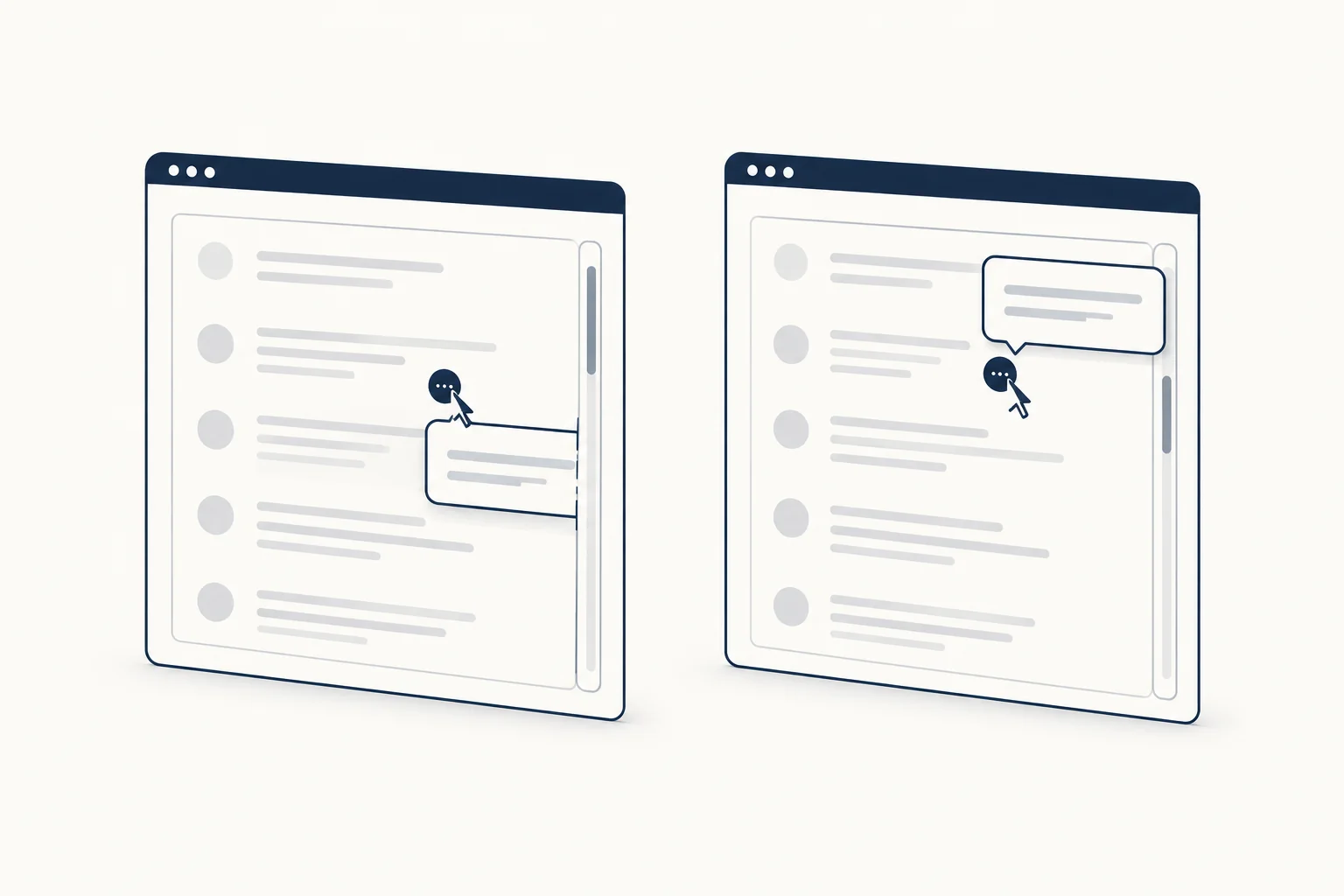
The limit: the tooltip always opens upward. Near the top of the viewport or inside a scrolling container with clipped overflow, it gets cut off.
Version 2: Popover API with CSS anchor positioning
The Popover API puts the tooltip in the top layer, so overflow: hidden on a parent can no longer clip it. CSS anchor positioning ties it to the trigger and can flip it when there is no room.
<button type="button" data-tip="tip-share" aria-describedby="tip-share" class="rounded-lg border border-slate-300 px-4 py-2 text-sm [anchor-name:--share]">
  Share
</button>
<div id="tip-share" popover="hint" role="tooltip" class="tip rounded-md bg-slate-900 px-2.5 py-1.5 text-xs text-white [position-anchor:--share]">
  Copy a link to this page
</div>
.tip {
  inset: auto;
  margin: 0 0 8px;
  border: 0;
  position-area: top;
  position-try-fallbacks: flip-block;
}
document.querySelectorAll('[data-tip]').forEach((trigger) => {
  const tip = document.getElementById(trigger.dataset.tip);
  if (!tip || typeof tip.showPopover !== 'function') return;
  let timer;
  const show = () => {
    clearTimeout(timer);
    if (!tip.matches(':popover-open')) tip.showPopover();
  };
  const hide = () => {
    timer = setTimeout(() => {
      if (tip.matches(':popover-open')) tip.hidePopover();
    }, 120);
  };
  [trigger, tip].forEach((el) => {
    el.addEventListener('pointerenter', show);
    el.addEventListener('pointerleave', hide);
  });
  trigger.addEventListener('focus', show);
  trigger.addEventListener('blur', hide);
  trigger.addEventListener('keydown', (event) => {
    if (event.key === 'Escape' && tip.matches(':popover-open')) tip.hidePopover();
  });
});
Notes on each piece:
popover="hint"is meant for tooltips. MDN explains that hint popovers do not close openautopopovers such as menus, and they respond to light dismiss and close requests. The HTML spec treats an unknown value asmanual, so browsers withouthintstill show the tooltip; the script's own Escape handler covers dismissal there.inset: autoandmarginundo the default popover styles that would otherwise center it in the viewport. The bottom margin is the gap.position-area: topplaces it above the anchor, andposition-try-fallbacks: flip-blockmoves it below when there is no room above.- Unique anchor names matter. Each trigger and tooltip pair needs its own name, set here with Tailwind arbitrary properties such as
[anchor-name:--share]. - The 120 ms delay gives the pointer time to cross from trigger to tooltip, which keeps it hoverable.
Browser support, from MDN browser compatibility data checked on 2026-10-09 (cross-check on Can I use):
| Feature | Chrome and Edge | Firefox | Safari |
|---|---|---|---|
popover attribute |
114 | 125 | 17 |
popover="hint" |
151 | 153 | Technology Preview only |
anchor-name, position-area |
125 (position-area 129) |
147 | 26 |
position-try-fallbacks |
128 | 147 | 26 |
Where anchor positioning is missing, the tooltip still opens in the top layer but without the anchored position. If that matters for your audience, wrap the CSS in @supports (position-area: top) and keep Version 1 as the fallback, or use the library route below. Chrome also ships an interestfor attribute that opens popovers on hover and focus without script, but MDN data lists it in Chromium only (142 and later), so it is not yet a cross-browser answer.
Version 3: React with Floating UI or a component library
Search results for "react tooltip" are mostly library threads, and the reason is real: collision handling, delays, portals and touch input add up. The Floating UI tooltip guide composes it from hooks: useFloating with offset, flip and shift middleware for placement, then useHover, useFocus, useDismiss and useRole for the interaction and ARIA wiring. You still style the floating element with Tailwind classes.
If you already use a component layer, the Radix tooltip opens on hover or focus, closes on Escape and lets you set delays through a provider. shadcn/ui's tooltip wraps that kind of primitive in Tailwind classes; its docs currently offer Base UI, React Aria and Radix UI variants and install with shadcn@latest add tooltip.
Which version to use
| Situation | Pick |
|---|---|
| Static site, tooltip far from edges | Version 1 |
| Tooltip inside scrolling or clipped containers | Version 2 |
| React app with many tooltips and dynamic content | Floating UI or your component library |
| Text people must read to complete a task | No tooltip: show it inline |
Ready-made tooltip designs
HorizonX has three editable tooltip tools: Rise Tooltip, a graphite button with a bubble that rises into place; Signal Tooltip, a three-tone set for neutral, info and alert messages; and Bounce Tooltip, a compact text trigger with a short bounce. Each lets you edit copy, geometry, palette and timing, works by keyboard or touch according to its page, and exports a self-contained HTML, CSS and JavaScript file. They are not Tailwind class lists, so use them for the motion and visual design and port the classes yourself.
FAQ
How do I add a tooltip in React with Tailwind?
Use Floating UI's hooks for placement and interaction and put Tailwind classes on the floating element, or install a library tooltip such as the shadcn/ui component. For a single static tooltip, the Version 1 markup works in JSX once class becomes className; attach the Escape handler in an effect.
Should tooltip components exist at all?
The question comes up often in React communities. A tooltip is fine for a short, optional description of a control, especially icon buttons. It is the wrong tool for anything essential, interactive or long; put that text inline or in a popover with a close button.
What is the best tooltip library for React?
There is no single answer, and it depends on what you already use. Floating UI is a positioning engine with interaction hooks, so you own the markup and styles. Radix UI, Base UI and React Aria ship complete tooltip primitives. If your project already uses shadcn/ui, its tooltip is the shortest path because it matches the rest of your components.
Next step
Pick Version 1 for simple pages, Version 2 when tooltips sit in clipped containers, and a library for large React apps. For more small state-change animations in the same spirit, browse the micro-interactions collection.