

To show text on hover, keep the text in the page and reveal it with CSS :hover together with :focus-visible, or use a real tooltip linked with aria-describedby that also opens on keyboard focus and closes with Escape. The title attribute is fine for a minor hint, but keyboard, touch and many screen reader users never see it.
That covers the first meaning of "text on hover". The second is the hover text effect: an underline that draws itself, a label that rolls, a word that scrambles before it settles. Both follow one rule. The words must stay readable before, during and after the motion, and nothing important can depend on a mouse.
What people mean by "text on hover"
The phrase covers three different needs: developers asking how to display text when the pointer is over an element, designers looking for animated text hover effects, and people asking about Apple's Hover Text.
That last one is an operating system feature. On a Mac, Hover Text shows a larger copy of the text under the pointer while you hold Command, and Hover Typing shows a larger copy of what you type in a text field (Apple Support). Both are switched on in System Settings > Accessibility > Hover Text. You do not build it into a website, but your site should keep working when visitors use it, which is one more reason to keep real text in the markup instead of baking it into images.
The rest of this guide covers the two web intents.
The title attribute: a hint, not a home for information
<abbr title="Content Delivery Network">CDN</abbr> gives mouse users a native tooltip with no code. That is its whole range. MDN's accessibility notes for the title attribute list touch-only users, keyboard users, screen reader and magnifier users, and people with motor or cognitive impairments as poorly served by it. You also cannot style it, set its delay or keep it open.
Use title only for redundant hints. If the text explains a control, a price, a limit or an error, it needs a visible or keyboard-reachable place in the interface.
Reveal text on hover with CSS only
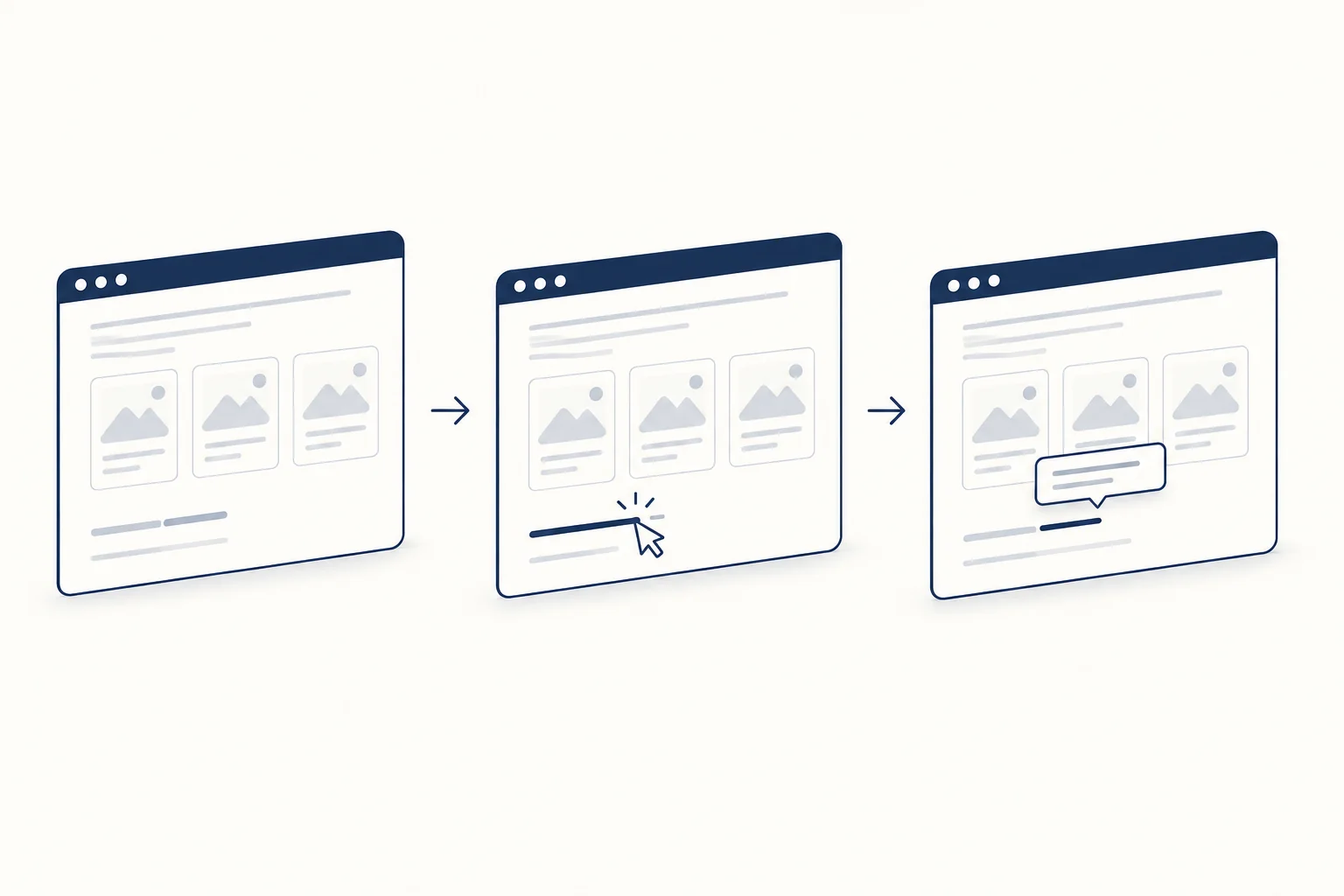
When the extra text belongs to a card or a figure, keep it in the markup and reveal it. Pair :hover with focus, and leave the text visible on devices that cannot hover.
<a class="card" href="/work/atlas">
  <img src="atlas.jpg" alt="Atlas reporting dashboard on a laptop">
  <span class="card__caption">Atlas: reporting for field teams</span>
</a>
.card { position: relative; display: block; }

.card__caption {
  position: absolute;
  inset: auto 0 0 0;
  padding: 0.75rem 1rem;
  background: rgb(255 255 255 / 0.94);
  color: #192c46;
}

/* Hide the caption only where a precise pointer can hover */
@media (hover: hover) and (pointer: fine) {
  .card__caption {
    opacity: 0;
    transform: translateY(0.5rem);
    transition: opacity 200ms ease, transform 200ms ease;
  }
  .card:hover .card__caption,
  .card:focus-visible .card__caption {
    opacity: 1;
    transform: none;
  }
}
The caption stays in the DOM the whole time, so it remains part of the link's accessible name, and phones show it without a tap. The hover media feature is marked Baseline widely available on MDN, supported across browsers since December 2018 (checked 2026-10-03). It describes the primary input, so a device whose primary input is touch, such as a tablet with a mouse connected, may still report no hover. That is the safe failure: the caption simply stays visible.
Build a tooltip that works without a mouse
For a short description of a control, use the tooltip pattern. The trigger points at the tooltip with aria-describedby, the tooltip has role="tooltip", it opens on hover and on focus, and Escape closes it. That is the behavior described in the WAI-ARIA Authoring Practices tooltip pattern, which the APG still marks as work in progress.
WCAG 2.2 adds three requirements in 1.4.13 Content on Hover or Focus: the content can be dismissed without moving the pointer or focus, the pointer can move onto it without it disappearing, and it stays visible until the user dismisses it or moves away.
<span class="tip">
  <button type="button" aria-describedby="tip-export">Export</button>
  <span class="tip__bubble" role="tooltip" id="tip-export">Downloads one HTML file</span>
</span>
.tip { position: relative; display: inline-block; }

.tip__bubble {
  position: absolute;
  bottom: 100%;        /* no gap, so the pointer can cross onto the bubble */
  left: 50%;
  transform: translateX(-50%);
  padding: 0.4rem 0.6rem;
  background: #192c46;
  color: #fff;
  white-space: nowrap;
  visibility: hidden;
}

.tip:hover .tip__bubble,
.tip:focus-within .tip__bubble { visibility: visible; }

.tip.is-dismissed .tip__bubble { visibility: hidden; }
// Escape dismisses any open tooltip without moving pointer or focus
document.addEventListener('keydown', (event) => {
  if (event.key !== 'Escape') return;
  document.querySelectorAll('.tip').forEach((tip) => tip.classList.add('is-dismissed'));
});

// Hovering or focusing again brings it back
document.querySelectorAll('.tip').forEach((tip) => {
  const reset = () => tip.classList.remove('is-dismissed');
  tip.addEventListener('pointerenter', reset);
  tip.addEventListener('focusin', reset);
});
Because the bubble sits inside .tip, moving the pointer onto it keeps the hover state, which covers the "hoverable" requirement. The dismissed rule comes last so it wins over the hover rule of equal specificity.
Two limits matter. Touch screens have no hover, and a tap on a button activates it, so the tooltip cannot be the only explanation of what a control does: write a clear label first and treat the tooltip as extra. And if the hidden content is long or contains links, it is not a tooltip. Use a disclosure button or a non-modal dialog instead, as the APG note suggests.
If you want a styled starting point, HorizonX's Bounce Tooltip lets you edit the trigger copy, bubble, palette and timing, hold the open state for review and export one self-contained HTML file. Check the exported markup against the requirements above, as you would with any code you paste into a project.
What makes a hover text effect readable
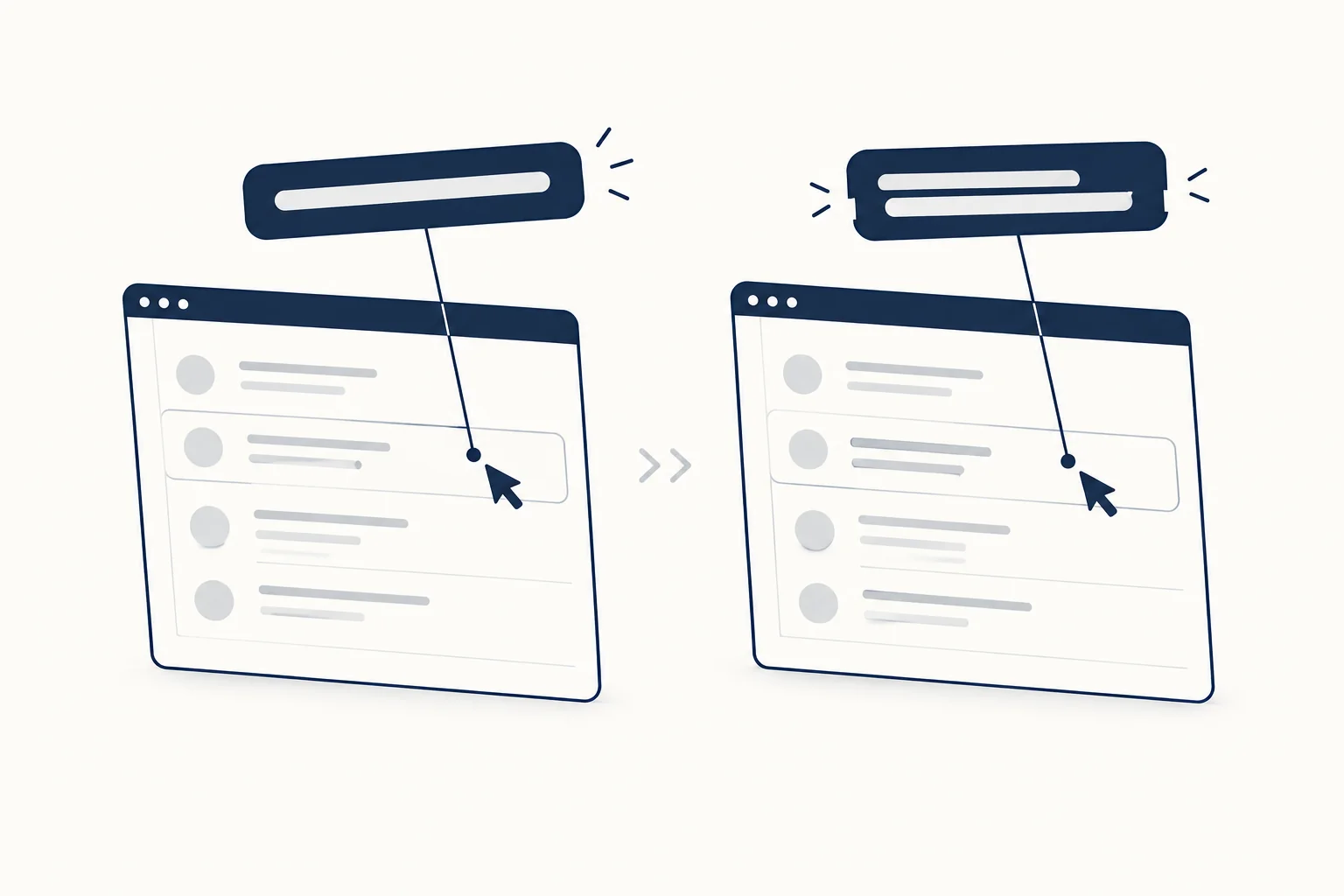
Before choosing an effect, set the criteria. Use these to review any text hover effect, ours included:
- Readable at every frame. The label is legible at rest, mid-transition and at the end. No moment where it is missing, clipped or half-replaced for long.
- Contrast in both states. Body-size text needs 4.5:1 against its background in the resting and hovered state (WCAG 1.4.3).
- No layout shift. The effect does not change the size of the box, so surrounding text does not jump.
- Focus gets the same state. Every
:hoverrule has a:focus-visibletwin. - Short. Hover feedback should finish while the pointer is still there. A few hundred milliseconds is plenty.
- One reading for screen readers. Duplicated or split text is hidden from the accessibility tree, and the name stays a normal word.
- A reduced-motion version. The state change stays; the travel goes.
A gallery of hover text effects, with the code
Underline that draws in
.link {
  color: inherit;
  text-decoration: none;
  background: linear-gradient(currentColor, currentColor) left bottom / 0% 2px no-repeat;
  transition: background-size 250ms ease;
}
.link:hover,
.link:focus-visible { background-size: 100% 2px; }
The text never moves, so it is the safest effect in the list. Keep a second cue for links inside paragraphs (color alone is not enough to identify a link), or keep a thin static underline and draw a thicker one on hover.
Color fill that sweeps across
.fill {
  color: transparent;
  background: linear-gradient(90deg, #192c46 50%, #6b7280 50%) right / 200% 100% no-repeat;
  -webkit-background-clip: text;
  background-clip: text;
  transition: background-position 400ms ease;
}
.fill:hover,
.fill:focus-visible { background-position: left; }

@media (forced-colors: active) {
  .fill { color: LinkText; background: none; }
}
The text is drawn by its clipped background, so both colors must pass contrast on their own. The forced-colors block hands the text back to the system colors in high contrast modes (MDN).
Rolling label
<a class="roll" href="/work">
  <span class="roll__inner">
    <span>Work</span>
    <span aria-hidden="true">Work</span>
  </span>
</a>
.roll { display: inline-block; overflow: hidden; height: 1.2em; line-height: 1.2; }
.roll__inner { display: flex; flex-direction: column; transition: transform 300ms ease; }
.roll:hover .roll__inner,
.roll:focus-visible .roll__inner { transform: translateY(-50%); }
The second copy is aria-hidden, so the link is still announced as "Work" once. Use a real element instead of content: attr() on a pseudo-element, because generated content can be read aloud. The Interactive Hover Button is a refined version of this idea: the resting label slides out while an inverse-color copy with an arrow slides in, the two are never legible at the same time, and keyboard focus drives the same transition. It is CSS transitions only, so the export is markup and one stylesheet.
Letters that shift one by one
Splitting a word into one <span> per letter allows a staggered lift with transition-delay: calc(var(--i) * 25ms). The risk is that some screen readers then read the word letter by letter. Put aria-label="About" on the link and aria-hidden="true" on the wrapper of the letter spans, so the visual is split but the name is not.
Scramble, then settle
<a class="scramble" href="/pricing" aria-label="Pricing">
  <span aria-hidden="true" data-text="Pricing">Pricing</span>
</a>
const glyphs = 'ABCDEFGHIJKLMNOPQRSTUVWXYZ';
const reduce = matchMedia('(prefers-reduced-motion: reduce)');

function scramble(span, duration = 400) {
  if (reduce.matches || span.dataset.running) return;
  span.dataset.running = 'true';
  const text = span.dataset.text;
  const start = performance.now();

  function frame(now) {
    const progress = Math.min((now - start) / duration, 1);
    const settled = Math.floor(progress * text.length);
    span.textContent = [...text]
      .map((ch, i) => (i < settled || ch === ' ' ? ch : glyphs[Math.floor(Math.random() * glyphs.length)]))
      .join('');
    if (progress < 1) requestAnimationFrame(frame);
    else delete span.dataset.running;
  }
  requestAnimationFrame(frame);
}

document.querySelectorAll('.scramble').forEach((link) => {
  const span = link.querySelector('[data-text]');
  link.addEventListener('pointerenter', () => scramble(span));
  link.addEventListener('focus', () => scramble(span));
});
Letters settle from left to right, and the final frame is always the real word. Random capitals are wider than most lowercase letters in proportional fonts, so use a monospace face or give the span a fixed width, or the link will jitter and push its neighbors. Keep scramble for short labels; it is the least readable effect here while it runs.
Effects to keep away from text people must read
- Weight changes on hover. Switching
font-weightmakes the word wider and reflows the line. If you want a bolder hover, reserve the width, or use a variable font with a grade (GRAD) axis, which makes letters bolder without changing their width or the line breaks. - Labels that only appear on hover. Icon-only navigation that reveals its words on hover leaves touch users with icons and nothing else.
- Blur or fade below readable contrast. A blurred resting state fails the "readable at every frame" test by design.
- Physics on functional text. Falling Text drops words when hovered and lets people drag them, with a keyboard replay and a readable reduced-motion state. That suits a playful hero line, not navigation or instructions.
Respect reduced motion
@media (prefers-reduced-motion: reduce) {
  .link, .fill, .roll__inner, .card__caption { transition-duration: 1ms; }
}
The hovered state still appears, so the feedback survives, but nothing travels. prefers-reduced-motion reflects an operating system setting, and the scramble script above already checks it.
A five-minute test before shipping
- Tab through the page: every hover state appears on focus, and Escape closes tooltips.
- Open it on a phone: no information is stuck behind a hover.
- Zoom to 200%: tooltips and captions do not cover the text they describe.
- Run a screen reader over the links: each name is read once, as a word.
- Turn on reduced motion and a high contrast mode: states still change and text stays visible.
Common questions
How do you make text appear on hover? Keep the text in the HTML, hide it with opacity or visibility inside @media (hover: hover), and reveal it on :hover and :focus-visible. For a description of a control, use a tooltip with role="tooltip" and aria-describedby.
What is hover text? On websites, it is text that appears when the pointer rests on an element, such as a tooltip or a caption. On a Mac, Hover Text is also an accessibility feature that enlarges the text under the pointer.
How do I turn on Hover Typing? On a Mac, open System Settings, then Accessibility, then Hover Text, and turn on Hover Typing. Press Escape to hide its window for a moment.
Where to start
Browse the text animations collection at HorizonX text animations for editable starting points, then apply the criteria above to whatever you pick. For entrance animations rather than hover, read Text Reveal Effects: Keep the Message Understandable Without Motion.