
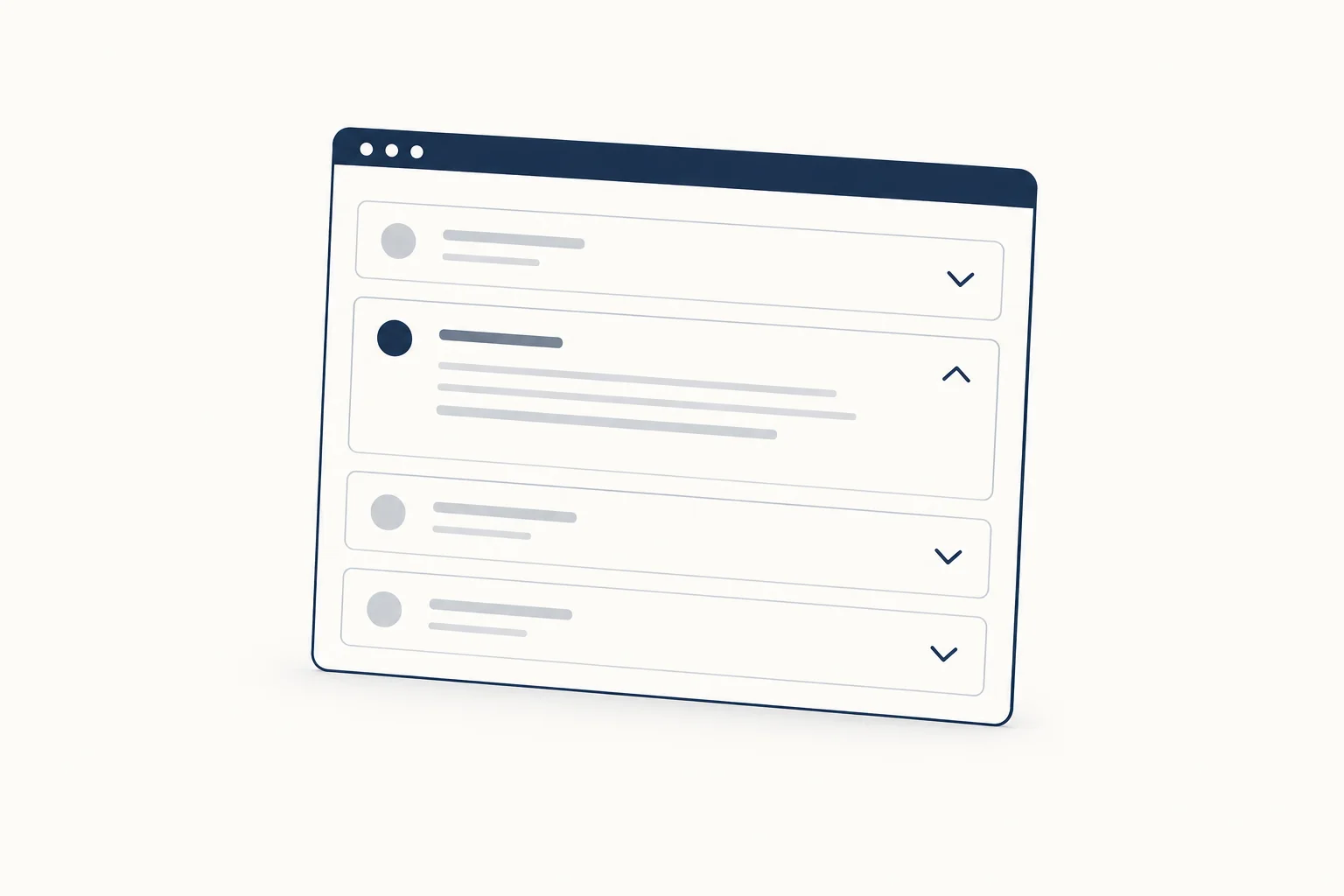
A Tailwind accordion is a stack of headers that each show or hide a panel. The fastest accessible version uses native <details> and <summary> elements, styled with Tailwind's open: and group-open: variants and grouped with the name attribute so only one panel opens at a time. Use a button pattern when you need heading semantics or framework state.
Both versions below are copy-paste ready, work with Tailwind CSS v4 utilities, and follow the WAI-ARIA Authoring Practices accordion pattern where it applies. If you would rather start from finished, styled sections, the Tailwind UI kits collection on HorizonX gathers the coded kits we publish for Tailwind projects.
What an accordion is in UI
An accordion is a vertically stacked set of headers. Each header controls one panel of content, and activating it expands or collapses that panel. The APG describes it as interactive headings that reveal sections of content, which is why FAQ pages, settings screens and long product specs use it so often.
Two terms get mixed up:
- Disclosure: one button that shows or hides one region. The APG disclosure pattern covers it.
- Accordion: a group of disclosures with a shared structure. Some accordions allow several panels open at once; others close the previous panel when a new one opens.
Native <details> is a disclosure. Several of them in a row, styled consistently, behave as an accordion. Since the name attribute arrived, they can also behave as an exclusive accordion.
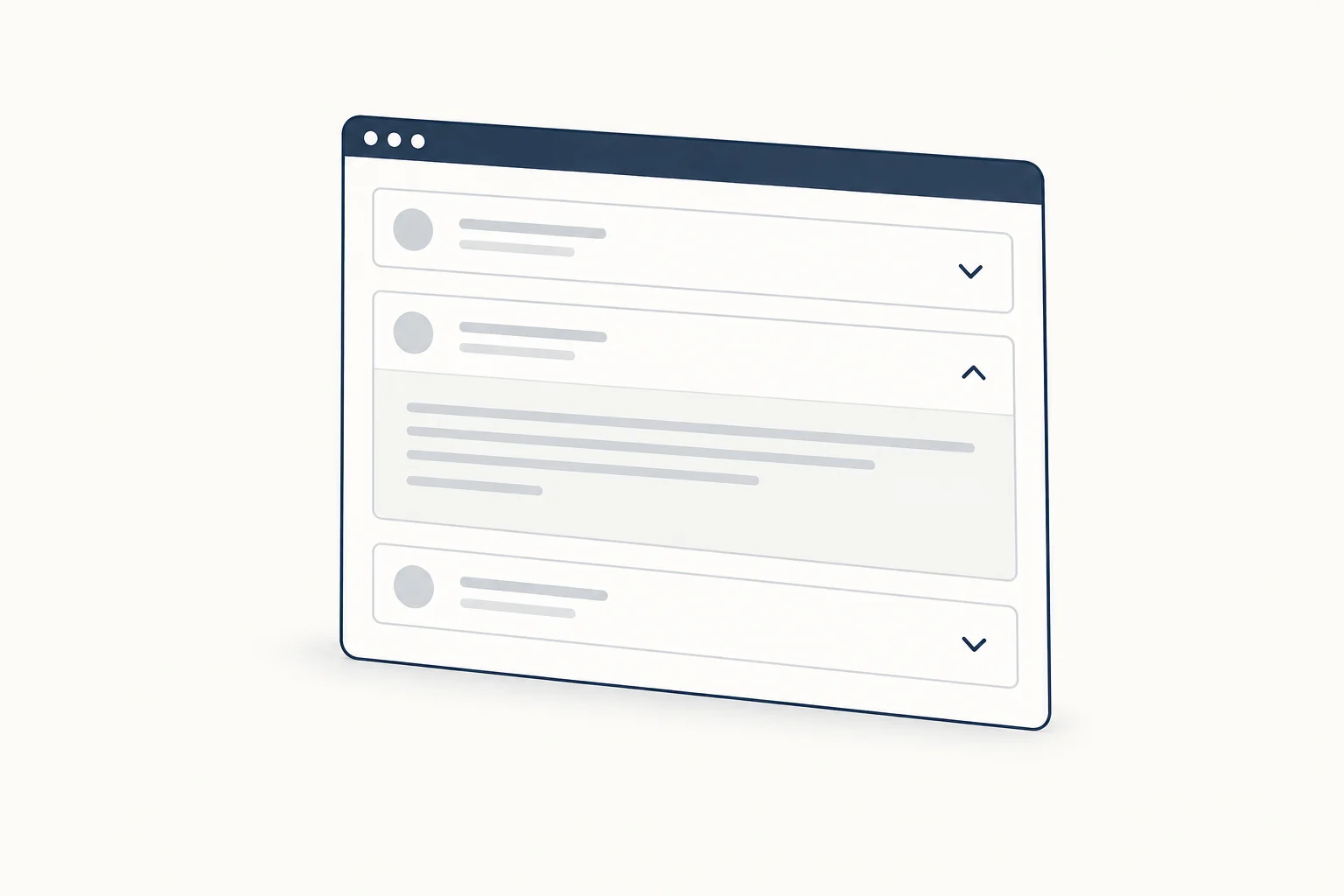
Option 1: native details and summary with Tailwind
This version needs no JavaScript. The browser handles keyboard activation (Enter and Space on the summary), focus and the open state.
<div class="mx-auto max-w-2xl divide-y divide-slate-200 rounded-xl border border-slate-200 bg-white">
  <details name="faq" class="group" open>
    <summary class="flex cursor-pointer list-none items-center justify-between gap-4 px-5 py-4 font-medium text-slate-900 focus-visible:outline-2 focus-visible:outline-offset-2 focus-visible:outline-slate-900 [&::-webkit-details-marker]:hidden">
      How long does shipping take?
      <svg aria-hidden="true" viewBox="0 0 16 16" fill="none" stroke="currentColor" stroke-width="2" class="size-4 shrink-0 transition-transform duration-200 group-open:rotate-180 motion-reduce:transition-none"><path d="M4 6l4 4 4-4" /></svg>
    </summary>
    <div class="px-5 pb-4 text-slate-600">
      <p>Orders leave the warehouse within two business days.</p>
    </div>
  </details>
  <details name="faq" class="group">
    <summary class="flex cursor-pointer list-none items-center justify-between gap-4 px-5 py-4 font-medium text-slate-900 focus-visible:outline-2 focus-visible:outline-offset-2 focus-visible:outline-slate-900 [&::-webkit-details-marker]:hidden">
      Can I change my order?
      <svg aria-hidden="true" viewBox="0 0 16 16" fill="none" stroke="currentColor" stroke-width="2" class="size-4 shrink-0 transition-transform duration-200 group-open:rotate-180 motion-reduce:transition-none"><path d="M4 6l4 4 4-4" /></svg>
    </summary>
    <div class="px-5 pb-4 text-slate-600">
      <p>Yes, until it ships. Reply to your confirmation email.</p>
    </div>
  </details>
</div>
The sample answers are placeholders. What each class does:
list-noneand[&::-webkit-details-marker]:hiddenremove the default triangle so your own chevron is the only indicator.groupon<details>plusgroup-open:rotate-180on the icon rotates the chevron when the panel is open. Tailwind documentsgroup-*variants and theopenvariant in its states guide.focus-visible:outline-*keeps a visible keyboard focus ring on the summary.motion-reduce:transition-nonedrops the rotation animation for people who ask for reduced motion.
Exclusive panels with the name attribute
Give every <details> in the group the same name value and the browser keeps only one open. MDN describes it as a way to build accordions without scripting. Support per MDN browser compatibility data, checked 2026-10-09: Chrome and Edge 120, Firefox 130, Safari 17.2 (see also Can I use). Older browsers ignore the attribute and simply allow several panels open, which is a safe fallback.
Animating the height (progressive enhancement)
Height animation is optional. The ::details-content pseudo-element targets the panel, and interpolate-size lets the browser transition to auto:
@media (prefers-reduced-motion: no-preference) {
  .accordion {
    interpolate-size: allow-keywords;
  }
  .accordion details::details-content {
    block-size: 0;
    overflow-y: clip;
    transition: block-size 0.25s ease, content-visibility 0.25s allow-discrete;
  }
  .accordion details[open]::details-content {
    block-size: auto;
  }
}
Add class="accordion" to the wrapper. Support checked 2026-10-09 in MDN data: ::details-content works in Chrome 131, Firefox 143 and Safari 18.4, while interpolate-size is Chromium only (129 and later). Elsewhere the panel opens instantly, which is fine.
Option 2: the APG button pattern with Tailwind
Use this when the headers must be real headings in the page outline, when the open state lives in a framework, or when you need to read and set it from code. The APG asks for a button inside a heading, aria-expanded on the button, and aria-controls pointing to the panel.
<div data-accordion data-single class="mx-auto max-w-2xl divide-y divide-slate-200 rounded-xl border border-slate-200 bg-white">
  <h3>
    <button type="button" data-accordion-trigger aria-expanded="true" aria-controls="panel-billing" id="trigger-billing" class="group flex w-full items-center justify-between gap-4 px-5 py-4 text-left font-medium text-slate-900 focus-visible:outline-2 focus-visible:outline-offset-2 focus-visible:outline-slate-900">
      Billing
      <svg aria-hidden="true" viewBox="0 0 16 16" fill="none" stroke="currentColor" stroke-width="2" class="size-4 shrink-0 transition-transform group-aria-expanded:rotate-180 motion-reduce:transition-none"><path d="M4 6l4 4 4-4" /></svg>
    </button>
  </h3>
  <div id="panel-billing" role="region" aria-labelledby="trigger-billing" class="px-5 pb-4 text-slate-600">
    <p>Invoices are sent on the first day of each month.</p>
  </div>
  <h3>
    <button type="button" data-accordion-trigger aria-expanded="false" aria-controls="panel-team" id="trigger-team" class="group flex w-full items-center justify-between gap-4 px-5 py-4 text-left font-medium text-slate-900 focus-visible:outline-2 focus-visible:outline-offset-2 focus-visible:outline-slate-900">
      Team members
      <svg aria-hidden="true" viewBox="0 0 16 16" fill="none" stroke="currentColor" stroke-width="2" class="size-4 shrink-0 transition-transform group-aria-expanded:rotate-180 motion-reduce:transition-none"><path d="M4 6l4 4 4-4" /></svg>
    </button>
  </h3>
  <div id="panel-team" role="region" aria-labelledby="trigger-team" class="px-5 pb-4 text-slate-600" hidden>
    <p>Owners can invite and remove members from Settings.</p>
  </div>
</div>
function setPanel(button, open) {
  button.setAttribute('aria-expanded', String(open));
  const panel = document.getElementById(button.getAttribute('aria-controls'));
  if (panel) panel.hidden = !open;
}

document.querySelectorAll('[data-accordion]').forEach((root) => {
  const single = root.hasAttribute('data-single');
  const triggers = root.querySelectorAll('[data-accordion-trigger]');
  triggers.forEach((button) => {
    button.addEventListener('click', () => {
      const isOpen = button.getAttribute('aria-expanded') === 'true';
      if (single && !isOpen) {
        triggers.forEach((other) => {
          if (other !== button) setPanel(other, false);
        });
      }
      setPanel(button, !isOpen);
    });
  });
});
A native <button> already responds to Enter and Space and sits in the Tab order, which covers the keyboard behavior the APG lists (Enter or Space to toggle, Tab and Shift + Tab to move). Remove data-single to let several panels stay open. group-aria-expanded:rotate-180 uses Tailwind's built-in aria-expanded variant to rotate the icon. The role="region" wrapper is optional; the APG suggests leaving it out when more than about six panels can be open at once, to avoid a pile of landmark regions.
If users need to find text inside closed panels with the browser's find command, hidden="until-found" opens a panel when a match is inside it. MDN data lists it in Chrome 102, Firefox 148 and Safari 26.2 (Safari with a scrolling bug), so treat it as an enhancement.
Which version to pick
| Need | details and summary | Button pattern |
|---|---|---|
| Works without JavaScript | Yes | No |
| One panel open at a time | name attribute |
data-single in the script |
| Headers in the heading outline | Heading inside <summary>, with spacing quirks MDN notes |
Yes, button inside a heading |
| State controlled by React, Vue or Svelte | Possible, awkward | Natural fit |
| Height animation | ::details-content, Chromium for auto |
Your own CSS or a library |
For marketing FAQs and docs, the native version is usually enough. For app settings and anything driven by data, the button pattern is easier to keep in sync.
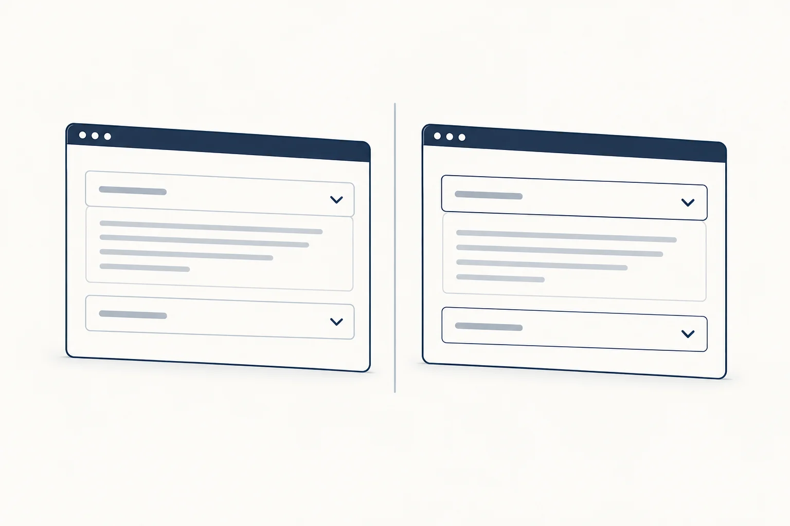
Are accordions good in UX?
They help when people need only a few sections of a long page, and they hurt when people need most of it. Nielsen Norman Group's guidance on accordions notes that they shorten pages and reduce scrolling, but lower content visibility and add interaction cost. Their advice: use them on content-heavy pages where users will not need several sections, and plan for printing with an Expand all control or panels that open at print time.
A few practical rules follow from that:
- Write header labels that predict the content. A vague label forces people to open every panel.
- Do not hide information that most visitors need, such as prices or key limits.
- Keep the first panel open when it answers the most common question.
- Keep links and buttons out of
<summary>. Clicking the summary already toggles the panel, so a nested control competes with it.
Horizontal and gallery accordions
Search results for accordion UI also include horizontal variants, where panels expand sideways. HorizonX has one as an editable tool: Accordion Gallery, an expanding-cards image gallery with arrow key, Home and End navigation, a visible focus ring and a still pose for reduced motion. It exports a self-contained HTML file rather than Tailwind classes, so treat it as the image-gallery cousin of the FAQ pattern above, not a drop-in replacement.
If you are choosing between tabs and an accordion for a features section, our feature section grid and tabs walkthrough covers the tab side of that decision. For React projects that prefer a library component, the React and Tailwind component library comparison lists the options.
FAQ
What does "accordion" mean on a website?
It is a list of headings that open and close the content beneath them. On a website it usually holds FAQs, specifications or settings so the page stays short until the reader asks for more.
What is an accordion in Bootstrap?
Bootstrap ships an Accordion component that uses its Collapse JavaScript plugin internally, according to the Bootstrap 5.3 documentation. The Tailwind versions above produce the same visual result without a component framework.
Ship it
Start with native <details> and the name attribute, add the height animation as an enhancement, and switch to the button pattern when the accordion is part of an application. For styled Tailwind sections to pair it with, browse the Tailwind UI kits collection.