
The dashboard problem nobody talks about
Every SaaS product eventually builds a dashboard. And most of them look exactly the same: a sidebar, some charts, a table, maybe a notification bell. The result? Users log in, glance at numbers they don't understand, and leave.
The real cost isn't the design time — it's the churn. A confusing dashboard is the number one reason users downgrade or cancel within the first 30 days.
This isn't about making things "pretty." It's about designing information architecture that drives the behavior you want.
What separates high-converting dashboards
After analyzing dozens of premium SaaS interfaces — including concepts like Mosk and VitalSync — three patterns emerge consistently in the ones that retain users:
1. Progressive disclosure over information overload
The worst dashboards show everything at once. The best ones show exactly what the user needs at each stage of their journey.
First login: Onboarding metrics and setup progress. Nothing else. Week one: Core KPIs with trend indicators. One suggested action. Month one: Full analytics with comparative periods and drill-downs.
This isn't about hiding features — it's about sequencing them. Users who feel overwhelmed in the first session rarely come back for the second.
2. Visual hierarchy that guides the eye
Premium dashboards use contrast, spacing, and color with surgical precision:
- Primary metrics get the largest type, highest contrast, and top-left positioning
- Secondary data uses muted colors and smaller containers
- Actions are visually distinct from information — buttons don't compete with charts
- Status indicators use semantic color (not decorative color) so users can scan in under 2 seconds
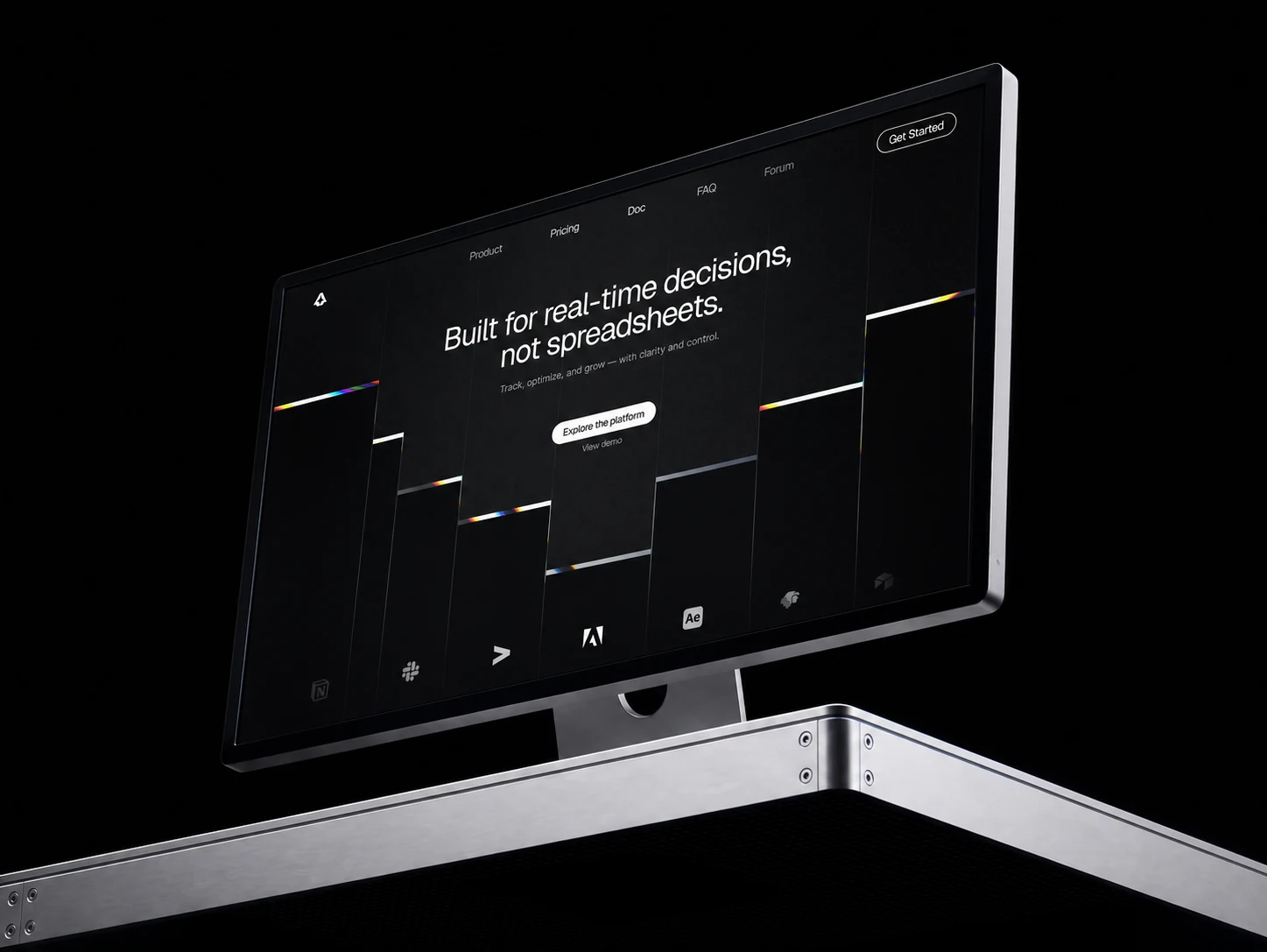
The Mosk dashboard concept demonstrates this well: dark background creates natural depth, gradient accents draw attention to actionable metrics, and analytics cards use consistent sizing that makes comparison effortless.
3. Density without clutter
There's a difference between "dense" and "cluttered." Dense means more information per pixel. Cluttered means the user can't find what matters.
The trick is consistent spacing systems:
- Use a 4px or 8px grid — never mix
- Cards should have uniform internal padding
- Group related metrics visually (proximity principle)
- Use dividers sparingly — white space is a better separator
The anatomy of a converting dashboard
Here's the framework we use when designing SaaS dashboards:
Header zone (top 80px)
- Product name or logo (minimal)
- Global search
- User avatar + quick settings
- One primary CTA (upgrade, create, invite)
KPI strip (next 120px)
- 3-5 key metrics in card format
- Each card: metric name, current value, trend arrow, comparison period
- Use sparklines for context, not full charts
Action zone (main content)
- The core workflow the user came to do
- Tables with inline actions
- Charts that answer specific questions (not just "show data")
- Empty states that guide toward first value
Context sidebar (optional, right)
- Activity feed
- Quick links to recent items
- Notifications or tasks
Dark mode isn't just aesthetic — it's functional
The shift toward dark interfaces in SaaS isn't about following trends. Dark backgrounds offer measurable UX advantages for data-heavy interfaces:
- Reduced eye strain during extended sessions (analytics, monitoring)
- Better contrast ratios for charts and data visualizations
- Natural depth perception — dark containers on dark backgrounds create layering without borders
- Professional perception — users associate dark UIs with premium, enterprise-grade software
Concepts like VOLTARA and Atomic show how dark design systems can maintain readability while creating a visually striking experience.
Common dashboard design mistakes
Mistake 1: Chart-first thinking
Charts are tools, not decorations. Every chart should answer a specific question. If you can't articulate the question, you don't need the chart.
Mistake 2: Ignoring mobile
Over 40% of SaaS users check dashboards on mobile at least once a week. Your dashboard needs a responsive strategy, not just a "it kinda works on small screens" approach.
Mistake 3: One dashboard for all user types
Admins, managers, and individual contributors need different views. Role-based dashboard variants aren't a luxury — they're a conversion lever.
Mistake 4: No loading states
Skeleton screens, progressive loading, and optimistic UI aren't polish — they're the difference between a dashboard that feels fast and one that feels broken.
Building your dashboard design system
The fastest path to a consistent, high-quality dashboard is starting with a component library rather than designing from scratch. Premium UI kits give you:
- Pre-built chart components with consistent styling
- Card systems with standardized spacing and typography
- Table components with sorting, filtering, and pagination patterns
- Form elements that match the dashboard aesthetic
- Dark and light mode variants out of the box
At HorizonX, we publish design concepts that serve as both inspiration and starting points for production dashboards. Each concept includes the visual language — typography, color system, component patterns — that you can adapt to your product.
The metrics that matter
A dashboard redesign isn't done when it "looks good." Track these metrics to validate your design decisions:
- Time to first meaningful action — how long before a new user does something valuable
- Session depth — are users exploring beyond the landing view?
- Feature discovery rate — are users finding the features you built?
- Support ticket volume — confused users create tickets, clear dashboards reduce them
- Net Promoter Score — directly correlated with perceived product quality, which dashboards heavily influence
Start with inspiration, build with intention
The best SaaS dashboards aren't designed in a vacuum. They're built by studying what works, understanding why it works, and adapting those patterns to your specific users and data.
Browse premium dashboard concepts on HorizonX Explore to see how leading designers approach information architecture, visual hierarchy, and interaction patterns. Then take those principles and make them yours.
The dashboard is often the first thing your users see every day. Make it worth their time.