The real cost of "free"
Every designer has been there: a new project lands, the deadline is tight, and you need a component library fast. You search Figma Community, find a free UI kit with 10,000 installs, and start building.
Three days later, you've spent more time fixing inconsistencies, adjusting spacing, and replacing placeholder icons than you would have spent designing from scratch.
Free UI kits have a place. But understanding when they cost more than they save is a career-level skill.
What you're actually paying for in premium kits
The price tag on a premium UI kit isn't for the pixels. It's for the decisions embedded in those pixels:
1. Typographic system design
Free kits typically use one or two font sizes and call it a day. Premium kits include:
- A complete type scale (6-8 sizes with defined line heights and letter spacing)
- Responsive type that adjusts for viewport
- Consistent application rules (when to use which size, weight, and color)
- Tested readability across devices and screen densities
This alone saves 4-8 hours per project — time you'd spend establishing your own type system.
2. Component depth
The difference between a free button component and a premium one isn't visual. It's architectural:
Free button component: - 2-3 variants (primary, secondary, maybe outlined) - Fixed sizing - No loading, disabled, or icon states - Manual color overrides
Premium button component: - 6+ variants with semantic naming - Multiple sizes (xs through xl) - Loading state with spinner - Icon support (leading, trailing, icon-only) - Disabled state with proper cursor and opacity - Focus ring for accessibility - Dark and light mode support - Auto-layout for responsive text
Multiply this depth across 40-60 components and the value becomes clear.
3. Consistency guarantees
In a premium kit, every component shares the same spacing system, color tokens, border radius scale, and shadow values. Change a design token and the entire system updates.
Free kits rarely have this level of systematization. Components are often contributed by different designers with different conventions, leading to subtle inconsistencies that accumulate.
4. Dark mode as a first-class citizen
Most free kits that claim "dark mode support" actually have a separate set of components with hardcoded dark colors. Premium kits use proper design token architecture — switch a mode variable and every component adapts.
When free UI kits make sense
Free isn't always wrong. Here's when it's the right choice:
- Learning projects — you're studying component architecture, not shipping to users
- Internal tools — the audience is small and tolerant of rough edges
- Hackathons and MVPs — speed matters more than polish, and you'll redesign before launch
- Single-component needs — you need one specific pattern (a pricing table, a chart card) and don't need a full system
When premium pays for itself
The math changes when any of these are true:
Client-facing work
If you bill by the hour, premium kits compress your timeline. A $79 kit that saves 20 hours at $100/hour has an ROI of 25x. Even at half that estimate, it's 12.5x.
Consistency-critical projects
Design systems, multi-page apps, and products with multiple designers need consistent foundations. Building consistency from scratch takes weeks; a premium kit provides it on day one.
Dark + light mode requirements
Implementing proper dual-mode design from scratch is a 40-80 hour investment. A premium kit with tokenized dark mode cuts that to configuration time.
Brand differentiation needs
The biggest hidden cost of free kits: everyone else is using the same ones. When your SaaS dashboard looks identical to three competitors because you all started with the same Community kit, you've lost before users even try your product.
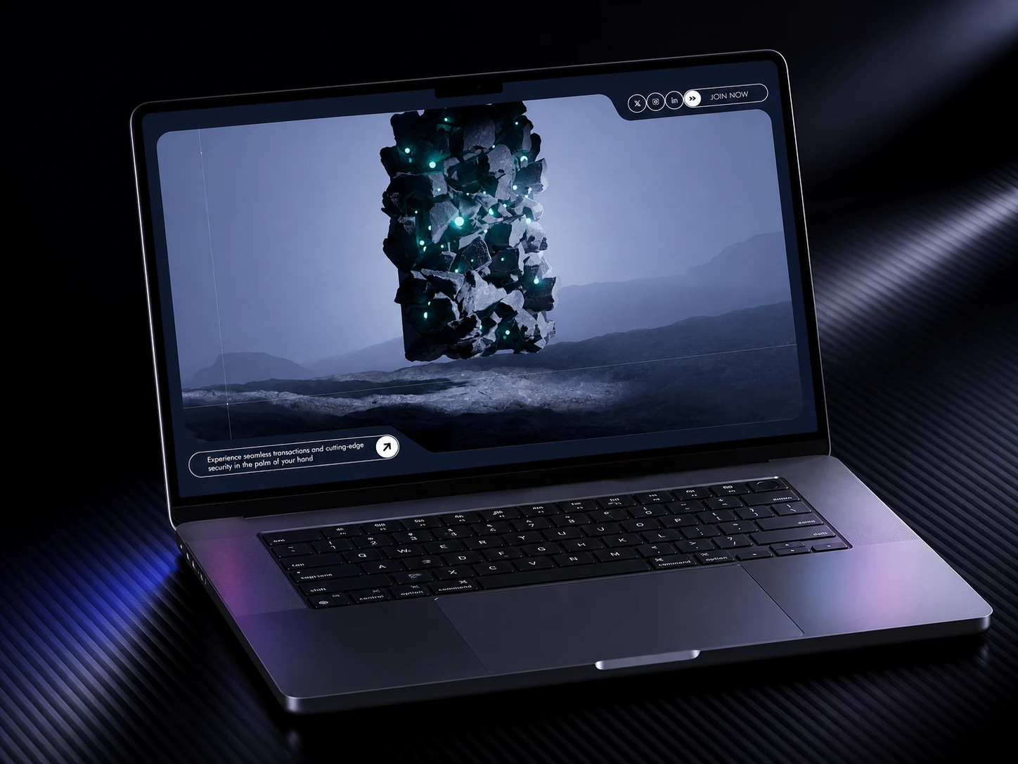
Premium concepts offer unique visual languages. HorizonX concepts each have a distinct design personality — from the editorial elegance of Hemlt to the analytical precision of Mosk — that no one else is shipping.
How to evaluate UI kit quality
Whether free or premium, here's the checklist:
Structure
- [ ] Uses auto-layout (not fixed positioning)
- [ ] Components use variants, not duplicated frames
- [ ] Design tokens defined as Figma variables (not hardcoded values)
- [ ] Consistent naming convention across all components
- [ ] Pages organized logically (foundations → components → templates)
Depth
- [ ] Each component has all necessary states (default, hover, active, disabled, focus, error)
- [ ] Responsive variants or clear responsive guidelines
- [ ] Both dark and light mode via token switching
- [ ] Loading/skeleton states for data-dependent components
- [ ] Empty states for lists, tables, and content areas
Typography
- [ ] Complete type scale with line heights
- [ ] Font pairing rationale documented
- [ ] Tested readability at small sizes
- [ ] Consistent application across components
Documentation
- [ ] Usage guidelines for each component
- [ ] Do's and don'ts
- [ ] Spacing and layout rules
- [ ] Color usage guidelines
- [ ] Accessibility considerations
The hidden multiplier: inspiration value
Beyond the practical time savings, premium UI kits serve as design education. Studying how a senior designer structures a component system, handles edge cases, and makes trade-offs teaches patterns you'll apply across every future project.
When you open a concept like VIBRAM or Rabbit on HorizonX, you're not just getting components — you're getting a masterclass in design decision-making.
Making the call
The decision framework is simple:
- Will this ship to real users? → Consider premium
- Does the project need dark mode? → Strongly consider premium
- Are multiple designers collaborating? → Premium almost always pays off
- Is this a learning exercise or hackathon? → Free is fine
- Do you bill for design time? → Premium is a no-brainer investment
The best designers treat UI kits as tools, not crutches. Start with quality foundations, then customize and extend. The time you save on implementation is time you can spend on the design decisions that actually matter — the ones that make your product uniquely valuable to your users.