
Definition
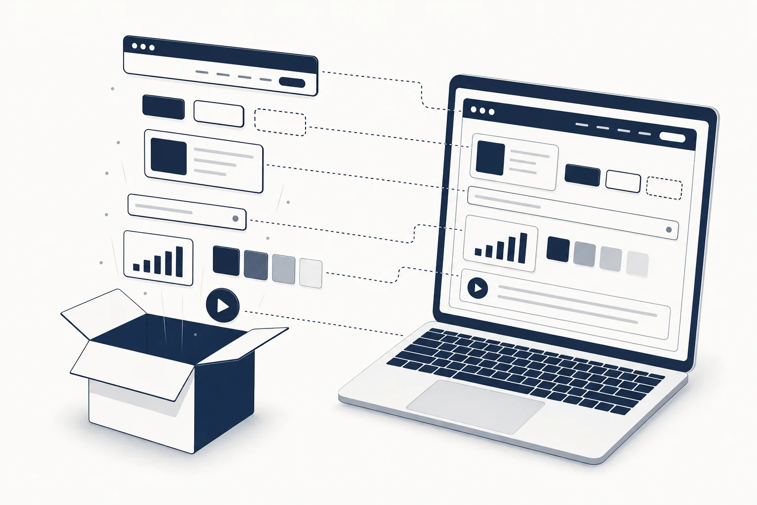
A coded UI kit is a set of interface pieces (components, sections, full pages, sometimes an entire product shell) delivered as source code you can run, in a specific stack such as React + Tailwind, SvelteKit, or plain HTML + CSS + JS. It is the same idea as a Figma UI kit, with one difference that changes everything: the deliverable is the interface itself, not a picture of it.
Where a Figma kit ends at "approved", a coded kit ends at "deployed".
What is inside a coded UI kit
A serious one ships, at minimum:
- Tokens: colours, type scale, spacing, radii, shadows, expressed as CSS variables or a Tailwind config so the whole kit restyles from one place.
- Components: buttons, inputs, cards, navigation, with their states (hover, focus, disabled, loading, error) implemented, not just drawn.
- Sections or blocks: hero, features, pricing, testimonials, footer, composed from the components.
- Pages: complete landings, dashboards or flows that show the components working together with real layout and responsive behaviour.
- Motion: entrance choreography, scroll effects, micro-interactions, wired with GSAP, Motion, or CSS.
- Assets: fonts, icons, imagery, in web-ready formats.
- A way to run it: a project you can
pnpm dev, or a single HTML file you can open.
The difference between a kit and a random folder of components is coherence. Everything in a kit was designed together by one hand, so it looks like one product.
Coded UI kit vs Figma UI kit vs component library
These three get confused constantly, so here is the split.
| Figma UI kit | Component library | Coded UI kit | |
|---|---|---|---|
| Format | Design file | npm package or copy-in source | Source code you run |
| Unit | Frames and components | Primitives (button, dialog) | Sections and pages, plus primitives |
| Look | Whatever the kit's designer chose | Usually neutral, you restyle | Art-directed, you adapt |
| Responsive and states | Drawn if the designer bothered | Implemented for primitives | Implemented for whole pages |
| Motion | Prototyped at best | Rarely | Usually built in |
| Who consumes it | Designers, then devs | Developers | Developers, vibe coders, designers who ship |
| Where it stops | Approval | Assembly | Deployment |
Component libraries (shadcn/ui, HeroUI, Tailwind Plus) are the foundation you build a look on. Coded UI kits are the look, already built. We compare the libraries themselves in Best React + Tailwind component libraries in 2026.
When a coded kit is the right call
- The design is decided and the deadline is close. You edit content in the browser and ship. See the decision rule in Figma templates vs coded components.
- You are the only developer. A coded kit gives you responsive behaviour, states and motion that would otherwise take you the week.
- You are working with an AI builder. Cursor, v0, Lovable and Bolt extend existing code far better than they invent taste. A coded kit is the constraint that keeps their output consistent, which is the argument of the vibecoding guide.
- The brief is "make it feel expensive". Motion and typography are where AI and neutral libraries fall down, and where an art-directed kit already did the work.
When it is not
- The direction still needs debate. Reach for a Figma kit; iteration is cheaper there.
- Your stack is fixed and the kit's is not it. A React kit in a Vue shop is a port, not a shortcut. Prefer kits shipped as HTML + CSS + JS, which port anywhere.
- You are building a design system, not a product. Then you want primitives (a component library) and a token strategy, not finished pages.
Examples of coded UI kits in practice
From the HorizonX catalogue, to make the definition concrete:
- Full landing pages: Velto (Next.js 16 + React 19 + Tailwind v4 + GSAP, scroll-scrubbed and bidirectional), Veyra (React + Vite, editorial AI landing), Cinderline (React + Vite portfolio), Velmont (SvelteKit 5 + Tailwind 4 + GSAP).
- Dashboards: BrainX Dashboard (Next.js + React + TypeScript), Verdara and Northloop (HTML + CSS + JS, portable to any stack).
- Hero sections: Aurel Liquid Hero and Eidolon Monolith Hero (React + Vite + GSAP), Synex Wealth Hero (SvelteKit + Tailwind).
- Interactive pieces: the tools are the smallest possible coded kit, a single component you tune live and export as HTML, Svelte or React.
Every one of these ships with its Figma-side counterpart available under the same membership when it exists, which is the point of buying design and code from one source.
How to evaluate a coded UI kit before you buy
- Run the demo on a phone. If the responsive story is bad, nothing else matters.
- Tab through it. Focus states and keyboard order tell you whether states were implemented or drawn.
- Look for tokens. One config or
:rootblock that restyles everything, or a hundred hard-coded hex values. - Check the stack and versions. Tailwind v4 and React 19 today; a kit on Tailwind v2 is a migration.
- Read the license. Client work, number of projects, redistribution. HorizonX includes a commercial license on every paid plan; one-time kits vary.
- Ask what the update cadence is. A static kit is done the day you buy it; a subscription catalogue keeps dropping new pieces monthly.
The premium vs free ROI analysis turns steps 1 to 6 into a cost model if you need to justify the purchase.
FAQ
Is a coded UI kit the same as a template?
Nearly. "Template" usually means one page or one product; "kit" implies a set of pieces that share tokens and can be recombined. Most catalogues, including HorizonX, use both words, and the evaluation checklist above applies to either.
Do coded UI kits work with Tailwind CSS?
Most modern ones are built on it, because Tailwind makes tokens and responsive rules explicit in the markup. Kits also exist as plain CSS, which is easier to port between frameworks.
Can I use a coded UI kit with shadcn/ui?
Yes, and it is a common combination: shadcn for the application primitives, a coded kit for the marketing pages and the visual direction. They only conflict if both try to own the same tokens, so pick one source of truth for colours and type.
Are coded UI kits good input for AI coding tools?
They are the best input. AI builders extend existing, consistent code more reliably than they generate taste from a prompt. Pair the kit with the Vibe Coding UI Specification so the builder also knows the constraints that are not visible in the code.
Does HorizonX sell coded UI kits?
Yes. The catalogue mixes Figma kits, coded pages and components in React, Next.js, SvelteKit and HTML, and interactive tools, under one membership with monthly drops. Start with the React templates and dashboard templates collections, and see plans on the pricing page.