

A portfolio cover should help someone identify the work and decide whether to open the project. Choose a visual that represents your contribution before adding an expressive treatment. A memorable texture is useful only if it does not obscure what the project actually contains.
Start with a plain description of the project, your role and the evidence available. A concept project, a shipped product and a visual experiment should not be presented as interchangeable kinds of work.
Match the cover to the contribution
If your contribution was interface design, show a relevant screen or interaction state. If it was a broader identity system, an editorial composition may communicate the direction more accurately than a small mockup of a website.
Do not select an impressive device mockup that makes the actual work too small to inspect. The frame should support the evidence, not become the main subject. Label conceptual work clearly rather than implying it was commissioned by a real client.
Use texture as a supporting treatment
A texture can connect a series or establish a project's tone. Apply it where it reinforces the subject, and keep an untreated reference available while making the decision.
For a fictional cultural publication, an ASCII or dithered treatment might support the editorial direction. For a financial dashboard, the same treatment could conceal the precision of the interface. The choice should reflect the work, not a uniform effect applied to every cover.
HorizonX's Glyph Study and Marble Signal are resources to inspect for those directions. They are not substitutes for authentic project evidence.
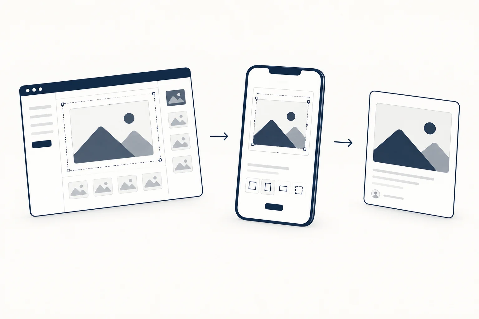
Create consistency through framing
Different projects can share a crop logic, title position and spacing without sharing the same palette or effect. This preserves a recognisable portfolio while allowing each project's identity to remain visible.
Check the covers together as a small grid. One may be too detailed, another too empty, or an unusually bright image may dominate for no meaningful reason. Adjust the composition rather than forcing every project into identical artwork.
Make the destination match the promise
The project page should substantiate what the cover suggests. If the cover presents a polished interface, the case study should explain your role and show the relevant work. Do not use a decorative concept to imply a shipped outcome that the page cannot support.
For additional visual resources, browse the HorizonX library, checking rights and formats for the selected item.

What should survive on mobile?
The project identity, a recognisable focal point and a clear destination. If those disappear when the cover becomes small, simplify it. A portfolio cover is an invitation to inspect the work, not a compressed replacement for the whole case study.