

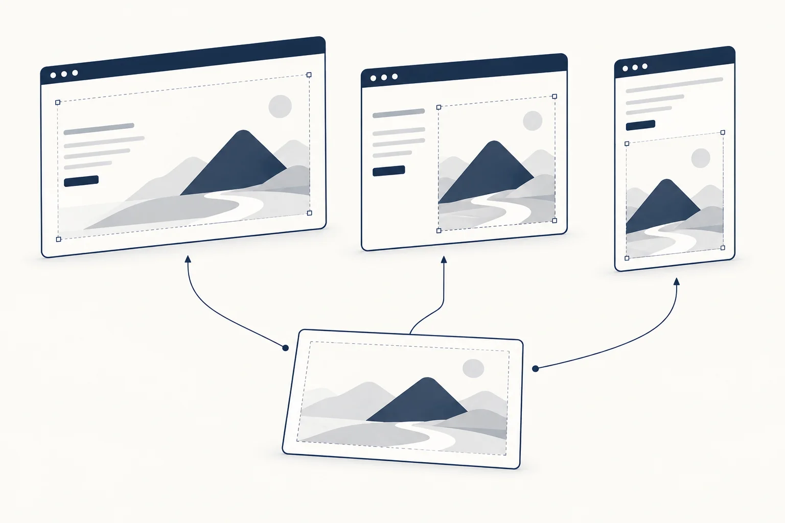
A responsive background is not simply a desktop image made smaller. Preserve the subject, the reading area and the relationship between them at each layout. Sometimes that means a different crop; sometimes it means a separate composition or placing the image beside the text instead of behind it.
Start with the content that must survive. The right crop is the one that supports that content, not necessarily the one that includes the largest portion of the original artwork.
Identify the focal point and the quiet area
For a fictional editorial page, the visual might contain a portrait on the right and a calm field on the left. A narrow crop can accidentally remove the face or move a detailed area behind the heading.
Mark the subject and the intended text region before adjusting the layout. This turns cropping into an explicit design decision rather than a series of guesses about what looks acceptable.
Recompose when the shape changes
A wide composition and a portrait composition organise space differently. Try a mobile version that places the artwork above the copy, or a tighter crop that retains the most recognisable part of the subject.
Do not compensate for a poor crop by shrinking important text. The image serves the message. If the same artwork cannot do that in both layouts, a different crop or simpler mobile visual is a legitimate choice.
Review the actual content length
Use the longest realistic heading and supporting text. A composition approved with a two-word title may fail when the real headline spans several lines.
Check whether the image is decorative or informative. If it contains evidence or a meaningful subject, preserve that information in the narrow version and provide the appropriate textual context. If it is only atmosphere, removing part of it may be harmless.

Inspect the exported artifact
Look at the image in the final page, not just the source editor. File dimensions, compression and the selected crop affect what readers actually see. Record what was reviewed rather than claiming that a large source file guarantees a sharp or lightweight result.
HorizonX's Glyph Study and Tulip Study are possible starting points for composition exercises. Check the individual editor and export options; this article does not assert that alternate crops have already been produced.
Keep a small review set
Review a wide layout, an intermediate layout and a narrow layout with the same real content. Add other sizes when the design reveals a specific problem. The production-readiness checklist can help record the outcome.
Does mobile always need a separate image?
No. Use one image when it preserves the subject and reading area reliably. Create a separate treatment when the composition requires it, not as a routine duplication of every asset.