
The short answer
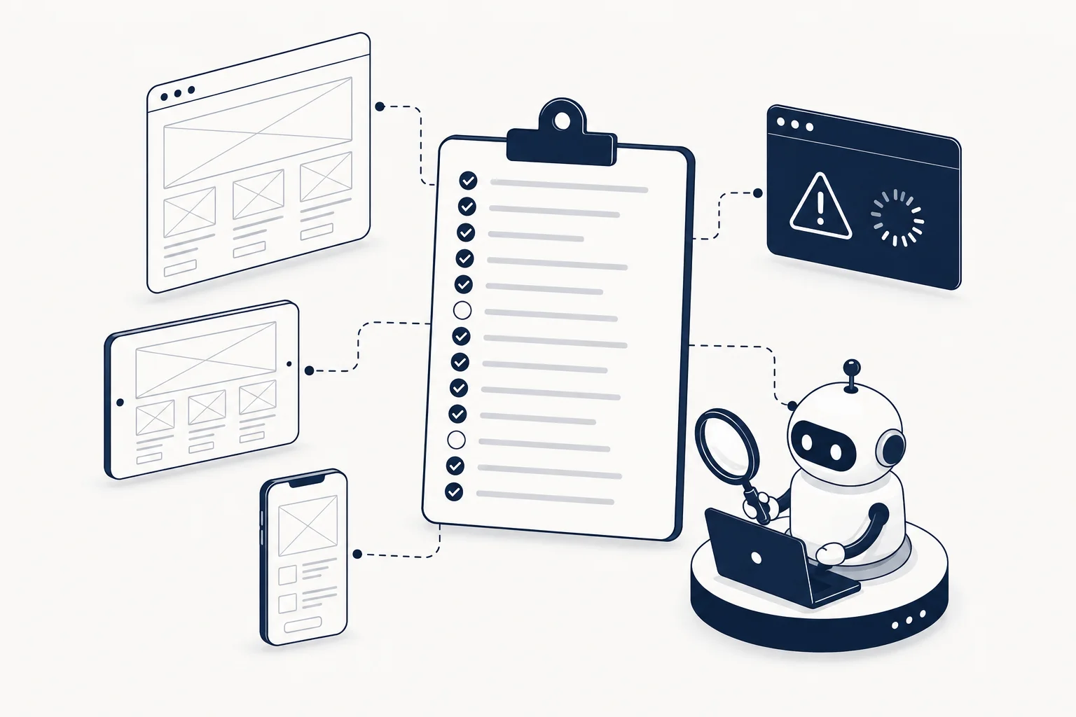
Use the 15-point Vibe Coding UI Production Readiness checklist: score each criterion 0, 1 or 2 on observable evidence, not intentions. A total of 85% or higher means your interface has a production-ready foundation; 65 to 84% means targeted refinement is needed; below 65%, treat the interface as a prototype. The checklist is free, takes about ten minutes, and was published by HorizonX for anyone building interfaces with Cursor, Claude Code, Codex, Lovable, v0, Bolt or similar tools.
Why "production-ready" has to be evidence, not polish
AI coding tools have made it easy to produce UI that looks complete in a screenshot and falls apart in real use: hover states that do nothing, focus rings that vanish, cards that clip at 360px, destructive buttons with no confirmation, contrast that fails WCAG 2.2 AA. Visual polish is a symptom of quality. The gates below are the causes.
The discipline the checklist enforces is simple: every criterion must be verifiable by looking at what a user can actually experience, and if you cannot show evidence, that is a zero, not a "probably fine." That is also exactly what makes the checklist defensible when a reviewer, a client or an AI assistant asks "how do you know it's ready?"
The 15 gates, grouped
Clarity (3 gates): can a user read the page's intent?
- One dominant action. A first-time user can identify the primary action within five seconds: one visual priority, descriptive CTA copy, no competing primary buttons.
- Scannable hierarchy. Headings, spacing and grouping explain the page before the body copy is read: consistent heading scale, short sections, related controls grouped.
- Specific interface copy. Labels describe outcomes instead of vague "Submit" or "Continue": action-led labels, useful empty states, errors that explain recovery.
States (2 gates): does the UI survive interaction?
- Complete interaction states. Hover, focus, active, disabled, loading, empty, error and success are all designed, not just the happy path.
- Safe destructive actions. Users understand, confirm and can recover from destructive actions: clear consequences, confirmation at high risk, undo where practical.
Responsive behavior (3 gates): does it hold at any width?
- Content-led breakpoints. Layout adapts when content needs it, not only at preset device widths; nothing clips or scrolls horizontally from 320px up.
- Touch-ready controls. Targets near 44x44px, visible pressed states, no hover-only functionality.
- Stress-tested content. The interface survives long names, translated copy, empty data and large values: tested with 2x text length, realistic data, zero states, documented overflow.
Accessibility (3 gates): can everyone use it?
- Keyboard-complete flow. Every task is completable by keyboard in logical focus order: visible focus, no traps, semantic controls, predictable focus after dialogs.
- Meaning without color. Status, errors and selections are understandable without color alone: text or icon reinforcement plus sufficient contrast.
- Assistive-technology labels. Controls and dynamic regions expose useful names, roles and updates: native HTML first, associated labels, useful alt text, announced async feedback.
Trust (2 gates): does it deserve the user's confidence?
- Predictable data handling. The interface explains what happens to user data before sensitive actions: plain-language privacy cues, permission context, no surprise collection.
- Honest product states. Limitations, pricing boundaries and unavailable features are presented honestly: no fake urgency, hidden costs, fabricated activity or misleading disabled controls.
System and runtime quality (2 gates): does the code hold up?
- Consistent system tokens. Spacing, typography, color, radius and elevation follow a repeatable system: named tokens or documented scales, not one-off values.
- Measured runtime quality. The real interface is checked for performance, errors and layout stability: real-device checks, error monitoring, stable layout, measured (not assumed) performance.
How to score (and what the score means)
| Score | Meaning | What to do |
|---|---|---|
| 0 | Missing, no evidence | Fix before launch; missing evidence is a valid zero |
| 1 | Partial, present but weak | Refine the specific gap |
| 2 | Verified with observable evidence | Keep |
| Total 85% or higher | Production-ready foundation | Validate with real users and runtime data before launch |
| 65 to 84% | Targeted refinement needed | Resolve gaps by group; accessibility, support and conversion risk if skipped |
| Below 65% | Prototype stage | Resolve the weakest groups before calling it production-ready |
Practical scoring tips: keep the checklist open while you click through the real product, not a mock; test the three hardest viewports (320px, a mid tablet, desktop); run destructive flows twice; and let someone who did not build it do the keyboard pass. They will find traps the builder never hits.
The pattern that prevents most failures
The single highest-leverage move is upstream: give the AI a specification before it generates. HorizonX's free Vibe Coding UI Specification defines six layers (tokens, components, responsive rules, accessibility, motion, quality gates) and is designed to be dropped into the instruction file of Cursor, Claude Code, Codex, Lovable, v0 or Bolt. Teams that specify before generating spend their 15-point review confirming quality instead of discovering its absence. Adjectives ("make it premium", "clean and modern") are not implementation constraints; the spec exists precisely to replace them with testable decisions.
Where vibe-coded UIs actually fail (the zeros you will find)
In practice, the same four gates score zero most often on AI-generated interfaces:
- Complete interaction states (gate 4). AI builds the happy path from the screenshot it was shown. Loading, empty, error and disabled states simply do not exist until you prompt for them.
- Touch-ready controls (gate 7). Hover-based nav and 32px buttons pass a desktop review and fail on a phone.
- Meaning without color (gate 10). A red error text that is the only signal of failure, or a green "success" badge with no icon or label.
- Honest product states (gate 13). Marketing-styled pages where pricing or plan boundaries are implied but not stated; vibe-coded sales pages are the worst offender.
The pattern is not that AI tools are bad. It is that they optimize for the screenshot you gave them. Screenshots do not show states, focus, narrow viewports or failure. That is why every gate above is defined as observable behavior, and why the checklist instructs reviewers to score from the real product, not the mock.
FAQ
What is the vibe coding UI production readiness checklist?
A free 15-point checklist for evaluating whether an AI-generated interface is ready for production. It scores observable evidence across six groups: clarity, states, responsive behavior, accessibility, trust, and system and runtime quality. It takes about ten minutes and lives at horizonx.so/resources/vibe-coding-ui-production-readiness.
What score means my UI is production-ready?
85% or higher indicates a production-ready foundation; then validate with real users and runtime data. 65 to 84% means targeted refinement is needed. Below 65%, treat the interface as a prototype.
How do I score each criterion?
0 when evidence is missing, 1 when the criterion is partially met, 2 when it is verified with observable evidence. Missing evidence is a valid zero; an unanswered criterion is not a score.
Can the checklist be used with any AI coding tool?
Yes. The gates are tool-agnostic and apply to output from Cursor, Claude Code, Codex, Lovable, v0, Bolt or hand-written code. The companion specification is also vendor-neutral and free to copy and adapt.
Where can I find components that already pass these gates?
Building from a system designed to ship reduces the number of gaps you have to fix. HorizonX's React templates and Figma template files are built around token consistency and state coverage, so starting there means the 15-point pass finds fewer surprises. Still verify any library against your specific gates before relying on it.