
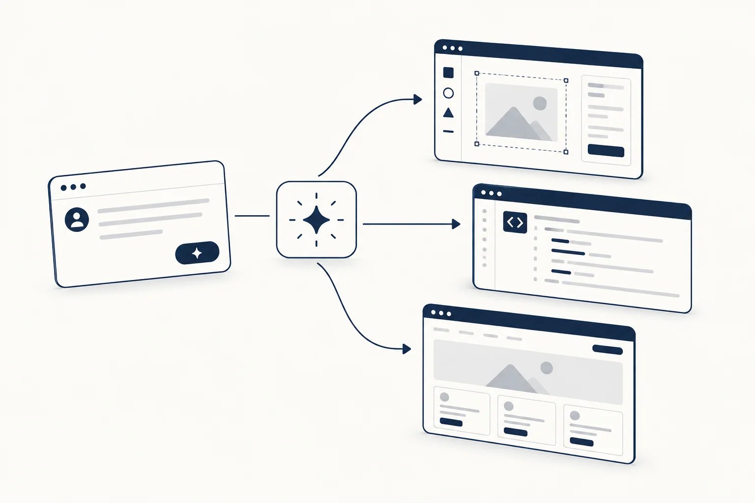
An AI UI generator turns a text prompt, a screenshot or a sketch into interface designs, front-end code or a working app. They differ most in where the output lands. Decide first whether you need an editable design file, code components or a running app, then compare two or three tools on the same brief.
This guide groups the main tools by output (sources checked 2026-10-09), lists the criteria that matter after the first impressive screen, and gives a repeatable test brief with checks you can see in the result. It is the tool-choice side of vibecoding: what to pick before you start prompting.
Three kinds of AI UI generator
| Output you need | Examples | What you get, per the vendor's docs |
|---|---|---|
| Editable design on a canvas | Uizard Autodesigner, Google Stitch, Figma Make | Multi-screen editable prototypes; UI designs that can be pasted into Figma; layers you can copy into Figma Design |
| Code components for your project | v0 | React components using Next.js, Tailwind and shadcn/ui; deploy or open a pull request |
| A full running app | Lovable, Bolt | A working app with frontend and backend (Lovable), a website or app you can publish (Bolt) |
The details, with sources:
- Uizard Autodesigner generates "multi-screen, editable prototypes" from text and can follow a brand kit, according to the Autodesigner page. The page does not mention code export.
- Google Stitch was announced in May 2025 as a Google Labs experiment that turns text and images (a sketch, screenshot or wireframe) into UI designs and front-end code that "can be seamlessly pasted to Figma" (Google Developers Blog). Labs products change quickly, so check its current state.
- Figma Make is described in Figma's help center as a prompt-to-app tool. You can edit the generated code, publish it to a URL, copy a snapshot of the preview as layers into Figma Design, and bring in variables and styles from your library with Make kits. It sits between the canvas and app categories.
- v0 builds with "Next.js, Tailwind, shadcn/ui, and more", can clone pages from screenshots or Figma files, and lets you deploy or open a pull request (v0 docs).
- Lovable generates "a working application that includes frontend, backend, database, authentication, and integrations, all backed by editable code", which can sync to GitHub, GitLab or Bitbucket (Lovable docs).
- Bolt "turns your ideas into real websites and apps" and can publish them to a live site (Bolt support).
If the next person to touch the result is a designer, start with the first row. If it is a developer with an existing React codebase, start with the second. If there is no codebase yet and you need something people can click, start with the third.
What to compare after the first screen
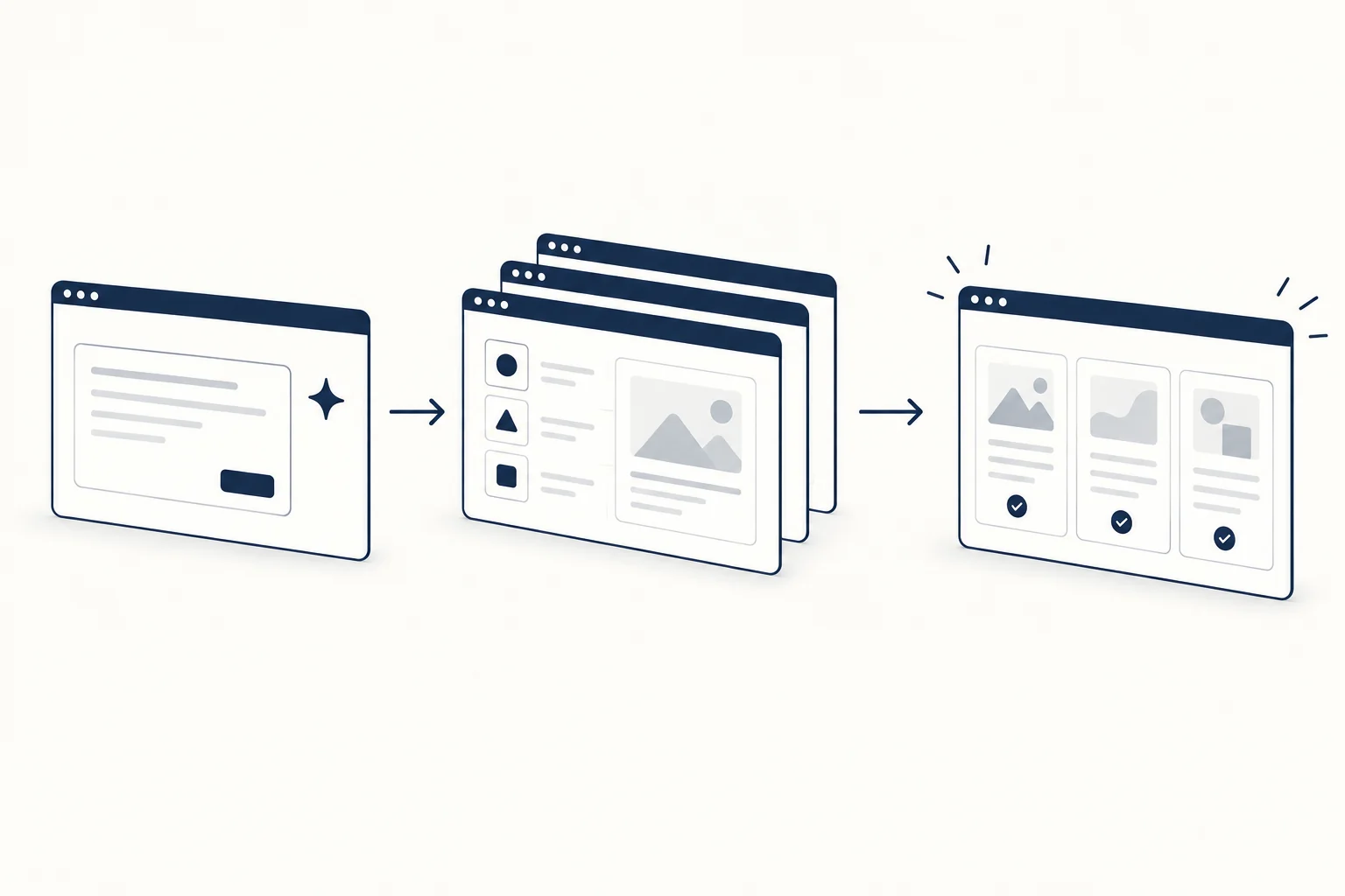
Every generator produces a good-looking first screen. The differences show up later:
- Where it lands. A Figma file, a component you paste, a repository or a hosted app. Moving between them later costs time.
- Who edits next. A designer needs layers and auto layout; a developer needs readable components and no unused dependencies.
- Design system input. Can you give it your tokens, components or a brand kit, or does every screen restart from its defaults? Figma Make kits and Uizard's brand kit are examples of this input.
- Code you would keep. Semantic HTML, real buttons and labels, a sensible file structure and dependencies you already use.
- Data and privacy. Read each tool's terms on how your prompts, uploads and code are stored and used before you paste client work.
- Pricing and limits. Free tiers and credit limits change often; check the current pricing page on the day you decide.
A repeatable test brief
Comparing tools on different prompts tells you nothing. Write one brief, paste it unchanged into each tool, and judge the results against the same checks. Here is a fictional example you can adapt:
Build the account settings page for a fictional invoicing app called Ledgerly. Sections: profile (name, email, avatar), billing (current plan, payment card, invoices table with 3 rows), and notifications (4 toggles). Include a delete account action with confirmation. Use a neutral palette with one accent color. It must work at 375, 768 and 1280 pixels wide.
Then check the result for things you can see, not for how it feels:
| Check | What to look for |
|---|---|
| Hierarchy | One clear page heading; section headings in order; primary action easy to find |
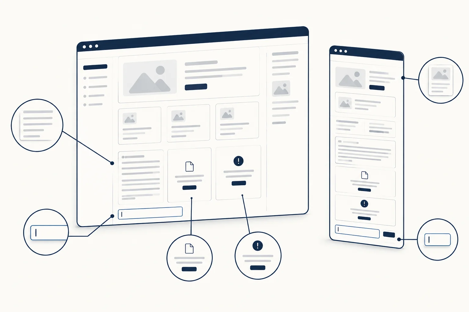
| Long content | Replace the name with a 40-character name and the email with a long address; nothing overflows |
| States | Empty invoices table, failed card, loading state; ask for them if they are missing |
| Widths | Resize to 375, 768 and 1280; no horizontal scrolling, readable tables |
| Keyboard | Tab through the page; every control is reachable and shows a visible focus ring |
| Labels | Every input and toggle has a visible label, not only a placeholder |
| Contrast | Body text meets 4.5:1 (WCAG 1.4.3), including the accent on white |
| Destructive action | Delete asks for confirmation and is not the most prominent button |
| Code or layers | Real <button> and <label> elements, or named layers with auto layout; no unused packages |
| Second edit | Ask for one change (move billing above profile); the rest of the page stays as it was |
The last check matters more than it looks. A generator that rewrites the whole page for a small change is hard to use past the first draft.
Two related guides go deeper on the input side. Why AI-generated UI looks generic explains the six-layer UI specification that stops results from converging on the same defaults, and AI prompts for UI design covers prompt structure for Cursor, v0 and Lovable. Run the same test brief before and after adding a specification and you will see which tool follows it.
From generated draft to production
A generator gives you a draft. Before it ships, run it through the vibe-coded UI production readiness checklist: states, accessibility, performance and the parts a demo skips.
Generated layouts also tend to share the same hero, cards and gradients. One way to avoid that is to start from components that already have a designed look. HorizonX is a library of editable components and templates, plus tool, texture and shader editors, that export HTML, Svelte or React. If you work with a coding agent, the HorizonX MCP server lets Claude Code, Codex, Cursor, VS Code, Windsurf or Gemini CLI search the library, adjust a component's settings and add it to your project; it requires an active membership and an API key.
For the full workflow, tools and templates around AI-assisted building, start from the vibecoding guide.
FAQ
Is there a free AI UI generator?
Most of the tools above have a free tier or trial with limited generations, and the limits change often. Check each tool's current pricing page, and run the test brief within the free allowance before you commit.
What is the best AI UI generator?
There is no single best one, because they produce different things. Pick the category first (design canvas, code components or full app), then run the same brief in two or three tools from that category and compare them against the checks above.
Can I generate UI inside Figma?
Yes. Figma Make generates from a prompt and lets you copy a snapshot of the preview into Figma Design as layers, according to Figma's help center. Google Stitch's announcement says its output can be pasted into Figma.
Can an AI UI generator use my design system?
Some can take it as input: Figma Make through Make kits that import variables and styles, Uizard through a brand kit, and Magic Patterns says on its homepage that you can import your design system. Test it with the brief above using your own tokens, and check whether the second edit keeps them.