
Why most AI-generated UIs look generic
Open any AI coding tool, type "build me a dashboard," and you'll get a functional but forgettable interface. Clean layout, blue buttons, white background, system fonts. It works. It just doesn't stand out.
The gap between "works" and "premium" isn't the AI's capability — it's the prompt. AI tools in 2026 can produce stunning, distinctive interfaces. But they need specific, design-literate instructions to do it.
This guide is about writing those instructions.
The anatomy of a great UI prompt
A prompt that produces premium results has five layers:
1. Concept and purpose
What is this interface for? Not just "a dashboard" — be specific about the domain, the user, and the goal.
Weak: "Build a dashboard" Strong: "Build an analytics dashboard for a crypto trading platform. The primary user is a day trader who needs to monitor 4-6 positions simultaneously while watching real-time price feeds."
2. Visual direction
This is where most prompts fail. Without visual direction, the AI defaults to generic Bootstrap-style layouts.
Weak: "Make it look modern" Strong: "Dark UI with a near-black background (#0D0D0D). Use a monochromatic palette with electric cyan (#00E5FF) as the sole accent color. Typography: Inter for UI labels, JetBrains Mono for numbers and data. Minimal borders — use surface elevation (subtle background shifts from #111 to #1A1A1A) for hierarchy."
3. Layout structure
Describe the spatial organization explicitly. AI tools are better at filling boxes than deciding where boxes go.
Strong: "Full-width layout, no sidebar. Top bar with logo left, search center, profile right. Below: a 4-column KPI strip (full width). Main area: 2/3 width chart panel (left) with a 1/3 width order book (right). Bottom: full-width positions table with inline P&L coloring."
4. Component behavior
Specify states, interactions, and edge cases:
Strong: "Price changes should flash green for positive, red for negative, then fade back to neutral in 800ms. Cards should have a subtle hover lift (2px translateY, 150ms ease). Loading states use skeleton screens that match the card dimensions."
5. Quality markers
Explicit instructions about polish and detail:
Strong: "Use 8px corner radius consistently. Card padding: 16px. Gap between cards: 12px. Text sizes: 11px for labels, 14px for values, 24px for primary metrics. All monetary values right-aligned. Use tabular numbers for data columns."
Prompt patterns that work
Here are proven prompt structures for common UI types:
SaaS Landing Page
Build a SaaS landing page for [product name], a [one-line description].

Visual style: [reference a specific aesthetic — "editorial with generous whitespace"
or "dense and technical like Linear's website" or "bold and playful like Notion's
marketing pages"]

Sections (in order):
1. Hero: headline + subheadline + CTA + product screenshot/mockup
2. Social proof: logo strip of 5-6 company logos
3. Feature grid: 3 features, each with icon + title + description
4. Product demo: large screenshot or interactive preview
5. Pricing: 3 tiers, highlight the middle one
6. CTA: final conversion section with testimonial

Colors: [primary], [accent], background [color]
Typography: [font] for headings, [font] for body
Spacing: generous — at least 80px between sections
Dashboard
Build a [domain] dashboard for [user type].

Layout: [sidebar/no sidebar] + [grid specification]
Theme: [dark/light], background [hex], surface [hex], accent [hex]
Typography: [font stack] with [size scale]

Must include:
- KPI strip with [N] metrics showing [specific metrics]
- [Chart type] showing [what data]
- Data table with [columns], sortable, with inline actions
- [Any other specific components]

States: include loading skeletons, empty states for tables,
hover states on all interactive elements.
Responsive: stack to single column on mobile, hide [specific elements]
on screens under 768px.
Learning from premium design concepts
The fastest way to level up your prompts is to study premium design and describe what you see. This trains your eye and your vocabulary.
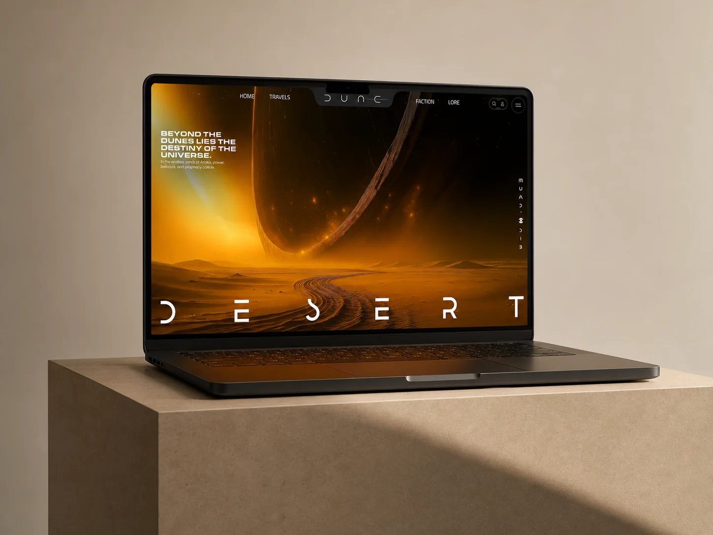
For example, look at Dune on HorizonX. Instead of just seeing "a dark website," break down:
- The color temperature (warm blacks and ambers vs. cool blacks and blues)
- The typography choices (display serif for headings creates editorial feel)
- The spacing rhythm (sections breathe — 100px+ between major blocks)
- The image treatment (high-contrast, desaturated, hero-scale)
- The micro-interactions (subtle parallax, fade-in on scroll)
Now you can write: "Build a product landing page in the style of Dune — warm dark palette with amber/gold accents, editorial serif headings, generous vertical spacing (100px+), and cinematic hero imagery with subtle parallax."
That prompt will produce something dramatically better than "build a dark landing page."
Platform-specific tips
Cursor
Cursor works best with file-level context. When prompting:
- Reference specific files: "Update components/Dashboard.tsx to match this layout"
- Include your tech stack: "Using Next.js 15, Tailwind CSS 4, shadcn/ui"
- Reference your existing tokens: "Use the colors from tailwind.config.ts"
- Iterate: "Make the sidebar narrower (240px → 200px) and add a collapse button"
v0 by Vercel
v0 excels at component-level generation: - Focus on one component at a time, not full pages - Include Tailwind classes you want preserved - Specify "shadcn/ui style" for consistent component language - Use the revision feature — your first generation is a draft, not a final
Lovable
Lovable handles full applications: - Describe the full user flow, not just visual layout - Include data models: "Users have name, email, avatar, plan (free/pro/enterprise)" - Specify navigation: "Tab-based navigation with Dashboard, Projects, Settings, Billing" - Include auth context: "Show different nav items based on user role"
The prompt pack concept
A prompt pack is a reusable set of prompts designed to reproduce a specific design style across different project types. Instead of starting from scratch each time, you have a pre-written visual direction that consistently produces high-quality results.
For example, a "Dark Analytics" prompt pack might include: - Color system definitions (exact hex values for background, surface, text, accent) - Typography specifications (fonts, sizes, weights, line heights) - Layout patterns (grid, spacing, section structure) - Component styling rules (border radius, shadows, hover states) - Ready-to-use prompts for: dashboard, settings page, data table, login screen
HorizonX publishes prompt packs based on our design concepts — each pack captures the visual DNA of a concept so you can reproduce that quality in your own projects using any AI tool.
Building your own prompt library
Whether you use published prompt packs or build your own, maintaining a prompt library saves enormous time:
- Save prompts that produce great results — when an AI generates something you love, save the prompt verbatim
- Annotate what worked — note which specific instructions made the difference
- Create templates — extract the reusable parts of successful prompts into templates
- Version your prompts — as AI tools improve, update your prompts to take advantage of new capabilities
- Share with your team — a shared prompt library is a design system for AI generation
The prompt is the new design brief
In traditional design workflow, the brief determined the quality of the output. A vague brief produced vague designs. A specific, well-researched brief produced excellent designs.
AI-powered design follows the same principle. The prompt is your brief. Its specificity, design literacy, and intentionality directly determine the quality of what gets generated.
Learn to see design. Learn to describe what you see. The AI will handle the rest.
Explore premium design concepts on HorizonX to train your eye and find visual directions worth reproducing. The best prompts come from studying the best design.