
The short answer
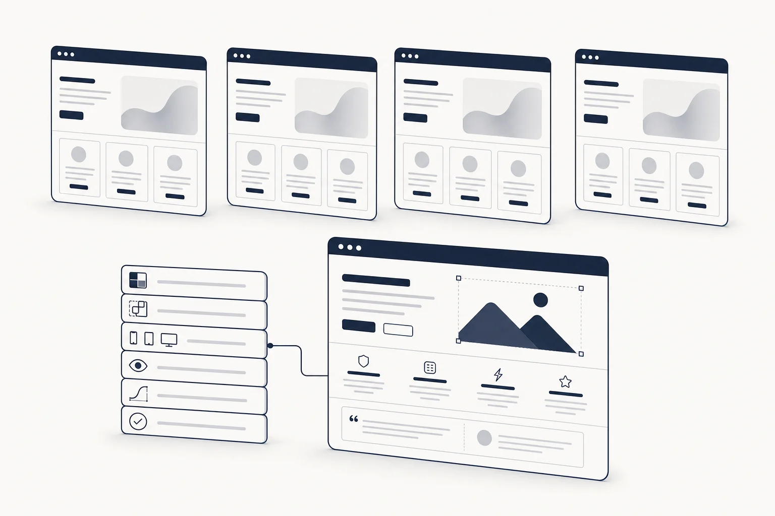
AI-generated UI looks generic because the prompt asked for an outcome ("clean, modern, premium") and the model filled every unspecified decision with its most probable default: Inter, a gray-blue palette, a three-column feature grid, cards with the same radius and shadow, a hero with a gradient blob. That is not a model failure. It is what "unspecified" means. The fix is to make the decisions before the agent does, in a form it can read and a reviewer can check: a UI specification with six layers (tokens, components, responsive rules, accessibility, motion, quality gates), placed in the agent's context, and a concrete kit that shows the spec applied. This post walks through why the defaults win, what the spec contains, and how to wire it into Cursor, v0, Lovable, Bolt or Claude Code.
Why every AI interface looks like every other AI interface
1. Adjectives are not constraints
"Make it look premium" has no testable meaning. The model cannot fail it, so it cannot satisfy it either; it produces the most average interpretation of "premium" in its training data. Anything you did not decide, the model decided for you, and it decides the same way every time.
2. The defaults are shared
Most builders ship on the same base: shadcn/ui primitives, Tailwind, Inter or Geist, a neutral gray scale, a single accent. That base is excellent (we rank it first in Best React + Tailwind component libraries in 2026), and it is also why ten unrelated products look like siblings. The base was never supposed to be the look.
3. No tokens, so every screen re-decides
Without a token set, the agent picks a radius on the first screen, a slightly different one on the second, and a third shade of gray for the border on the third. The result reads as generic because nothing repeats on purpose. Coherence is a decision, not a byproduct.
4. States are missing
The prompt described the ideal screenshot. It did not mention hover, focus, disabled, loading, empty, error or "no permission", so the agent drew the happy path and invented the rest, or skipped it. Interfaces with no designed states feel like demos, because they are.
5. Motion is absent or stock
Either no motion, or the fade-up-on-scroll every builder emits. Neither says anything about the product. Motion is one of the two places (with typography) where "someone with taste built this" is decided.
6. Nobody defined "done"
No browsers, no viewports, no checks. The agent stops when the output looks plausible in one screenshot, and the drift shows up on mobile, in dark mode, or on the second page.
Is your UI generic? A two-minute test
- Change the font to Inter and the accent to blue. Does anything look different? If not, the design was never there.
- Open three screens side by side. Count the distinct border radii and gray values. More than two of each is drift.
- Tab through the main flow. If focus is invisible or the order is wrong, states were not designed.
- Resize to 375 px. If the navigation collapses into whatever the framework does by default, responsive rules were not specified.
- Scroll the landing page twice. If the entrance animations only played the first time, motion was stock.
Three or more hits and you have a specification problem, not a prompt problem.
The fix: a UI specification with six layers
HorizonX maintains a free, vendor-neutral Vibe Coding UI Specification built for exactly this. It is a Markdown document with a YAML contract you copy into your repo as ui-spec.yaml. The six layers are the six places where the defaults were winning.
Layer 1: Tokens
Colour, typography, spacing, radius, shadow and layout values, defined before any component introduces a one-off. This is the single highest-leverage layer: once the agent has --radius-md, it stops inventing radii. If your team has no tokens yet, the design tokens guide shows a minimal set you can write in an afternoon.
Layer 2: Components
For each component: variants, sizes and every user-visible state, not just the ideal screenshot. "Button: primary, secondary, ghost; sm, md, lg; hover, focus-visible, active, disabled, loading" is a sentence an agent can implement and a reviewer can test.
Layer 3: Responsive rules
Navigation, grids, overflow, content stress and touch behaviour at measurable viewports. Say what happens to the nav at 768 px. Say what a 40-character product name does inside a card. Otherwise the framework decides, and the framework does not know your product.
Layer 4: Accessibility
Semantic HTML, keyboard completion, visible focus, programmatic errors and WCAG 2.2 AA contrast. Written as requirements, these are cheap for an agent to satisfy on the first pass and expensive for a human to retrofit.
Layer 5: Motion
Named durations and easings, the safe properties (transform and opacity), and reduced-motion behaviour that preserves essential feedback. Motion specified this way stops being decoration and starts being the product's voice, which is the whole difference between a page like Velto (scroll-scrubbed, reversible) and a fade-up template.
Layer 6: Quality gates
The browsers, viewports, states and repeatable checks that must pass before the agent may say "done". This is the layer that turns a spec into a contract. The companion 15-point production readiness checklist is the scoring sheet.
Putting the spec in the agent's context
The specification only works if the agent reads it before it writes interface code. The quick start on the resource page is five steps:
- Download the Markdown specification and copy the YAML contract into
ui-spec.yaml. - Replace every value marked
REQUIREDwith a real product decision. Blank values are how defaults get back in. - Link the file from
AGENTS.md,CLAUDE.mdor your tool's instruction file, with an instruction along the lines of: readui-spec.yamlbefore changing interface code; treat its tokens, states, responsive rules, accessibility requirements and acceptance criteria as implementation constraints; if a request conflicts with the specification, identify the conflict before writing code. - Ask the agent to implement one component or page at a time. Whole-app prompts are where drift compounds.
- Run the acceptance checklist before merging.
In Cursor and Claude Code the instruction file is read on every turn. In v0, Lovable and Bolt, paste the relevant spec sections into the project's system or knowledge context, and re-paste the tokens block when you start a new chat; the vibecoding guide covers how each tool takes context.
Before and after: the same request, specified
Before:
Build a pricing page for our SaaS. Make it clean and premium, three tiers, highlight the middle one.
After:
Build
/pricingperui-spec.yaml. Three tiers on a 12-column grid, stacked atmdand below. Use--color-surface-raisedfor cards,--radius-lg,--shadow-2. Middle tier:--color-accentborder, "Most popular" badge component. Buttons: primary on the highlighted tier, secondary on the others, all states per spec. Motion: cards enter with--motion-enter(transform + opacity only), respect reduced motion. Done means: passes gates 1 to 15 at 375, 768 and 1280 px in Chrome and Safari, keyboard-complete, AA contrast.
The second prompt is longer because the decisions exist. That is the point. The agent no longer has anything to fill in with its defaults.
Spec, then kit, then ship
A specification tells the agent the rules. A kit shows it the rules applied. AI builders extend consistent, existing code far more reliably than they generate taste from a description, which is why the fastest route to a non-generic interface is spec plus a coded starting point: a finished page or product shell whose tokens, states and motion already agree with each other. That is the argument of What are coded UI kits?, and it is how art-directed pages such as Veyra (React + Vite, configurable motion) or an application shell like BrainX Dashboard (Next.js + React + TypeScript) are meant to be used with an agent: as the constraint, not the inspiration.
The workflow in one line: write ui-spec.yaml, point the agent at a kit that already obeys it, build one slice at a time, score against the checklist, ship.
FAQ
Why does my v0 or Lovable UI look like everyone else's?
Because every decision you did not make was made by the model, and the model makes the same choices for everyone: neutral palette, Inter, equal cards, gradient hero. Specify tokens, states, responsive rules and motion and the output stops converging on the average.
What is a UI specification for AI coding agents?
An explicit contract, in the agent's context, covering tokens, component states, responsive behaviour, accessibility, motion and verification criteria. The free Vibe Coding UI Specification is a vendor-neutral version you can copy.
Is a better prompt enough?
Better prompts help (see AI prompts for UI design in Cursor, v0 and Lovable), but a prompt is per request and a specification is per project. The spec is what keeps the tenth screen consistent with the first.
Which tools can use the specification?
Any agent that reads an instruction file or accepts project context: Cursor, Claude Code, Codex, Lovable, v0, Bolt and similar. The spec is plain Markdown and YAML, so nothing is vendor-specific.
Do I still need a designer?
You need design decisions. A designer makes them fastest, but a small team can make them with a token set and an art-directed kit. What you cannot do is leave them to the model and expect anything but the default.