
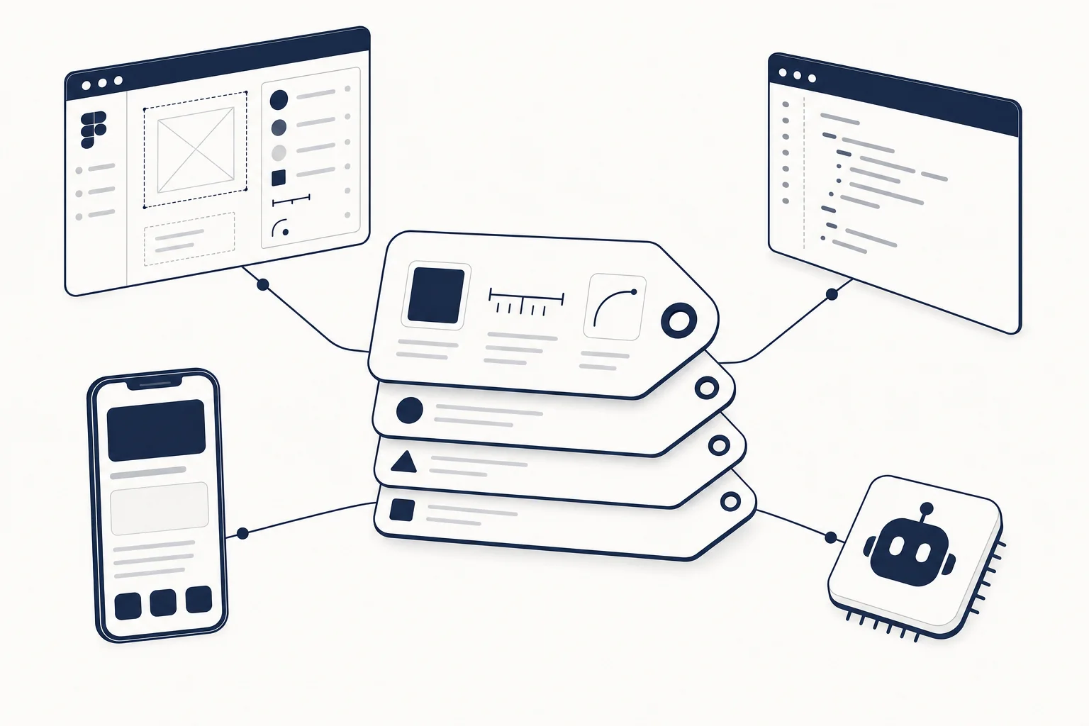
Definition
A design token is a named design decision stored as data: color.accent, space.4, radius.md, motion.enter. The name carries the intent, the value carries the implementation, and because it is data rather than a Figma style or a CSS class, the same decision can be exported to CSS, iOS, Android, a Figma library and an AI coding agent's context without anyone re-typing a hex value.
Tokens are not a colour palette. A palette is a list of values. Tokens are the mapping from a decision ("the surface a card sits on") to a value ("#f7f7f5 in light, #1a2238 in dark"), and the mapping is the part that scales.
The three tiers that keep tokens sane
Most token sets that fail, fail because they only have one tier. Use three.
- Primitive (global): raw values with neutral names.
blue.500,gray.100,size.16,font.sans. No meaning, just the scale. - Semantic (alias): decisions that point at primitives.
color.surface,color.surface.raised,color.text.muted,color.accent,space.section,radius.control. This is the tier components consume, and the tier that changes between light and dark, or between brands. - Component (optional): overrides for one component.
button.radius,card.padding. Use sparingly; every component token is a place semantic tokens were not enough.
A dark mode is then a second set of semantic values over the same primitives, which is why the dark UI design guide spends its time on elevation and contrast rather than on picking a new palette.
A minimal token set you can write this afternoon
| Category | Semantic tokens to start with | Typical count |
|---|---|---|
| Colour | surface, surface.raised, border, text, text.muted, accent, accent.text, danger, success | 9 to 12 |
| Typography | font.sans, font.mono, size scale (xs to 4xl), weight.regular, weight.semibold, leading.tight, leading.normal | 12 to 15 |
| Spacing | a 4 px base scale (1 to 16) plus section and gutter | 10 to 14 |
| Radius | sm, md, lg, full | 4 |
| Shadow | 1, 2, 3 (elevation, not decoration) | 3 |
| Motion | duration.fast, duration.base, duration.slow, easing.standard, easing.enter, easing.exit | 6 |
| Layout | container.max, breakpoints (sm, md, lg, xl) | 5 |
Fifty to sixty tokens cover a product. If you have three hundred, you have a palette with names, not a system.
The 2026 landscape, in one pass
The format: DTCG 2025.10
The Design Tokens Community Group (a W3C community group) published the first stable version of its JSON format, 2025.10, after years of drafts. A token is an object with $value, $type and optionally $description, nested in groups. It is the interchange format, not the thing you hand-write daily: design tools export it, build tools consume it. Adopters listed by the group include Figma, Tokens Studio, Style Dictionary, Penpot, Sketch, Supernova and zeroheight, which is the list you need for "will my tokens survive a tool change".
{
  "color": {
    "accent": { "$type": "color", "$value": "#1a2238", "$description": "Primary action and emphasis" }
  },
  "radius": {
    "md": { "$type": "dimension", "$value": { "value": 12, "unit": "px" } }
  }
}
The build step: Style Dictionary
Style Dictionary turns a token JSON into CSS variables, a Tailwind theme, Swift, Kotlin or anything else. Version 4 reads DTCG natively; full support for the 2025.10 revision is in progress for version 5, so check the release notes before you rely on a new feature of the format.
The consumer: Tailwind v4 @theme
Tailwind v4 moved configuration into CSS. Theme variables declared inside @theme do two things at once: they become regular CSS variables you can reference anywhere, and they generate utility classes.
@import "tailwindcss";

@theme {
  --color-surface: #f7f7f5;
  --color-surface-raised: #ffffff;
  --color-accent: oklch(0.28 0.05 265);
  --radius-md: 12px;
  --spacing-section: 6rem;
}
bg-surface, text-accent and rounded-md now exist, and var(--color-accent) works in arbitrary values and inline styles. Use :root for variables that should stay plain CSS and not spawn utilities. This is the cleanest token consumer on the web today, and it is why most coded kits worth buying are on Tailwind v4.
The source: Figma Variables
Figma Variables with modes (light, dark, brand A, brand B) are the design-side home for primitives and semantics. Export them through a plugin or the API into DTCG JSON, run Style Dictionary, and the @theme block writes itself. The handoff tax that Figma templates vs coded components describes mostly disappears when the tokens are the contract on both sides.
Tokens for AI workflows
This is the part that changed in the last two years. An AI coding agent has no taste, but it is extremely good at obeying a variable it can see. Give it --color-surface-raised and it will never invent a fourth shade of gray; leave it without tokens and it will, on every screen.
That is why tokens are the first of the six layers in the free Vibe Coding UI Specification, ahead of components, responsive rules, accessibility, motion and quality gates. Practical rules:
- Tokens before components. Define the set, put it in
ui-spec.yamlor the@themeblock, and reference it from yourAGENTS.mdorCLAUDE.mdbefore asking for a single screen. - Semantic names in prompts. "Use
--color-accentfor the primary button" is a constraint. "Use our blue" is a suggestion. - Forbid raw values. One instruction line ("no hard-coded colours, radii or durations; use theme variables") removes the most common drift.
- Motion tokens too. Duration and easing tokens are what stop the agent emitting the stock fade-up every time; why AI-generated UI looks generic goes through the rest of the layers.
If you do not have tokens yet, take them from a kit
Writing a token set from a blank page is slow because the hard part is the decisions, not the syntax. The faster route is to start from a design system that already made them and extract the primitives and semantics.
- Figma side: industry design systems such as Axiom (tech incubator), Modernist (architecture) or Loom (fashion retail) give you a palette, type scale, spacing and imagery direction to approve, then export as variables.
- Code side: pages on Tailwind v4 such as Velto (Next.js 16 + React 19) or Velmont (SvelteKit 5) already consume their decisions through theme variables, so the
@themeblock is your starting token set. For dark-first tokens, Nocturne Studio Dashboard was designed for dark rather than inverted.
Rename the semantics to your product, swap the primitives to your brand, keep the structure. Browse the Figma templates and React templates collections to see kits in both formats.
Five token mistakes to avoid
- Naming by value.
blue.500is fine as a primitive;color.blueas a semantic name is a lie the day the brand changes. - One tier only. Components pointing straight at primitives means dark mode is a rewrite.
- Tokens in three places. Figma, a JSON file and a Tailwind config that drift apart. Pick the source, generate the rest.
- No motion or shadow tokens. These are where "looks like a template" shows up, and they are the ones everyone skips.
- Three hundred tokens. If designers cannot remember the semantic names, they will use raw values, and so will the agent.
FAQ
What are design tokens, in one sentence?
Named design decisions stored as data (colour, type, spacing, radius, shadow, motion) so the same decision can be used in design tools, code and AI agents without re-typing values.
Is there a standard format for design tokens?
Yes. The Design Tokens Community Group's format module reached its first stable version, 2025.10, in JSON with $value, $type and $description fields. Figma, Tokens Studio, Style Dictionary, Penpot and others list support.
How do design tokens work with Tailwind CSS v4?
Declare them as theme variables inside @theme in your CSS. Tailwind generates both utility classes and plain CSS variables from them; use :root for variables that should not become utilities.
Do design tokens help with AI coding tools like Cursor, v0 or Lovable?
More than any other single artefact. Tokens are the first layer of a UI specification an agent can obey, and they remove the most visible cause of generic output: values re-decided on every screen.
Do HorizonX kits come with tokens?
The catalogue is design and code from one source under one membership: Figma design systems for the design-side decisions and Tailwind v4 pages for the code-side ones. Plans and allowances are on the pricing page.