
Dark mode is no longer optional
In 2020, dark mode was a nice-to-have toggle. In 2026, it's the default for most premium digital products. Spotify, Linear, Vercel, Arc, Raycast — the products that designers and developers actually love all ship dark-first.
This isn't coincidence or aesthetic preference. There are measurable reasons why dark interfaces dominate premium software, and understanding them will change how you approach UI design.
The functional case for dark UI
1. Reduced cognitive load in data-heavy interfaces
When users stare at screens for 8+ hours, bright backgrounds create visual fatigue that compounds throughout the day. Dark interfaces reduce the total amount of light emitted, which directly impacts:
- Eye strain (reduced by up to 60% in controlled studies)
- Reading endurance for long documents and code
- Focus duration during complex analytical tasks
This is why every serious code editor, terminal, and analytics tool defaults to dark: it's not about looking cool, it's about sustained performance.
2. Superior contrast for data visualization
Charts, graphs, and dashboards are objectively better on dark backgrounds. The reason is simple physics: colored data points against a dark background have higher perceived contrast than the same colors against white.
This means: - More distinguishable data series in charts - Better readability for small text annotations - Cleaner separation between UI chrome and content - More effective use of color for status and alerts
3. Natural depth and hierarchy
Dark design systems create depth through luminance rather than shadows. This gives designers a more nuanced toolkit:
- Elevation through brightness — higher elements are lighter, lower elements are darker
- Focus through contrast — active elements pop naturally against recessed backgrounds
- Grouping through tone — subtle background shifts group related content without borders
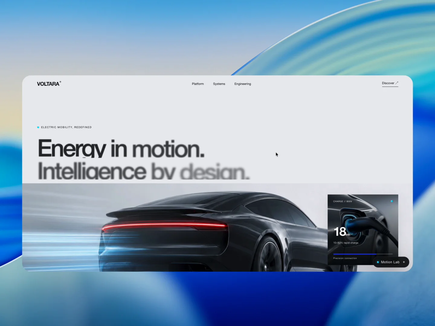
The VOLTARA design concept demonstrates this approach: layered dark surfaces create a rich sense of depth without a single drop shadow.
How to design dark UI that actually works
Most dark mode implementations fail because designers treat them as "inverted light mode." That approach produces washed-out, hard-to-read, uncomfortable interfaces. Here's what actually works:
Don't use pure black
#000000 as a background creates too much contrast with text and creates a harsh, unnatural feel. The best dark interfaces use very dark grays:
- Background:
#0A0A0Ato#141414 - Surface (cards):
#1A1A1Ato#222222 - Elevated surface:
#262626to#2A2A2A
This creates a warm, comfortable foundation that feels sophisticated rather than stark.
Adjust your text colors
White text (#FFFFFF) on dark gray backgrounds has a contrast ratio that's technically accessible but visually aggressive. Reduce text brightness slightly:
- Primary text:
#F0F0F0to#E8E8E8 - Secondary text:
#A0A0A0to#B0B0B0 - Disabled/tertiary:
#666666to#707070
Rethink your color palette
Colors that work beautifully on white backgrounds often look garish on dark ones. For dark UI:
- Desaturate slightly — reduce saturation by 10-20% from your light mode palette
- Increase lightness — bump the L value in HSL for better readability
- Limit accent colors — one or two accent colors maximum, used sparingly
- Use gradients carefully — subtle gradients add richness; aggressive ones create noise
Borders and dividers
In light mode, you use borders everywhere. In dark mode, you should almost never need them:
- Replace borders with surface color differences — a card that's
#1E1E1Eon a#121212background is clearly delineated - Use borders only for interactive elements (inputs, buttons) where the boundary must be explicit
- If you must use borders, keep them very subtle:
rgba(255, 255, 255, 0.06)torgba(255, 255, 255, 0.12)
Dark design systems in practice
Building a production-ready dark design system requires thinking about more than just colors. Here's the complete checklist:
Typography
- Test every font weight at every size on your dark background
- Some fonts that look great on white become too thin on dark — you may need to bump weight
- Code fonts (monospace) generally perform better on dark backgrounds
Iconography
- Outlined icons work better than filled icons on dark backgrounds
- Adjust icon stroke width — 1.5px or 2px strokes are more legible than 1px
- Use semantic color for status icons, neutral for navigation
Imagery and media
- Photos need careful treatment — they can "blow out" the UI with brightness
- Use subtle overlays or vignettes to integrate photos into the dark surface
- Consider duotone or desaturated treatments for consistency
Interaction states
- Hover: increase surface brightness by one step (not opacity change)
- Active/pressed: slight brightness decrease or scale
- Focus: use a visible ring in accent color — essential for accessibility
- Selected: accent color background at low opacity + accent border
The business case
Dark mode isn't just a designer preference — it's a competitive advantage:
- Premium perception — users consistently rate dark interfaces as more "professional" and "high-end"
- Developer adoption — if your target includes developers, dark mode is table stakes
- Mobile battery life — OLED screens use less power displaying dark pixels, extending battery life by up to 30%
- Differentiation — in markets flooded with generic white SaaS UIs, dark mode instantly distinguishes your product
Products like Mosk, Dune, and Zyno showcase how dark design language can transform a standard interface into something that feels premium and intentional.
Tools and resources
Building a dark design system from scratch is time-consuming. Here are the approaches, from fastest to most custom:
- Start with a premium UI kit — concepts on HorizonX include complete dark color systems and component patterns you can reference or adapt
- Use design tokens — define your dark palette as tokens from day one, making it systematically maintainable
- Test with real content — dark mode edge cases (dense tables, long forms, embedded media) only surface with real data
Dark mode done right
The best dark interfaces share one quality: they feel inevitable. The user doesn't think "oh, this is dark mode." They just think "this feels right."
That feeling comes from consistency, restraint, and attention to the details that most designers skip — text contrast, surface hierarchy, interaction states, and image treatment.
Start by studying interfaces that nail it. Then build your system with intention, not just inversion.