

A CSS wave background is usually one of two things: a wavy edge between sections, or a field of moving waves behind content. Draw the edge with an inline SVG path or a CSS mask of radial gradients. For motion, slide a repeated SVG wave layer with transform, and stop it under reduced motion.
This guide covers each technique with code that we rendered in Chromium on 2026-10-09, explains why the animated version moves a layer instead of a background position, and shows when a soft, organic wave field is easier to get from a shader such as the HorizonX Waves shader.
Three kinds of wave background
| What you want | Technique | Moves? |
|---|---|---|
| A section that ends in a smooth wave | Inline SVG path as a divider | No |
| A scalloped or zigzag edge with no extra markup | CSS mask with radial gradients |
No |
| Layered waves drifting across a hero | Repeated SVG layers moved with transform |
Yes |
| A soft, organic wave field | WebGL shader | Yes |
Pick the simplest row that matches the design. The first two cost nothing at runtime; the last two keep animating, so they need a reduced-motion fallback.
A static SVG wave divider
An inline SVG path gives you any wave shape you can draw, and it scales with the section. Place it at the bottom of the section and fill it with the color of the next section.
<section class="hero">
  <h1>Your heading</h1>
  <svg class="wave-divider" viewBox="0 0 1200 120" preserveAspectRatio="none" aria-hidden="true">
    <path d="M0 60 C 300 0 300 120 600 60 S 900 0 1200 60 V120 H0 Z" fill="currentColor" />
  </svg>
</section>
.hero {
  position: relative;
  background: #192c46;
  color: #fff;
  padding: 6rem 1.5rem 8rem;
}

.wave-divider {
  position: absolute;
  inset-inline: 0;
  bottom: -1px;
  display: block;
  width: 100%;
  height: clamp(3rem, 8vw, 6rem);
  color: #fff;
}
Four details make it hold up:
preserveAspectRatio="none"lets the wave stretch to any width without leaving gaps at the sides. MDN's preserveAspectRatio reference explains the values. The trade-off is that the curve flattens on wide screens, so theclamp()height grows with the viewport.display: blockandbottom: -1pxremove the thin line that can appear between the SVG and the next section from inline baseline spacing and subpixel rounding.fill="currentColor"lets you change the color from CSS, including in dark mode.aria-hidden="true"keeps a decorative shape out of the accessibility tree.
To design your own curve, edit the path's d attribute (MDN path data reference). The C command draws the first bend and S mirrors it, which keeps the joint smooth. Online wave generators output the same kind of path if you prefer to drag points.
Adding a wave gradient
To fill the wave with a gradient instead of a flat color, define a linearGradient and point the fill at it:
<svg class="wave-divider" viewBox="0 0 1200 120" preserveAspectRatio="none" aria-hidden="true">
  <defs>
    <linearGradient id="wave-fill" x1="0" y1="0" x2="1" y2="0">
      <stop offset="0" stop-color="#c9d6e8" />
      <stop offset="1" stop-color="#ffffff" />
    </linearGradient>
  </defs>
  <path d="M0 60 C 300 0 300 120 600 60 S 900 0 1200 60 V120 H0 Z" fill="url(#wave-fill)" />
</svg>
Gradient IDs are global to the page, so give each one a unique name. In React, generate it with useId().
A CSS-only wave edge with mask
If you would rather not add markup, a CSS mask can cut a scalloped wave into the bottom of any element. Three mask layers do the work: a solid layer keeps everything above the wave, one row of circles carves the dips, and a second row adds the bumps.
.wave-edge {
  --r: 24px;
  background: #192c46;
  color: #fff;
  padding: 4rem 1.5rem calc(4rem + 2 * var(--r));
  mask:
    linear-gradient(#000 0 0) top / 100% calc(100% - 2 * var(--r)) no-repeat,
    radial-gradient(circle var(--r) at 75% 100%, #0000 98%, #000) 0 calc(100% - var(--r)) / calc(4 * var(--r)) var(--r) repeat-x,
    radial-gradient(circle var(--r) at 25% 0, #000 98%, #0000) 0 100% / calc(4 * var(--r)) var(--r) repeat-x;
}
Each radial tile is four radii wide and one radius tall. In the upper row, the circle sits on the bottom edge of the tile and is transparent inside, so it cuts a half-circle dip. In the lower row, the circle hangs from the top of the tile and is opaque inside, so it adds a half-circle bump between the dips. Change --r to make the wave bigger or smaller, and keep the extra bottom padding so text never sits in the masked area. Using 98% instead of 100% for the circle stop softens the edge slightly to reduce jagged pixels.
The unprefixed mask shorthand is supported in Chrome and Edge 120, Firefox 53 and Safari 15.4 according to MDN's mask reference and browser-compat data 8.1.5 (checked 2026-10-09; see also caniuse). Older Chromium needs a -webkit-mask copy of the same value.

Animated layered waves
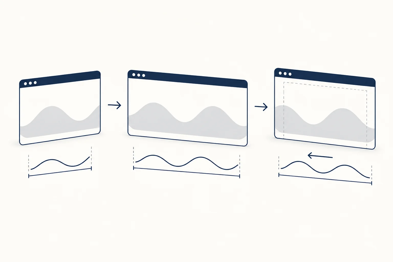
For moving waves, draw a path that repeats exactly, make the layer twice as wide as its frame, and slide it left by half its width. When the animation restarts, the layer looks identical to where it began, so there is no jump.
<div class="ocean" aria-hidden="true">
  <svg class="ocean__layer" viewBox="0 0 1200 120" preserveAspectRatio="none">
    <path d="M0 60 Q 150 0 300 60 T 600 60 T 900 60 T 1200 60 V120 H0 Z" fill="currentColor" />
  </svg>
  <!-- repeat the svg for each layer -->
</div>
.ocean {
  position: relative;
  height: 14rem;
  overflow: hidden;
  background: #f4f6f9;
}

.ocean__layer {
  position: absolute;
  bottom: 0;
  left: 0;
  width: 200%;
  height: 100%;
  animation: wave-drift var(--duration, 12s) linear infinite;
}

.ocean__layer:nth-child(1) { --duration: 18s; color: #c5cfdc; }
.ocean__layer:nth-child(2) { --duration: 12s; color: #7d8ea6; height: 80%; }
.ocean__layer:nth-child(3) { --duration: 8s; color: #192c46; height: 60%; }

@keyframes wave-drift {
  to { transform: translateX(-50%); }
}

@media (prefers-reduced-motion: reduce) {
  .ocean__layer { animation: none; }
}
The path covers two full periods: each Q and T pair draws one crest and one trough over 600 units of the 1,200-unit view box. Because the second half repeats the first, the frame at translateX(-50%) matches the frame at 0. We checked this in Chromium on 2026-10-09 by screenshotting the strip at both positions: the two images were byte-identical.
Different durations per layer make the waves drift apart and back together, which reads as depth. Under prefers-reduced-motion: reduce the layers stop and the static wave stays (MDN reference). If the waves sit behind content and loop for more than five seconds, WCAG 2.2.2 also asks for a way to pause them; a pause button that sets animation-play-state: paused is enough.
Why transform instead of background-position
You could put the wave in a repeating background-image and animate background-position. It works, but it changes paint on every frame. web.dev's animations guide recommends sticking to transform and opacity, which browsers can usually move on the compositor without repainting. We traced both versions of this wave in Chromium on 2026-10-09 (remote headless browser, 1000 by 600 viewport, three-second recording each): the background-position version recorded more than 360 paint events, while the three transform layers recorded none. One browser and one machine, so read it as a direction, not a benchmark.
When a shader is the better wave
SVG waves are sharp, regular and cheap. If the design calls for a soft, cloudy field of waves that warp and blend, drawing that with paths is slow work. That is what a WebGL shader is for:
- The Waves shader is a soft, cloud-like WebGL field with warping, colour blending and fine grain; you tune intensity, warp, detail, speed, softness and colours in the editor.
- Flowing Waves gives liquid, metallic waves with silver highlights.
- Wave renders rolling waves as a crisp pixel grid on a transparent background, so you can lay it over a section.
HorizonX shader pages state that the animation respects the device's reduced-motion preference, and the editors export HTML, Svelte or React (export requires membership). Before you add one, read when to choose CSS, a texture or a shader for an animated background, and if you work in React, plan the static fallback for a WebGL background.
Checklist before you ship
- The divider has no visible seam at any width (test 375, 768 and 1440 pixels).
- Decorative SVGs carry
aria-hidden="true". - Text never sits on the masked or animated part of the background, and contrast still passes where it overlaps.
- Animated waves stop under reduced motion, and long loops have a pause control.
- Animations use
transform, notbackground-positionor path morphing on every frame.
Browse the Waves shader if you want the soft version without writing WebGL.
FAQ
How do I make a wave background in CSS?
For a wavy edge, use an inline SVG path at the bottom of the section or a CSS mask made of two rows of radial gradients. For a full background, layer two or three SVG waves at different heights and colors, and animate them with transform if they should move.
Is there a CSS waves background maker?
Wave generators produce the SVG path for you; paste it into the divider markup above. For a soft animated wave field, the HorizonX Waves editor lets you tune the shader and export it.
How do I draw a squiggly line in CSS?
For text, text-decoration-style: wavy draws a wavy underline. For a divider line, use the mask technique above with a small --r, or a thin SVG path with fill="none" and a stroke.