

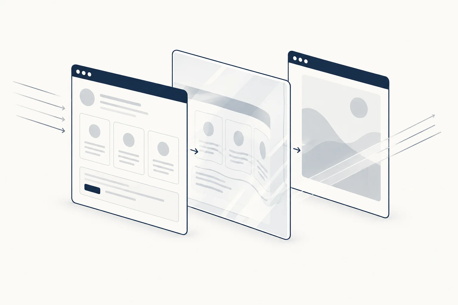
A glass-inspired background and a translucent interface card are different design choices. The first supplies an image or moving field; the second holds content and controls. Keep that distinction clear so an attractive refraction treatment does not become an unreliable reading surface.
Start with the content-bearing layer. Decide where the heading, labels and actions live before adding light, distortion or transparency around them.
Separate the background from the panel
For a fictional design event, refracted light might establish atmosphere behind the hero. The ticket information, however, needs a dependable surface. The panel does not have to inherit every variation in the background.
Trying to make both layers equally expressive can leave the text competing with edges, highlights and patterns. Give one layer the decorative role and let the other do the explanatory work.
Choose a rhythm that suits the composition
Broad bands, fine lines and irregular highlights create different visual rhythms. Compare them beside the real heading rather than as full-screen artwork.
If the background resembles a second set of columns, check whether it conflicts with the page's actual alignment. If bright edges pass through fine text, move the artwork, simplify the field or give the text a separate surface.
Do not judge transparency in isolation
A translucent card changes appearance with what sits behind it. Inspect the combined composition at the intended size. A card that looks restrained over a plain field may become noisy over detailed motion.
Keep the visual states of controls clear. Decorative transparency should not make a disabled control, selected item or focus indicator ambiguous. Those behaviours need to be checked in the actual interface, not inferred from a static design sample.
Compare the relevant resource types
HorizonX's A Shader and Shader Lines provide background directions to inspect. Liquid Glass represents a different kind of visual resource. Read the individual descriptions and formats rather than treating them as interchangeable exports.
This article proposes a composition method; it does not claim that those resources have been integrated together or tested for every use case.
Design the no-effect version
Replace the decorative field with a quiet surface and confirm that the content still has a coherent hierarchy. The still version should look intentional. If the design loses its meaning without refraction, the visual may be carrying too much responsibility.

When is a solid surface better?
Use one for dense information, important forms or any composition where the changing background makes reading harder. Glass-inspired art can remain elsewhere on the page. Restraint does not remove the design direction; it gives it a clear boundary.