Overview
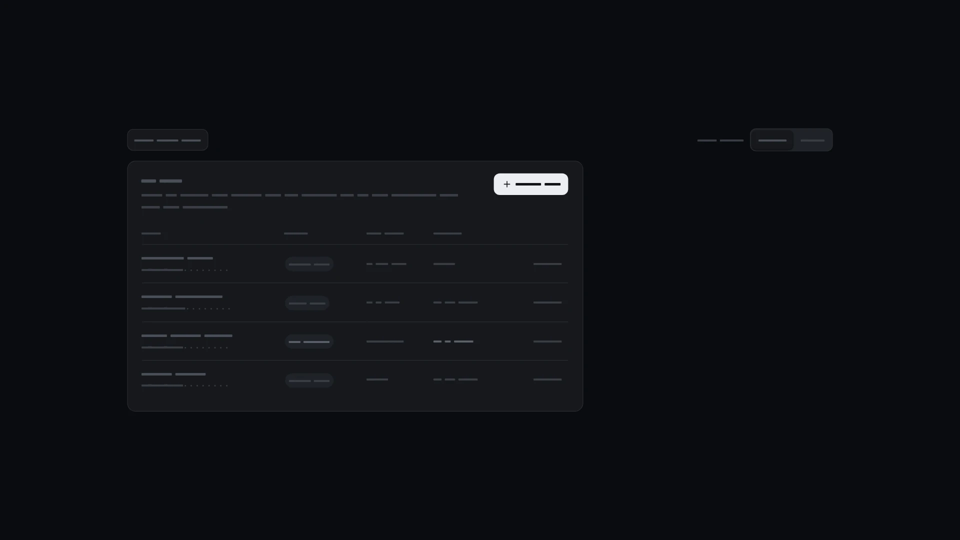
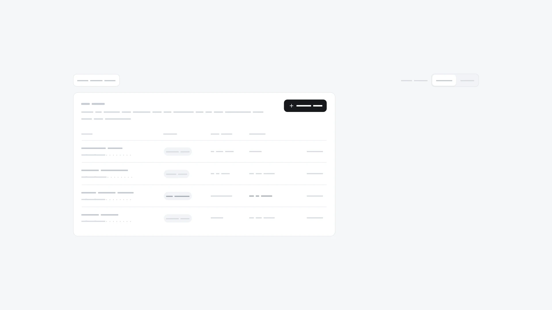
Create, list and revoke API keys: name, scope and expiry, the secret shown once with copy, last-used dates. It comes from the Settings kit and also works on its own. Keyboard and screen readers: Access is a radio group drawn as cards: arrow keys move and select, Tab leaves the group. The create dialog starts in the name field; after creating, focus moves to Copy and the copy result is announced. The show-once warning is text with an icon, not color alone; masked prefixes tell screen readers that characters are hidden. Every Revoke button names its key and asks for confirmation; with reduced motion new rows appear without sliding. Built with React 19 and TypeScript, Tailwind CSS 4, Base UI, Lucide icons and Motion. Light and dark themes come from CSS variables you can edit, and every demo uses believable sample data you replace with your own. Included: the component source, its sample data, light and dark theme variables, a runnable demo page, and setup guides for people and for AI coding agents.
Highlights
- Production-ready, documented source
- Clean, componentized architecture
- Drops into your stack with minimal setup