Overview
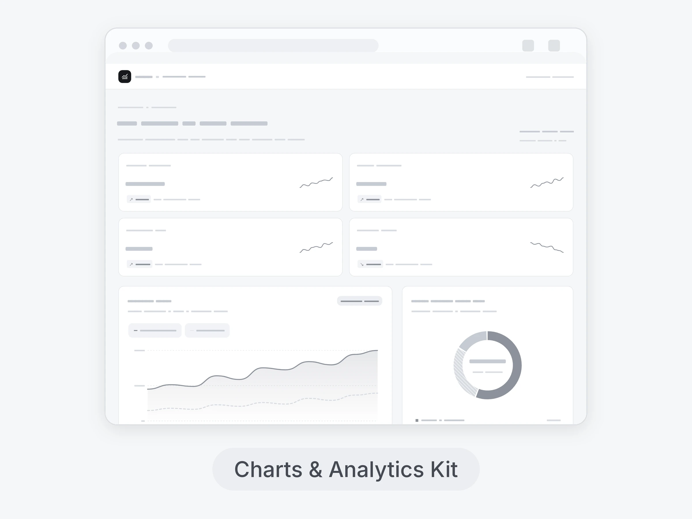
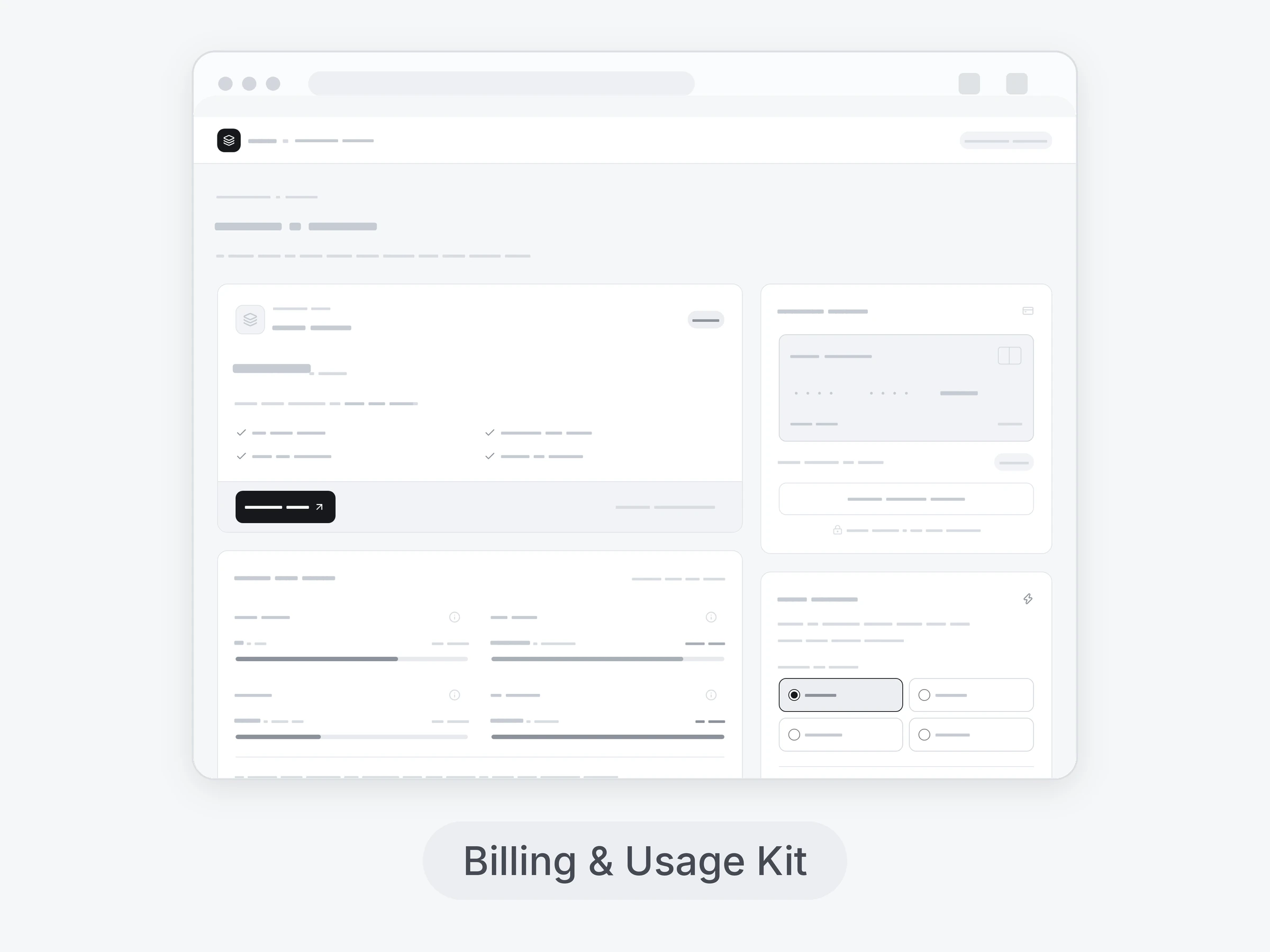
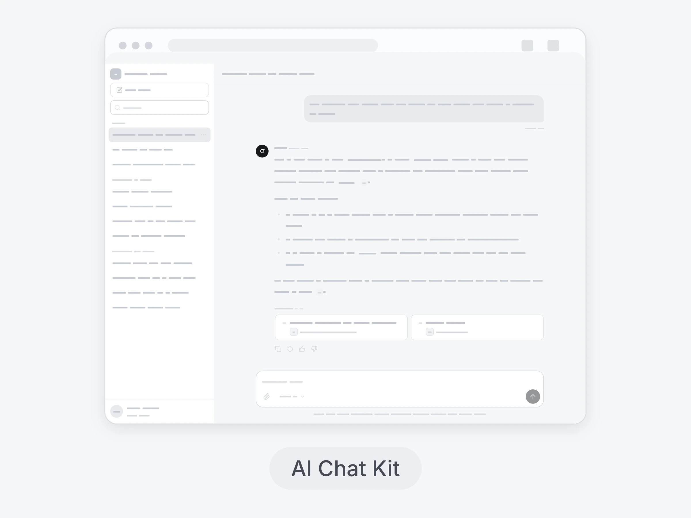
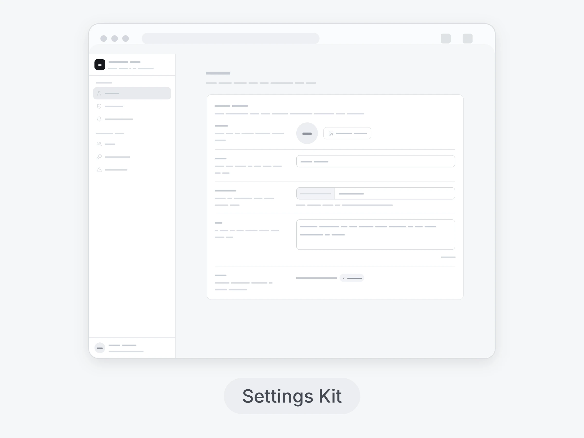
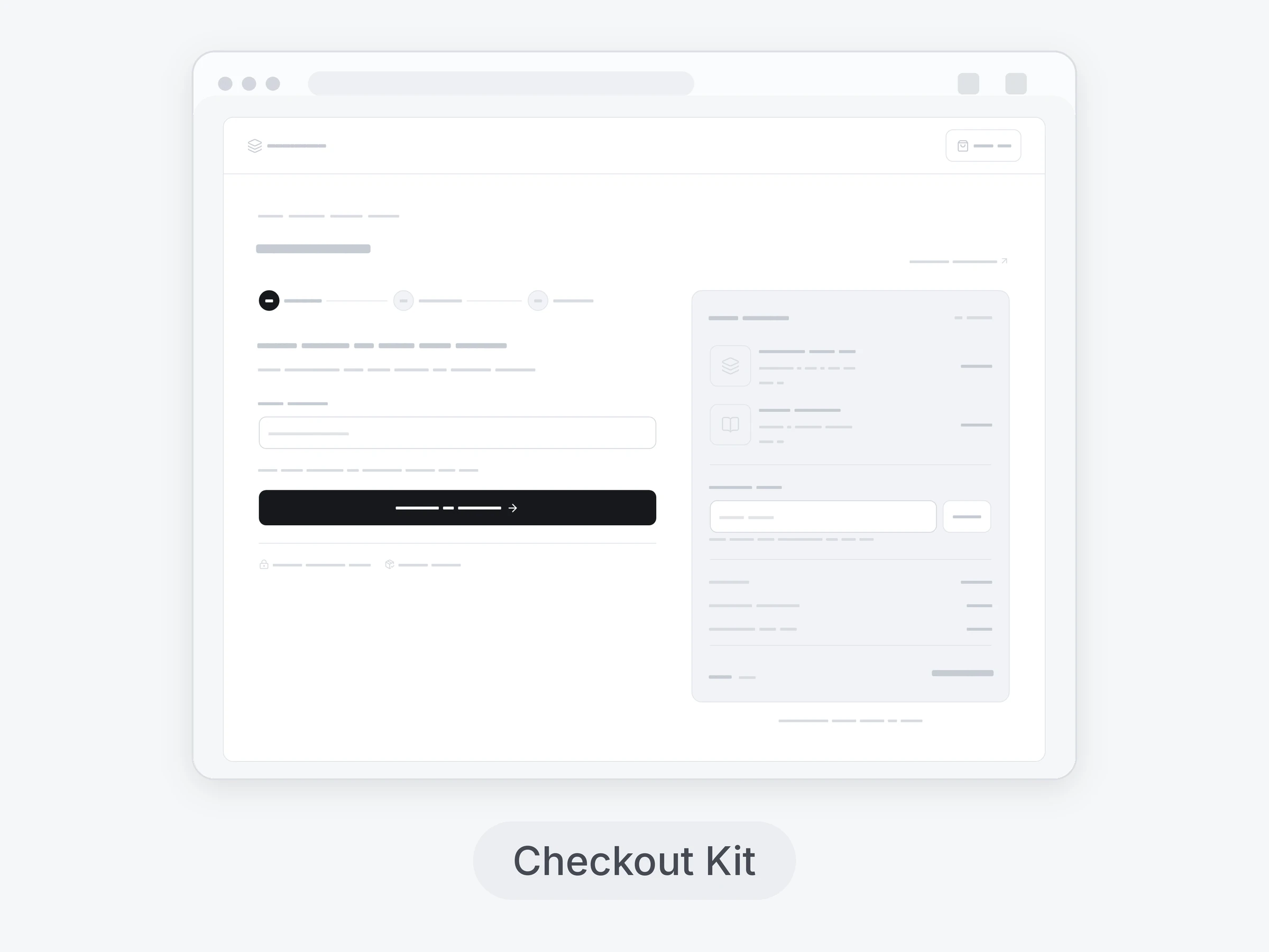
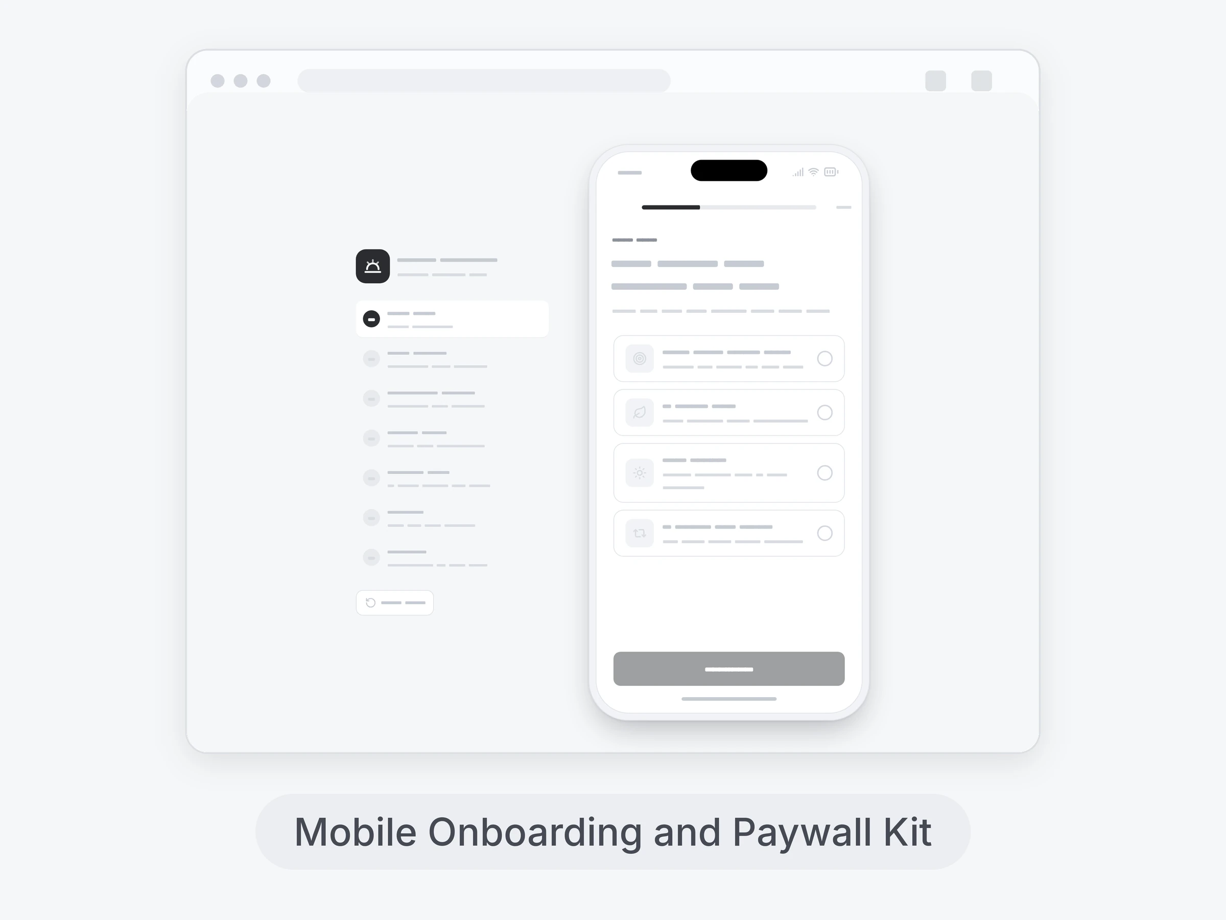
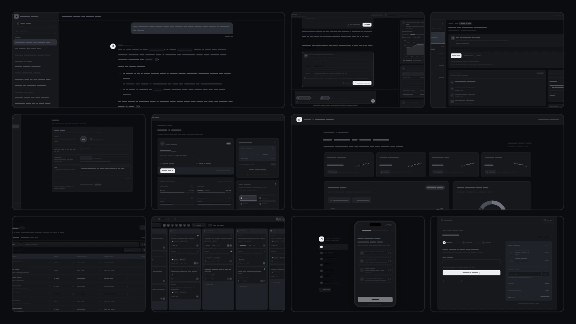
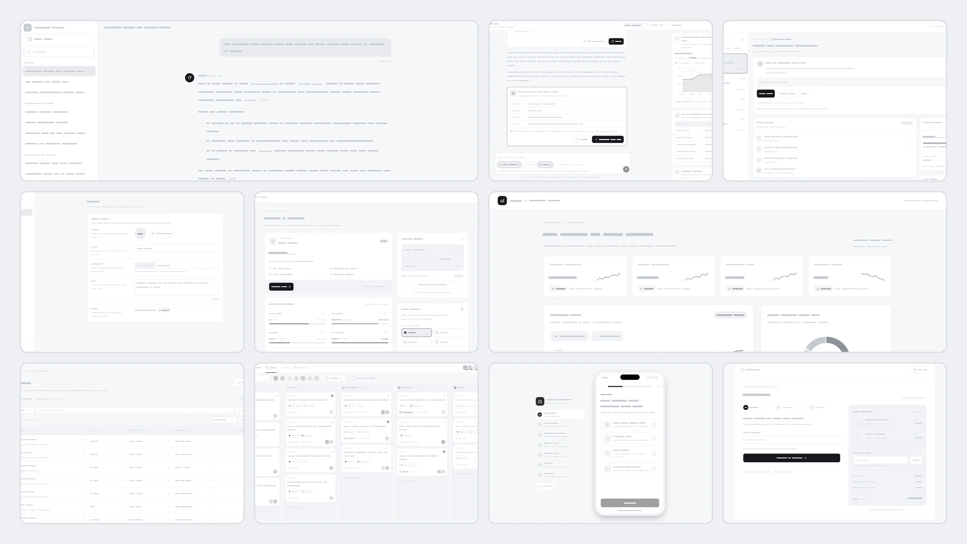
64 React components and 10 full app screens in one project, grouped in 10 kits with a switcher to move between them. Every kit opens as its own full screen, and each component also works on its own. The 64 components, by kit: AI Chat Kit, 7 components: chat thread, streaming message, prompt composer, suggestion chips, conversation sidebar, message actions and source citations. Tool Calls Kit, 6 components: tool call card, approval request, result cards, reasoning steps, tool error card and tool chips. Agent Monitor Kit, 7 components: session list, action timeline, approval gate, cost meter, task queue, checkpoint restore and live log. Settings Kit, 6 components: profile form, security panel, notification preferences, members and invites, developer keys and danger zone. Billing & Usage Kit, 6 components: current plan, usage meters, invoice table, payment method, upgrade modal and credits top-up. Data Table Kit, 6 components: filter bar, column manager, inline cell edit, bulk actions, grouped rows and table pagination. Kanban Kit, 6 components: kanban board, task detail panel, task list view, timeline view, board filters and assignee picker. Charts & Analytics Kit, 7 components: area chart, bar chart, donut chart, funnel chart, heatmap, kpi cards and period compare. Mobile Onboarding and Paywall Kit, 7 components: goal quiz, plan builder, permission primers, social proof step, founder note, trial timeline and paywall. Checkout Kit, 6 components: cart drawer, checkout steps, payment methods, order summary, upsell modal and order confirmation. Keyboard and screen readers: every component works with the keyboard, and its guide lists its screen reader and reduced-motion behavior. Built with React 19 and TypeScript, Tailwind CSS 4, Base UI, Lucide icons and Motion. Light and dark themes come from CSS variables you can edit, and every demo uses believable sample data you replace with your own. Included: the source of all 64 components, the 10 composed screens, sample data, light and dark theme variables, a runnable demo app with a kit switcher, and setup guides for people and for AI coding agents.
Highlights
- Production-ready, documented source
- Clean, componentized architecture
- Drops into your stack with minimal setup