Overview
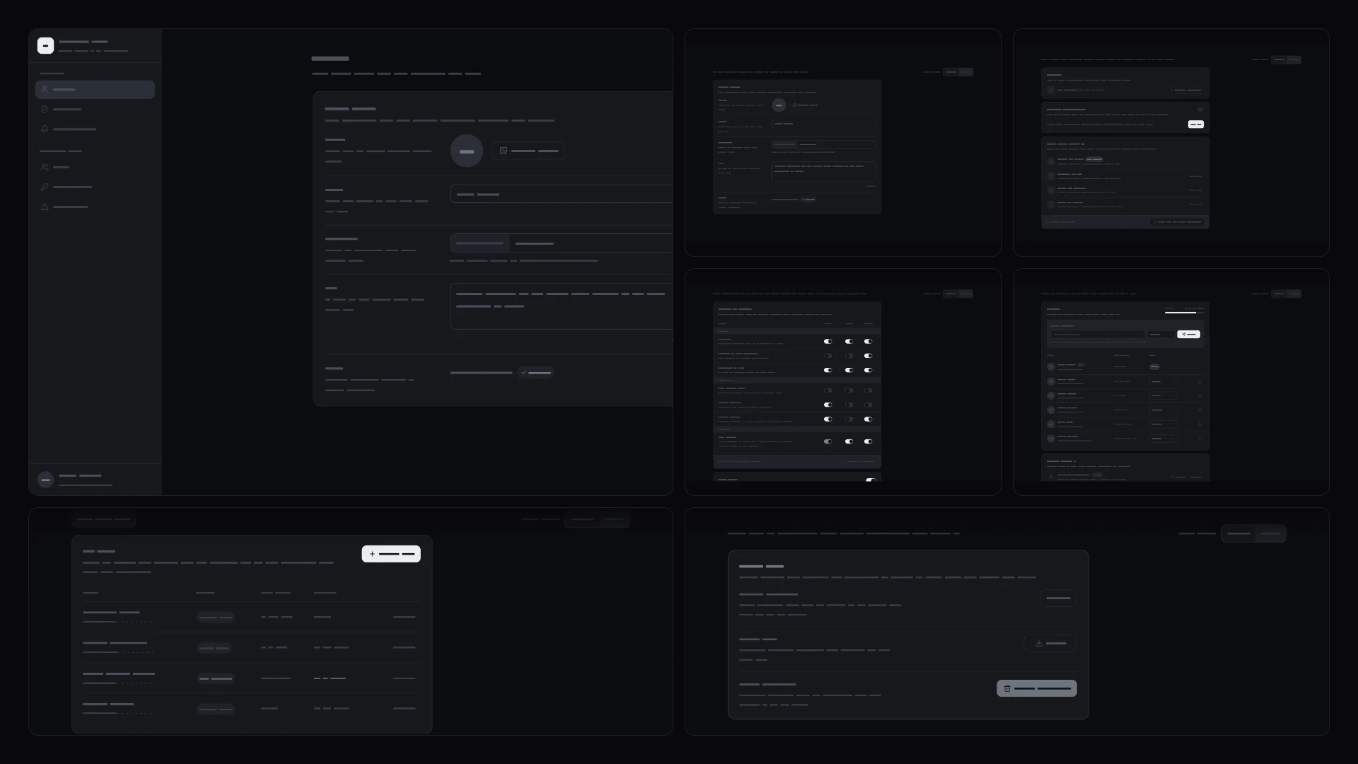
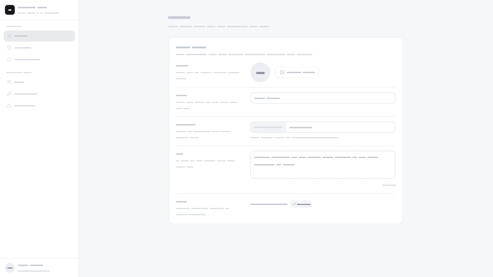
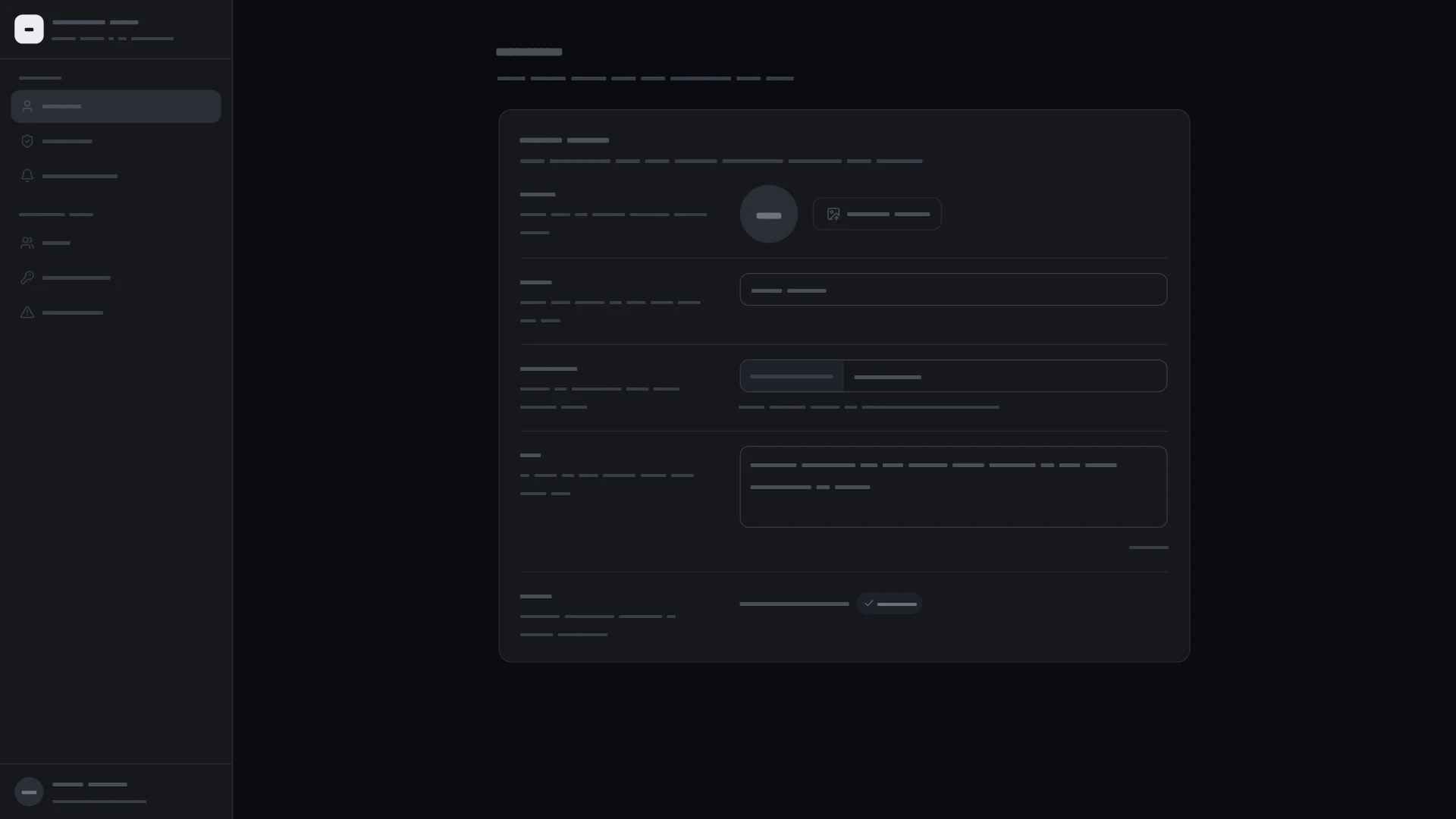
Account and workspace settings: profile, security with 2FA, notification matrix, members and invites, API keys and a danger zone. Every piece is wired into one full screen you can run, and each one also works on its own. Pieces (6): profile form, security panel, notification preferences, members and invites, developer keys and danger zone. Keyboard and screen readers: every piece works with the keyboard, and its guide lists its screen reader and reduced-motion behavior. Built with React 19 and TypeScript, Tailwind CSS 4, Lucide icons, Motion and Base UI. Light and dark themes come from CSS variables you can edit, and every demo uses believable sample data you replace with your own. Included: the source of all 6 components, the composed settings screen, sample data, light and dark theme variables, a runnable demo app, and setup guides for people and for AI coding agents.
Highlights
- Production-ready, documented source
- Clean, componentized architecture
- Drops into your stack with minimal setup