Overview
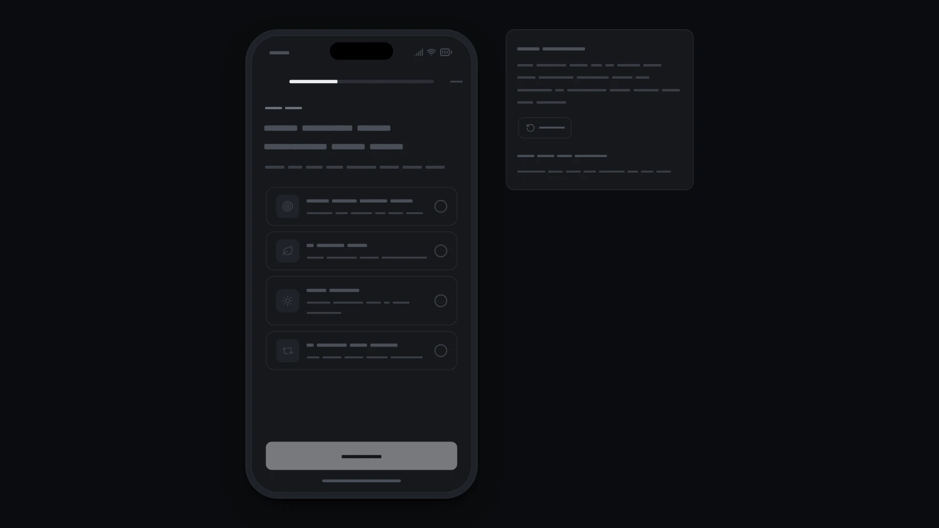
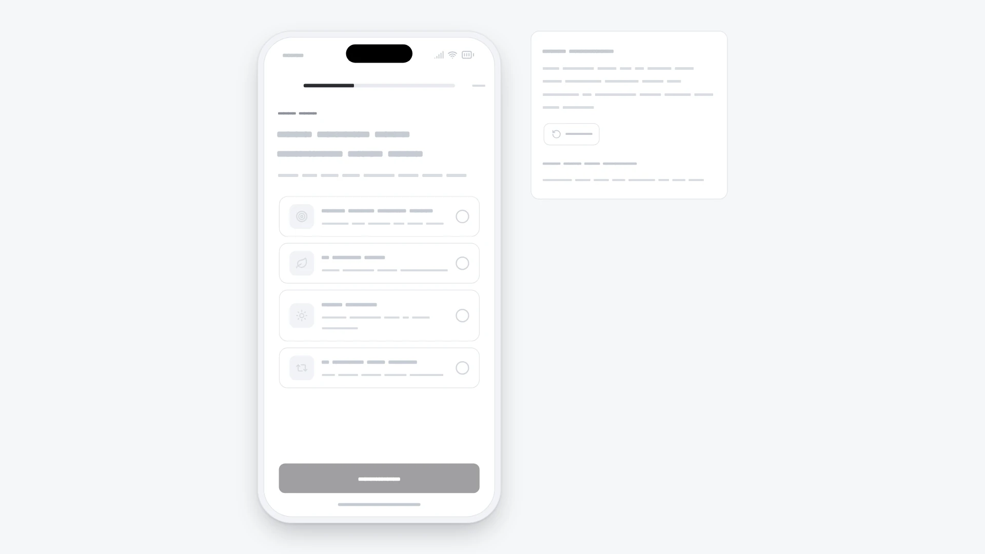
Onboarding questions one per screen, single or multiple choice with a limit, progress bar, back and continue. It comes from the Mobile onboarding and paywall kit and also works on its own. Keyboard and screen readers: Single choice is a radio group with one Tab stop: arrow keys move and select, Home and End jump. Multiple choice options are checkboxes; at the limit the rest are marked unavailable and a polite line says how to pick another. Continue stays disabled until the question is answered; after Next or Back focus moves to the new question's heading. Progress is a progressbar with "Question 2 of 3" as its value; with reduced motion steps swap without sliding and presses do not scale. Built with React 19 and TypeScript, Tailwind CSS 4, Lucide icons and Motion. Light and dark themes come from CSS variables you can edit, and every demo uses believable sample data you replace with your own. Included: the component source, its sample data, light and dark theme variables, a runnable demo page, and setup guides for people and for AI coding agents.
Highlights
- Production-ready, documented source
- Clean, componentized architecture
- Drops into your stack with minimal setup