Overview
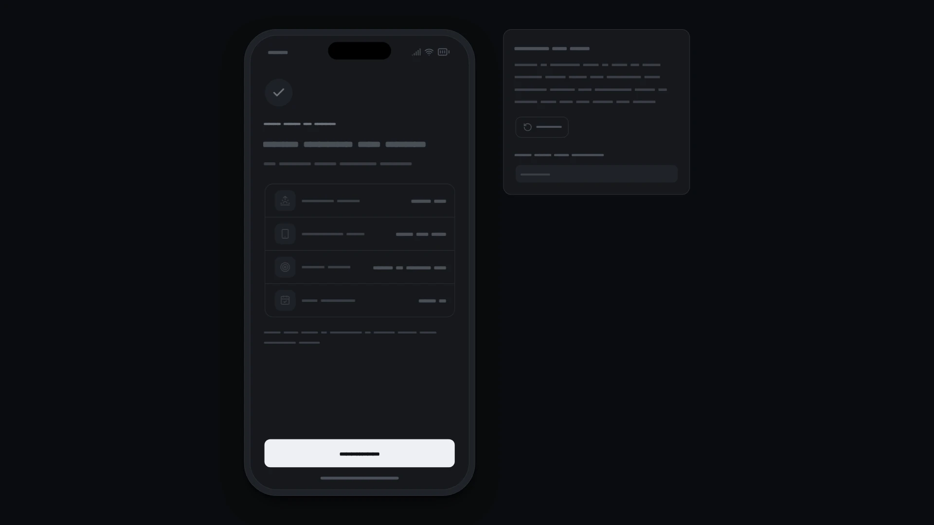
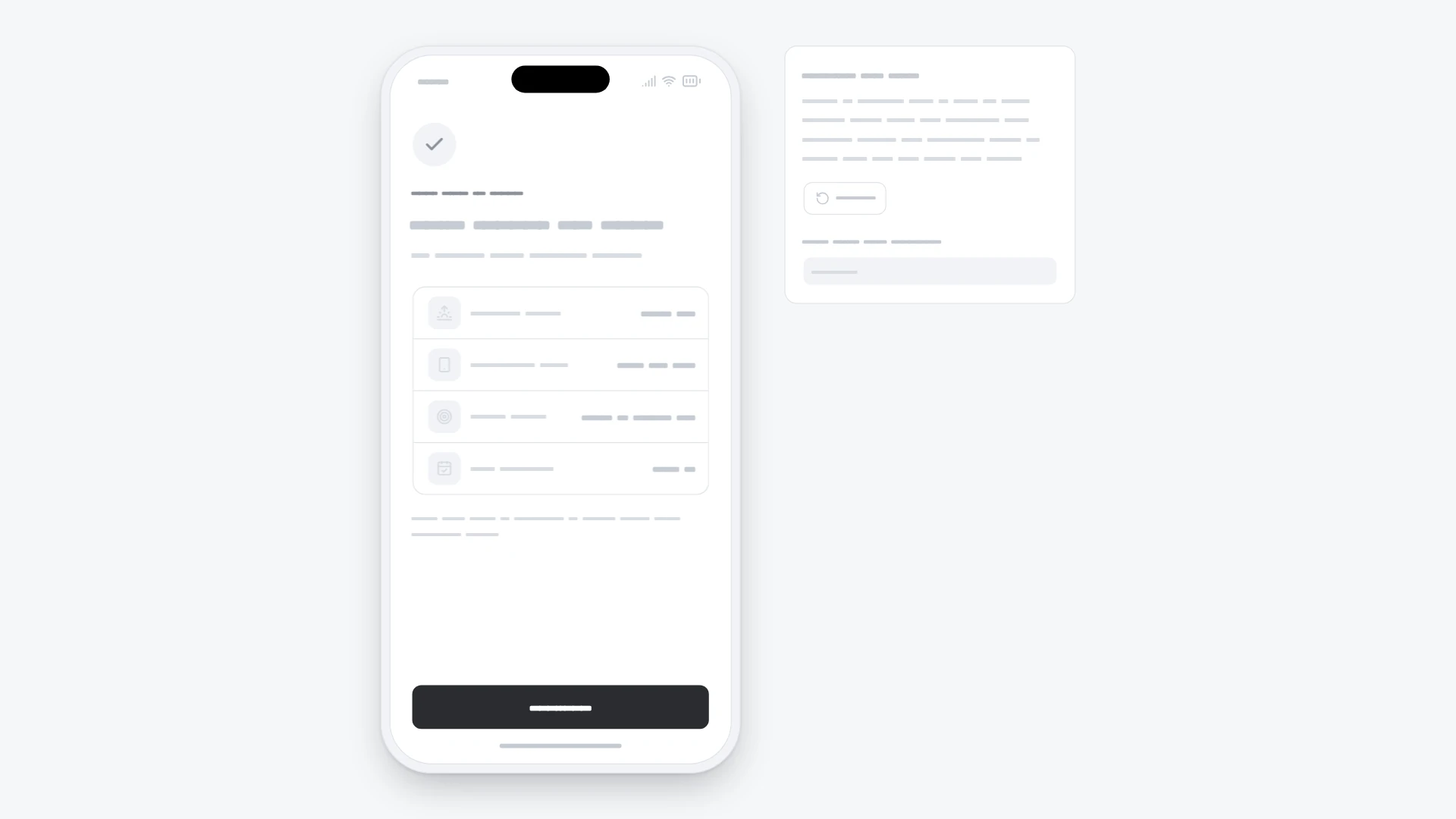
"Building your plan" loader with a percentage and a checklist that fills, then a summary of the plan with Continue. It comes from the Mobile onboarding and paywall kit and also works on its own. Keyboard and screen readers: The bar is a progressbar with a percentage value; a polite status line announces each finished step and then the result. Each checklist line tells screen readers whether it is done, in progress or waiting, not only by icon. When the summary appears its heading takes focus only if focus was already on this screen. With reduced motion the bar jumps in steps, spinners stand still and the summary appears without movement. Built with React 19 and TypeScript, Tailwind CSS 4, Lucide icons and Motion. Light and dark themes come from CSS variables you can edit, and every demo uses believable sample data you replace with your own. Included: the component source, its sample data, light and dark theme variables, a runnable demo page, and setup guides for people and for AI coding agents.
Highlights
- Production-ready, documented source
- Clean, componentized architecture
- Drops into your stack with minimal setup