
A CSS animation is a set of @keyframes applied to an element with the animation property, which controls duration, easing, delay, repetition and fill. The examples below cover the jobs animation does in real interfaces: entrances, slide-ins, staggered lists, attention cues, loaders, skeletons, popovers and scroll reveals, each with reduced-motion handling.
Every snippet animates opacity, transform or the individual translate, scale and rotate properties, which the web.dev animations guide recommends because they avoid layout and paint. All CSS was validated with csstree-validator, and the patterns were rendered and measured in Chromium on 2026-10-09. For ready-made animated components you can edit, see the HorizonX animated UI components library.
Animation, transition or JavaScript?
Pick the tool before writing keyframes.
| You need | Use | Example |
|---|---|---|
| A change between two states, triggered by hover, focus or a class | transition |
Button hover, popover open |
| Several steps, a loop, or motion that starts on its own | @keyframes + animation |
Loader, entrance, pulse |
| Control from code: pause, reverse, sequence, wait for the end | Web Animations API (element.animate()) |
Drag release, chained steps |
| Timelines across many elements, text splitting, complex scroll sequences | A library | Hero sequences, split text |
The MDN animation reference documents the shorthand. Its one ordering rule matters: the first time value is the duration, the second is the delay. For the JavaScript side, our guide to text animation in JavaScript compares CSS, the Web Animations API and GSAP.
A reduced-motion strategy for every example
The examples use one rule: motion that only decorates goes inside @media (prefers-reduced-motion: no-preference), so people who asked their system for less motion never get it. Motion that carries meaning, such as a loader showing work in progress, stays but gets calmer under reduce. This follows WCAG 2.3.3, a level AAA criterion that asks that motion triggered by interaction can be disabled unless it is essential. The prefers-reduced-motion query is widely available.
1. Fade and rise on entry
@keyframes fade-up {
  from {
    opacity: 0;
    translate: 0 12px;
  }
}

@media (prefers-reduced-motion: no-preference) {
  .fade-up {
    animation: fade-up 320ms ease-out both;
  }
}
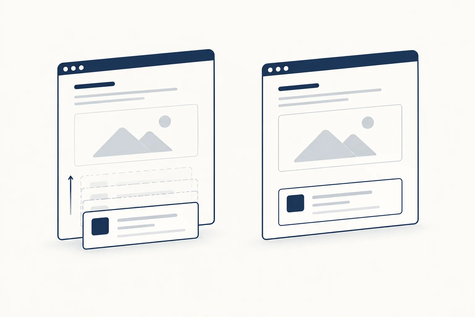
The keyframes define only from. The browser animates to the element's normal styles, so the same keyframes work on elements with different final opacity or position. both applies the first frame during any delay, which prevents a flash of the final state before the animation starts. With reduced motion the element simply appears.
2. Slide in from the right
@keyframes slide-in-right {
  from {
    translate: 100% 0;
  }
}

@keyframes fade-in {
  from {
    opacity: 0;
  }
}

.toast-region {
  overflow-x: clip;
}

.toast {
  animation: fade-in 150ms ease-out both;
}

@media (prefers-reduced-motion: no-preference) {
  .toast {
    animation: slide-in-right 280ms cubic-bezier(0.2, 0.8, 0.2, 1) both;
  }
}
translate: 100% 0 moves the element by its own width, so it starts just off its container's right edge whatever its size. overflow-x: clip on the container stops the off-screen start from creating a horizontal scrollbar. Under reduced motion the toast fades in instead of traveling, so the user still notices it.
3. Staggered list
<ul class="stagger">
  <li style="--i: 0">First</li>
  <li style="--i: 1">Second</li>
  <li style="--i: 2">Third</li>
</ul>
@media (prefers-reduced-motion: no-preference) {
  .stagger > * {
    animation: fade-up 320ms ease-out both;
    animation-delay: calc(min(var(--i, 0), 10) * 60ms);
  }
}
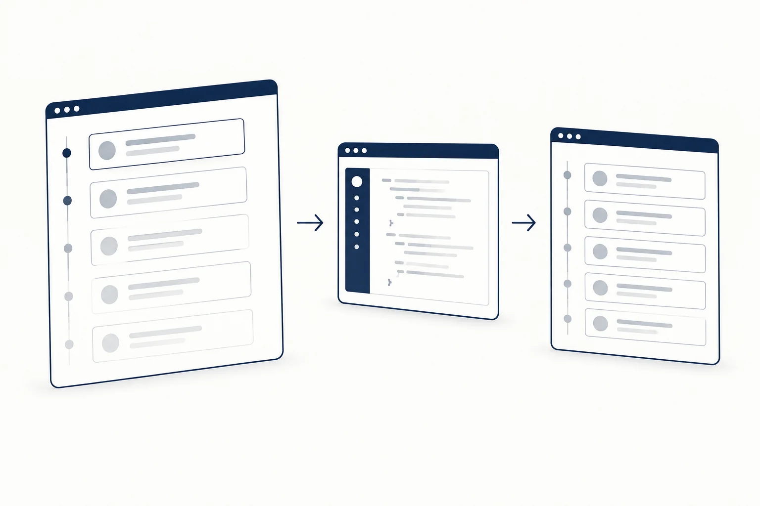
Each item waits 60ms longer than the one before. The min() caps the delay at the tenth item, so a list of forty does not keep the last row hidden for over two seconds. In our render, items 0, 2 and 14 got delays of 0s, 0.12s and 0.6s.
The inline --i values will soon be optional. sibling-index() returns an element's position among its siblings, and it reached Baseline in August 2026 (Chrome 138, Firefox 154, Safari 26.2, per web-features data checked 2026-10-09). To use it with a fallback, drop the inline styles and add:
@supports (order: sibling-index()) {
  .stagger > * {
    --i: calc(sibling-index() - 1);
  }
}
Older browsers then show every item at once, which is a fine fallback.
4. Attention pulse that stops
@keyframes pulse {
  50% {
    scale: 1.15;
  }
}

@media (prefers-reduced-motion: no-preference) {
  .badge--new {
    animation: pulse 1.2s ease-in-out 3;
  }
}
The iteration count of 3 matters. An infinite pulse keeps pulling the eye away from whatever the user is reading. Three cycles last 3.6 seconds, inside the five-second limit after which WCAG 2.2.2 requires a way to pause moving content. Keep the change in size small and the rhythm slow; a fast bright blink is a flash, and WCAG 2.3.1 limits flashes to three per second.
5. Spinner loader
<div role="status">
  <span class="spinner" aria-hidden="true"></span>
  <span class="visually-hidden">Loading results</span>
</div>
@keyframes spin {
  to {
    rotate: 1turn;
  }
}

.spinner {
  display: inline-block;
  width: 2rem;
  aspect-ratio: 1;
  border: 3px solid #d0d5dd;
  border-top-color: #192c46;
  border-radius: 50%;
  animation: spin 800ms linear infinite;
}

@media (prefers-reduced-motion: reduce) {
  .spinner {
    animation-duration: 2.4s;
  }
}
The spinner is the exception to the opt-in rule: its motion tells the user the page is still working, so reduced motion slows it down rather than stopping it. The role="status" wrapper with visible-to-screen-reader text announces the state; the spinner itself is hidden from assistive technology. Use your project's visually hidden utility class for the label. The HorizonX CSS loaders collection has more loader styles, and Word Carousel Loader is a useful example of generated keyframes: it builds the keyframes from your word list and exposes every value as a custom property.
6. Skeleton shimmer
.skeleton {
  position: relative;
  overflow: hidden;
  border-radius: 6px;
  background: #e4e7ec;
}

.skeleton::after {
  content: "";
  position: absolute;
  inset: 0;
  background: linear-gradient(90deg, transparent, rgb(255 255 255 / 0.6), transparent);
  translate: -100% 0;
}

@keyframes shimmer {
  to {
    translate: 100% 0;
  }
}

@media (prefers-reduced-motion: no-preference) {
  .skeleton::after {
    animation: shimmer 1.4s ease-in-out infinite;
  }
}
Many shimmer snippets animate background-position, which repaints the block every frame. Moving a gradient pseudo-element with translate gives the same look on the compositor. Under reduced motion the skeleton is a plain gray block, which still reads as "loading". Mark the region that is loading with aria-busy="true" and remove it when content arrives.
7. Popover that animates in and out
Entry and exit animations used to need JavaScript because display: none cannot be transitioned. Two newer features fix that: @starting-style defines the values to transition from when an element first renders, and transition-behavior: allow-discrete lets display and overlay switch at the right end of the transition.
<button popovertarget="menu">Menu</button>
<div class="menu" id="menu" popover>Menu items</div>
.menu[popover] {
  opacity: 0;
  translate: 0 8px;
  transition:
    opacity 200ms ease-out,
    translate 200ms ease-out,
    overlay 200ms allow-discrete,
    display 200ms allow-discrete;
}

.menu[popover]:popover-open {
  opacity: 1;
  translate: 0 0;
}

@starting-style {
  .menu[popover]:popover-open {
    opacity: 0;
    translate: 0 8px;
  }
}

@media (prefers-reduced-motion: reduce) {
  .menu[popover],
  .menu[popover]:popover-open {
    translate: none;
  }
}
In our render, opacity was about 0.26 sixty milliseconds after opening and 1 after the transition. Sixty milliseconds after closing, the popover was still displayed and fading, and it switched to display: none once the fade ended. Support, from web-features data checked 2026-10-09: @starting-style and transition-behavior are Baseline since August 2024 (Chrome 117, Firefox 129, Safari 17.5). The overlay property is Chromium only; in other browsers the popover can leave the top layer before the exit fade finishes. Opening is unaffected everywhere, and the reduced-motion block keeps the fade but removes the movement.
8. Reveal on scroll without JavaScript
@supports (animation-timeline: view()) {
  @media (prefers-reduced-motion: no-preference) {
    .reveal {
      animation: fade-up linear both;
      animation-timeline: view();
      animation-range: entry 0% entry 60%;
    }
  }
}
view() ties the animation's progress to the element's position in the viewport instead of time. The animation completes while the element travels through the first 60% of its entry. Order matters: the animation shorthand resets animation-timeline and animation-range, so declare both after it. MDN's animation-timeline page explains the same pitfall, and the shorthand reference adds that a browser which does not accept a timeline inside the shorthand drops the whole declaration. In our render the element sat at opacity 0 below the fold and reached 1 when scrolled to the middle of the viewport.
Scroll-driven animations are not Baseline: Chrome 115 and Safari 26 support them, and Firefox has them only in preview builds (checked 2026-10-09). The @supports wrapper means other browsers show the content without animation, which is why the base state must be the visible one. For when scroll-linked motion helps and when it gets in the way, see scroll-driven and auto-drifting galleries.
Checklist before shipping a CSS animation
- It animates
opacityand transforms. If it animateswidth,height,toporbox-shadow, there is a cheaper way. - Decorative motion is inside
prefers-reduced-motion: no-preference. Meaningful motion is calmer underreduce, not gone. - Anything that moves on its own for more than five seconds can be paused, or stops by itself.
- Nothing flashes more than three times per second.
- The element is visible and usable if the animation never runs (old browser,
@supportsfalse, reduced motion). - As a rule of thumb, interface feedback stays around 150 to 400ms. Longer durations suit loops and ambient motion.
- Entrance delays are capped so the last item does not wait seconds.
FAQ
What is the order of the CSS animation shorthand?
Most values can come in any order, with two rules. The first time value is animation-duration and the second is animation-delay, and a keyframes name should not match a keyword such as ease or infinite. A typical declaration is animation: fade-up 320ms ease-out 100ms both. The shorthand resets animation-timeline and animation-range, so write those on their own lines after it.
How do I make an element slide in from the right in CSS?
Define keyframes that start from translate: 100% 0 and let the element animate to its normal position, as in example 2. Clip overflow on the parent so the starting position does not add a horizontal scrollbar, and replace the slide with a fade under reduced motion.
Is there a CSS animation library I can use?
Animate.css is a long-standing option: you add animate__animated plus an effect class such as animate__fadeInUp, and it ships the keyframes. Check its license before adopting it, since it uses the Hippocratic License rather than MIT. For a handful of effects, copying the keyframes you need, like the ones above, keeps the CSS smaller and under your control.
Next step
Copy the pattern that matches the job, keep the reduced-motion block with it, and run the checklist. To see these ideas in finished components you can edit and export, browse the HorizonX animated UI components library.