

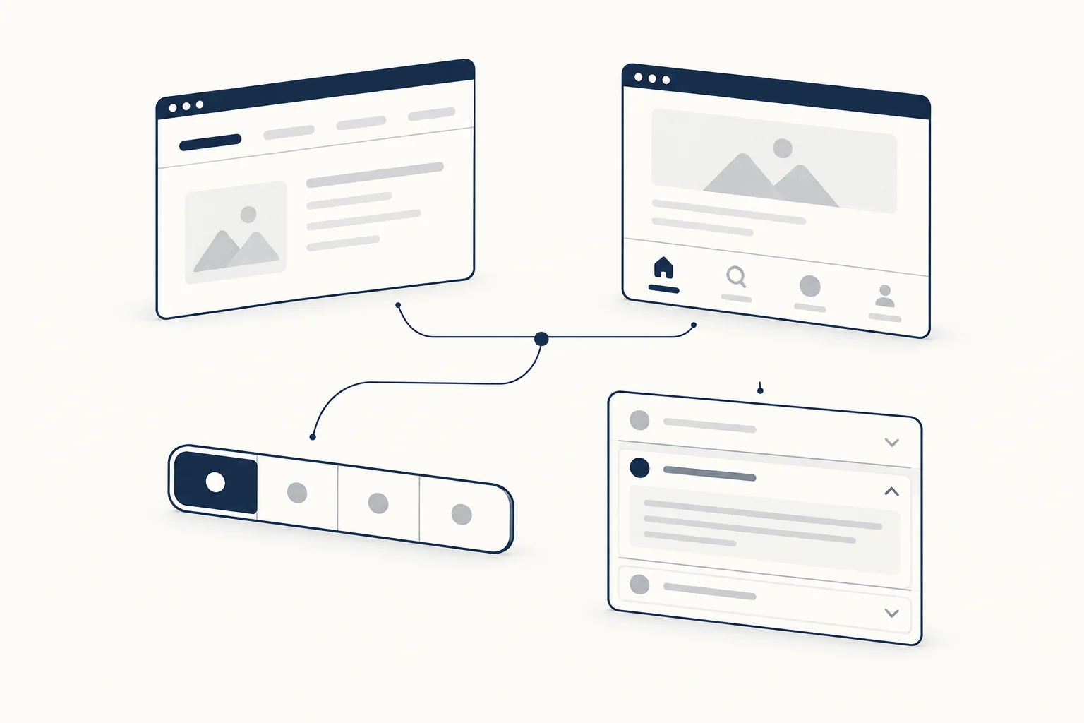
Good tab bar design starts with knowing which tab bar you are building. An app tab bar moves between sections, so it is navigation: links with aria-current. In-page tabs swap panels inside one view, so they follow the WAI-ARIA tabs pattern: a tablist, arrow keys and one visible panel. Segmented controls and accordions cover the rest.
This guide gives a decision table for those four patterns, the design rules that keep tabs usable, tested HTML, CSS, JavaScript and React code for accessible in-page tabs, and a pre-ship checklist. If you are still deciding whether a landing page section should use tabs at all, start with our feature section walkthrough on grids, tabs and step-by-step layouts. This article picks up where that one ends: the tab component itself. For ready-made tabs, steppers and menus, see the navigation components collection.
Navigation tabs vs in-page tabs
The two look alike and behave differently. Nielsen Norman Group's Tabs, Used Right (last reviewed September 2026) separates them:
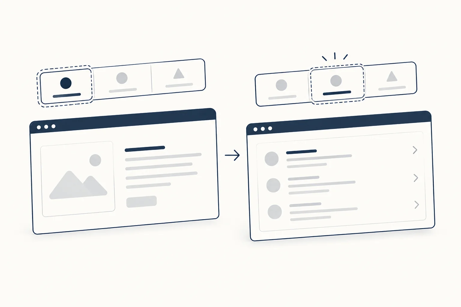
- In-page tabs "are not for navigation but enable users to alter the content displayed in the panel". People expect to stay in the current view, and they expect the panel to appear instantly.
- Navigation tabs take people to different pages or app sections. People expect a new view and accept a slight loading delay. On mobile they often sit at the bottom of the screen.
Apple's Human Interface Guidelines for tab bars describe the mobile version as navigation too: "Use a tab bar to support navigation, not to provide actions." The same page asks you to keep the tab bar visible as people move between sections, to avoid overflow tabs, and not to disable or hide tab bar buttons when their content is unavailable. Explain the empty state inside the section instead.
The difference matters for the code. An app tab bar or a row of section links is a <nav> with links and aria-current="page" on the current one. It does not get role="tablist": the tab roles describe panels of content on the same page, and a set of links to other pages has no panels.
<nav class="tab-bar" aria-label="Main">
  <a href="/inbox" aria-current="page">Inbox</a>
  <a href="/search">Search</a>
  <a href="/settings">Settings</a>
</nav>
Tabs vs segmented control vs navigation vs accordion
| You need to | Use | Markup |
|---|---|---|
| Move between app sections or pages, each with its own URL | Navigation tab bar | <nav>, links, aria-current="page" |
| Switch between related panels of content in one view | In-page tabs | tablist, tab, tabpanel (APG tabs pattern) |
| Pick one option that changes a view or a setting, such as Day, Week, Month | Segmented control | A radio group: fieldset with native radios |
| Let people open several sections, or read sections in order on a small screen | Accordion | Disclosure buttons with aria-expanded |
| Compare information across groups | None of these: show it on one page | Headings and sections |
Apple's segmented control guidance fits the third row: use it for "closely related choices that affect an object, state, or view", keep segments equal in width, and aim for no more than about five to seven segments in a wide interface and about five on iPhone. The web has no segmented control role, so a radio group (APG radio group pattern) is the closest semantic match.
For in-page tabs, NN/g lists the conditions where they work: lengthy content with clear groupings, few groupings, content of unequal importance (the default tab gets most of the attention), labels that can be short, and no need to see two panels at once. If people have to flip back and forth to compare, tabs add memory load and interaction cost. Put everything on one page instead.
Build accessible tabs with the WAI-ARIA pattern
The APG tabs pattern defines the contract:
- A container with
role="tablist", labelled byaria-labelledbyoraria-label. - Each tab has
role="tab",aria-controlspointing to its panel, andaria-selected="true"on the active one only. - Each panel has
role="tabpanel"andaria-labelledbypointing back to its tab. If the panel's first content is not focusable, give ittabindex="0". - Tab moves focus to the active tab, and Tab again moves to the panel. Left and Right Arrow move between tabs and wrap at the ends. Home and End are optional. A horizontal tab list leaves Up and Down Arrow alone so the page can still scroll.
- APG recommends activating a tab as soon as it receives focus "as long as their associated tab panels are displayed without noticeable latency". If a panel has to load, use manual activation: arrows move focus, and Space or Enter selects.
<div class="tabs">
  <div role="tablist" aria-label="Plan details">
    <button type="button" role="tab" id="tab-features" aria-selected="true" aria-controls="panel-features">Features</button>
    <button type="button" role="tab" id="tab-limits" aria-selected="false" aria-controls="panel-limits" tabindex="-1">Limits</button>
    <button type="button" role="tab" id="tab-support" aria-selected="false" aria-controls="panel-support" tabindex="-1">Support</button>
  </div>
  <div role="tabpanel" id="panel-features" aria-labelledby="tab-features" tabindex="0">
    <p>Everything included in the plan.</p>
  </div>
  <div role="tabpanel" id="panel-limits" aria-labelledby="tab-limits" tabindex="0" hidden>
    <p>Usage limits and quotas.</p>
  </div>
  <div role="tabpanel" id="panel-support" aria-labelledby="tab-support" tabindex="0" hidden>
    <p>How to reach the team.</p>
  </div>
</div>
Only the active tab is in the Tab sequence (tabindex="-1" on the others). MDN's tab role page stresses that tabindex="0" and aria-selected="true" must always move together.
function initTabs(tablist) {
  const tabs = [...tablist.querySelectorAll('[role="tab"]')];

  function select(tab) {
    for (const t of tabs) {
      const selected = t === tab;
      t.setAttribute('aria-selected', String(selected));
      t.tabIndex = selected ? 0 : -1;
      document.getElementById(t.getAttribute('aria-controls')).hidden = !selected;
    }
    tab.focus();
  }

  tablist.addEventListener('click', (event) => {
    const tab = event.target.closest('[role="tab"]');
    if (tab) select(tab);
  });

  tablist.addEventListener('keydown', (event) => {
    const i = tabs.indexOf(document.activeElement);
    if (i === -1) return;
    const target = {
      ArrowLeft: (i - 1 + tabs.length) % tabs.length,
      ArrowRight: (i + 1) % tabs.length,
      Home: 0,
      End: tabs.length - 1,
    }[event.key];
    if (target === undefined) return;
    event.preventDefault();
    select(tabs[target]);
  });
}

document.querySelectorAll('[role="tablist"]').forEach(initTabs);
This is automatic activation. For manual activation, make the arrow keys move focus and roving tabindex without changing aria-selected or the panels, and keep the click handler as it is: a <button> already turns Space and Enter into a click.
[role="tablist"] {
  display: flex;
  gap: 0.25rem;
  border-bottom: 1px solid #d1d5db;
  overflow-x: auto;
}

[role="tab"] {
  flex: none;
  padding: 0.625rem 1rem;
  border: 0;
  border-bottom: 3px solid transparent;
  background: none;
  color: #4b5563;
  font: inherit;
  white-space: nowrap;
  cursor: pointer;
}

[role="tab"][aria-selected="true"] {
  border-bottom-color: currentColor;
  color: #111827;
}

[role="tab"]:focus-visible,
[role="tabpanel"]:focus-visible {
  outline: 2px solid #1d4ed8;
  outline-offset: 2px;
}

[role="tabpanel"] {
  padding-block: 1rem;
}
The selected tab gets an underline as well as a darker color, so the state does not depend on color alone. The weight stays the same in both states so tab widths do not jump when the selection changes. Styling through the ARIA attributes keeps the visual state and the accessible state from drifting apart.
React tabs
If you already use a headless library, Radix UI Tabs states that it adheres to the WAI-ARIA tabs pattern and has an activationMode prop ("automatic" by default, or "manual"), and React Aria's useTabList exposes the same choice as keyboardActivation. If you want no dependency, this component implements the pattern above:
import { useId, useRef, useState } from 'react';

export function Tabs({ label, items }) {
  const [active, setActive] = useState(0);
  const tabRefs = useRef([]);
  const base = useId();
  const last = items.length - 1;

  function onKeyDown(event) {
    const next = {
      ArrowLeft: active === 0 ? last : active - 1,
      ArrowRight: active === last ? 0 : active + 1,
      Home: 0,
      End: last,
    }[event.key];
    if (next === undefined) return;
    event.preventDefault();
    setActive(next);
    tabRefs.current[next].focus();
  }

  return (
    <div className="tabs">
      <div role="tablist" aria-label={label} onKeyDown={onKeyDown}>
        {items.map((item, i) => (
          <button
            key={item.id}
            ref={(el) => {
              tabRefs.current[i] = el;
            }}
            type="button"
            role="tab"
            id={`${base}-tab-${i}`}
            aria-selected={i === active}
            aria-controls={`${base}-panel-${i}`}
            tabIndex={i === active ? 0 : -1}
            onClick={() => setActive(i)}
          >
            {item.label}
          </button>
        ))}
      </div>
      {items.map((item, i) => (
        <div
          key={item.id}
          role="tabpanel"
          id={`${base}-panel-${i}`}
          aria-labelledby={`${base}-tab-${i}`}
          tabIndex={0}
          hidden={i !== active}
        >
          {item.content}
        </div>
      ))}
    </div>
  );
}

// <Tabs label="Plan details" items={[{ id: 'features', label: 'Features', content: <p>Everything included.</p> }]} />
useId keeps the ids unique when the component appears more than once on a page. The CSS above works unchanged because it targets roles and ARIA states.
Tab design checklist
- [ ] You picked the right pattern: navigation tab bar, in-page tabs, segmented control or accordion (see the table).
- [ ] There are few tabs, the labels are short, and they name the content. If the tabs overflow on small screens, reconsider the grouping before adding scroll arrows.
- [ ] The default tab holds the most important content. People rarely open every tab.
- [ ] No disabled tabs. An empty section explains itself inside its panel.
- [ ] The selected state uses more than color, such as an underline or a fill, and the indicator has 3:1 contrast against its background (WCAG 1.4.11).
- [ ] Only the active tab is in the Tab order. Left and Right Arrow wrap, and Home and End work.
- [ ] Panels appear instantly with automatic activation, or you switched to manual activation.
- [ ] Focus is visible on tabs and panels.
- [ ] Navigation tab bars use links and
aria-current="page", notrole="tab".
FAQ
What are tabs in UI?
Tabs are a row of labels that switch which content you see. In-page tabs swap between related panels inside one view, and people expect to stay on the same page and see the new panel instantly. Navigation tabs look similar but take people to different pages or app sections. The two need different code: in-page tabs follow the WAI-ARIA tabs pattern with a tablist and panels, while navigation tabs are links inside a <nav>.
What is a tab bar?
A tab bar is a row of navigation tabs that moves people between the main sections of an app, often fixed to the bottom of the screen on mobile. Each tab opens its own section or page, so people expect a new view and accept a short loading delay. On the web, build it as a <nav> of links with aria-current="page" on the current one, not as a role="tablist", because there are no panels on the same page.
When should you use tabs in UI?
Use in-page tabs when the content is long, splits into a few clear groups with short labels, is of unequal importance, and people do not need to see two panels at once. Those are the conditions Nielsen Norman Group lists. If people have to flip back and forth to compare panels, tabs add memory load, so put everything on one page instead. To pick one option such as Day, Week or Month, a segmented control fits better.
How do you design an iOS tab bar?
Follow Apple's Human Interface Guidelines for tab bars: use the tab bar to move between sections, never to trigger actions, and keep it visible as people move around the app. Avoid overflow tabs, and do not disable or hide a tab when its content is unavailable. Let the section open and explain the empty state inside it. Keep the labels short and make them name the content. For choosing one option within a view, use a segmented control instead.
Start from an editable tab component
Beacon Tabs is a row of two to six tiles, numbered by default with editable labels, that animates the selection. It has a visible focus ring and a reduced-motion fallback, and it exports as HTML, Svelte or React. Under the hood it is a radio group (role="radiogroup" with native radio inputs), which is the right markup when it acts as a segmented control that picks one option. To use it as tabs that show panels, keep its visual style and replace the markup with the tablist pattern above.
For more tabs, steppers and menus, browse the navigation components collection.