

A hero section is the first full-width block at the top of a web page, the part visitors see before they scroll. It usually holds the page's main headline, a short supporting line, one or two calls to action and a visual. Its job is to say what the page offers and what to do next.
This guide covers the parts of a hero, the common layouts and when each fits, then a semantic HTML and CSS version that loads fast and stays accessible. If you want a finished one to edit, the HorizonX hero sections collection gathers our hero templates.
Hero section, hero image and hero card
The terms get mixed up, so here is how they relate:
- Hero section: the whole opening block of a page, including text, actions and visual.
- Hero image: the large image or video inside that block. Some heroes have none.
- Hero card: in app and dashboard UI, a large featured card at the top of a feed or screen, such as the lead story in a news app. Same idea at a smaller scale: the most important item gets the most space.
Hero section vs landing page
A landing page is a whole page built for one goal, usually the destination of an ad or campaign link. A hero section is the top part of a page. Every landing page has a hero, but so do home pages, product pages and pricing pages. The hero has to work for whatever the rest of the page is trying to do, which is why a hero that is beautiful in isolation can still be wrong for its page.
Anatomy of a hero section
| Part | What it does | Practical rule |
|---|---|---|
| Headline | Says what the product does, for whom | The page's single h1; specific beats clever |
| Supporting line | Adds the how or the proof behind the headline | One or two sentences; cap the line length (48ch in the code below) |
| Primary action | The one thing you want people to do next | One per hero, styled as the strongest element |
| Secondary action | A lower-commitment path (tour, docs, pricing) | Visually quieter than the primary |
| Visual | Shows the product or sets the mood | Must support the headline, not compete with it |
| Proof (optional) | Logos, a rating or a customer count | Only real, current numbers |
Navigation is not part of the hero, even when it sits on top of the same background. Keep it in a header above the hero's section so landmarks stay clear. MDN's heading elements guide recommends a single h1 per page that describes the content, and the hero headline is usually that heading.
Choosing the visual (a product screenshot, a texture or motion) is its own decision; Hero Visuals for SaaS: Product Screenshot, Texture or Motion? covers that trade-off in depth. The rest of this article is about the structure around it.
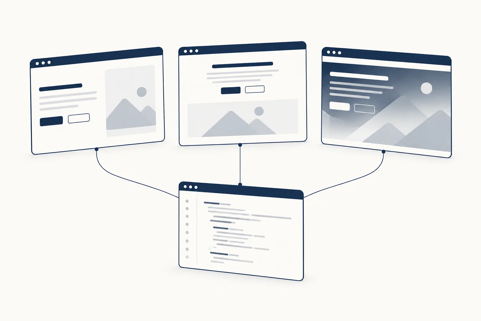
Common hero layouts
| Layout | Fits when | Watch out for |
|---|---|---|
| Split: copy left, visual right | Software and products with a screen worth showing | Stacks to copy-then-visual on phones; check the visual is still useful that small |
| Centered: copy above, visual below | Short, confident headlines; launches; developer tools | Long headlines get hard to read when centered |
| Full-bleed: copy over an image or video | Brands, travel, hospitality, portfolios | Text contrast over a changing image; video weight |
| Text only | Documentation, editorial sites, strong copy | Can look unfinished without careful typography |
Build a hero section in HTML and CSS
The markup below is a split hero for a fictional invoicing product. The copy and the product name are placeholders.
<!-- Fictional product and copy, for illustration only -->
<header class="site-header">...</header>
<main>
  <section class="hero" aria-labelledby="hero-title">
    <div class="hero__copy">
      <p class="hero__eyebrow">Invoicing for small studios</p>
      <h1 id="hero-title">Send an invoice in the time it takes to write the email</h1>
      <p class="hero__lede">Northwind Invoices turns a time log into a branded invoice and chases late payments for you.</p>
      <div class="hero__actions">
        <a class="button button--primary" href="/signup">Start a trial</a>
        <a class="button button--ghost" href="/tour">Watch the 2 minute tour</a>
      </div>
      <p class="hero__proof">Used by [your real customer count] studios</p>
    </div>
    <figure class="hero__media">
      <img
        src="/img/hero-invoice-1200.webp"
        srcset="/img/hero-invoice-800.webp 800w, /img/hero-invoice-1200.webp 1200w, /img/hero-invoice-1800.webp 1800w"
        sizes="(min-width: 64rem) 50vw, 100vw"
        width="1200" height="900"
        alt="Invoice editor with a time log on the left and the generated invoice on the right"
        fetchpriority="high">
    </figure>
  </section>
</main>
A few decisions in that markup matter more than they look:
aria-labelledbypoints the section at its headline, so it shows up as a named region for screen reader users.- The actions are links, because they navigate. Use
buttononly for actions that stay on the page. widthandheighton the image let the browser reserve space before it loads, so the copy does not jump.fetchpriority="high"and noloading="lazy": more on that in the performance section.
.hero {
  display: grid;
  gap: clamp(2rem, 5vw, 4rem);
  align-items: center;
  padding-block: clamp(3rem, 8vw, 6rem);
  padding-inline: max(1.25rem, (100% - 72rem) / 2);
}

.hero > * {
  min-inline-size: 0; /* let grid columns shrink below the image's natural width */
}

.hero__media {
  margin: 0;
}

.hero h1 {
  font-size: clamp(2.25rem, 1.6rem + 3vw, 4rem);
  line-height: 1.05;
  text-wrap: balance;
  max-inline-size: 18ch;
}

.hero__lede {
  font-size: clamp(1.0625rem, 1rem + 0.4vw, 1.25rem);
  max-inline-size: 48ch;
}

.hero__actions {
  display: flex;
  flex-wrap: wrap;
  gap: 0.75rem;
}

.hero__media img {
  inline-size: 100%;
  block-size: auto;
}

@media (min-width: 64rem) {
  .hero {
    grid-template-columns: 1fr 1fr;
    min-block-size: min(100svh, 52rem);
  }
}
Notes on the CSS:
- Fluid type with a floor. The headline uses
clamp()with arempart and avwpart. Sizing text in viewport units alone is a documented WCAG failure (F94 under Understanding 1.4.4 Resize Text), because browser zoom then barely changes it. Therempart keeps zoom working. - Balanced headline lines.
text-wrap: balanceevens out line lengths so you do not get a single word on the last line. It works in Chrome 114, Firefox 121 and Safari 17.5 or later, per MDN compatibility data checked 2026-10-09 (text-wrap); older browsers simply wrap normally. - Height that respects mobile browsers.
min(100svh, 52rem)fills the small viewport height on desktop-sized screens without growing endlessly on tall monitors.svhmeasures the viewport with browser toolbars shown, so the actions are not hidden behind them. Support: Chrome 108, Firefox 101, Safari 15.4 (length units). The hero only gets a minimum height at 64rem and wider; on phones it is as tall as its content. - Centred content without a wrapper.
padding-inline: max(1.25rem, (100% - 72rem) / 2)keeps a 72rem content column centred and a 1.25rem gutter on small screens. min-inline-size: 0on grid items. Grid items default tomin-width: auto, so a column cannot shrink below its content's minimum size. I rendered this hero in Chromium 128 to check. With the image loaded, the layout held either way. With the image failing to load, the browser laid out the alt text instead, and without this rule the media column grew to 1,067px and the page scrolled sideways by 135px at 1280px wide. With the rule, there was no horizontal overflow at 390, 768, 1280 or 1600px in either case, and the headline measured 37.3px, 48.6px, 64px and 64px.

Text over a photo or video
Full-bleed heroes put text on an image you do not fully control. Add a scrim, a gradient between the image and the text:
.hero--photo {
  position: relative;
  color: #fff;
  background: #10151d; /* shows while the image loads, and keeps text readable */
}

.hero--photo > img {
  position: absolute;
  inset: 0;
  inline-size: 100%;
  block-size: 100%;
  object-fit: cover;
}

.hero--photo::after {
  content: "";
  position: absolute;
  inset: 0;
  background: linear-gradient(to right, rgb(16 21 29 / 0.85) 0 45%, rgb(16 21 29 / 0.2));
}

.hero--photo .hero__copy {
  position: relative;
  z-index: 1;
}
Do the contrast arithmetic for the worst case: the lightest part of the image that can end up under the text. With this scrim at 0.85 alpha, white text over a pure white patch of photo still measures 11.77:1 by the WCAG formula, well above the 4.5:1 minimum in WCAG 1.4.3. At the scrim's right end (0.2 alpha) the same pair measures 1.54:1, so keep the copy inside the dark left part. The solid background colour also covers the moment before the image loads.
Background video adds one more rule. If it plays automatically for more than five seconds alongside other content, WCAG 2.2.2 requires a way to pause it (Understanding Pause, Stop, Hide). Add a visible pause button, and show the poster image instead of playing when prefers-reduced-motion: reduce matches.
Make the hero fast
The hero image is often the page's Largest Contentful Paint element, the metric Google's Core Web Vitals use for load speed. web.dev sets a good LCP at 2.5 seconds or less at the 75th percentile of page loads. Three habits help most:
- Use an
imgelement, not a CSS background. web.dev's Optimize LCP guide lists "the LCP element requires a CSS background image" among the cases where the browser has to apply the stylesheet before it can even discover the image. - Mark it important.
fetchpriority="high"tells the browser to fetch the image early (Fetch Priority on web.dev). Supported in Chrome 101, Firefox 132 and Safari 17.2 (MDN img reference, checked 2026-10-09); older browsers ignore it. - Never lazy-load it. web.dev's lazy-loading guide says to "use loading=lazy only for images outside the initial viewport".
Hero section checklist
- The headline is the page's only
h1and says what the product does in plain words. - There is one primary action, it is a real link or button, and it is visible without scrolling on a 390px wide phone.
- Text meets 4.5:1 against the worst-case part of the image under it.
- The hero image is an
imgwithwidth,height,srcset,sizesandfetchpriority="high", and noloading="lazy". - Headline size uses
clamp()with aremcomponent, and the page still works at 200% zoom. - Video or motion has a pause control and a reduced-motion state.
- Any proof (logos, ratings, counts) is real and current.
FAQ
How do you create a good hero section?
Start with the message, then build around it. Write one specific headline as the page's only h1, add a supporting line of one or two sentences, give the hero one primary action plus an optional quieter secondary one, and pick a visual that supports the headline. Then make it hold up: fluid type with a rem floor, text that meets 4.5:1 contrast over the image, and a hero image that loads early and is never lazy-loaded. The checklist above covers each point.
What are some examples of hero images?
Common hero visuals are a product screenshot, an abstract texture, motion such as a background video, and a full-width photo, like the travel or hospitality shots that full-bleed heroes put behind their copy. Some heroes have no image at all, as on documentation and editorial sites. Whatever you pick should show the product or set the mood without competing with the headline. Our guide to hero visuals for SaaS compares screenshot, texture and motion.
How should a hero section look on mobile?
On a phone, a split hero stacks into copy first and visual second, so check that the visual is still useful at that size. The primary action should be visible without scrolling on a 390px wide screen. Give the hero a minimum height only on wide screens and let it be as tall as its content on phones. Size the headline with clamp() so it shrinks without breaking zoom, and use svh units for viewport height so browser toolbars do not hide the actions.
Hero sections to start from
These HorizonX templates are complete heroes with source you can edit:
- Movement Beyond Hero is a full-bleed editorial hero with a Web Animations API entrance, a keyboard-accessible navigation drawer, video and poster fallbacks and reduced-motion handling.
- NeoShell Hero is an edge-to-edge product hero built with semantic HTML, CSS design tokens and vanilla JavaScript, with reduced-motion support.
- Synex Wealth Hero is a calmer editorial layout in SvelteKit and Tailwind CSS with scroll-driven motion.
Run each against the checklist above before you ship it, then compare more layouts in the hero sections collection.