
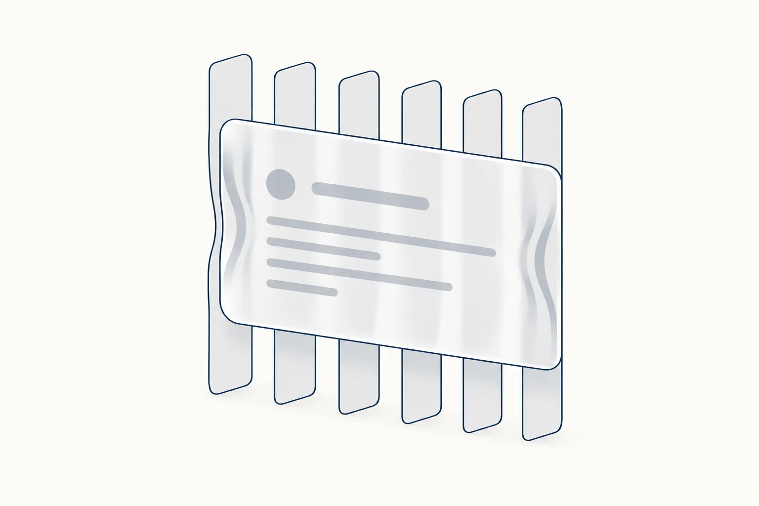
You can get most of Apple's Liquid Glass look in CSS. A translucent tint, a light border and backdrop-filter: blur() saturate() give the frosted base in every current browser. The bending, refractive edge needs an SVG displacement filter used as a backdrop filter, which in practice only Chromium renders, so treat refraction as an enhancement on a panel that already reads well.
This tutorial builds that panel in three layers, then sizes the tint for text contrast and adds fallbacks for people who turn transparency off. For finished glass controls and kits, the HorizonX glassmorphism collection groups them in one place.
What Liquid Glass is, and what CSS can copy
Apple introduced Liquid Glass on June 9, 2025 as the material behind iOS 26, iPadOS 26, macOS Tahoe 26, watchOS 26 and tvOS 26, describing it as a "translucent material" that "reflects and refracts its surroundings" (Apple Newsroom). Apple's materials guidance covers how the system uses it.
The web has a reasonable subset of that:
- Frosted translucency:
backdrop-filterwithblur()andsaturate(), supported in all current engines. - Edge highlights and depth: inset
box-shadow, borders and gradients. - Refraction: an SVG filter with
feDisplacementMapthat shifts the pixels behind the panel. Chromium only, in practice.
What CSS does not give you is the system behaviour: glass that adapts its tint to the content below, reacts to device motion, or bends light according to the real shape of the control. Some of that can be approximated with generated displacement maps; kube.io's write-up goes deep on shape-aware refraction and also calls its demo Chrome-only.
Step 1: the frosted base
.glass {
  --glass-tint: rgb(255 255 255 / 0.4);

  border-radius: 24px;
  padding: 1.5rem;
  background: var(--glass-tint);
  border: 1px solid rgb(255 255 255 / 0.5);
  box-shadow:
    inset 0 1px 0 rgb(255 255 255 / 0.7),
    inset 0 -1px 0 rgb(0 0 0 / 0.06),
    0 8px 24px rgb(0 0 0 / 0.12);
  -webkit-backdrop-filter: blur(14px) saturate(160%);
  backdrop-filter: blur(14px) saturate(160%);
}
The tint is the most important line, because it decides whether text on the panel stays readable (step 3). saturate(160%) keeps colours behind the glass from turning gray after the blur. The two inset shadows draw a bright top edge and a faint bottom edge, which is most of what makes a flat rectangle read as a slab.
Support, from MDN's browser compatibility data (version 8.1.5, checked 2026-10-09): backdrop-filter works unprefixed in Chrome 76, Edge 79, Firefox 103 and Safari 18. Safari 9 to 17 need the -webkit- prefix, which is why both declarations are there. MDN also notes that before Firefox 123 the property did not run on systems with an unknown GPU vendor. See the backdrop-filter reference.
Step 2: refraction with an SVG displacement filter
The refraction comes from an SVG filter. feTurbulence generates smooth noise, feGaussianBlur softens it, and feDisplacementMap moves each backdrop pixel by an amount read from the noise's red and green channels. scale controls how far pixels move.
<svg width="0" height="0" aria-hidden="true" style="position: absolute">
  <filter id="liquid" x="0" y="0" width="100%" height="100%" color-interpolation-filters="sRGB">
    <feTurbulence type="fractalNoise" baseFrequency="0.012" numOctaves="2" seed="7" result="noise" />
    <feGaussianBlur in="noise" stdDeviation="2" result="soft" />
    <feDisplacementMap in="SourceGraphic" in2="soft" scale="40" xChannelSelector="R" yChannelSelector="G" />
  </filter>
</svg>

<div class="liquid">
  <h2>Storage</h2>
  <p>18.4 GB of 50 GB used</p>
</div>
The CSS grammar allows this. Filter Effects defines the value of backdrop-filter as a filter list, and that list accepts url() references to SVG filters (Filter Effects 1, Filter Effects 2). Support is the problem. MDN's compatibility data has no separate entry for url() inside backdrop-filter. I tested the filter above in Chromium 128 on 2026-10-09: CSS.supports('backdrop-filter', 'url(#liquid)') returned true and the backdrop was visibly displaced. I could not test Firefox or Safari for this article, and kube.io reports the technique as Chrome-only. So the refraction goes on its own layer:
.liquid {
  position: relative; /* no z-index, filter, opacity or mask here */
  border-radius: 24px;
  padding: 1.5rem;
  border: 1px solid rgb(255 255 255 / 0.5);
  box-shadow: 0 8px 24px rgb(0 0 0 / 0.12);
}

.liquid > * {
  position: relative;
  z-index: 1;
}

.liquid::before,
.liquid::after {
  content: "";
  position: absolute;
  inset: 0;
  z-index: 0;
  border-radius: inherit;
  pointer-events: none;
}

/* Base layer: frosted blur, works wherever backdrop-filter works */
.liquid::before {
  -webkit-backdrop-filter: blur(14px) saturate(160%);
  backdrop-filter: blur(14px) saturate(160%);
}

/* Enhancement layer: SVG refraction (Chromium in practice) plus the tint */
.liquid::after {
  backdrop-filter: url(#liquid);
  background: rgb(255 255 255 / 0.4);
  box-shadow:
    inset 0 1px 0 rgb(255 255 255 / 0.7),
    inset 0 -1px 0 rgb(0 0 0 / 0.06);
}
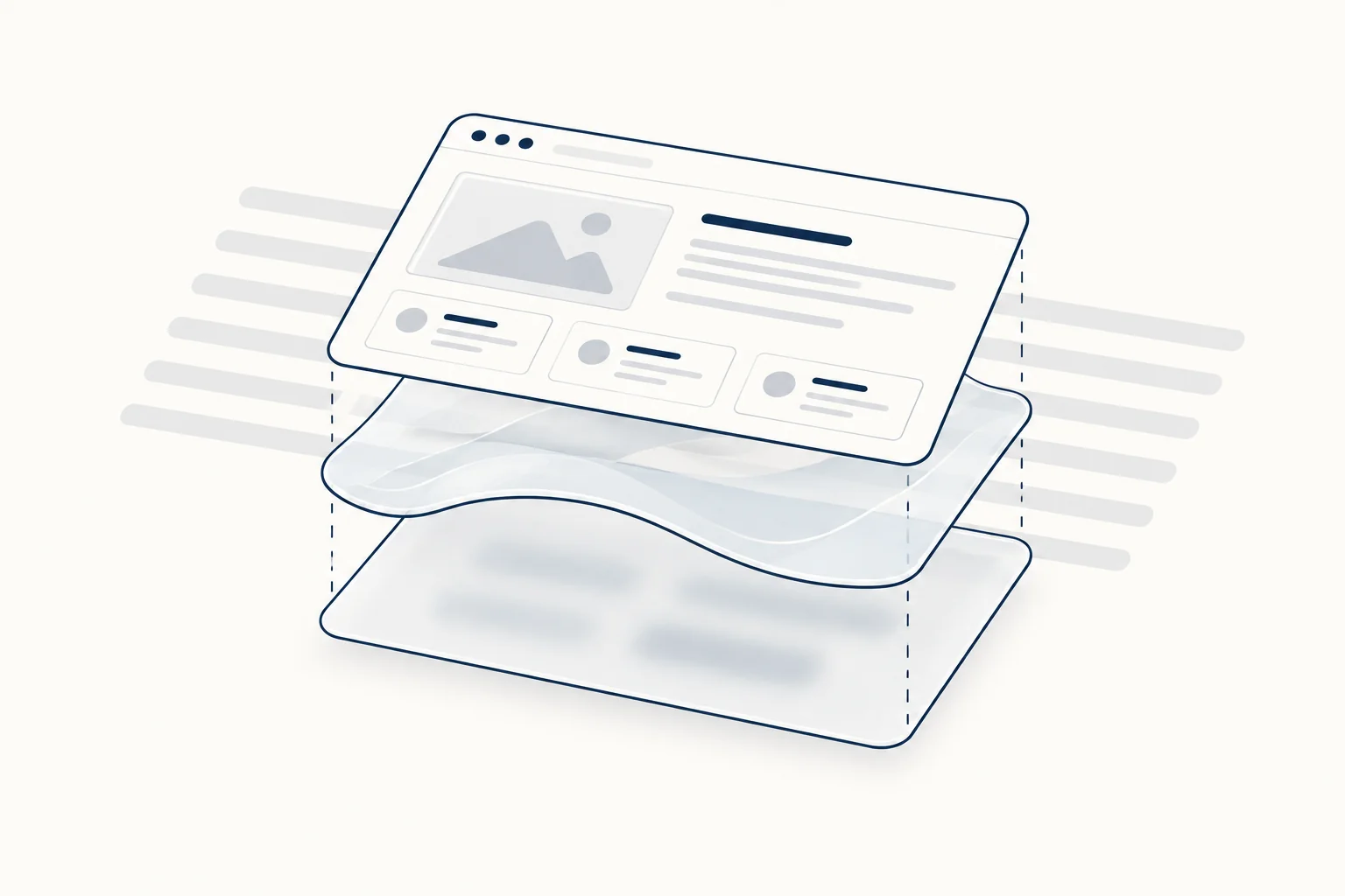
Why the pseudo-elements, and why the warning about the panel itself? Filter Effects 2 introduces the Backdrop Root: an element with filter, opacity below 1, a mask, clip-path, backdrop-filter or a mix-blend-mode other than normal starts a new one, and descendants can only see the backdrop up to that element. If you put backdrop-filter on .liquid itself and refraction on a child, the child sees almost nothing. Keeping the panel plain lets both layers sample the page behind it.
The split also gives a safer failure mode. Filter Effects 1 says that if a url() points to a filter that does not exist, "the whole filter chain is ignored". In Chromium I pointed the top layer at a missing filter ID: the refraction disappeared and the blurred base layer still frosted the panel, with the tint intact. A browser that parses url() but never renders it should land in the same place, but that is the part I could not verify outside Chromium.
Step 3: pick the tint for contrast, not for looks
Glass fails in the same place every time: text over a backdrop you do not control. Nielsen Norman Group's review of iOS 26 puts it bluntly: "anything placed on top of something else becomes harder to see" (NN/g, October 2025). The fix is arithmetic. Take the darkest colour your panel can sit over, blend the tint on top, and check the text against the result. Blur averages small details, so the worst case is a dark area larger than the blur radius.
Worked example with dark text #0B1220 on a white tint, using the WCAG contrast formula and the 4.5:1 minimum from WCAG 1.4.3:
| Backdrop behind the panel | Tint alpha | Text contrast |
|---|---|---|
Navy #192C46 |
0.30 | 3.46:1 (fails) |
Navy #192C46 |
0.39 | 4.55:1 (minimum that passes) |
Navy #192C46 |
0.40 | 4.68:1 |
| Black | 0.40 | 3.26:1 (fails) |
| Black | 0.49 | 4.55:1 (minimum that passes) |
That is why the panel above uses 0.4: it is designed for a page whose darkest region is navy. If photos or video can sit behind it, plan for black and go to 0.5 or more. Flip the logic for white text on a dark tint (#0B1220): over a white backdrop the tint needs at least 0.58 alpha, over light gray #E5E7EB at least 0.53. The saturate() filter barely moves these numbers for dark navy (4.71:1 instead of 4.68:1 at 0.4 by the same formula), but recheck if your backdrop is strongly coloured.
Step 4: fallbacks for user settings
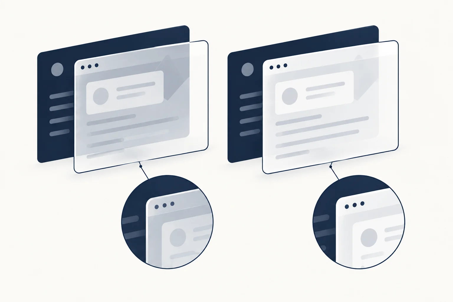
Some people switch transparency off at the system level, and some need higher contrast. Give both a solid panel:
@media (prefers-reduced-transparency: reduce) {
  .liquid::before,
  .liquid::after {
    -webkit-backdrop-filter: none;
    backdrop-filter: none;
  }
  .liquid::after {
    background: rgb(255 255 255 / 0.94);
  }
}

@media (prefers-contrast: more) {
  .liquid {
    border-color: #0b1220;
  }
  .liquid::after {
    background: #fff;
  }
}

@supports not ((backdrop-filter: blur(1px)) or (-webkit-backdrop-filter: blur(1px))) {
  .liquid::after {
    background: rgb(255 255 255 / 0.9);
  }
}
Support for these media features is uneven, so check it before relying on them (MDN data, checked 2026-10-09):
- prefers-reduced-transparency is marked experimental: Chrome and Edge 118 or later, Firefox only behind a flag, and not in Safari.
- prefers-contrast works in Chrome 96, Firefox 101 and Safari 14.1 or later.
Because prefers-reduced-transparency is missing in some browsers, the tint from step 3 is the real safety net, not the media query. The @supports not block covers browsers without any backdrop-filter, where a 0.4 tint would leave text sitting on an unblurred page.
In Chromium I confirmed that prefers-contrast: more switches the tint to solid white. My test browser would not emulate prefers-reduced-transparency, so check that rule on a device with the setting turned on.
Where liquid glass works, and where it does not
Use it for small surfaces that float over changing content: a sticky header, a floating toolbar, a segmented control, a media player bar. Avoid it for long text, forms, data tables and anything people read for more than a few seconds. Two practical limits:
- Each filtered layer re-samples what is behind it whenever that content changes, for example while the page scrolls under a sticky header. Keep the glass area small and test scrolling on a mid-range phone.
- Refraction moves pixels. Text or icons directly behind a refracting panel are distorted on purpose, so do not put the panel over content people still need to read.
For glass used as a decorative background rather than a surface that carries text, see Glass-Inspired Backgrounds: Refraction as Decoration, Not a Surface for Text.
FAQ
Does liquid glass CSS work in Safari?
The frosted part does. backdrop-filter with blur() and saturate() works unprefixed in Safari 18, and Safari 9 to 17 need the -webkit- prefix, per MDN compatibility data checked 2026-10-09. The refractive edge is different: it relies on an SVG filter referenced from backdrop-filter, which this article could not test in Safari and which kube.io reports as Chrome-only. With the two-layer structure from step 2, Safari should still show a blurred, tinted panel.
Can you make liquid glass with CSS only?
Mostly. A translucent tint, a light border, inset shadows and backdrop-filter: blur() saturate() give the frosted look in pure CSS, and all current engines support it. The bending, refractive edge needs an SVG filter with feDisplacementMap, referenced from CSS with url(), and in practice only Chromium renders it. Build the frosted panel first so it reads well on its own, then add refraction as an enhancement layer on top.
Can CSS recreate iOS 26 Liquid Glass?
Only part of it. CSS can copy the look of Apple's material: frosted translucency, bright edge highlights and, in Chromium, refraction through an SVG displacement filter. It cannot copy the system behaviour, such as glass that adapts its tint to the content below, reacts to device motion or bends light according to the real shape of the control. Generated displacement maps can approximate shape-aware refraction, so treat the result as a web material inspired by iOS 26, not a copy of it.
Glass components to start from
- Glass Radio is a frosted segmented control: a 6% white surface with a 12px backdrop blur and a three-layer bevel. It is a real radio group, so keyboard focus and arrow keys work, and it renders without JavaScript.
- Neon Glass Card lights a frosted card from behind, with the light source as a sibling of the glass rather than a child. That is the Backdrop Root rule from step 2 in practice.
- Liquid Glass is an editable Figma component kit with a calendar widget, progress indicator, input, segmented controls and buttons.
- Floating Glass is a WebGL glass background, for when you want the refraction as decoration behind the content.
Compare more panels, cards and controls in the glassmorphism collection.