
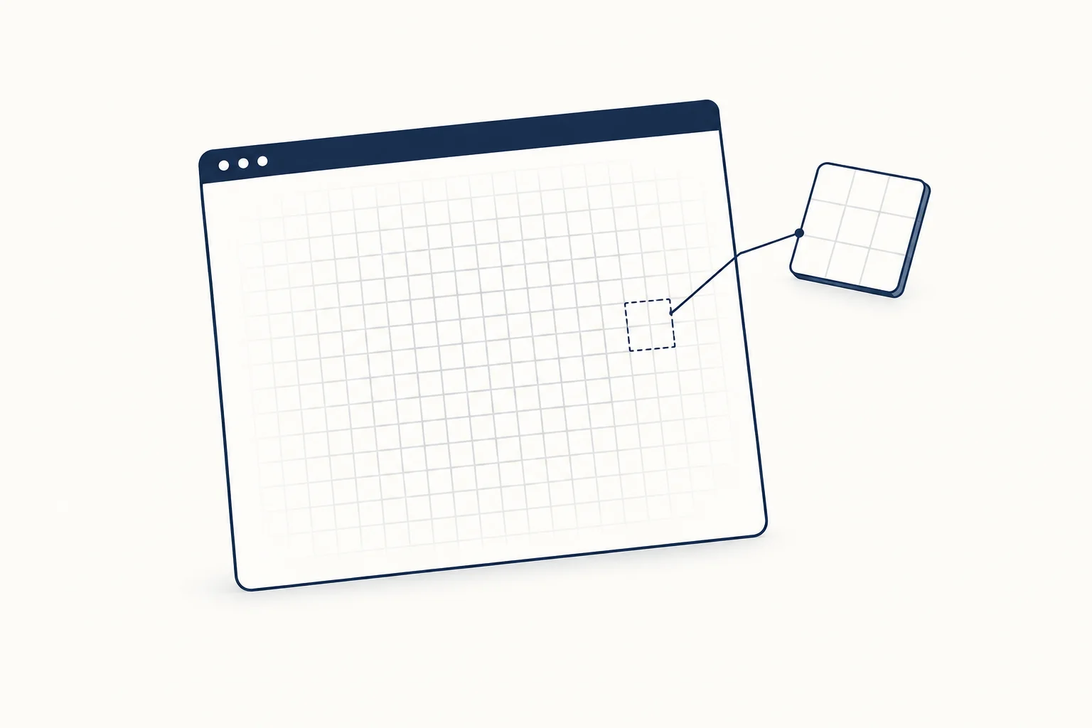
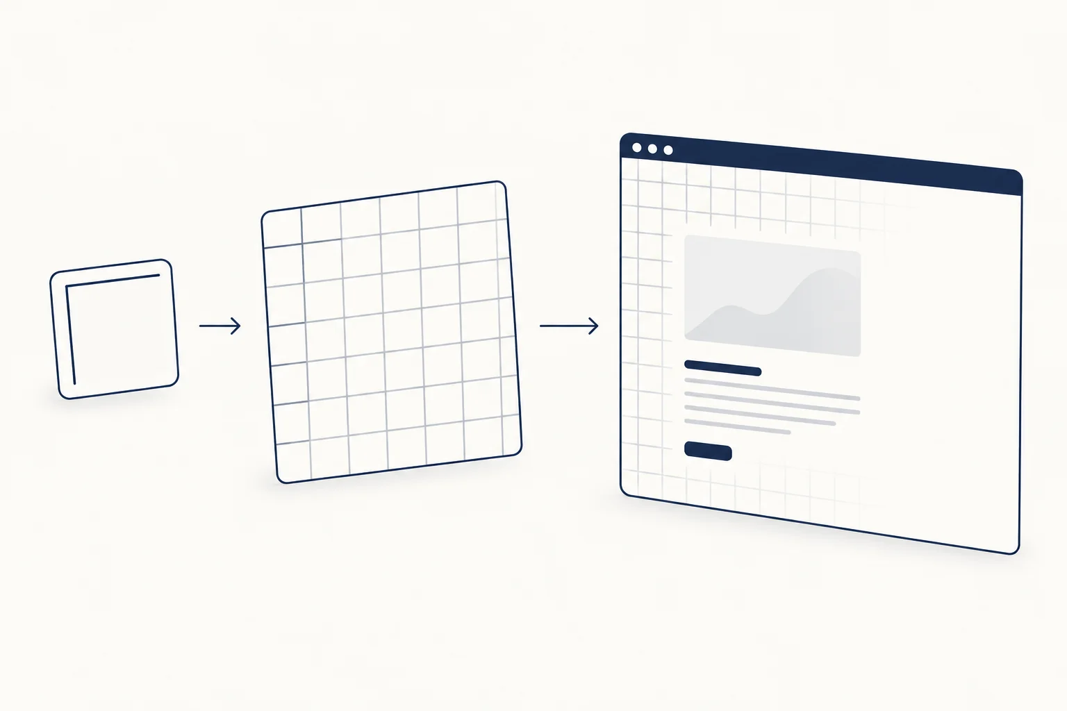
A grid background in CSS needs no image file. Layer two linear gradients, one for vertical lines and one for horizontal lines, each drawing a 1px line at the start of a transparent tile, then set background-size to the cell size. The same tile idea gives you dot grids, graph paper, fades and motion.
Below are copyable versions of each, with the accessibility and browser notes that usually get skipped. If you would rather start from an interactive effect and edit it visually, the HorizonX cursor effects collection includes interactive grids that light up under the pointer.
The basic CSS grid background
.grid-bg {
  --grid-size: 32px;
  --grid-line: 1px;
  --grid-color: rgb(25 44 70 / 0.12);

  background-color: #fff;
  background-image:
    linear-gradient(to right, var(--grid-color) var(--grid-line), transparent var(--grid-line)),
    linear-gradient(to bottom, var(--grid-color) var(--grid-line), transparent var(--grid-line));
  background-size: var(--grid-size) var(--grid-size);
}
Each gradient is a hard stop: the colour runs from 0 to --grid-line, then switches to transparent for the rest of the tile. The first gradient goes to right, so it paints a vertical line on the left edge of every tile. The second goes to bottom and paints a horizontal line on the top edge. background-size then repeats that tile across the element. MDN's linear-gradient reference explains hard colour stops, and background-size explains how the tile is sized.
Two details are worth knowing before you ship it:
- Lines sit on the top and left edge of each tile, so if the element width is an exact multiple of the cell size, the right and bottom edges have no closing line. Add a 1px border in the same colour if you need a closed frame.
- At fractional zoom levels or device pixel ratios, some 1px lines can render softer than others. Check it at 110% and 125% zoom; the SVG tile further down is the alternative to try if it bothers you.
Transparent, black and checkerboard variants
Because the colour lives in custom properties, the common variants are one or two overrides:
/* Transparent: lines only, whatever is behind shows through */
.grid-bg--transparent {
  background-color: transparent;
}

/* Black grid background */
.grid-bg--dark {
  --grid-color: rgb(255 255 255 / 0.08);
  background-color: #0a0d12;
}
A transparent grid background is simply the lines with no background colour, so whatever sits behind the element shows through. People searching for "transparent grid background" sometimes want something else: the gray and white checkerboard that image editors use to show transparency. That is a conic gradient, not a line grid:
.checkerboard {
  background: repeating-conic-gradient(#e5e7eb 0 25%, #fff 0 50%) 0 0 / 16px 16px;
}
Graph paper with major and minor lines
Stack four gradients. The first two draw the darker major lines every five cells, the last two the faint minor lines. Earlier layers paint on top, so the major lines win where they overlap.
.graph-paper {
  --minor: 16px;
  --major: calc(var(--minor) * 5);
  --minor-color: rgb(25 44 70 / 0.07);
  --major-color: rgb(25 44 70 / 0.16);

  background-color: #fff;
  background-image:
    linear-gradient(to right, var(--major-color) 1px, transparent 1px),
    linear-gradient(to bottom, var(--major-color) 1px, transparent 1px),
    linear-gradient(to right, var(--minor-color) 1px, transparent 1px),
    linear-gradient(to bottom, var(--minor-color) 1px, transparent 1px);
  background-size:
    var(--major) var(--major),
    var(--major) var(--major),
    var(--minor) var(--minor),
    var(--minor) var(--minor);
}
Dot grid background
A dot grid uses one radial-gradient per tile. The extra half pixel between the colour stop and the transparent stop gives the dot a soft edge instead of a jagged one.
.dot-grid {
  --dot-radius: 1.5px;
  --dot-gap: 24px;
  --dot-color: rgb(25 44 70 / 0.3);

  background-color: #fff;
  background-image: radial-gradient(
    circle,
    var(--dot-color) var(--dot-radius),
    transparent calc(var(--dot-radius) + 0.5px)
  );
  background-size: var(--dot-gap) var(--dot-gap);
}
Dots read lighter than lines at the same colour, because they cover far fewer pixels. That makes them a good choice behind long text, and the reason they usually need a stronger colour (0.3 alpha here against 0.12 for lines).

Fade the grid toward the edges
A full-bleed grid can feel like a spreadsheet. Fading it out from the centre keeps the texture and removes the hard edges. Put the grid on a pseudo-element and mask that, not the section itself, or you will fade your headline too.
<section class="hero-grid">
  <h1>Ship the dashboard your team will actually open</h1>
  <p>Grid lines sit behind the content and fade out toward the edges.</p>
</section>
.hero-grid {
  position: relative;
  isolation: isolate;
  padding: 6rem 1.5rem;
}

.hero-grid::before {
  content: "";
  position: absolute;
  inset: 0;
  z-index: -1;
  pointer-events: none;
  background-image:
    linear-gradient(to right, rgb(25 44 70 / 0.12) 1px, transparent 1px),
    linear-gradient(to bottom, rgb(25 44 70 / 0.12) 1px, transparent 1px);
  background-size: 32px 32px;
  mask-image: radial-gradient(ellipse 70% 60% at 50% 40%, #000 30%, transparent 100%);
}
isolation: isolate keeps the z-index: -1 layer inside the section instead of slipping behind the backgrounds of parent elements, and pointer-events: none stops it from intercepting clicks. Unprefixed mask-image works in Chrome and Edge 120, Firefox 53 and Safari 15.4 or later according to MDN's browser compatibility data (version 8.1.5, checked 2026-10-09). Add -webkit-mask-image with the same value only if you support older Chromium. See the mask-image reference for the full syntax.
An animated grid that does not repaint the page
The obvious way to animate a grid is to move background-position. That works, but the browser has to repaint the background on every frame. The web.dev guide to high performance animations recommends sticking to transform and opacity where you can. So make the grid layer one cell larger than the section and translate it by exactly one cell: the end frame looks identical to the start frame, and the loop has no visible jump.
.grid-pan {
  --grid-size: 40px;
  position: relative;
  isolation: isolate;
  overflow: hidden;
}

.grid-pan::before {
  content: "";
  position: absolute;
  /* one extra cell above and to the left, so the move never shows an edge */
  inset: calc(var(--grid-size) * -1) 0 0 calc(var(--grid-size) * -1);
  z-index: -1;
  background-image:
    linear-gradient(to right, rgb(25 44 70 / 0.12) 1px, transparent 1px),
    linear-gradient(to bottom, rgb(25 44 70 / 0.12) 1px, transparent 1px);
  background-size: var(--grid-size) var(--grid-size);
  animation: grid-pan 6s linear infinite;
}

@keyframes grid-pan {
  to { transform: translate(var(--grid-size), var(--grid-size)); }
}

@media (prefers-reduced-motion: reduce) {
  .grid-pan::before { animation: none; }
}
The section needs isolation: isolate for the same reason as the fade example. prefers-reduced-motion handles people who asked their system for less motion (MDN reference). It does not cover WCAG 2.2.2 on its own: moving content that starts automatically, lasts more than five seconds and sits next to other content needs a way to pause, stop or hide it (Understanding Pause, Stop, Hide). For a decorative background, the simplest fix is to let it stop by itself:
/* Or stop on its own after 5 seconds: two 2.5 s loops of one cell each */
.grid-pan--short::before {
  animation: grid-pan 2.5s linear 2;
}
Perspective grid floor
The retro "tron" or synthwave floor is the same line grid, tilted away from the viewer. perspective on the parent sets the camera distance, rotateX lays the layer down, and a mask fades it into the horizon.
.grid-floor {
  position: relative;
  overflow: hidden;
  background: #05070b;
  perspective: 500px;
}

.grid-floor::before {
  content: "";
  position: absolute;
  inset: 45% -50% -60%;
  background-image:
    linear-gradient(to right, rgb(180 200 230 / 0.35) 1px, transparent 1px),
    linear-gradient(to bottom, rgb(180 200 230 / 0.35) 1px, transparent 1px);
  background-size: 48px 48px;
  transform: rotateX(65deg);
  transform-origin: 50% 0;
  mask-image: linear-gradient(to bottom, transparent, #000 35%);
}
The negative inset values make the layer wider and longer than the section so the tilted edges stay out of view. Tune the rotateX angle and the perspective distance together: a shorter distance gives a steeper, more dramatic floor.
A grid that lights up under the pointer
A spotlight effect needs a few lines of JavaScript to pass the pointer position into CSS. The grid itself stays in CSS: a faint resting grid, and a stronger copy that is only visible inside a radial mask centred on the pointer.
.grid-spotlight {
  position: relative;
  isolation: isolate;
}

.grid-spotlight::before,
.grid-spotlight::after {
  content: "";
  position: absolute;
  inset: 0;
  z-index: -1;
  pointer-events: none;
  background-size: 32px 32px;
}

/* resting grid */
.grid-spotlight::before {
  background-image:
    linear-gradient(to right, rgb(25 44 70 / 0.08) 1px, transparent 1px),
    linear-gradient(to bottom, rgb(25 44 70 / 0.08) 1px, transparent 1px);
}

/* stronger grid, visible only around the pointer */
.grid-spotlight::after {
  background-image:
    linear-gradient(to right, rgb(25 44 70 / 0.45) 1px, transparent 1px),
    linear-gradient(to bottom, rgb(25 44 70 / 0.45) 1px, transparent 1px);
  mask-image: radial-gradient(160px circle at var(--x, 50%) var(--y, 50%), #000, transparent);
  opacity: var(--spot, 0);
  transition: opacity 0.2s;
}
const area = document.querySelector('.grid-spotlight');

area.addEventListener('pointermove', (event) => {
  const box = area.getBoundingClientRect();
  area.style.setProperty('--x', `${event.clientX - box.left}px`);
  area.style.setProperty('--y', `${event.clientY - box.top}px`);
  area.style.setProperty('--spot', '1');
});

area.addEventListener('pointerleave', () => {
  area.style.setProperty('--spot', '0');
});
Touch screens do not fire pointermove without contact, so treat the spotlight as decoration and never put information in it. The resting grid is what most mobile visitors see.
SVG tile and Tailwind versions
If you prefer a real tile, an inline SVG data URI draws the same grid. The path draws the top and left edges of a 32 by 32 square, offset by half a pixel so the 1px stroke covers one full pixel row instead of two half rows:
.grid-svg {
  background-color: #fff;
  background-image: url("data:image/svg+xml,%3Csvg xmlns='http://www.w3.org/2000/svg' width='32' height='32'%3E%3Cpath d='M32 .5H.5V32' fill='none' stroke='%23192C46' stroke-opacity='.12'/%3E%3C/svg%3E");
  background-size: 32px 32px;
}
There is one visible difference from the gradient version. With a translucent line colour, the two gradient layers overlap where lines cross, so every crossing is a slightly darker dot. In a Chromium screenshot of the 12% navy grid, the line pixels measured #E3E5E8 and the crossings #CACED4. The SVG path draws each corner once, so its crossings match the lines. Use an opaque line colour if you want the gradient version to behave the same way.
In Tailwind CSS v4, the arbitrary value syntax handles the gradient directly; underscores stand for spaces inside the brackets (background-image and background-size docs):
<div class="bg-white bg-[linear-gradient(to_right,rgb(25_44_70/0.12)_1px,transparent_1px),linear-gradient(to_bottom,rgb(25_44_70/0.12)_1px,transparent_1px)] bg-size-[32px_32px]">
  ...
</div>
If you use it more than once, register a utility in your main CSS file and write class="bg-grid" instead:
@utility bg-grid {
  background-image:
    linear-gradient(to right, rgb(25 44 70 / 0.12) 1px, transparent 1px),
    linear-gradient(to bottom, rgb(25 44 70 / 0.12) 1px, transparent 1px);
  background-size: 32px 32px;
}
Which technique should you use?
| Technique | Use it when | Watch out for |
|---|---|---|
| CSS gradients | You want themeable lines or dots with no extra request | Uneven 1px lines at some zoom levels; long gradient lists get hard to read |
| SVG tile | You need a pattern gradients cannot draw, such as crosses or dashed lines | Colour changes mean editing the data URI unless you inline the SVG |
| PNG or WebP image | The grid has texture, noise or hand-drawn lines | Blurry at high zoom; another file to load and cache |
| Canvas or WebGL | Cells react to the pointer, light up or move independently | JavaScript cost, a fallback for no WebGL, pausing when off-screen |
A grid behind text is decoration, so it should stay quiet. One worked example from this article's own colours: gray text #6B7280 on white measures 4.83:1, which passes the 4.5:1 minimum in WCAG 1.4.3. Where a 12% navy line crosses a letter, the pixel underneath measured #E3E5E8 in Chromium and the pair drops to 3.83:1, and at a crossing (#CACED4) to 3.06:1. A 1px line will not make a paragraph unreadable, but it is the reason to keep the grid faint, or fade it out, wherever body copy sits.
Before you ship, check that:
- The grid lives on a pseudo-element or a
background, so screen readers ignore it. pointer-events: noneis set on any grid layer that covers interactive content.- Body text still meets 4.5:1 against the background colour, and the grid is faint where text crosses it.
- Any motion stops within five seconds or has a pause control, and stops entirely under reduced motion.
FAQ
Do you need a generator to make a CSS grid background?
No, a basic grid is short enough to write by hand: two linear gradients that each draw a 1px line at the edge of a transparent tile, plus background-size for the cell size. Keep the size, line width and colour in custom properties, and the transparent, black and dotted variants become one or two overrides. An editor helps when the grid has to react, such as Cursor Grid, which lights cells under the pointer and exports HTML, React or Svelte.
How do you make a dotted background in CSS?
Use one radial-gradient per tile and repeat it with background-size. For example, radial-gradient(circle, rgb(25 44 70 / 0.3) 1.5px, transparent 2px) on a 24px tile draws a dot every 24px, and the extra half pixel between the two stops softens the edge. Dots cover fewer pixels than lines, so they read lighter at the same colour and usually need a stronger one, which also makes them a quiet choice behind long text.
Ready-made grid effects
When the effect needs more than a gradient, these HorizonX editors export the result as HTML, React or Svelte:
- Cursor Grid is a canvas lattice where cells light up under the pointer and clicks send waves across the grid. It supports touch, keyboard activation and reduced motion.
- Glow Grid builds a dark tile wall lit from behind, with a floating logo block. It respects reduced motion, pauses off-screen and falls back to plain DOM without WebGL.
- Gradient Dots is a WebGL dot grid lit by moving colour fields, with controls for dot spacing, radius, speed and edge fade.
For the wider choice between CSS, textures and shaders, read Animated Website Backgrounds: CSS, Textures or Shaders?. To compare interactive grid effects side by side, browse the HorizonX cursor effects collection.