
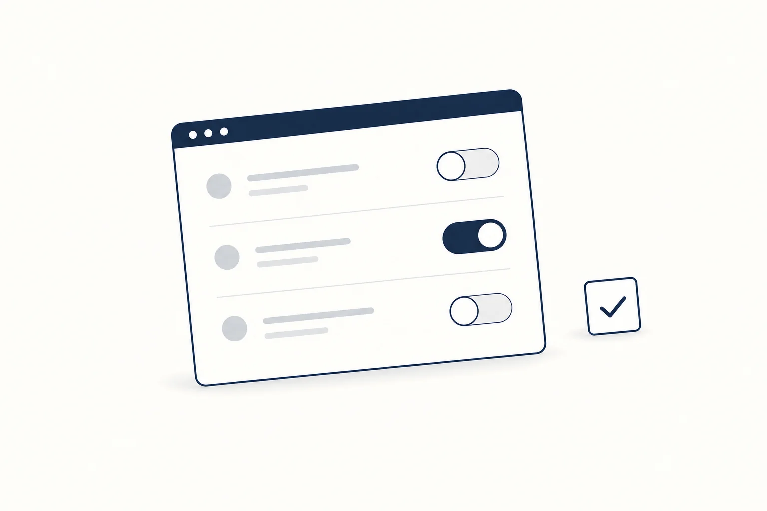
A switch UI, or toggle switch, is a two-state on/off control that takes effect immediately, like turning on dark mode or email notifications. Build it as a checkbox with role="switch" or a button with role="switch" and aria-checked, keep its label fixed, and use a plain checkbox whenever the choice waits for a Submit button.
This guide starts with the decision (switch, checkbox or toggle button), then gives two accessible builds that follow the WAI-ARIA switch pattern, a React toggle that handles failed saves, a note on the new native switch attribute, and a design checklist. For editable switches, radio groups and other inputs, browse the form controls collection.
What is a toggle UI?
"Toggle" means flipping between two states. In an interface, three controls do that, and they are easy to mix up:
- Switch: on or off, nothing in between. It changes a setting or a system state.
- Checkbox: checked or unchecked, with an optional mixed state for "some of these". It records a choice.
- Toggle button: pressed or not pressed, usually in a toolbar, such as Bold or Mute.
The WAI-ARIA Authoring Practices switch pattern puts the difference in terms of meaning: for a control that turns lights on or off, a screen reader saying "Lights switch on" is friendlier than "Lights checkbox checked". In a list of items that must be included in a procedure, the checkbox wording makes more sense. Switches are also strictly binary, while checkboxes and toggle buttons can have a third, partial state.
Switch vs checkbox vs toggle button
The most useful rule comes from Nielsen Norman Group's toggle switch guidelines: toggle switches "should take immediate effect and should not require the user to click Save or Submit to apply the new state." If the change only applies after Submit, use a checkbox. NN/g also advises against dropping toggles into long forms with a Submit button, because people cannot tell which changes are already live.
| Question | Switch | Checkbox | Toggle button |
|---|---|---|---|
| When does the change apply? | Immediately | Usually on Submit | Immediately |
| How many states? | On and off only | Checked, unchecked, optional mixed | Pressed, not pressed, optional mixed |
| Typical use | Settings: dark mode, notifications, autoplay | Forms: consent, filters, selecting rows | Toolbars: Bold, Mute, Show grid |
| Markup | role="switch" with aria-checked, or a checkbox with role="switch" |
<input type="checkbox"> |
<button aria-pressed> |
| Label | Names the setting, never changes | Names the choice | Names the action, never changes |
Two quick tests settle most cases. Does the change apply the moment it is flipped? If not, it is a checkbox. Does the label still make sense with "on/off" appended (NN/g's own test)? If "Email notifications on" reads well, it is a switch. If the control triggers an action in a toolbar, it is a toggle button, and the APG button pattern covers it.
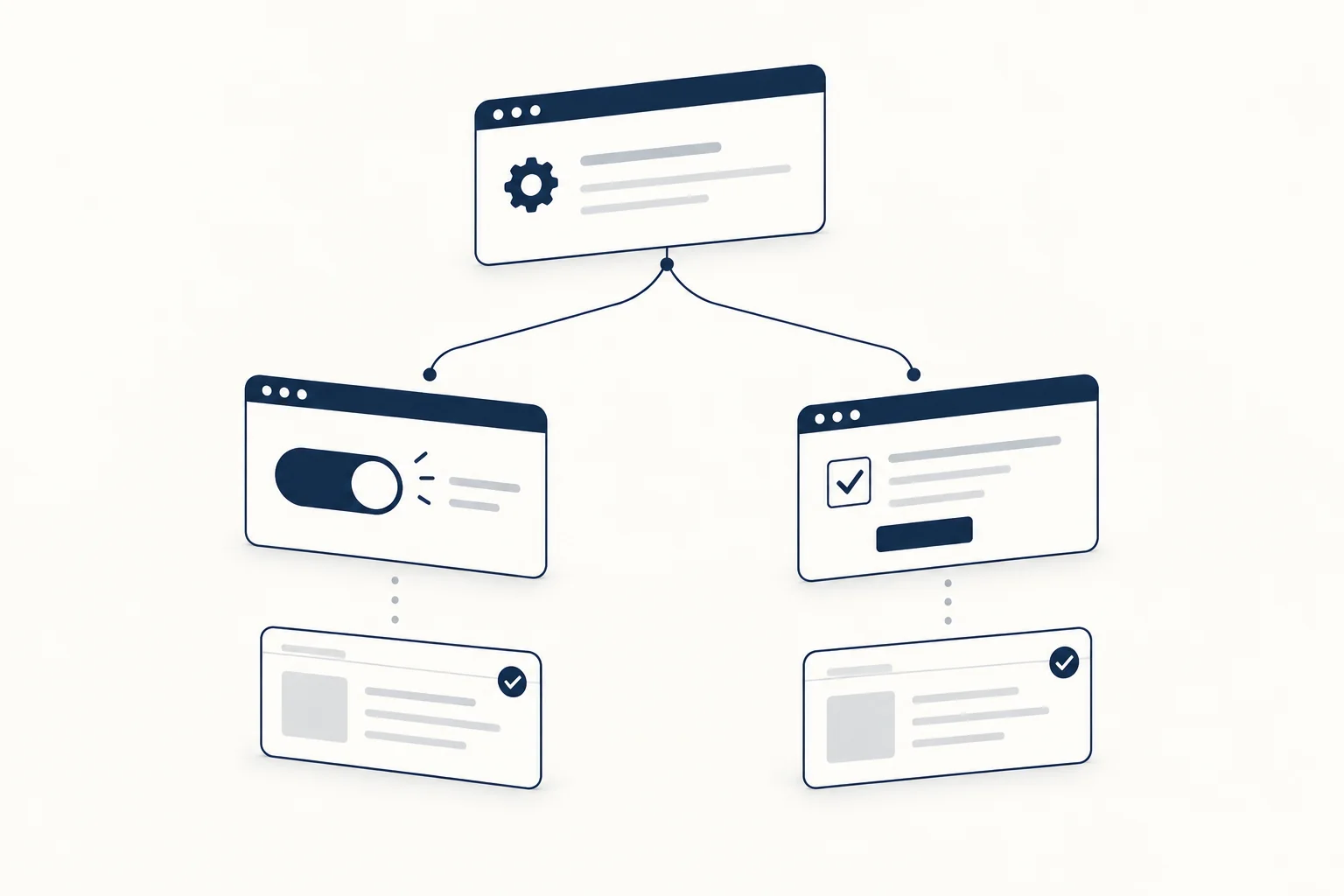
Build an accessible switch with the WAI-ARIA pattern
The APG switch pattern sets the contract:
- The element has
role="switch"and an accessible name from visible text,aria-labelledbyoraria-label. aria-checked="true"when on and"false"when off. A nativeinput[type="checkbox"]uses itscheckedstate instead.- Space toggles it. Enter is optional.
- A group of switches sits in a
fieldsetwith alegend, or in an element withrole="group"andaria-labelledby. - "It is critical the label on a switch does not change when its state changes." A label that flips from "Turn on" to "Turn off" makes the state ambiguous.
MDN's switch role page adds that a switch has no mixed value: aria-checked="mixed" is treated as false.
Option 1: a checkbox with role="switch"
Use this inside forms and settings lists. The browser handles Space, label clicks, form submission and the checked state, and it works before any JavaScript loads.
<fieldset class="settings">
  <legend>Notifications</legend>
  <label class="switch">
    <span class="switch-control">
      <input type="checkbox" role="switch" name="email" checked>
      <span class="switch-track" aria-hidden="true"></span>
    </span>
    Email notifications
  </label>
  <label class="switch">
    <span class="switch-control">
      <input type="checkbox" role="switch" name="sms">
      <span class="switch-track" aria-hidden="true"></span>
    </span>
    Text messages
  </label>
</fieldset>
The real input sits invisibly on top of the drawn track, so clicks, taps and focus all land on the actual control.
Option 2: a button with role="switch"
Use this for a single control outside a form, such as a theme switch in a header.
<button type="button" class="switch-button" role="switch" aria-checked="false" id="dark-mode">
  <span class="switch-track" aria-hidden="true"></span>
  Dark mode
</button>
function initSwitch(button, onToggle) {
  button.addEventListener('click', () => {
    const on = button.getAttribute('aria-checked') !== 'true';
    button.setAttribute('aria-checked', String(on));
    onToggle(on);
  });
}

initSwitch(document.getElementById('dark-mode'), (on) => {
  document.documentElement.classList.toggle('dark', on);
});
A <button> already fires click for Space and Enter, so no key handling is needed. The visible text "Dark mode" is the accessible name, and it stays the same in both states.
Shared CSS for both versions
.switch,
.switch-button {
  display: inline-flex;
  align-items: center;
  gap: 0.75rem;
  font: inherit;
  cursor: pointer;
}

.switch-button {
  padding: 0;
  border: 0;
  background: none;
  color: inherit;
}

.switch-control {
  position: relative;
  display: inline-flex;
}

.switch-control input {
  position: absolute;
  inset: 0;
  z-index: 1;
  margin: 0;
  opacity: 0;
  cursor: pointer;
}

.switch-track {
  position: relative;
  flex: none;
  box-sizing: border-box;
  width: 48px;
  height: 28px;
  border: 2px solid #374151;
  border-radius: 999px;
  background: #fff;
}

.switch-track::before {
  content: "";
  position: absolute;
  top: 3px;
  left: 3px;
  width: 18px;
  height: 18px;
  border-radius: 50%;
  background: #374151;
  transition: translate 150ms ease-out;
}

:checked + .switch-track,
[aria-checked="true"] > .switch-track {
  border-color: #1d4ed8;
  background: #1d4ed8;
}

:checked + .switch-track::before,
[aria-checked="true"] > .switch-track::before {
  background: #fff;
  translate: 20px 0;
}

:focus-visible + .switch-track {
  outline: 2px solid #1d4ed8;
  outline-offset: 2px;
}

@media (prefers-reduced-motion: reduce) {
  .switch-track::before {
    transition: none;
  }
}
The state is carried by the thumb's position as well as the fill, so it does not rely on color alone (WCAG 1.4.1). Both the gray outline and the blue fill are well above the 3:1 contrast that WCAG 1.4.11 asks for against white. The 48 by 28 px track clears the 24 by 24 px minimum in WCAG 2.5.8, and the label text is clickable too. The button keeps the browser's default focus outline.
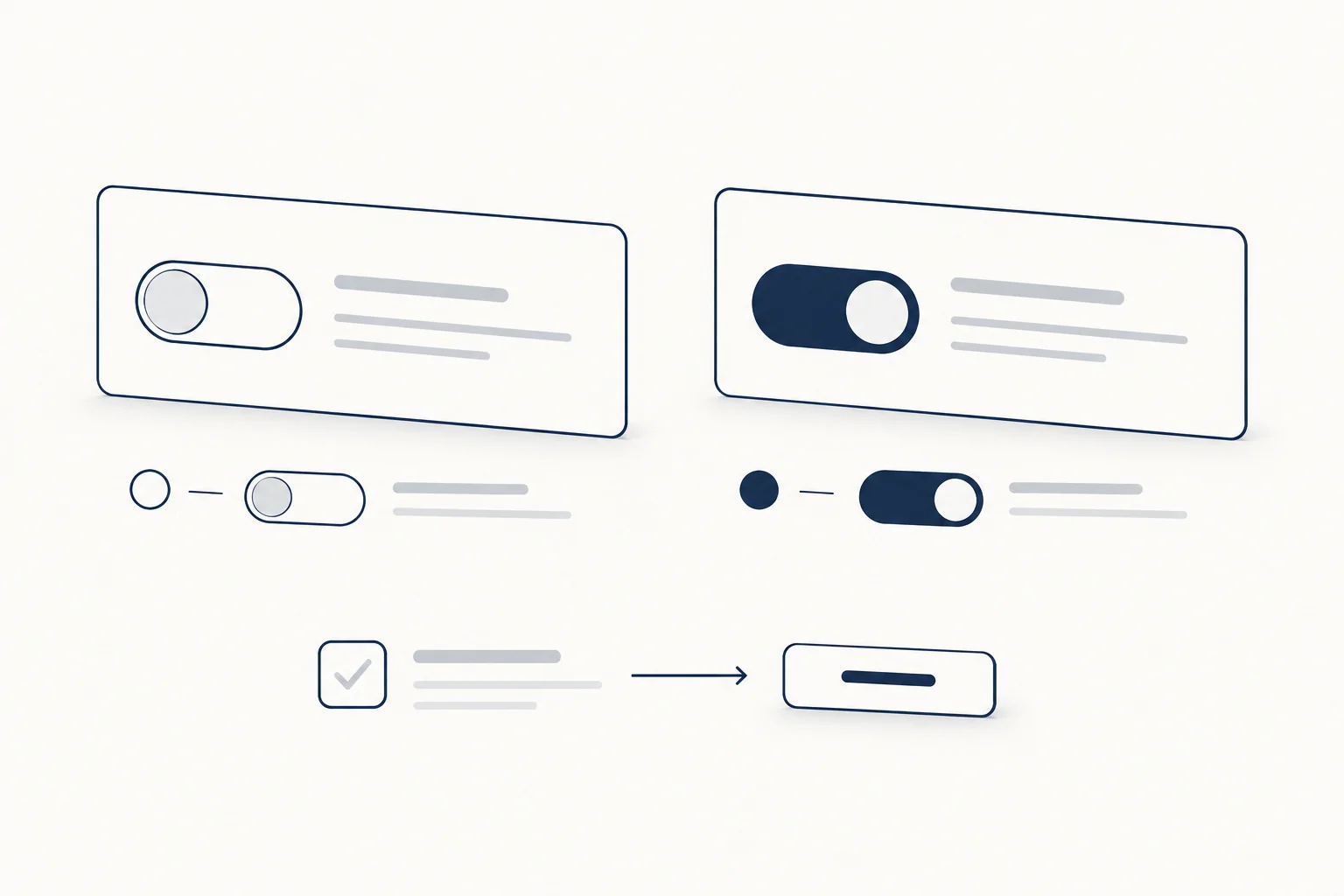
The native HTML switch: input type="checkbox" switch
Safari 17.4 added a native switch. As the WebKit announcement explains, <input type="checkbox" switch> renders a switch and maps it to role=switch, and browsers without support show a regular checkbox. You can recolor the on state with accent-color or remove the default look with appearance: none.
Support is still narrow. MDN's checkbox reference marks the attribute as experimental with limited browser support, and MDN's browser compatibility data (version 8.1.5, checked 2026-10-09) lists Safari 17.4 and later only, with no Chrome or Firefox support. If you use it, add role="switch" too, so every browser announces switch semantics, and accept that the visual will be a checkbox outside Safari. For a consistent look everywhere, use the custom version above.
A React toggle switch that handles failed saves
Because a switch applies immediately, it often triggers a network request. The interface should flip at once and flip back if the save fails, with a message saying so.
import { useState } from 'react';

export function Switch({ label, checked, onChange, disabled = false }) {
  return (
    <label className="switch">
      <span className="switch-control">
        <input
          type="checkbox"
          role="switch"
          checked={checked}
          disabled={disabled}
          onChange={(event) => onChange(event.target.checked)}
        />
        <span className="switch-track" aria-hidden="true" />
      </span>
      {label}
    </label>
  );
}

export function EmailSetting({ save }) {
  const [on, setOn] = useState(true);
  const [error, setError] = useState('');

  async function handleChange(next) {
    setOn(next);
    setError('');
    try {
      await save('emailNotifications', next);
    } catch {
      setOn(!next);
      setError('Could not save email notifications. Try again.');
    }
  }

  return (
    <>
      <Switch label="Email notifications" checked={on} onChange={handleChange} />
      <p role="status">{error}</p>
    </>
  );
}
The component is controlled, so the parent owns the state. The label never changes. The status message is announced politely if the save fails, and the switch returns to its previous position.
Switch design checklist
- [ ] The change applies immediately. If it needs Save or Submit, it is a checkbox.
- [ ] The label is short, names the setting and passes the "append on/off" test. It does not change with the state.
- [ ] Only two states. If a parent stands for "some of these", use a checkbox with a mixed state.
- [ ] State shows through position and fill, not color alone. Avoid red for "on", which NN/g calls counterintuitive for people who read red as stop.
- [ ] Track and thumb reach 3:1 contrast against what is next to them, and the target is at least 24 by 24 CSS px.
- [ ] Space toggles, and focus is clearly visible.
- [ ] Related switches sit in a
fieldsetwith alegend. - [ ] The thumb transition is removed under
prefers-reduced-motion: reduce. - [ ] If saving can fail, the switch reverts and a message explains why.
FAQ
What is a toggle in HTML?
HTML has no <toggle> element. A toggle is built from a checkbox (<input type="checkbox">, optionally with role="switch"), a button with role="switch" and aria-checked, or a button with aria-pressed for a toolbar toggle button. The experimental switch attribute on checkboxes is the closest thing to a native toggle, and so far only Safari supports it.
What does "toggle" mean in an app?
It means a control that flips one setting between two states, such as notifications on and off. In app settings that control is usually drawn as a switch, and the change applies as soon as you flip it.
Switch examples you can edit
These HorizonX components are starting points for the build above:
- Theme Switch: a dark mode toggle with a frosted glass track and a glowing light. It is a
buttonwithrole="switch"andaria-checked, removes its transitions under reduced motion, and exports as HTML, Svelte or React. If you use it for dark mode, give it the accessible label "Dark mode" so "on" has a clear meaning. - 3D Switch: a capsule switch with a metallic thumb and controls for depth, lift, tilt and perspective. It also uses
role="switch"witharia-checkedand exports as standalone HTML. - Neumorphic LED Switch: a soft neumorphic control with an LED that lights up when on. It is built on a native checkbox, so screen readers announce it as a checkbox. Add
role="switch"to the input if it controls an on/off setting.
For more inputs that follow the same rules, see the form controls collection.