

Skeleton loading is a placeholder pattern: while data loads, the page shows gray blocks shaped like the final layout, then swaps in the real content. Use it for full-page or large-region loads that take roughly 1 to 10 seconds. Use a spinner for a single small module, a progress bar for longer waits, and nothing for sub-second loads.
This guide covers the decision first and the build second: a CSS skeleton that occupies the same space as the real content, a pulse that respects reduced motion, the accessibility wiring most examples skip, and a React version that avoids a flash on fast loads. If you would rather start from a ready-made loader, the CSS loaders collection has editable spinners, pulsing dots, rings and skeleton loaders.
Skeleton loader vs spinner: what is the difference?
Both tell people the system is working, and neither tells them how long the wait will be. The difference is what they show. A spinner is a generic wait animation. A skeleton previews the structure of the page, so when the content lands it fills shapes people have already seen.
Nielsen Norman Group's Skeleton Screens 101 (last reviewed September 2026) draws the lines clearly. Skeletons are for full-page loads. Spinners are "typically best used on a single module, like a video or a card which is on a dashboard". Both suit waits under 10 seconds, and progress bars are "strongly recommended" beyond that. For pages that load in under 1 second, neither is necessary, and a quick flash of placeholders can be annoying. The same article warns against skeletons for uploads, downloads or file conversions, and against "frame-display" skeletons that show only a header, a footer and an empty background.
Those numbers line up with the classic response time limits: about 1 second keeps the flow of thought uninterrupted, and about 10 seconds is the limit for keeping attention on the task.
Which loading indicator to use
| Situation | Use | Reason |
|---|---|---|
| Most loads finish in under about 1 s | Nothing, or a delayed skeleton that rarely appears | A flash of placeholders is noisier than the wait |
| Full page or large region, about 1 to 10 s, layout known in advance | Skeleton | Shows the structure and reduces the jolt when content arrives |
| One card, chart, video or button action | Inline spinner | A skeleton for one small box adds little information |
| Upload, download, export or conversion | Progress bar | The task is a process, not a page taking shape |
| Likely over 10 s | Progress bar with percent or steps | People need to know how much longer |
| Layout unknown until data arrives | Spinner, or a skeleton of the most common item | A wrong skeleton causes its own layout jump |
| Only header and footer, empty body | Do not use | Gives no sense of the page that is coming |
The last two rows are where most skeletons go wrong. A placeholder that does not match what loads is worse than a plain spinner, because the page visibly rearranges itself when the data arrives.
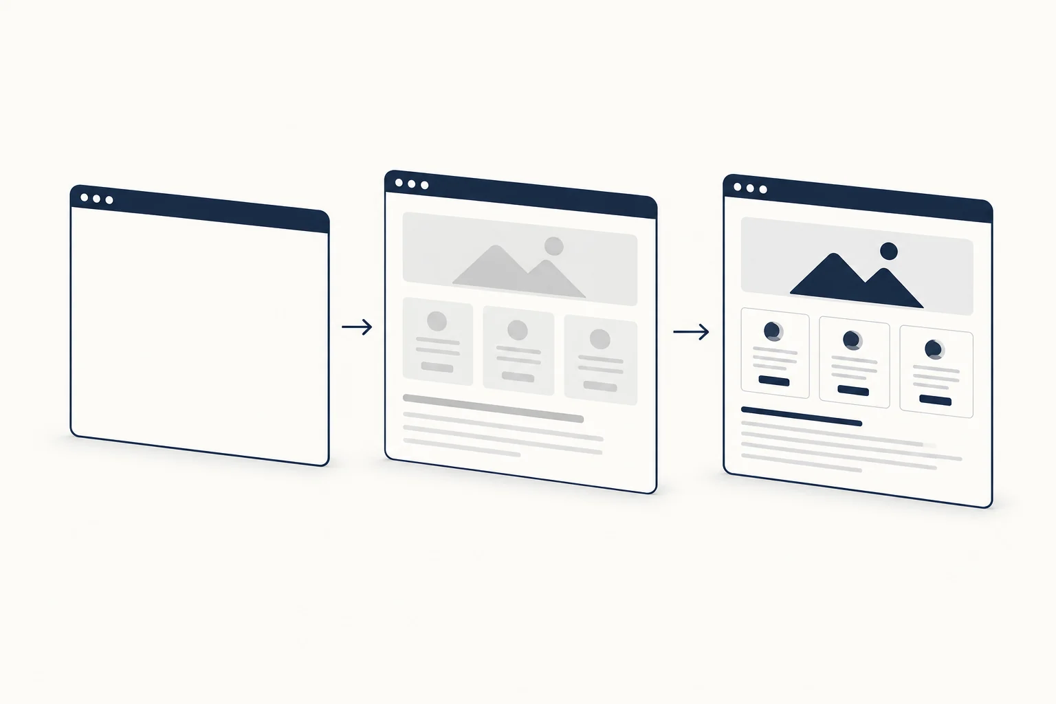
Build the skeleton to match the final layout
The value of a skeleton depends on how closely it matches the real content. If the placeholder is shorter than the card that replaces it, everything below jumps down when the data arrives, and that movement counts toward Cumulative Layout Shift, where web.dev sets 0.1 or less as a good score.
The simplest way to keep them in sync is to share layout classes between the placeholder and the real component, and to give images explicit dimensions. Here is a profile card in both states.
<p class="visually-hidden" role="status" id="profile-status">Loading profile</p>

<section class="profile" id="profile" aria-busy="true">
  <div class="profile-card skeleton" aria-hidden="true">
    <div class="avatar skeleton-block"></div>
    <div>
      <div class="profile-name skeleton-line" style="--w: 45%"></div>
      <div class="skeleton-line" style="--w: 95%"></div>
      <div class="skeleton-line" style="--w: 80%"></div>
    </div>
  </div>
</section>
.profile {
  min-block-size: 4rem;
}

.profile-card {
  display: grid;
  grid-template-columns: 4rem 1fr;
  gap: 1rem;
  line-height: 1.5;
}

.avatar {
  inline-size: 4rem;
  aspect-ratio: 1;
  border-radius: 50%;
}

.profile-name {
  font-size: 1.125rem;
}

.skeleton-block,
.skeleton-line {
  background-color: var(--skeleton-bg, #e5e7eb);
}

.skeleton-line {
  box-sizing: border-box;
  block-size: 1lh;
  inline-size: var(--w, 100%);
  padding-block: 0.3lh;
  background-clip: content-box;
  border-radius: 999px;
}
Three details do the work here:
- The avatar uses the same
.avatarclass as the real<img class="avatar" width="64" height="64">, so the circle and the photo occupy the same square. - Each text line is exactly one line box tall.
block-size: 1lhmatches the line height of the text it stands in for, andbackground-clip: content-boxwith vertical padding draws a thinner bar centered inside it. The name line carries the same.profile-namefont size as the real name, so its line box matches too. Thelhunit works in Chrome 109, Firefox 120 and Safari 16.4 and later, according to MDN browser compatibility data (checked 2026-10-09). - Line widths vary (
--w) so the block reads as text rather than a stack of identical bars. Use widths close to typical content, not random ones.

Animate it: a pulse that respects reduced motion
The most common skeleton animation is a slow opacity pulse. Tailwind's animate-pulse is exactly that (pulse 2s cubic-bezier(0.4, 0, 0.6, 1) infinite, fading to half opacity), and its docs describe it as "useful for things like skeleton loaders". In plain CSS:
@media (prefers-reduced-motion: no-preference) {
  .skeleton {
    animation: skeleton-pulse 2s ease-in-out infinite;
  }
}

@keyframes skeleton-pulse {
  50% {
    opacity: 0.5;
  }
}
The animation lives inside prefers-reduced-motion: no-preference, so it is opt-in: people who ask their system for less motion (MDN) see static gray blocks, which still read as "loading". NN/g notes that animated skeletons "can potentially be distracting, annoying, or even create accessibility problems for some users", so a subtle pulse is a better default than a bright sweep.
One more rule applies if a skeleton could keep moving for a long time next to content people are reading. WCAG 2.2.2 Pause, Stop, Hide covers moving content that starts automatically, lasts more than five seconds and sits alongside other content. Its exception for preload animations only applies when nobody can interact during that phase. A simple way to stay clear of it is to cap the cycles: animation: skeleton-pulse 2s ease-in-out 2; pulses twice and then rests as a static placeholder.
Prefer a light sweep moving across each block? That shimmer variant is covered step by step in our CSS animation examples, with the same reduced-motion guard.
Make the loading state accessible
A skeleton is visual. Screen reader users need a different signal, and most skeleton tutorials leave it out. Four rules cover it:
- Mark the region as busy. Put
aria-busy="true"on the container that is being filled and set it tofalsewhen loading completes. MDN's aria-busy reference says this "prevents assistive technologies from announcing changes before updates are done". - Hide the shapes. The gray blocks carry no information, so the skeleton wrapper gets
aria-hidden="true". None of the placeholders should be focusable. - Announce once, politely. A single visually hidden element with
role="status"says "Loading profile". The status role is polite by default, and MDN is explicit: "Do not give focus to the status when its content updates." Keep it outside the busy container so its message is not held back. - Close the loop. When the content lands, replace the placeholder, clear
aria-busyand update or clear the message.
function finishLoading(region, status, content) {
  region.replaceChildren(content);
  region.setAttribute('aria-busy', 'false');
  status.textContent = 'Profile loaded';
}

// finishLoading(document.getElementById('profile'), document.getElementById('profile-status'), card);
If a whole page shows ten skeleton cards, it still gets one status message, not ten.
How to use a skeleton in React
In React, a skeleton is usually the fallback of a Suspense boundary. The Suspense reference describes a fallback as "a lightweight placeholder view, such as a loading spinner or skeleton".
import { Suspense } from 'react';

export function ProfileSkeleton() {
  return (
    <>
      <p className="visually-hidden" role="status">Loading profile</p>
      <section className="profile" aria-busy="true">
        <div className="profile-card skeleton" aria-hidden="true">
          <div className="avatar skeleton-block" />
          <div>
            <div className="profile-name skeleton-line" style={{ '--w': '45%' }} />
            <div className="skeleton-line" style={{ '--w': '95%' }} />
            <div className="skeleton-line" style={{ '--w': '80%' }} />
          </div>
        </div>
      </section>
    </>
  );
}

export function ProfilePage({ profilePromise }) {
  return (
    <Suspense fallback={<ProfileSkeleton />}>
      <Profile profilePromise={profilePromise} />
    </Suspense>
  );
}
There is a catch: the same page notes that "Suspense does not detect when data is fetched inside an Effect or event handler". The fallback only appears when Profile suspends, for example by reading a promise with use, through lazy, or through a Suspense-enabled framework.
If your data arrives through an Effect or a fetching hook that returns isLoading, render the skeleton yourself and delay it slightly, so fast responses never flash placeholders:
import { useEffect, useState } from 'react';

export function useDelayedFlag(active, delay = 300) {
  const [show, setShow] = useState(false);
  useEffect(() => {
    if (!active) {
      setShow(false);
      return;
    }
    const id = setTimeout(() => setShow(true), delay);
    return () => clearTimeout(id);
  }, [active, delay]);
  return show;
}

export function ProfileSlot({ isLoading, profile }) {
  const showSkeleton = useDelayedFlag(isLoading);
  if (isLoading) {
    return showSkeleton ? <ProfileSkeleton /> : <section className="profile" aria-busy="true" />;
  }
  return <ProfileCard profile={profile} />;
}
The 300 ms delay is a starting value, not a standard; tune it against your real response times. The empty .profile section keeps its min-block-size during the delay, so the delay itself does not cause a jump.
Skeleton loading checklist
Use this before shipping a skeleton:
- [ ] The wait is a page or large region that usually takes 1 to 10 seconds. Otherwise, use the table above.
- [ ] The skeleton uses the same layout classes, image dimensions and line heights as the real content.
- [ ] Line widths look like typical content, and the number of placeholder items matches what usually loads.
- [ ] The animation is opt-in under
prefers-reduced-motion: no-preference, subtle, and capped if it can run past five seconds. - [ ] The region has
aria-busy, the shapes arearia-hidden, and one polite status message announces the load without moving focus. - [ ] Fast loads do not flash the skeleton.
- [ ] You still worked on the load itself. NN/g puts it plainly: skeletons "do not replace performance-optimization efforts".
FAQ
How do you create a skeleton loader?
Copy the structure of the finished component, replace text with one-line-tall bars and images with blocks of the same size, give them a neutral background, and add aria-hidden="true" to the wrapper. Then add the busy state and status message described above. The CSS and HTML in this article are a complete starting point.
How do you make a skeleton shimmer run across the screen?
That effect is a light linear gradient on a pseudo-element, clipped by its block with overflow: hidden and moved from left to right with an infinite translate animation. Keep it inside prefers-reduced-motion: no-preference like the pulse above. The full recipe is in our CSS animation examples.
Start from an editable skeleton loader
The Profile Skeleton Loader is an avatar-and-lines skeleton with a polite status message, hidden placeholder shapes and a reduced-motion rule already in place. You can change its tone, contrast, scale and pulse speed, then export it as a self-contained HTML document. Match its proportions to your real card before you ship it.
For the cases in the table where a skeleton is the wrong tool, the CSS loaders collection has spinners, pulsing dots and rings you can edit and export.