
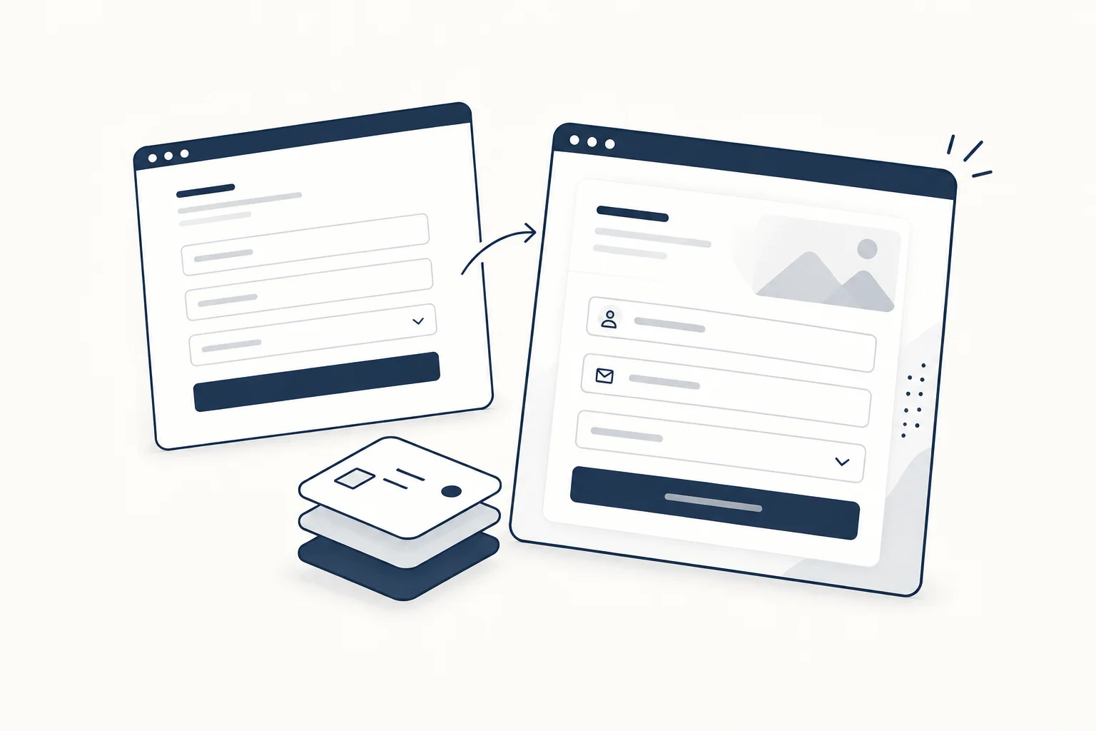
You do not need to replace an application's controls to make its presentation distinctive. Keep the established components that handle everyday interaction and add visual character where it serves a specific purpose. A textured illustration or expressive feature card should not force a rewrite of forms, navigation or dialogs.
shadcn/ui gives teams component code to adapt. This article proposes an integration approach around that foundation; it does not claim that every third-party visual can be dropped into every shadcn project unchanged.
Draw the boundary first
Separate functional controls from decorative material. A submit button has a job: communicate an action and expose its states. A background can establish atmosphere without becoming part of that action.
For a fictional analytics product, keep the working filter controls and results table intact. Add a restrained visual treatment to a marketing section explaining the product, or place an illustration beside onboarding instructions. This creates a clear place to evaluate the addition without changing the core workflow.
Share the small decisions that make a system coherent
Before adding an asset, write down the type scale, spacing rhythm, corner treatment and colour roles it must respect. The goal is not to force every element to look identical. It is to make deliberate differences look related.
An animated card with a new font, unrelated radius and stronger contrast than the page heading can become the centre of attention unintentionally. Start by matching typography and spacing; decide whether the remaining difference still helps explain the content.
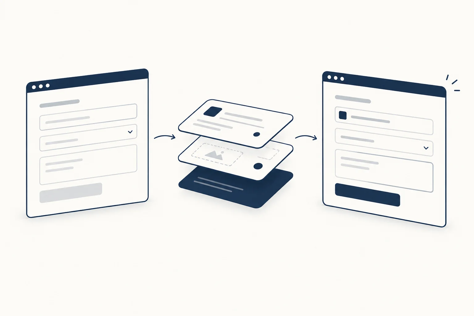
Integrate one asset in context
Use an isolated page with the real surrounding content. Include the longest expected heading, a narrow viewport and a quiet state without decorative motion. Check whether the new visual blocks clicks, covers a focus indicator or introduces an unwanted scroll container.
These are checks to perform on the actual integration. Neither the source library nor a catalogue screenshot proves the result in your application.
HorizonX's Pixel Card is one possible visual to inspect. If you use it, read the individual resource details and documentation, then review the resulting component rather than assuming the exported output has the same conventions as your existing code.
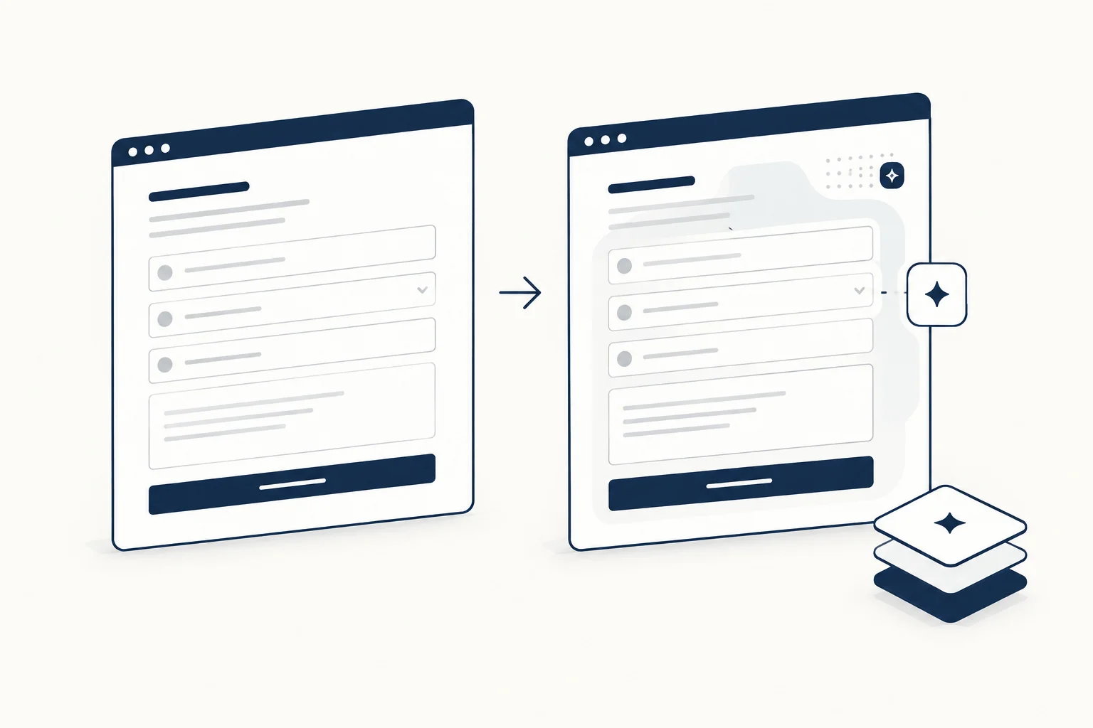
When should you skip the extra layer?
Skip it when the screen is already dense, when it competes with an important action or when nobody owns its maintenance. A support dashboard may benefit more from clear states than from another effect.
The UI specification guide can help record the boundary: what remains fixed, what may change and what evidence a reviewer expects. Distinctiveness should be a controlled design decision, not a second component system growing unnoticed.