

Choose a texture effect by the visual language you need and the detail you must preserve. Dithering suggests tonal structure through a pattern, halftone suggests a dot-based print treatment, and ASCII uses a character-based appearance. These broad categories are useful for art direction, but individual tools can combine them or implement them differently.
The best comparison uses the same source image, crop and final display size. Otherwise you may be choosing between photographs rather than judging the treatments themselves.
Start with the intended impression
For a fictional music event, a deliberately coarse pattern might support a digital or print-inspired identity. For a product tutorial, the same treatment could obscure the details someone needs to follow.
Write the role of the visual before choosing the effect. Is it a recognisable portrait, a decorative background or a diagram that carries information? Keep factual or instructional detail clear even when the surrounding art direction is expressive.
Compare silhouette and tonal separation
Begin with an image whose subject is easy to recognise. Make a restrained version of each treatment and inspect the outline, shadows and focal point.
An effect can look impressive when enlarged yet become muddy in a small card. Judge the final layout, not just the editor's largest preview. If a face or product becomes unrecognisable, reconsider the crop or the treatment before adding more contrast.
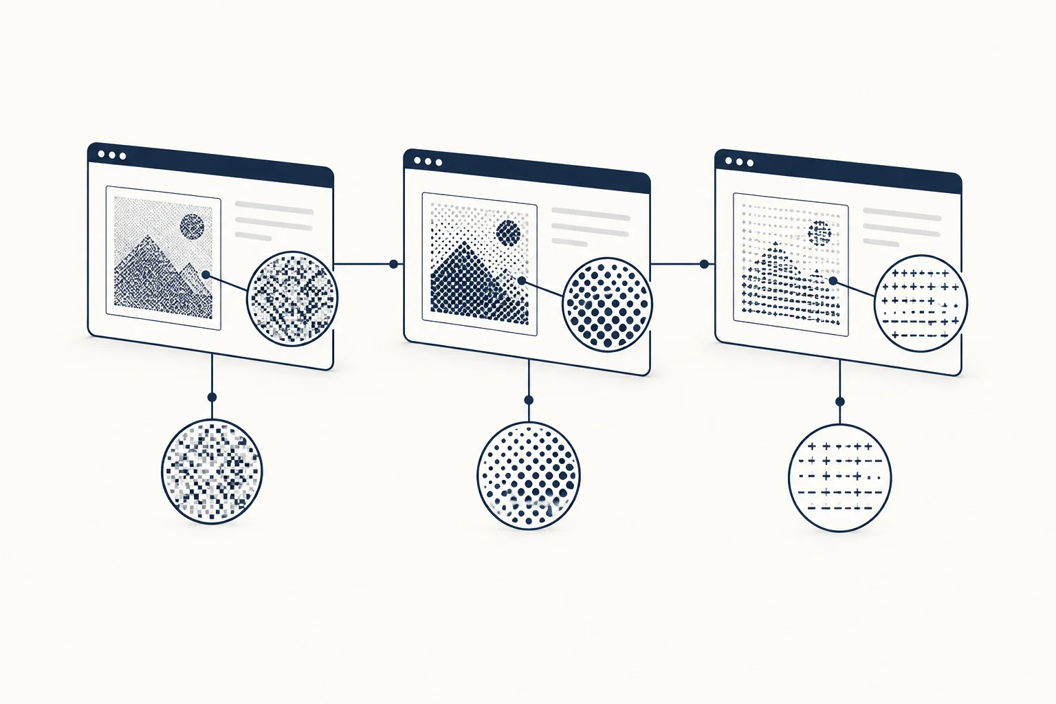
Use the pattern scale deliberately
Coarse patterns foreground the texture itself. Finer patterns can retain more detail but may become visually busy. Neither direction is inherently better; the choice depends on what the composition needs to emphasise.
Avoid putting fine body text inside a heavily processed image. Keep the written message in the page and let the artwork support it. That also makes later copy changes easier than rebuilding the image each time.
Inspect resources by their actual controls
HorizonX's Marble Signal and Glyph Study are different starting points to examine. Use the texture catalogue to compare the available families, then check the chosen editor's current settings and output details.
Do not describe a digital preview as a verified reproduction of a physical printing process. “Print-inspired” is a more accurate description when no print production test has been performed.
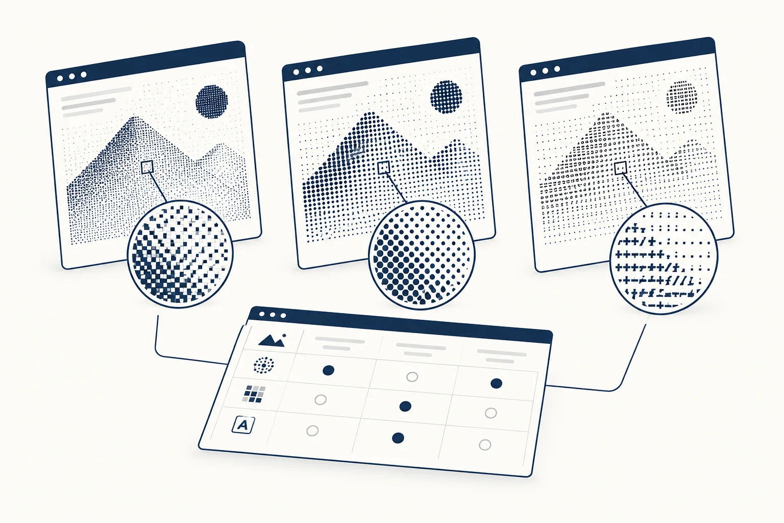
How should you make the final decision?
Place the candidates beside the same headline and caption. Choose the one that communicates the intended tone while retaining the necessary subject detail. Record the source and settings so the treatment can be repeated across a series.
If none improves the composition, use the original image. A comparison is valuable when it helps you reject an unnecessary effect as well as select a useful one.