
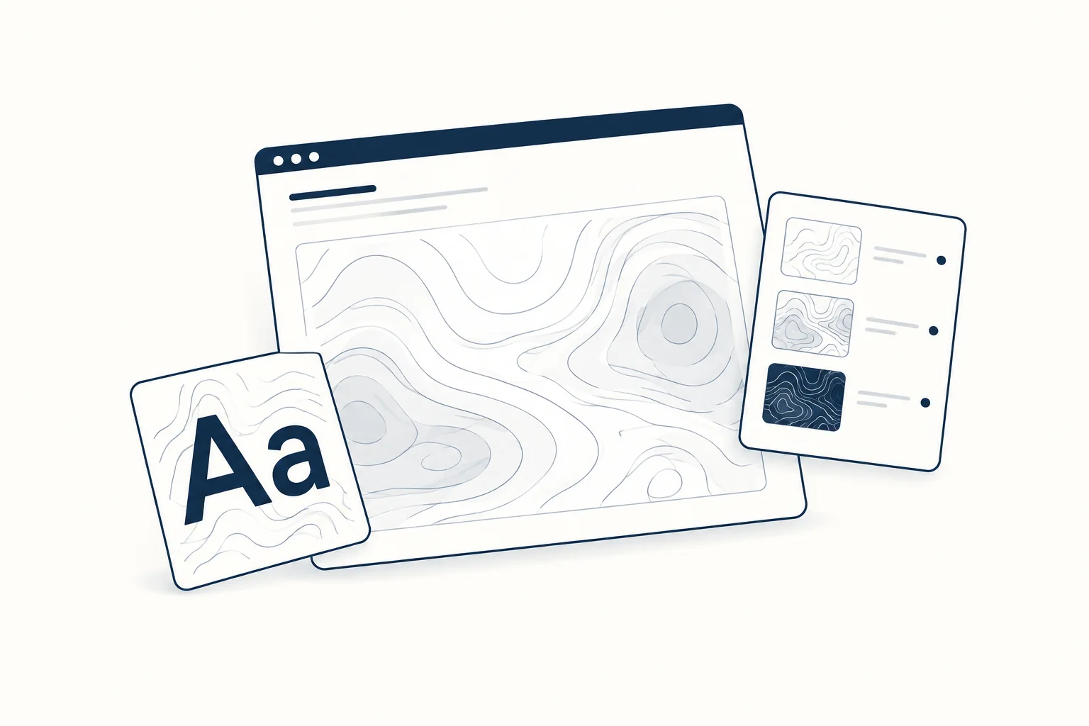
Contour-style lines can give a composition rhythm and depth, but a decorative pattern should not be presented as a real map or measurement. Decide whether the image is art or information before using scientific-looking labels, coordinates or legends. The distinction should be clear to the reader.
This guide concerns abstract visual treatment. It does not describe a method for creating accurate geographic, medical or engineering visualisations.
Give the lines a compositional role
For a fictional architecture publication, contour-like artwork could establish a sense of terrain or structure. It can guide the eye toward a heading without claiming to depict the site of a real building.
Choose where the lines are dense and where the page needs calm. A uniform field can work as a background, but a change in density may create an unintended focal point. Place the actual text before deciding whether that emphasis helps.
Compare scale and contrast separately
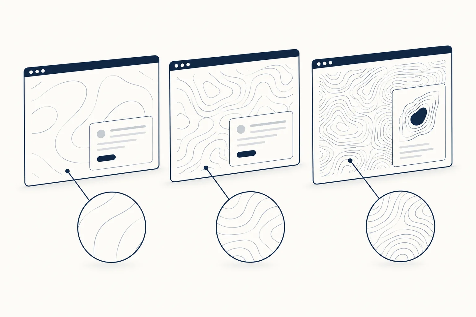
Begin with a simple line treatment. Compare a broad pattern with a finer one while keeping the palette fixed. Then evaluate contrast without changing the pattern again.
This makes the decision easier to explain: the broader lines support a large cover, while the finer version becomes too busy in a small card. Do not assume one export should serve every context without review.
Keep decorative labels honest
Coordinates, numeric scales and technical legends can make abstract art look like evidence. Leave them out unless they describe real data and you can explain the source and method.
If the work is illustrative, use an ordinary caption such as “Abstract contour study”. That is clearer than inventing a survey label for visual atmosphere. The reader should not have to inspect a footnote to discover that an apparent map is fictional.
Explore a map-like or typographic direction
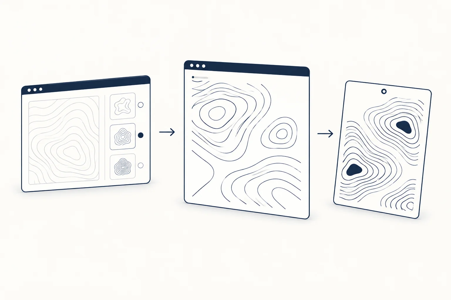
HorizonX provides Contour Map and Contour Type resources to inspect. Their names identify visual starting points; do not treat the names alone as evidence of data-processing capabilities.
Review each resource's description and controls. Select the direction that supports the composition, then check the actual output at the intended size. Keep meaningful page text outside decorative artwork when it needs to remain readable and editable.
When should you use a real chart instead?
Use a properly sourced visualisation when the page is making a factual claim about geography, a measurement or a relationship in data. Decorative contours cannot substitute for the method, units and explanation that claim needs.
For purely expressive work, explore the texture catalogue with a simpler goal: create a clear visual rhythm while keeping the nature of the image honest.