
Overview
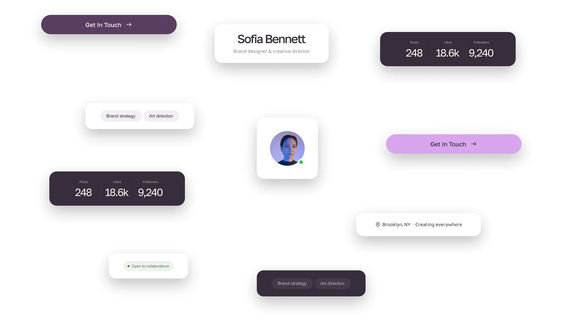
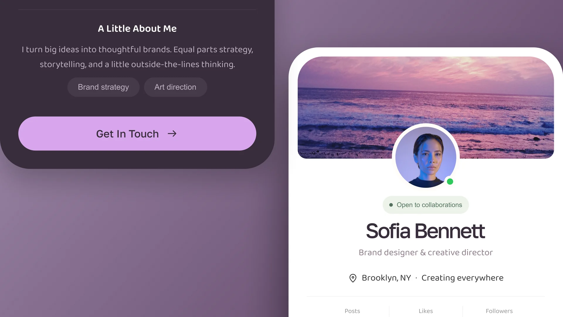
Profile Card Components is a Figma set for the personal-brand card: the block that introduces someone on a portfolio, a directory, a team page or a freelance marketplace. Each card stacks a cover banner, a circular avatar with an online presence dot, an "Open to collaborations" availability pill, name and role, a location line, a three-column stat row for posts, likes and followers, a short about paragraph, skill chips and a full-width contact button. The layout is auto-layout end to end, so a longer name, a fourth chip or a three-line bio pushes the card taller instead of clipping. It ships in two complete themes (a soft white card and a deep plum dark card with a lavender action button), sharing the same structure, so a theme switch is a swap, not a rebuild. Pull individual parts as well: the stat row, the availability pill and the chip group all stand on their own. Fully editable, images are placeholders you swap for your own.
Highlights
- Crafted to production standard
- Ready to adapt to your own project
- Included with every membership