Overview
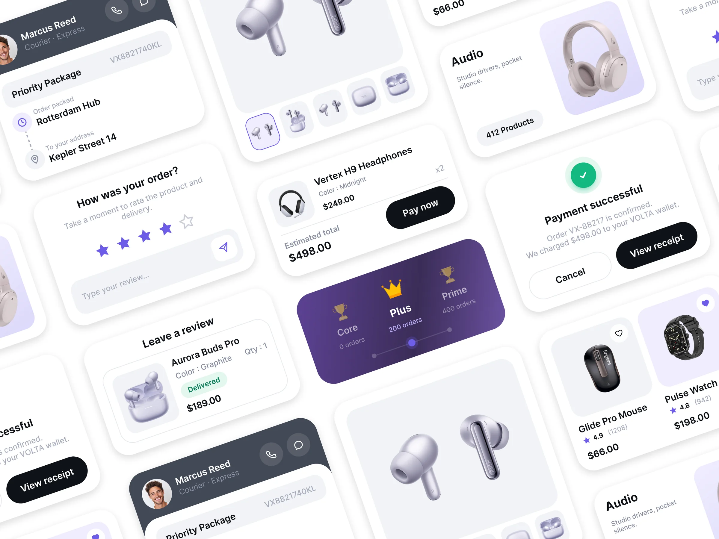
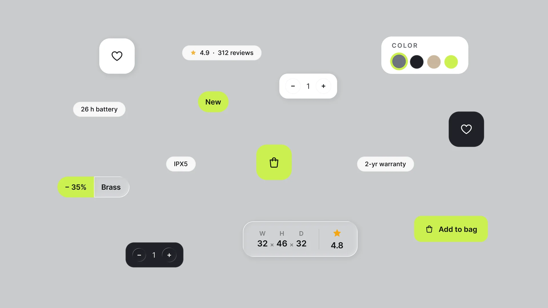
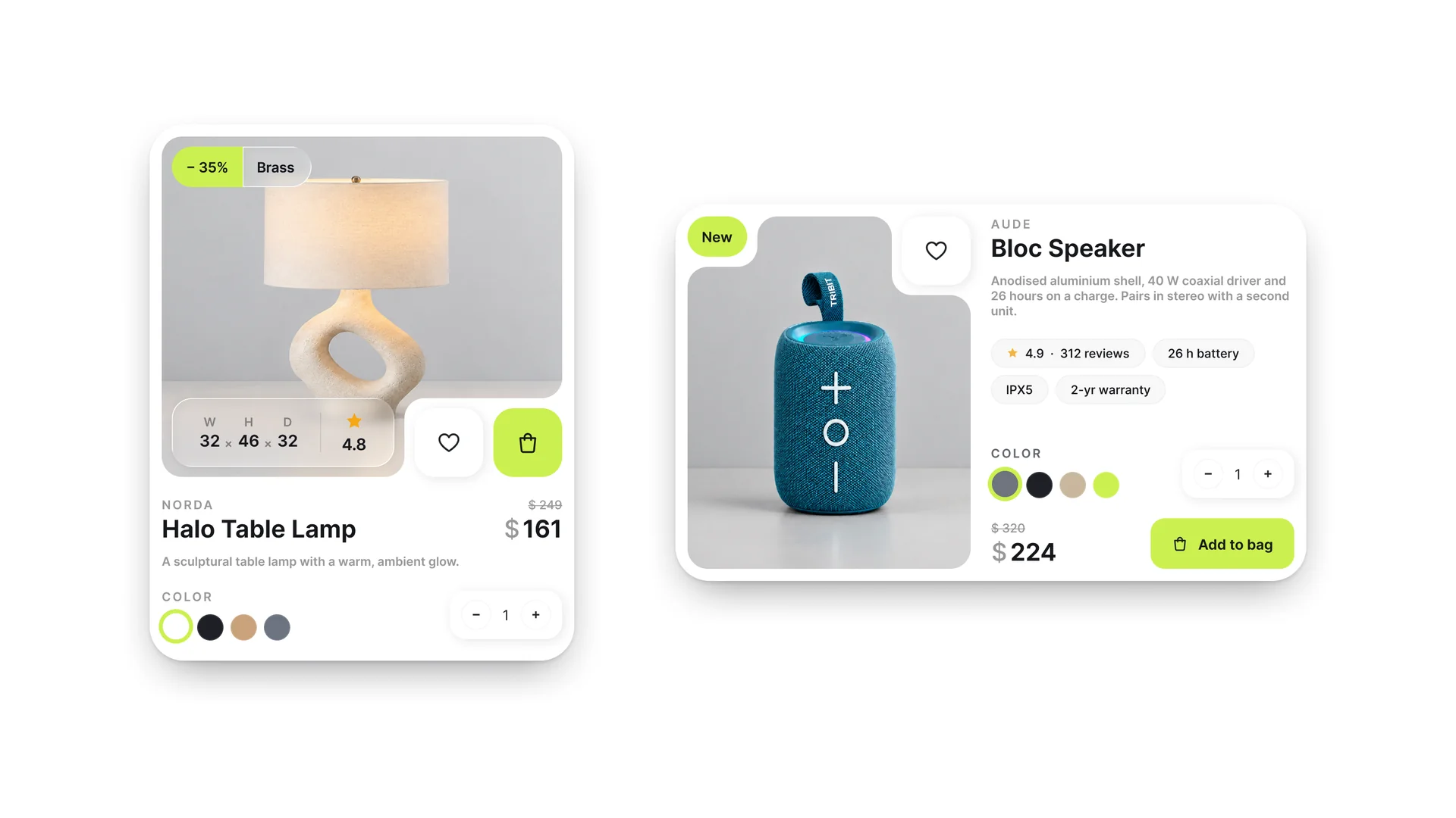
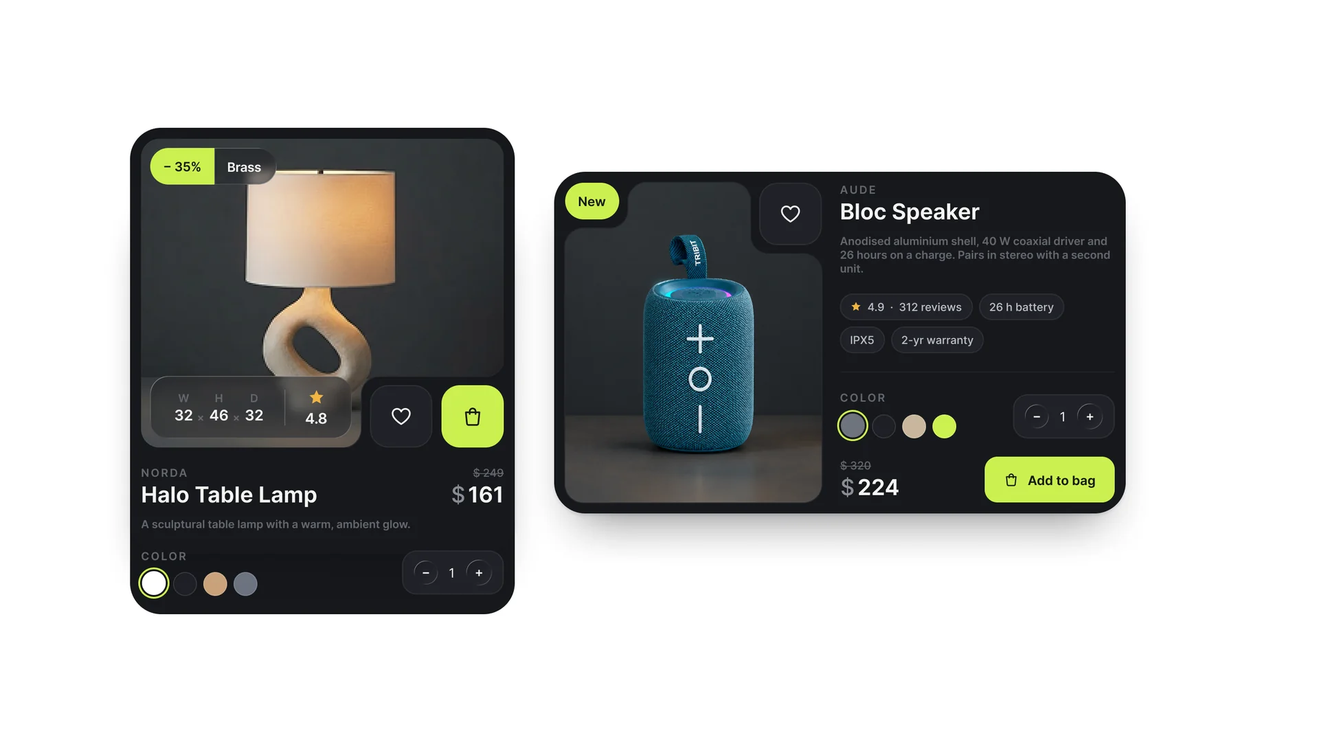
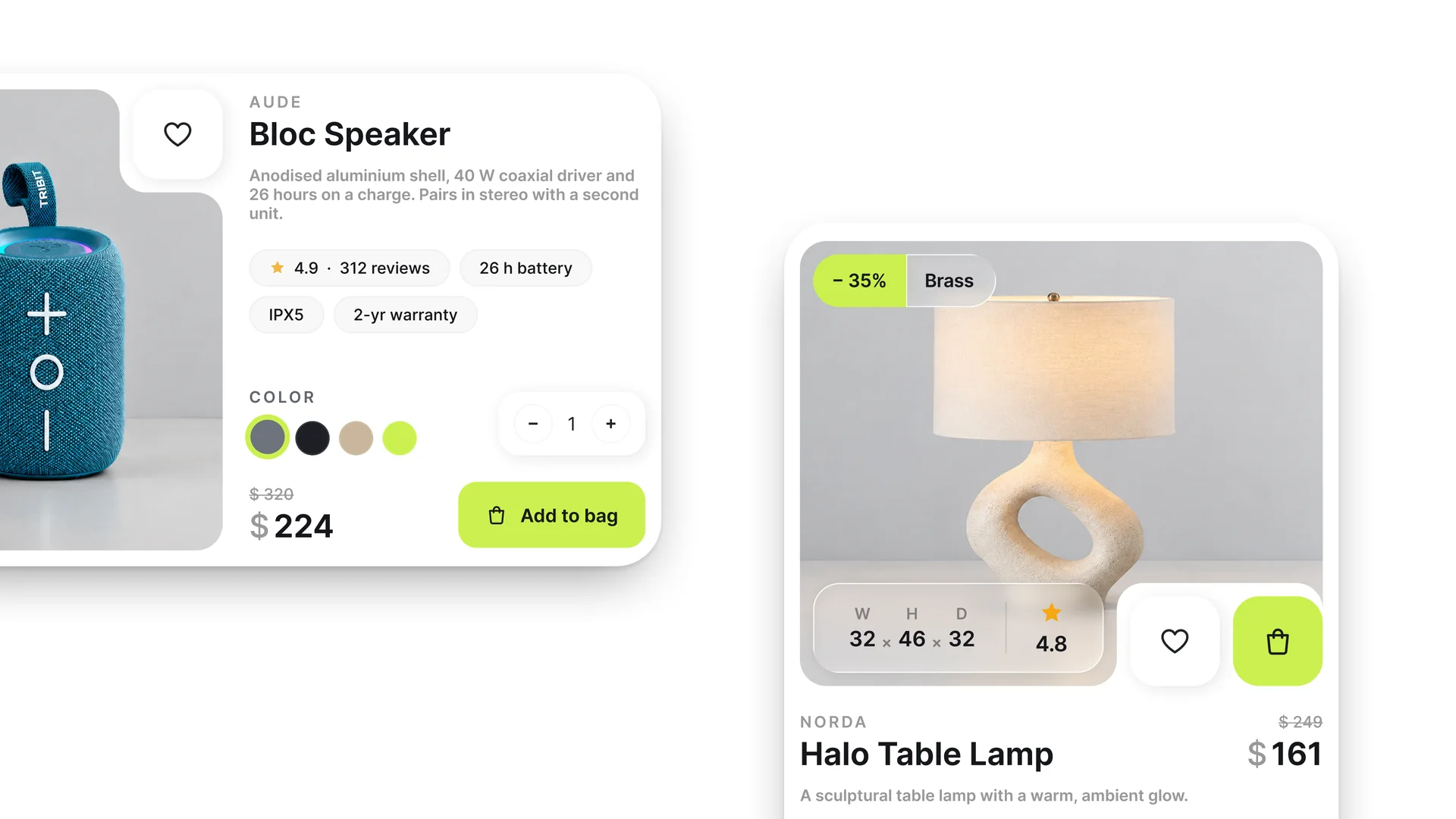
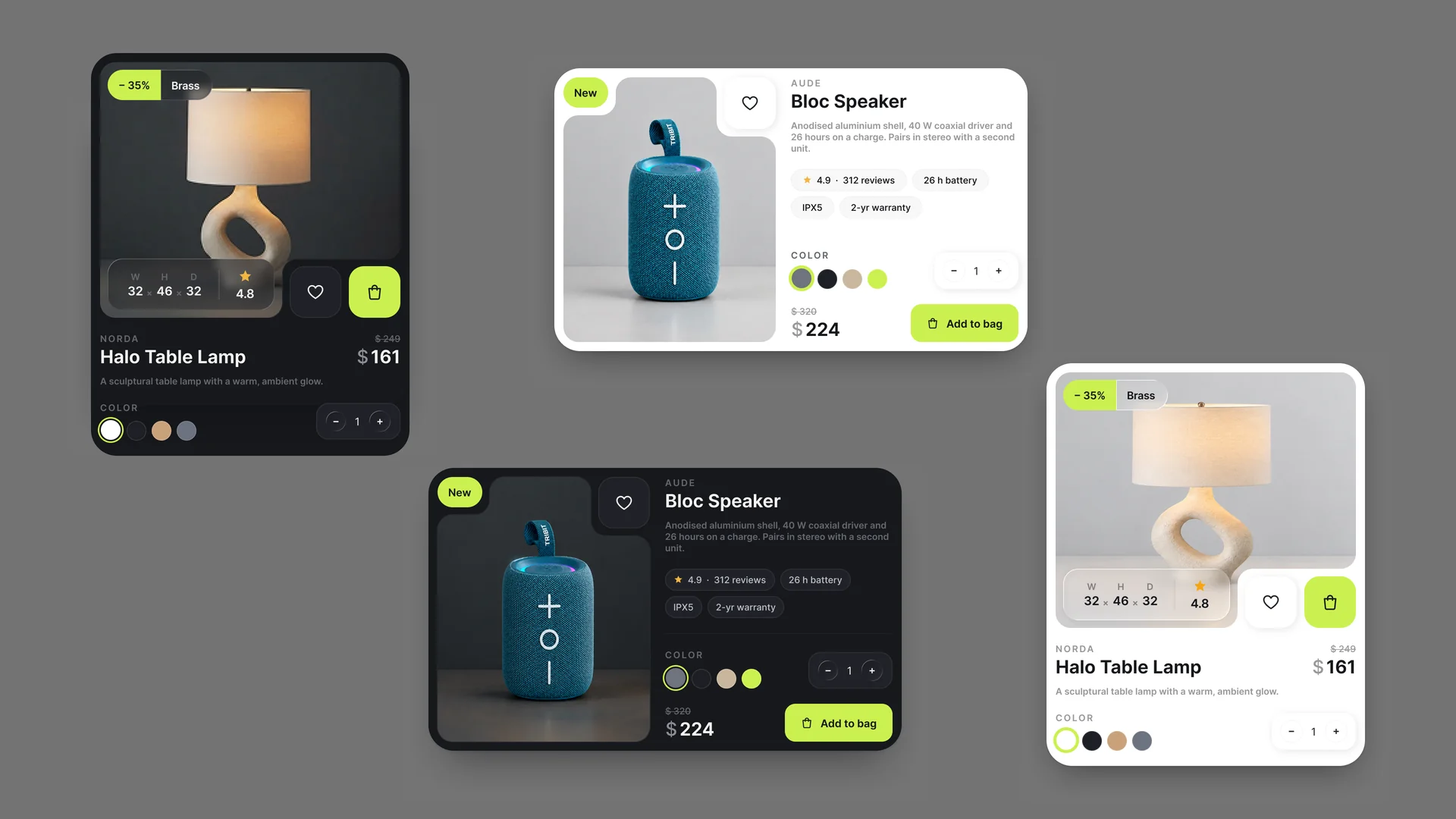
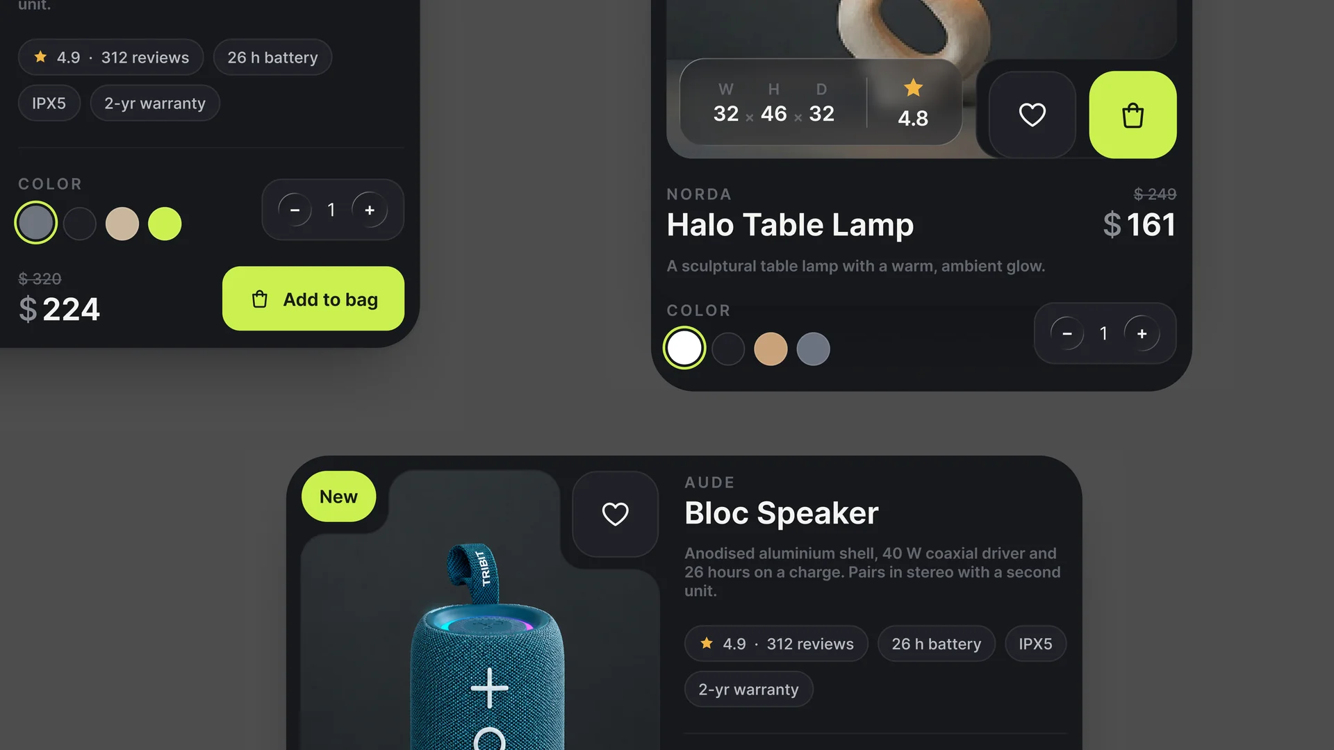
Product Card Components is a Figma set for the piece of an online store that does the actual selling. Each card carries the full merchandising stack: product image with discount and "New" badges, brand line, title, strikethrough original price against the live price, a short description, rating and review count, feature chips, colour swatches, a spec overlay with dimensions, a wishlist toggle, a quantity stepper and the add-to-bag action. Everything ships in two complete variants (a deep charcoal dark mode with a lime accent and a clean light mode), so you can match either half of a theme switch without rebuilding. The cards are auto-layout throughout, which means longer product names, extra chips or a fourth swatch reflow instead of overlapping. Use them as a catalogue grid, a featured row, or pull individual pieces (the swatch row, the spec overlay, the stepper) into an existing design system. Fully editable, images are placeholders you swap for your own.
Highlights
- Crafted to production standard
- Ready to adapt to your own project
- Included with every membership