Overview
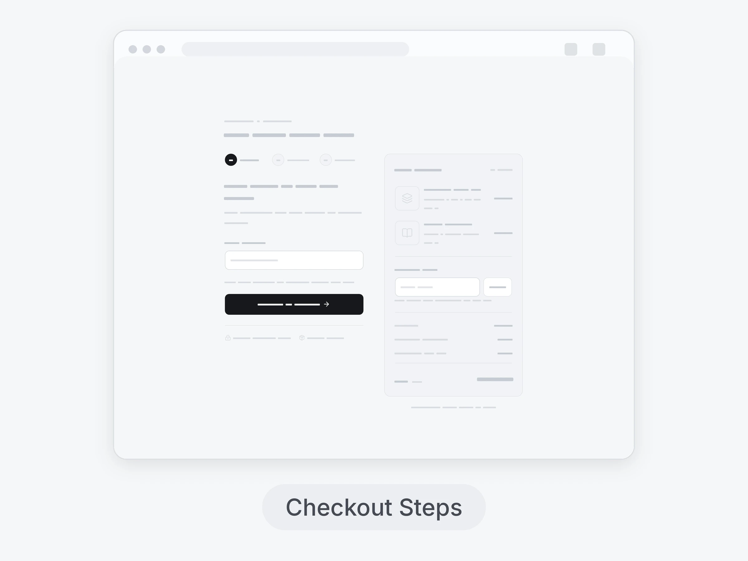
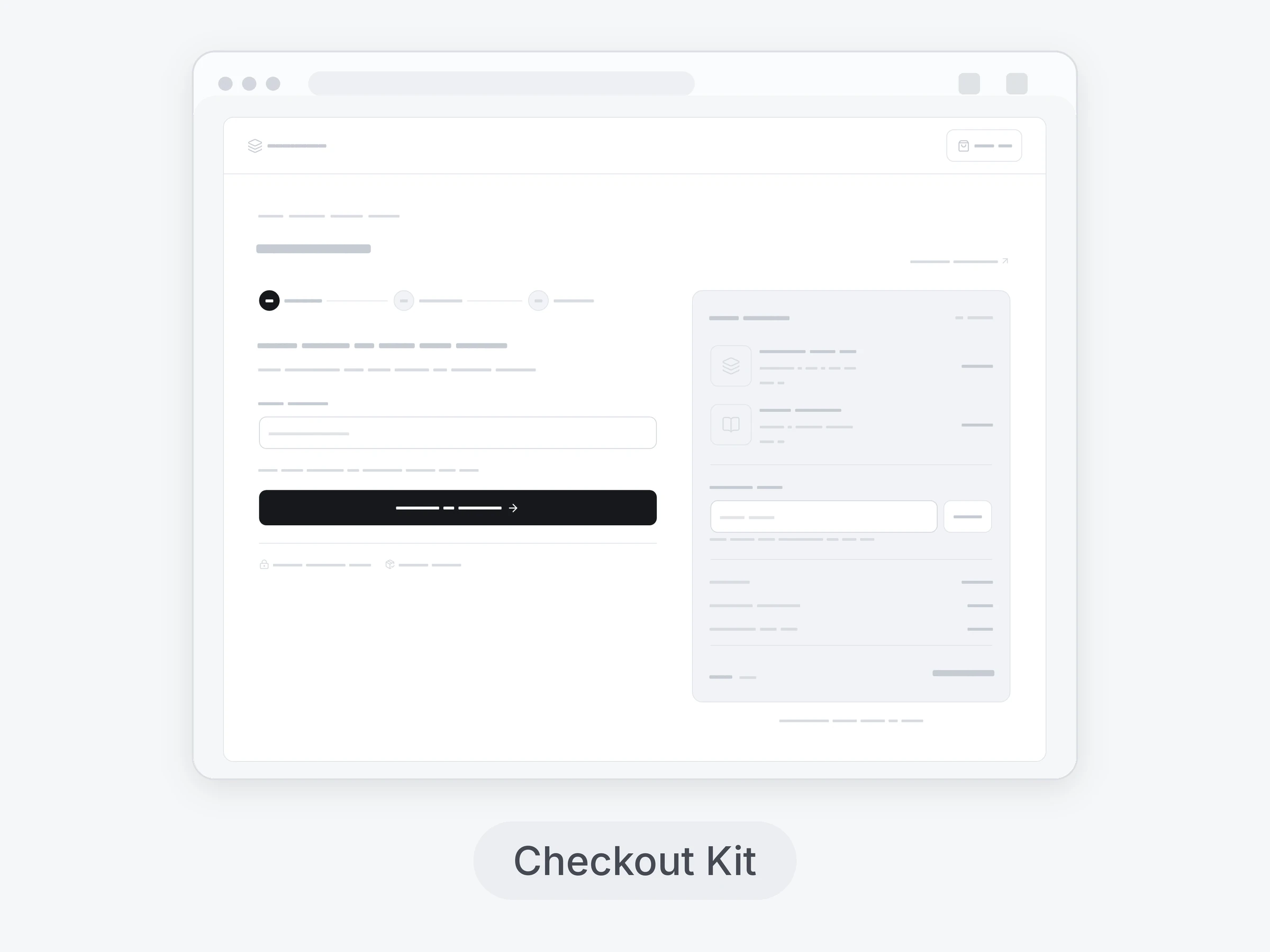
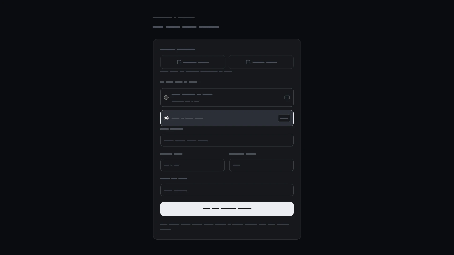
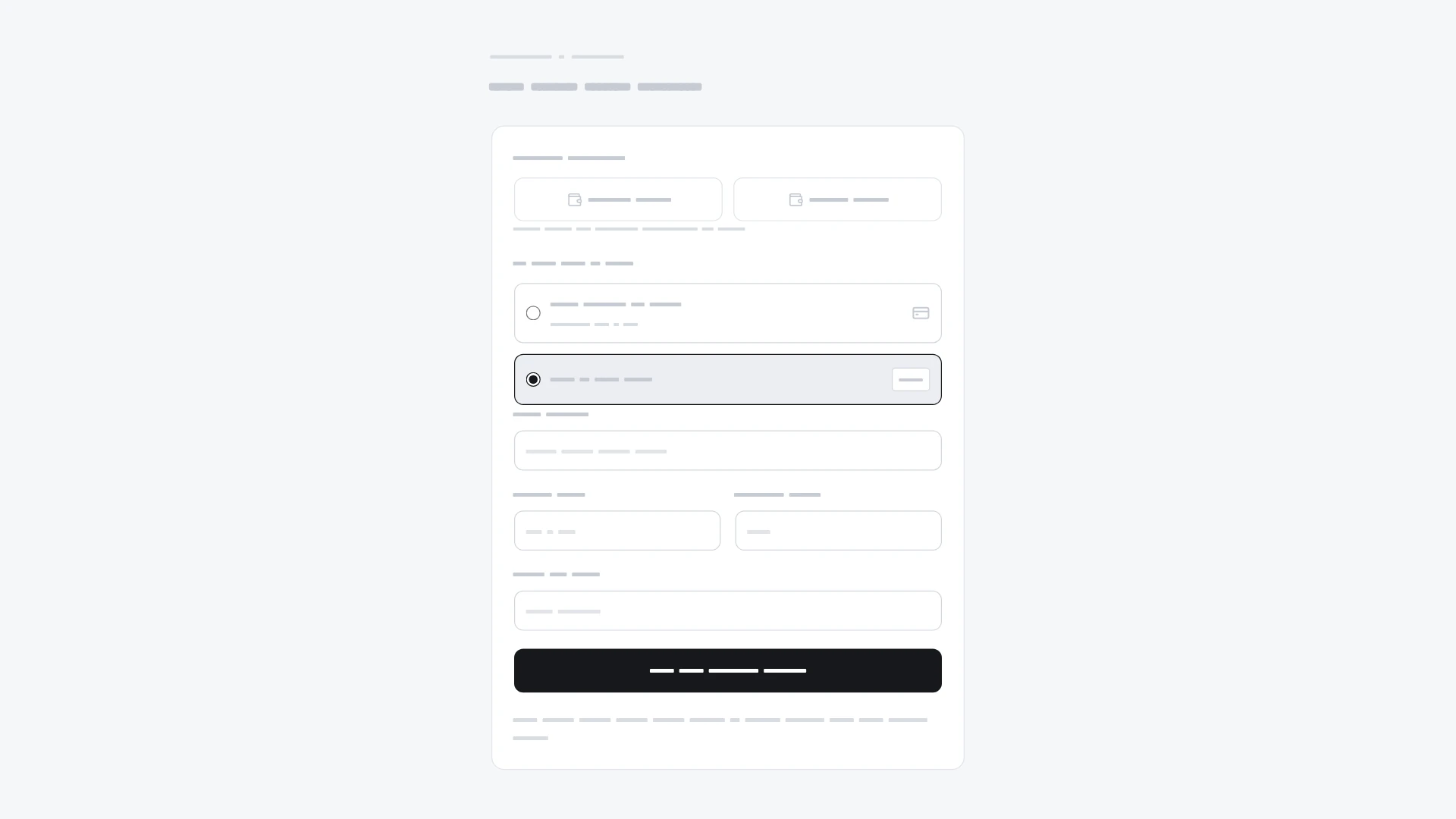
Formatted card fields, prefix-based brand text, saved cards and neutral wallet choices. It comes from the Checkout kit and also works on its own. Keyboard and screen readers: Native controls have visible focus and descriptive accessible names. Errors and changes are announced; dialogs trap focus, close with Escape and restore focus. Reduced motion preserves every action without movement. Built with React 19 and TypeScript, Tailwind CSS 4 and Lucide icons. Light and dark themes come from CSS variables you can edit, and every demo uses believable sample data you replace with your own. Included: the component source, its sample data, light and dark theme variables, a runnable demo page, and setup guides for people and for AI coding agents.
Highlights
- Production-ready, documented source
- Clean, componentized architecture
- Drops into your stack with minimal setup