Overview
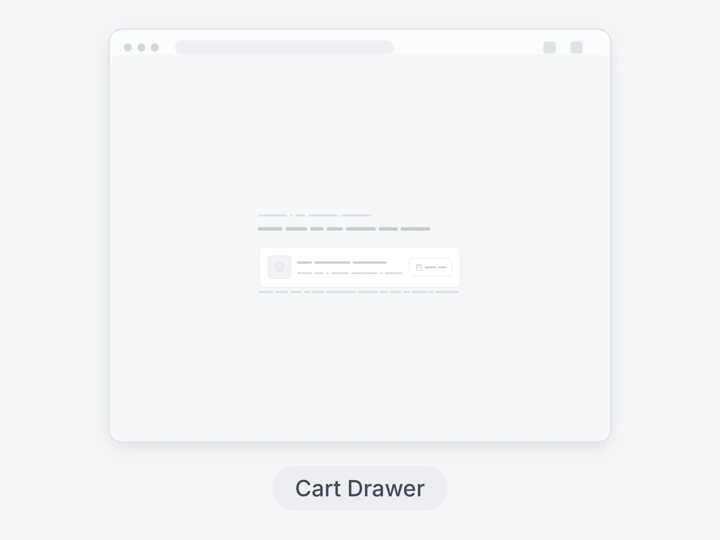
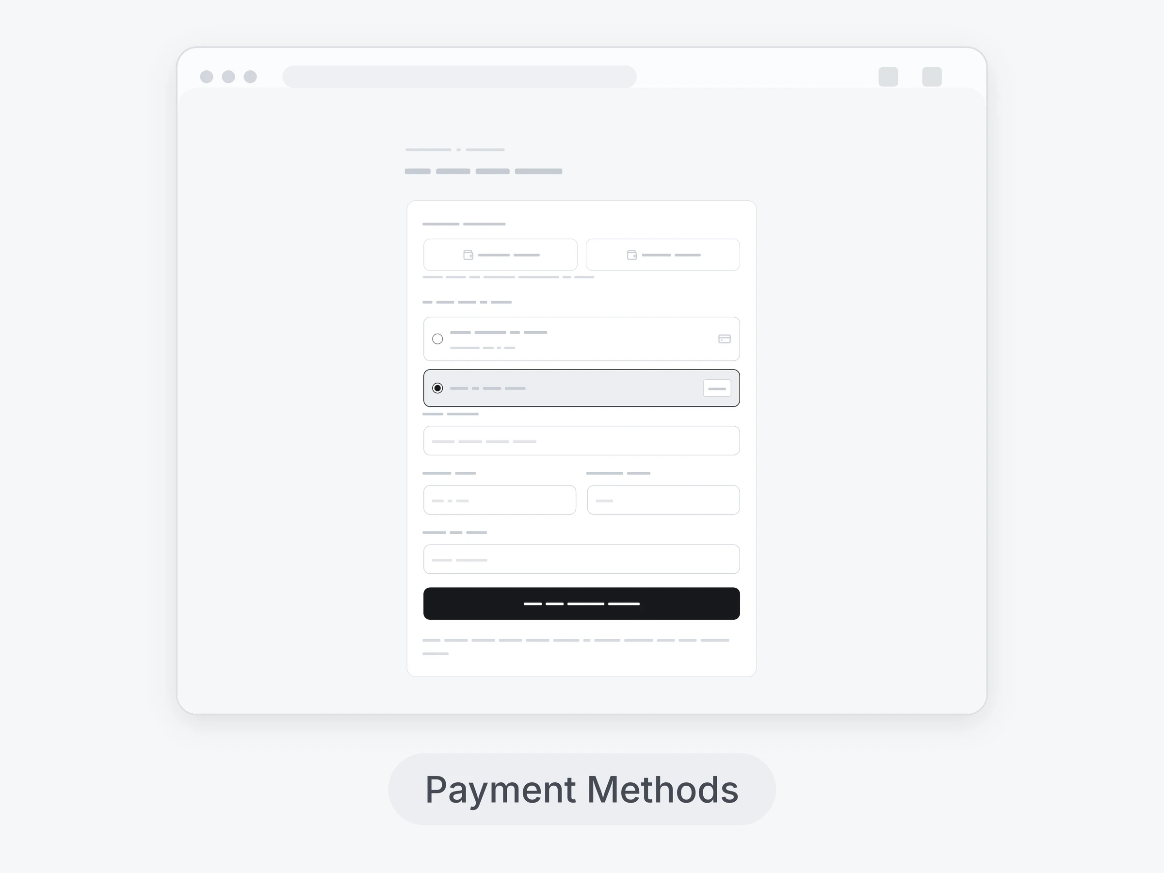
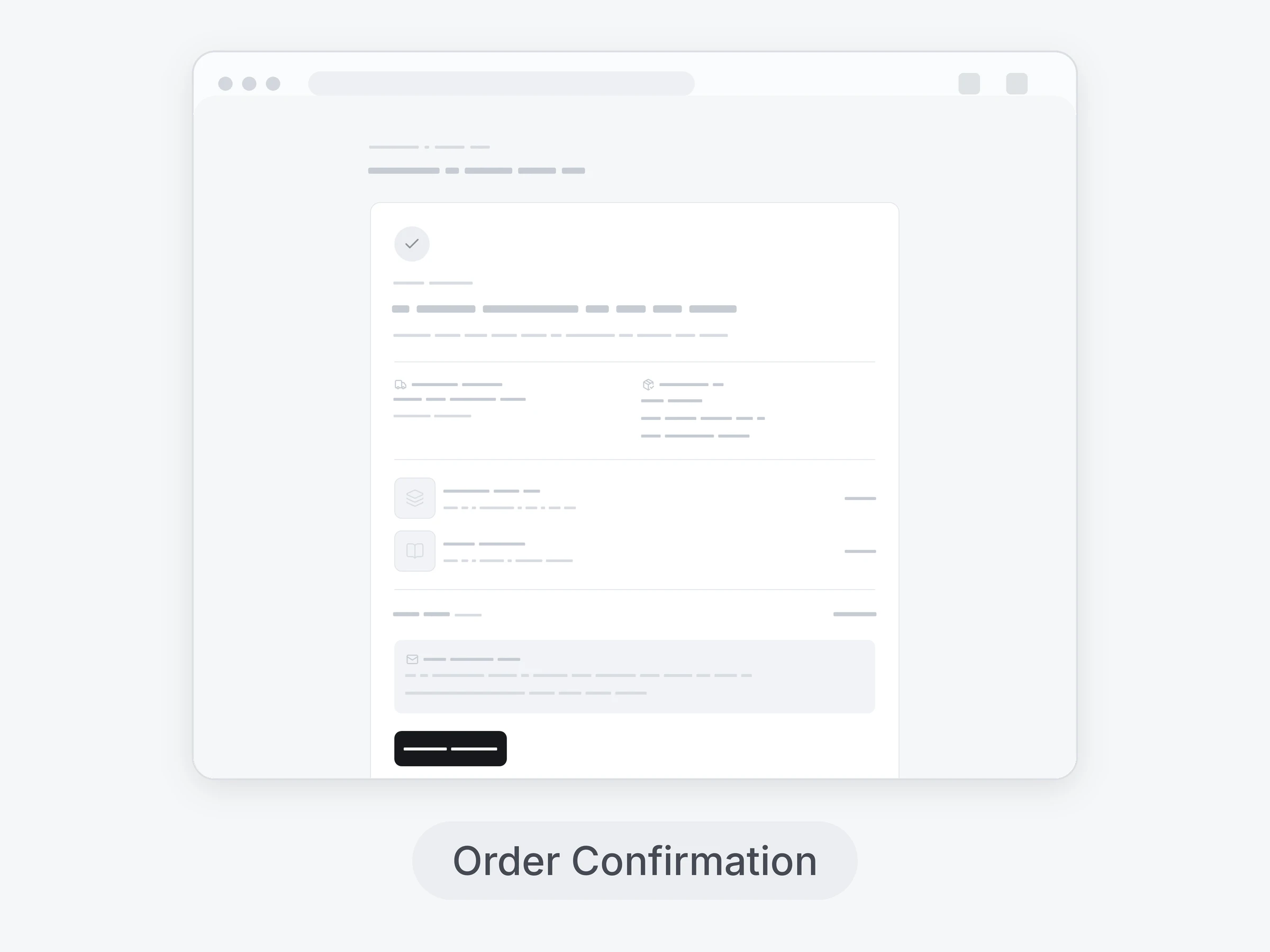
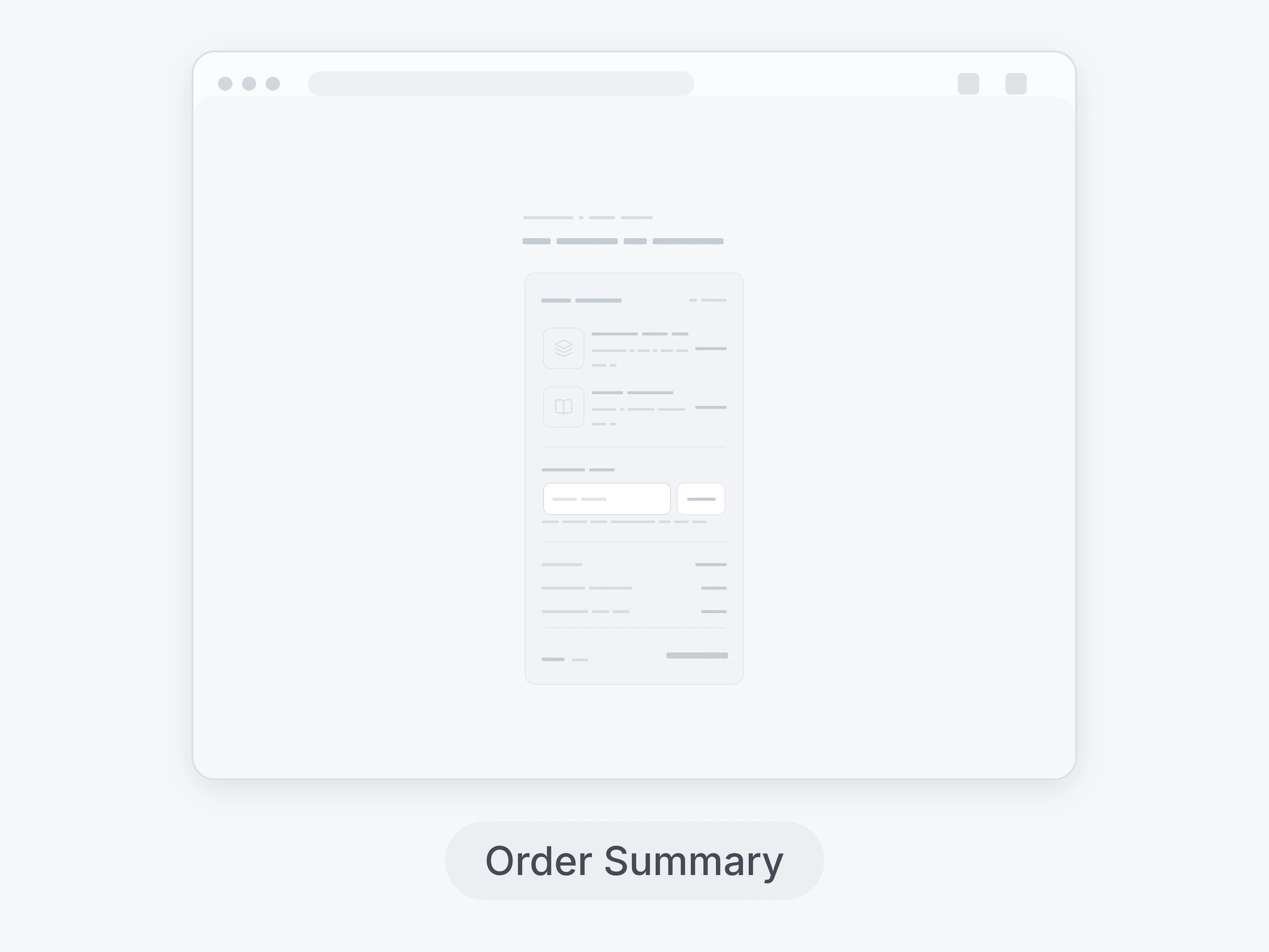
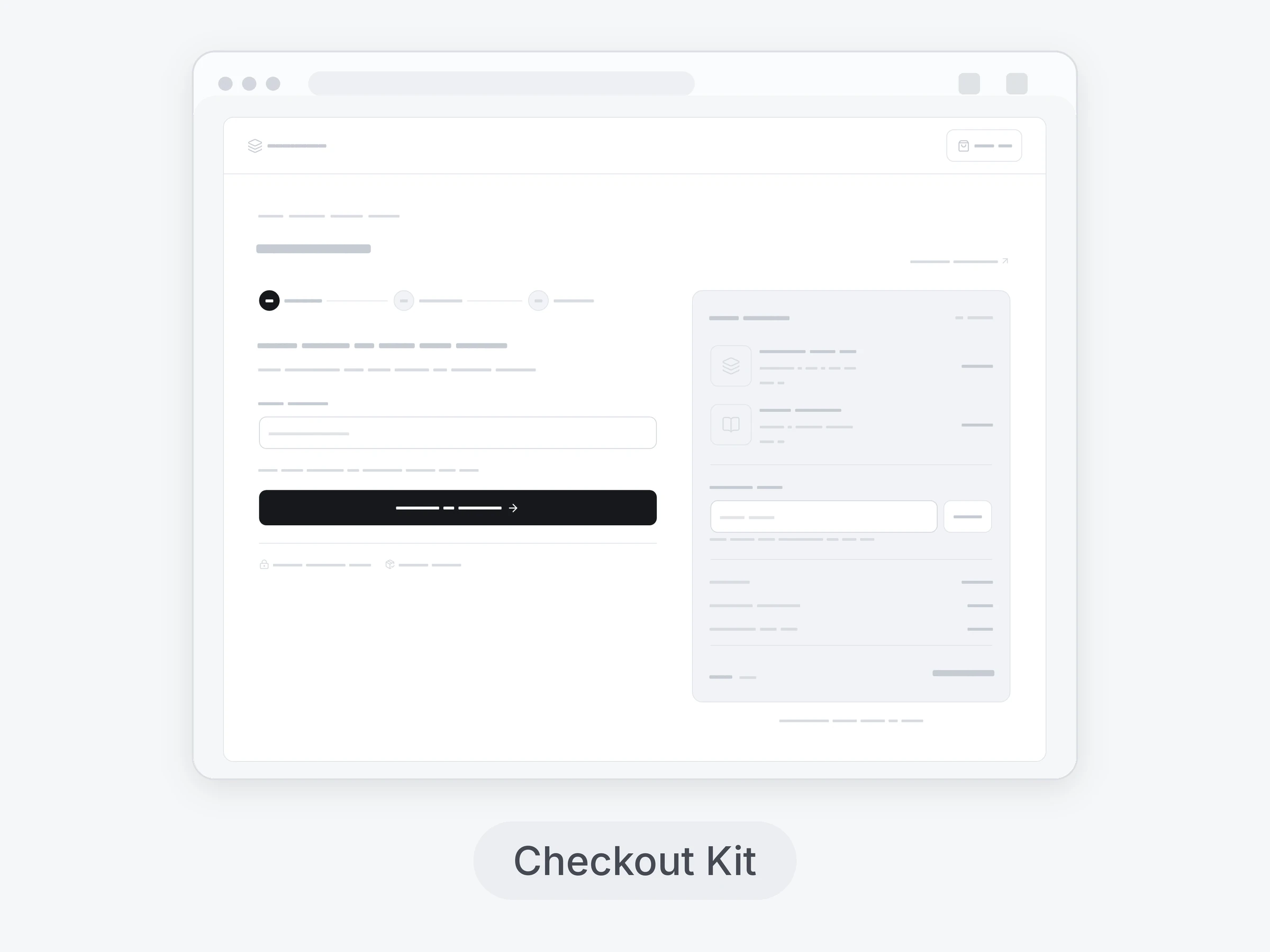
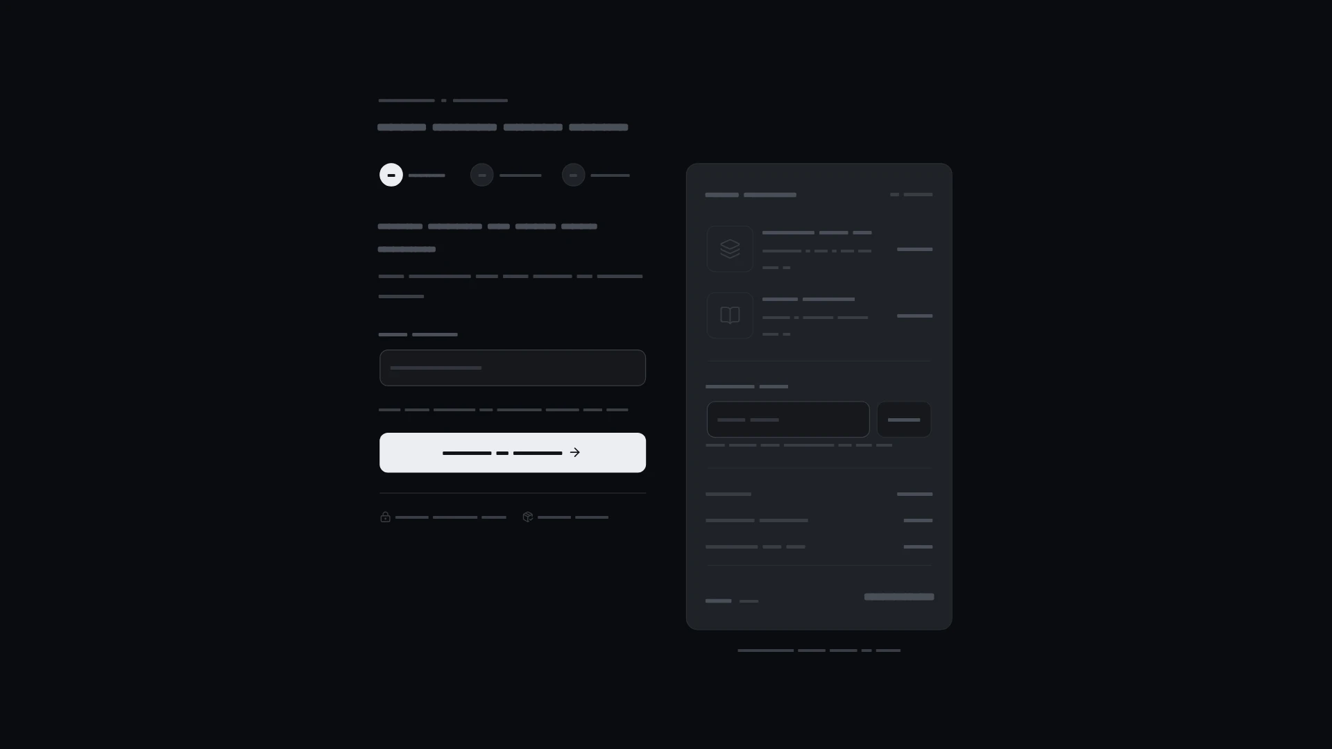
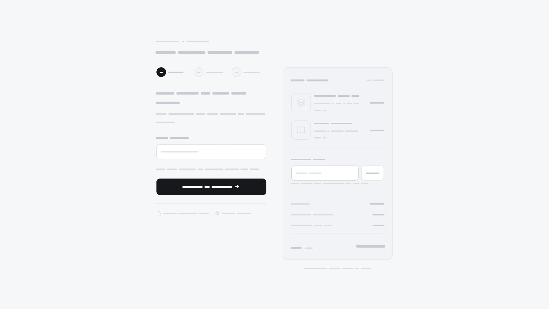
Contact, shipping and payment stages with validation, edit actions and a mobile order disclosure. It comes from the Checkout kit and also works on its own. Keyboard and screen readers: Native controls have visible focus and descriptive accessible names. Errors and changes are announced; dialogs trap focus, close with Escape and restore focus. Reduced motion preserves every action without movement. Built with React 19 and TypeScript, Tailwind CSS 4, Lucide icons and Motion. Light and dark themes come from CSS variables you can edit, and every demo uses believable sample data you replace with your own. Included: the component source, its sample data, light and dark theme variables, a runnable demo page, and setup guides for people and for AI coding agents.
Highlights
- Production-ready, documented source
- Clean, componentized architecture
- Drops into your stack with minimal setup