
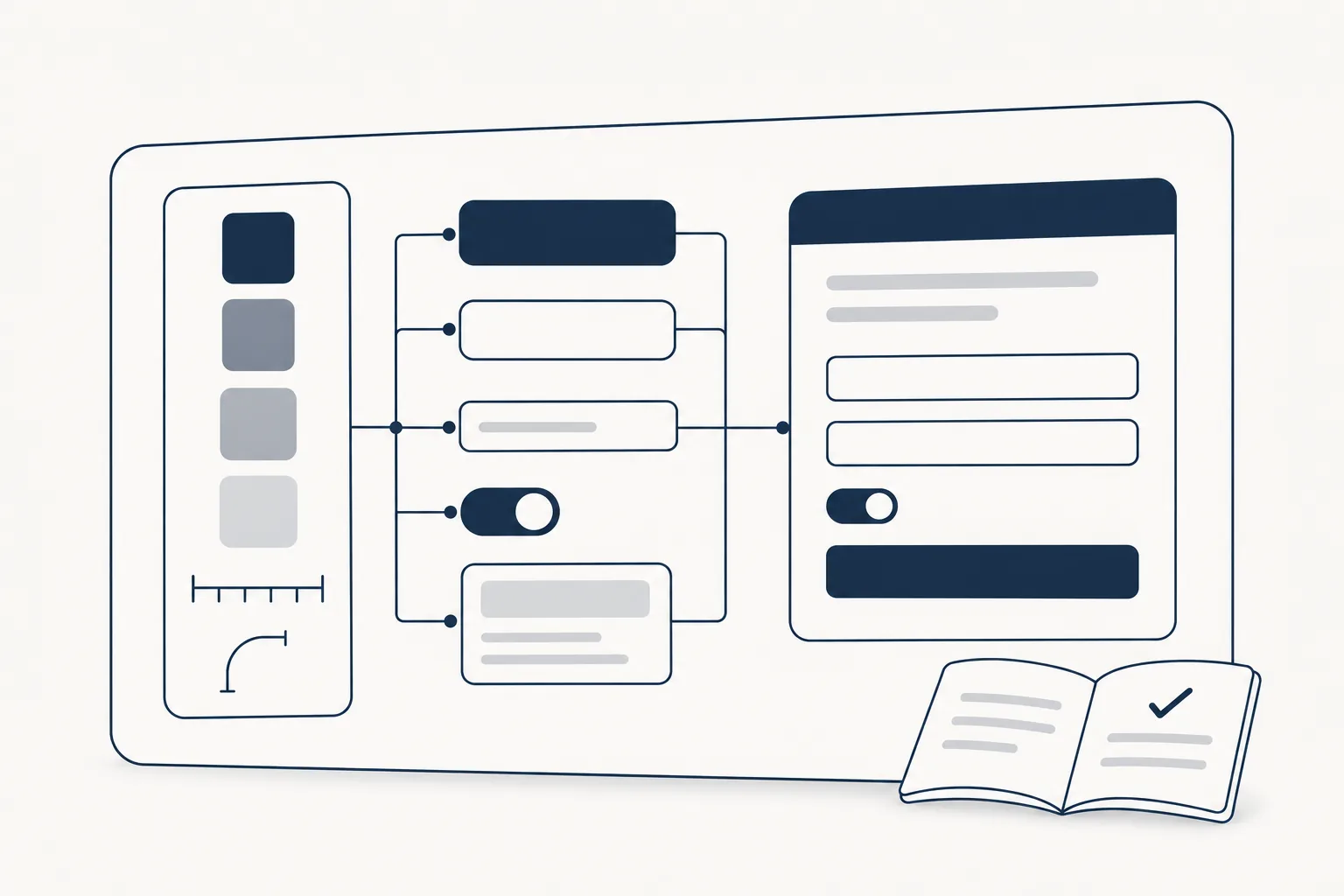
A design system is the shared set of decisions a product is built from: the tokens (colours, type, spacing), the components that use them, the patterns that combine those components, and the written rules for when to use what. Its job is to make the hundredth screen as consistent and as cheap to build as the first.
Nielsen Norman Group puts it as "a complete set of standards intended to manage design at scale using reusable components and patterns" (NN/g, Design Systems 101, last reviewed August 27, 2026). The important word is standards. A folder of nice components is not a design system until there are rules everyone follows about how they are used.
What a design system is made of
Most systems have the same four layers, from smallest to largest.
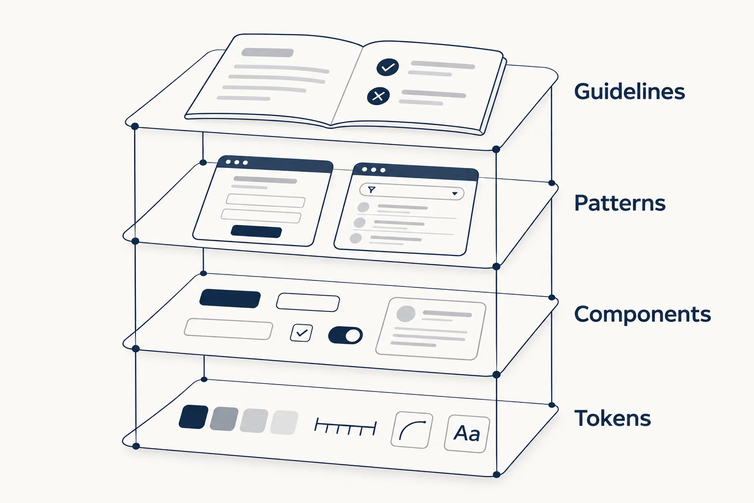
1. Design tokens. Named values for the basic decisions: color-text-primary, space-4, radius-card, font-size-lg. Components never use a raw hex code or pixel value; they use a token. Change the token and every component that uses it changes with it. Since October 2025 there is a stable, tool-neutral file format for exchanging tokens, the Design Tokens Format Module 2025.10 from the W3C Design Tokens Community Group (a Community Group report, checked November 18, 2026). Our design tokens guide covers naming and structure in depth.
2. Components. The reusable pieces of interface: buttons, inputs, selects, cards, dialogs, tabs, toasts. Each one exists twice, once in the design tool and once in code, and the two have to match: same names, same variants, same states (hover, focus, disabled, loading, error).
3. Patterns. Recipes that combine components to solve a recurring problem: a sign-in form, an empty state, a settings page, a data table with filters. Patterns are where most of the time savings live, because they answer layout and behaviour questions that a single component cannot.
4. Guidelines and documentation. The rules: when to use a dialog instead of a new page, how error messages are written, which contrast levels are allowed, how icons are sized. Without this layer, two teams using the same components still build different products.
Around these four layers sits governance: who can add or change something, how changes are reviewed and versioned, and how teams are told. It is the least visible part and the one that decides whether the system survives its first year.
Design system vs UI kit vs component library vs style guide
These terms are often used as if they meant the same thing. They do not.
| What it contains | Where it lives | Has usage rules? | |
|---|---|---|---|
| Style guide | Brand colours, type, logo use, tone of voice | A document or page | Yes, for the brand, not for interface behaviour |
| UI kit | Ready-made components and screens, drawn or coded | A design file (for example Figma) or, for a coded UI kit, a code package | Usually only light notes |
| Component library | Coded, reusable components | A code package (React, Svelte, Vue...) | API docs, rarely design rules |
| Design system | Tokens, design components, coded components, patterns, guidelines and governance | Design file, code and documentation, kept in sync | Yes, that is the point |
Put simply: a style guide, a UI kit and a component library can each be part of a design system. A design system is what you have when all of them describe the same decisions and someone is responsible for keeping them that way.
A coded UI kit is the closest of the three to a design system, because its tokens and components already run in code; our guide to coded UI kits explains the difference.
Well-known examples worth studying
Large public systems are the best way to see what a mature one looks like. Each of these publishes its tokens, components and guidelines openly:
- Material Design 3 (Google): strong on tokens and theming. Google's open-source Material Color Utilities generate whole colour schemes from a single source colour.
- Carbon (IBM): open source, with detailed guidance for data-heavy enterprise interfaces, including data visualisation.
- Fluent 2 (Microsoft): one system across web, Windows, iOS and Android.
They are useful references, not templates to copy whole. Each was shaped by a large company with its own design teams and products very different from yours. Borrow the structure of their documentation and the way they name tokens; build your own visual layer.
Do you need one?
You probably need at least a small design system when one of these is true:
- More than one person designs or builds the interface.
- The same component exists in two or three slightly different versions in the code.
- Changing the brand colour or the corner radius means a search across dozens of files.
- New screens take as long as the first ones did.
You probably do not need a full one yet if you are a single person validating an idea with a handful of screens. Even then, defining tokens from day one costs almost nothing and saves a painful clean-up later.
How to start: a minimal design system in one afternoon
You do not have to begin with fifty components. A useful starting point is small enough to fit on one screen. The example below is an illustration we wrote for this article, not taken from a real product.
Step 1. Audit what you already have. Take screenshots of every button, input and heading colour in the product and put them side by side. The duplicates you find are the first decisions to make.
Step 2. Define a short list of tokens. Start with colour roles (not raw colours), a spacing scale, two or three radii and a type scale:
:root {
  /* colour roles, not colour names */
  --color-surface: #ffffff;
  --color-text: #0f172a;
  --color-text-muted: #475569;
  --color-accent: #1d4ed8;
  --color-accent-text: #ffffff;
  --color-border: #e2e8f0;

  /* spacing scale (4px steps) */
  --space-1: 4px;
  --space-2: 8px;
  --space-3: 12px;
  --space-4: 16px;
  --space-6: 24px;

  /* shape and type */
  --radius-control: 8px;
  --radius-card: 16px;
  --font-size-sm: 14px;
  --font-size-base: 16px;
  --font-size-lg: 20px;
}
Step 3. Build the first components on top of the tokens only. A button is the classic first one, because every state has to be decided:
.button {
  padding: var(--space-2) var(--space-4);
  border-radius: var(--radius-control);
  font-size: var(--font-size-base);
  background: var(--color-accent);
  color: var(--color-accent-text);
  border: 1px solid transparent;
}
.button:focus-visible { outline: 2px solid var(--color-accent); outline-offset: 2px; }
.button:disabled { opacity: 0.5; cursor: not-allowed; }
.button--secondary {
  background: var(--color-surface);
  color: var(--color-text);
  border-color: var(--color-border);
}
Notice that every colour, spacing step, radius and font size comes from a token; only small structural details like the 1px border, the 2px focus ring and the disabled opacity stay literal. That is the rule that makes the system work: a dark theme, for example, becomes a second set of values for the same tokens rather than a rewrite of every component.
Step 4. Write down three rules. For example: "one primary button per view", "error text says what happened and what to do next", "icons are 16px inside controls and 24px on their own". Short rules that people actually follow beat a long document nobody reads.
Step 5. Grow it from real screens. Add a component or pattern to the system when the second screen needs it, not before. Inputs, selects, cards, dialogs and toasts usually come next.
How to evaluate a design system before adopting one
If you are choosing an existing system or a commercial one instead of building your own, check:
- Tokens first. Can you change colour, type and radius in one place, or are values hard-coded in components?
- Design and code match. Does every component in the design file exist in code with the same name, variants and states?
- Accessibility is built in. Focus styles, keyboard support and contrast are part of the components, not left to you.
- Licence. Can you use it in client and commercial work? Read the licence of the system and of anything it bundles, such as fonts and icon sets.
- Your stack. A system built for React does not help a Svelte or Vue codebase without a port.
Where HorizonX fits
HorizonX is a design and development library, not a design system for your company. It can save time on the parts you would otherwise build from scratch:
- Design systems: 31 industry design systems (count checked November 18, 2026), each built for a sector such as finance, hospitality or tech. The product pages list foundations (colour, type, spacing, imagery, patterns), components (buttons and tags, cards, dialog, forms, navigation, feedback, table), a theme sheet, a landing starter and a pitch deck. Use one to study a complete structure or as a starting point you then make your own.
- Component libraries: our comparison of React and Tailwind libraries if you need the coded layer first.
- Icons: open-source icon sets, each under its own authors' licence, so the icon rule in step 4 has something consistent to point to.
Whatever you start from, the advice is the same: decide the tokens first, build components only from tokens, and write down the few rules your team will really follow.