
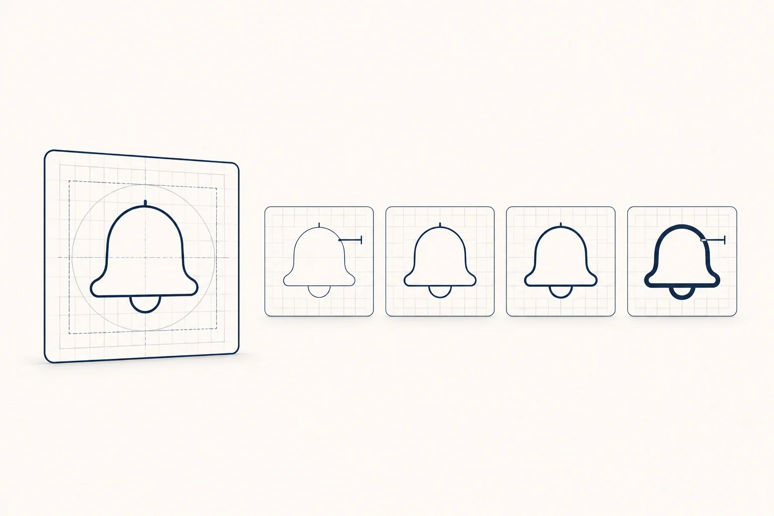
If you want one answer: Lucide is the safest default for a React or Vue product interface (ISC licence, about 2,000 outline icons, tree-shakable packages for both frameworks). Pick Phosphor when you need the same icon in several weights, Tabler when you need the most icons in one outline style, and Heroicons when you build with Tailwind and want a small, carefully drawn set. Material Symbols, Fluent UI and Carbon make sense when your product already follows Google, Microsoft or IBM design language. All twelve libraries below can be used in commercial work, but their licences differ in ways that matter if you redistribute the files, and two of them (Boxicons and Material Design Icons) deserve a closer read before you ship.
Every licence, version and count below was checked on the project's own site, GitHub repository or npm package on 2026-11-09. Icon sets grow every month, so treat counts as approximate.
The 12 libraries at a glance
Where a project states a count on its site, that figure is used. Otherwise we downloaded the latest npm package of the SVG files and counted them; the package and version are named in the notes below the table.
| Library | Licence | Icons (approx.) | Styles | Drawn on | Official React / Vue |
|---|---|---|---|---|---|
| Lucide | ISC (Feather-derived icons also MIT) | ~2,000 | Outline, adjustable stroke | 24 px | lucide-react, @lucide/vue |
| Phosphor | MIT | ~1,500 per weight | Thin, light, regular, bold, fill, duotone | 256 units | @phosphor-icons/react, @phosphor-icons/vue |
| Tabler | MIT | ~6,300 | Outline, filled | 24 px | @tabler/icons-react, @tabler/icons-vue |
| Heroicons | MIT | ~320 per style | Outline, solid, mini, micro | 24, 20, 16 px | @heroicons/react, @heroicons/vue |
| Material Symbols | Apache 2.0 | 3,800+ | Outlined, rounded, sharp, plus fill, weight, grade and size axes | 24 px (960 units) | None official |
| Fluent UI System Icons | MIT | ~3,000 | Regular, filled, some color and light | 10 to 48 px | @fluentui/react-icons (React only) |
| Bootstrap Icons | MIT | 2,078 | Outline plus fill variants | 16 px | None official |
| Iconoir | MIT | ~1,670 | Regular, solid | 24 px | iconoir-react, @iconoir/vue |
| Ionicons | MIT | 421 x 3 styles, plus logos | Outline, filled, sharp | 512 units | Web component; React via @ionic/react |
| Carbon | Apache 2.0 | ~2,600 | One style, redrawn per size | 32 px, plus 16, 20, 24 | @carbon/icons-react, @carbon/icons-vue |
| Boxicons | v2: MIT. v3: CC BY 4.0 for icons | 1,634 (v2) | Regular, solid, logos | 24 px | @boxicons/react, @boxicons/vue |
| Material Design Icons | Apache 2.0 (icons), MIT (code) | ~7,400 | Mostly filled, ~1,900 outline variants | 24 px | @mdi/js + @mdi/react |
Notes on the counts, all checked 2026-11-09:
- Lucide: lucide.dev lists 2,029 icons. The package is lucide-react 1.70.0.
- Phosphor: @phosphor-icons/core 2.1.1 contains 1,512 icons in each of its six weights (phosphoricons.com).
- Tabler: @tabler/icons 3.51.0 has 5,233 outline and 1,054 filled icons, matching tabler.io/icons.
- Heroicons: 2.2.0 ships 324 icons at 24 px outline, 24 px solid and 20 px solid, and 316 at 16 px. heroicons.com says 316.
- Material Symbols: Google's developer guide says 3,800+.
- Fluent: @fluentui/svg-icons 1.1.345 has 2,996 unique icon names (GitHub).
- Bootstrap Icons: 1.13.2; icons.getbootstrap.com lists 2,078.
- Iconoir: 7.12.2 has 1,383 regular and 288 solid (iconoir.com).
- Ionicons: 8.1.0 has 421 icons in three styles plus 94 logos (ionic.io/ionicons).
- Carbon: @carbon/icons 11.92.0 has 2,646 SVGs in its 32 px folder (Carbon icon library).
- Boxicons: 2.1.4 has 814 regular, 665 solid and 155 logos (v2.boxicons.com).
- Material Design Icons: @mdi/svg 7.4.47 has 7,447 icons (Pictogrammers).
Licences: what actually differs
Most of these licences ask for the same thing: keep the copyright and licence notice when you redistribute the files. Using an icon inside your app or website is fine under all of them. The differences show up when you ship the icons themselves, for example inside a UI kit, a template or a theme.
- MIT and ISC (Phosphor, Tabler, Heroicons, Fluent, Bootstrap Icons, Iconoir, Ionicons, Boxicons v2, Lucide) are short permissive licences. Lucide is ISC, but its licence file also carries an MIT notice for the icons that came from Feather, so keep both notices.
- Apache 2.0 (Material Symbols, Carbon, Material Design Icons) also lets you use the icons commercially. When you redistribute, the licence asks you to include the licence text and any NOTICE file and to mark files you changed.
- Material Design Icons is a mix. The Pictogrammers licence page says icons and fonts are Apache 2.0 and code is MIT, and it notes that some icons are redistributed under their own licences. That is why GitHub shows the repository licence as unrecognised.
- Boxicons depends on the version. The npm package and the GitHub repository are at 2.1.4 under MIT. The current boxicons.com site is version 3 with a paid Pro tier. Its free licence puts the icons under CC BY 4.0, the fonts under SIL OFL 1.1 and the code under MIT, and says attribution is required. Check which version you install before you decide whether to credit it.
- Carbon packages depend on IBM Telemetry. According to its README, it collects anonymised usage data only when the package is installed on a CI server or inside a container, never on a local machine. You can turn it off by setting
IBM_TELEMETRY_DISABLED='true'. It is not a licence issue, but your security review may want to know. - Brand logos in Ionicons, Boxicons and Material Design Icons are other companies' trademarks. The open source licence covers the drawing, not the right to use the brand.
React and Vue packages, and what tree-shaking means for icons
Tree-shaking means your bundler only keeps the icons you actually import. It works when each icon is its own module and the package declares it has no side effects (webpack guide). On 2026-11-09 we checked the package.json of each official package. These declare "sideEffects": false:
- lucide-react and @lucide/vue
- @phosphor-icons/react and @phosphor-icons/vue
- @tabler/icons-react and @tabler/icons-vue
- @heroicons/react and @heroicons/vue
- iconoir-react and @iconoir/vue
- @carbon/icons-react and @carbon/icons-vue
- @mdi/js
Import named icons from them and the production bundle stays small.
The differences that bite in practice:
- Dev server speed with big barrels. Next.js has an
optimizePackageImportssetting that is already on by default for lucide-react, @tabler/icons-react and the Heroicons React folders (Next.js docs). Phosphor is not on that default list. Phosphor's README warns that some bundlers transpile all 9,000+ modules when you import from the package root. It recommends either deep imports such as@phosphor-icons/react/dist/csr/BellSimpleor adding the package tooptimizePackageImports. For React Server Components, it says to import from@phosphor-icons/react/ssr. - Material Symbols is a font first. Google publishes it as a variable font and as SVG downloads, with no official React component. Its developer guide shows the whole font at 295 KB. Passing the
icon_namesparameter for three icons brings that down to 1.7 KB, so always subset. In React, MUI's @mui/icons-material ships the older Material Icons set, not Symbols. MUI's own docs say Symbols are not supported there yet. - Ionicons loads at runtime. The
<ion-icon>web component fetches each SVG when it becomes visible. That suits plain HTML pages, but it is a different model from bundling components. - Bootstrap Icons has no official components. You use the SVG files, the SVG sprite or the web font. It is a good fit for pages without a build step.
- Fluent's React package is React only. It offers resizable icons (
AccessTimeFilled) and fixed-size ones (AccessTime24Filled), plus abundleIconhelper to switch between regular and filled. - Mixing sets without bloat. unplugin-icons compiles icons from Iconify's catalogue (over 200,000 icons, which includes most of these sets) into components on demand for Vue, React, Svelte and others. Icônes is a fast way to search all of them at once.
How to choose
Start with the icons you need, not the total count. Write down the 30 or 40 icons your product actually uses: navigation, actions, statuses, file types and empty states. Then search two or three candidates for every one of them. The library with the fewest gaps in your own list usually wins, because every missing icon means drawing one yourself or borrowing from another set.
Then match the library to your situation:
- Generic SaaS or a shadcn/ui project: Lucide. The shadcn/ui registry components import their icons from lucide-react (its dialog component, for example, checked 2026-11-09). Choosing Lucide keeps one icon style across generated and hand-written code.
- Marketing pages that need emphasis: Phosphor. Six weights of the same drawing let you use thin icons in body copy and bold or duotone icons in feature grids without changing sets.
- Dashboards and admin tools that need breadth: Tabler or Material Design Icons. Both have thousands of icons, so you rarely hit a gap.
- Tailwind projects: Heroicons. It is small, but it ships separate 20 px (mini) and 16 px (micro) solid sets, so dense interfaces do not depend on shrinking the 24 px drawing.
- Products inside a platform's look: Material Symbols for Android or Google-style apps, Fluent for Microsoft 365 or Windows-style apps, and Carbon for IBM-style enterprise and data products.
- Plain HTML or Bootstrap sites: Bootstrap Icons (sprite or font, no build step) or Ionicons (web component).
- A softer, editorial line: Iconoir. Its 1.5 px stroke reads lighter than Lucide's 2 px.
How to keep a consistent icon style
Inconsistent icons are almost always the result of mixing sets. These habits prevent it:
- Use one library for interface icons. Keep logos, illustrations and product-specific glyphs as separate categories with their own rules.
- If you must mix, match the stroke-to-grid ratio. We read the SVG source files on 2026-11-09:
- Lucide and Tabler draw a 2 px stroke on a 24 px grid, a ratio of 1:12.
- Heroicons outline and Iconoir draw 1.5 on 24, and Ionicons outline draws 32 on 512. All three are 1:16.
- Icons from the same group sit together well; icons from different groups look like two families. Lucide's
strokeWidthprop lets you set 1.5 to match the 1:16 group. - Use the size the icon was drawn for. Heroicons, Carbon and Fluent ship separate files for smaller sizes. Use the 16 px file at 16 px instead of squeezing the 24 px one, which blurs thin strokes.
- Keep strokes constant when icons scale. The SVG attribute
vector-effect: non-scaling-strokestops strokes thickening at large sizes. Lucide exposes it as anonScalingStrokeprop. - Colour with
currentColor. The SVG files of Lucide, Phosphor, Tabler, Heroicons, Iconoir and Bootstrap Icons already usecurrentColor, so the icon follows the text colour. The raw SVG files of Material Symbols, Material Design Icons, Carbon, Fluent and Boxicons set no colour and render black, so addfill: currentColorin your CSS. - Wrap icons in one component. A single
Iconcomponent with three sizes (16, 20, 24) and a fixed stroke keeps every screen consistent. Store those sizes as tokens next to your spacing scale; our design tokens guide covers how to structure them. - Handle accessibility once, in that component. Decorative icons next to a text label get
aria-hidden="true". Icon-only buttons need an accessible name. Icons that carry meaning need at least 3:1 contrast against their background under WCAG 1.4.11. - Tell your AI assistant which set to use. If Cursor, Claude Code or another assistant writes your UI, name the icon library and import path in its rules file, or it will pull from whatever it saw last. Our guide to Cursor rules for UI design shows where that line belongs.
FAQ
Can I use these icons in a commercial product? Yes. All twelve allow commercial use. Keep the licence notice if you redistribute the files, and check the Boxicons version, because version 3 requires attribution.
Is Lucide the same as Feather? Lucide is a fork of Feather Icons (its GitHub README says so) and keeps Feather's MIT notice for the icons it inherited. It has since grown to around 2,000 icons.
Are Material Icons and Material Symbols the same? No. Material Symbols is Google's newer variable set with fill, weight, grade and optical size axes. Material Icons is the older static set that MUI's React package still uses.
Do I have to credit the authors on my website? Not for MIT, ISC or Apache 2.0 icons used inside an app or site. You only need to keep the notice when you redistribute the files. Boxicons version 3 is the exception and asks for attribution.
Can I mix two icon libraries? You can, but pick sets with the same stroke-to-grid ratio and corner style, and draw from the second set only for gaps. Iconify with unplugin-icons makes this practical without bundling both libraries.
Next step
If you would rather download a complete set than install a package, HorizonX Icons offers these same twelve libraries as ready-made packs. HorizonX did not draw them: each pack is the original authors' icons, unchanged, under the authors' licence. The Lucide pack, for example, contains the SVG files, a sprite, a tags file and the original LICENSE, and HorizonX adds no conditions of its own. The libraries are free from their authors; on HorizonX, the packs download as part of a membership.