
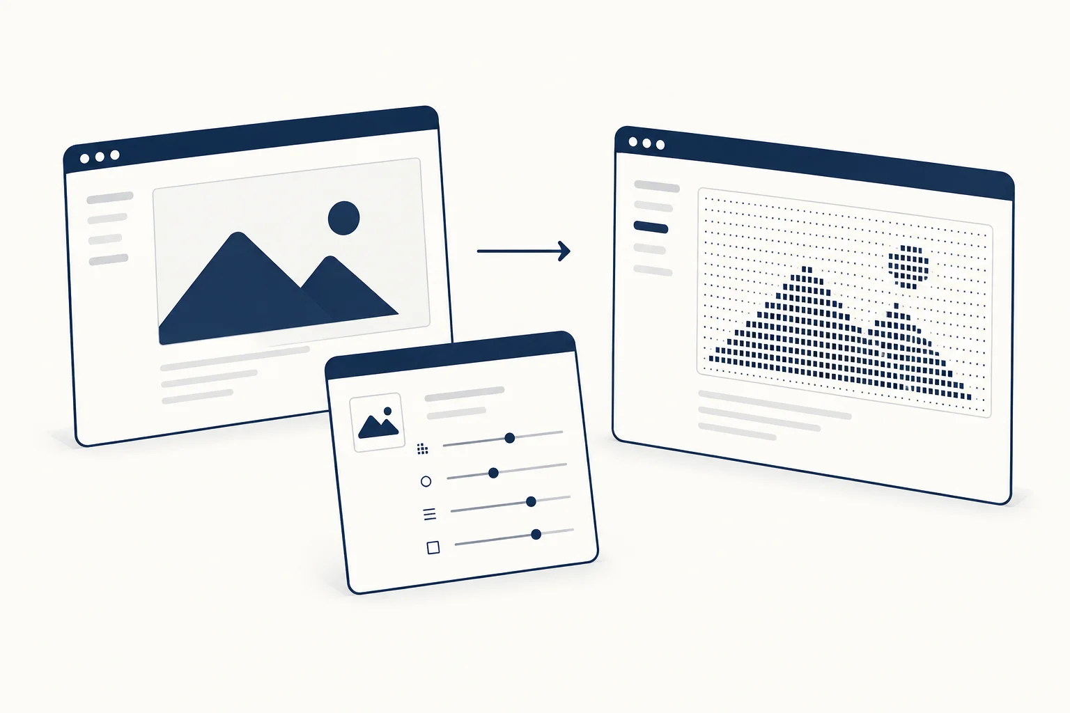
To make an image-to-ASCII treatment useful on a website, preserve the subject first and choose character detail second. Start with a clear source image, inspect the result at its final display size and keep important text outside the decorative artwork. More characters do not automatically produce a better composition.
This article concerns a visual treatment for web design. It does not assume that a rendered ASCII image is selectable text or a substitute for a meaningful written description.
Choose a source with a clear silhouette
A simple subject against a distinct background gives you an easier starting point. A busy scene can turn into a field of characters without a recognisable focal point.
Use an image you own or are entitled to use. Crop it before tuning the treatment so that you are evaluating the intended composition, not a temporary full-size photo. If the result is for a portfolio, do not disguise someone else's work as your own source material.
Tune the subject before the finish
Begin with density and tonal separation. Compare a coarse version that emphasises shape with a finer version that retains more detail. Judge both at the size the reader will actually see.
HorizonX's Glyph Study exposes controls for the character grid and tonal treatment, with additional colour and finish options. Those controls let you explore the look; they do not determine whether a particular source image remains clear.
Add grain, scanlines or glow only after the main subject works. If the finish makes the focal point harder to recognise, reduce it rather than compensating with more effects.
Place the artwork in a real composition
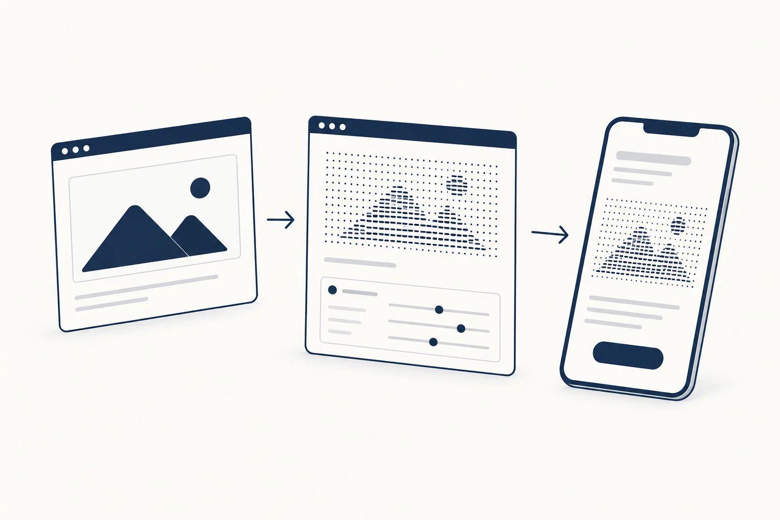
For a fictional editorial landing page, try the visual beside a short heading instead of placing the heading over the densest part. Give the image a job: establish the theme, illustrate the subject or connect a series of posts.
Test a portrait crop as well as a wide one. The narrow version may need a different framing rather than a simple reduction of the desktop image. Preserve the important subject, not every original pixel.
Be precise about output
Check the current editor and documentation for available export and access details. Do not promise copyable text art when the actual deliverable is a rendered image, or assume every texture has identical output options.
Write image descriptions according to the role of the finished visual. Informative artwork needs an explanation of the information it conveys; purely decorative treatment should not create redundant narration.
When is ASCII the wrong choice?
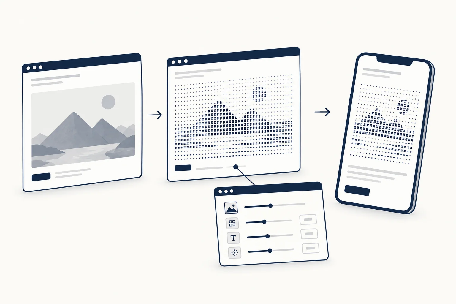
Avoid it when the viewer must inspect fine product detail, read embedded text or identify subtle colour differences. Use the original image when fidelity is the purpose. The texture catalogue is a place to explore treatments, not a reason to apply one to every image.